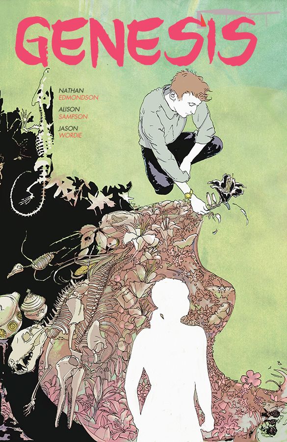
Typically a newcomer artist to comics doesn't have a background of 25 years of experience in architecture, but United Kingdom-based Alison Sampson is not your typical creator. One realizes that after seeing her one-of-a-kind work on Genesis, her upcoming Image Comics graphic novella with writer Nathan Edmondson about a man who gains unlimited power, only for it to become his worst nightmare.
Naturally, I was curious to learn how an architect decided to explore working in comics; we discuss that among other topics in this interview.
Tim O'Shea: How does a professional architect get interested in creating comics in the first place?
Alison Sampson: In the same way as anyone else. I've always been interested in how words fit with other things, so when I found out that people made comics, and not only did they do this, but they did it in a way I could relate to, it was quite hard to keep away. I didn't start by thinking I wanted to make comics, but rather with a blog called Space in Text. This was intended to be a place for me to practice my writing, but finding out about comics took over. After a couple of years of that, I got into more drawing, and one thing led to another. I also read Watchmen, some time before the film came out and that made me think comics could be ... just about anything.
Loads of architects make comics: Joost Swarte studied industrial design and he works with real, as well as drawn, architecture. Ask Gabriel Rodriguez, Manuele Fior, Andre Lima Araujo, Emma Rios and Jiminez Lai the same questions and I'm sure everyone would give different answers.
(Thanks here to Tom Kaczynski, who helped me with this list, who himself has an undergraduate degree in architecture.)
How does your architecture background inform/influence your art approach?
Probably in a lot of ways. The job is about dreaming up, drawing, designing, communicating, publishing and presenting complex ideas, layered stories and spatial arrangements, so all sorts of people can understand, and be involved in the work. That's pretty much the same agenda as comics. Architecture involves designing buildings, but it is really about using the material stuff as a tool to define space and that space being a place where people's lives happen, and those people's lives being the most interesting thing. All architecture is exacting, because it has to be, and that helps. We have to exercise our aesthetic judgement all the time, and make many, many tiny aesthetic decisions every day, with our designs. You cannot help but bring this kind of ingrained practice to bear. Or in my case, bears.
When portraying a scene like the one early in the book of a suicide attempt, what was your thinking in terms of the layout? Believe it or not, there is almost a majestic nature to the scene, despite the inherent violence of it.
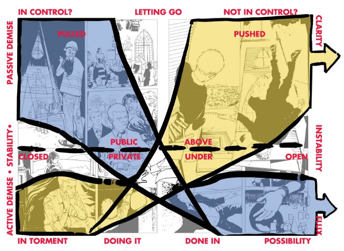
Thank you! Since this is so early in the book, and I thought it was part of our pitch and very much part of whether the book would be picked up, or not, I thought about it a lot, and even have a diagram- where I drew out the layout to explain some of the "hidden lines" for someone (as shown below).
I wanted to set up a way of thinking and a graphic (that black suit, the white hair) for the whole book. There are some very specific architectural needs, too. Here is the script, so this is what I had to work with:
PAGE THREE
Panel One
Now we’re looking past his feet which are on the ledge of the STEEPLE, and we’re looking down at the steps of the church, well below.
1) Caption: ...ever makes a difference.
Panel Two
He’s falling now, through the air.
Panel Three
His body, sprawled awkwardly on the steps of the church.
2) Caption: This should have been it.
Panel Four
Now, we see, near the steps (just his arm is in the picture here, dangling off a step) a collection of BLOCKS like in panel one. Just sitting there in the dirt.
I wanted the reader to be with Adam, as he looked out over his hometown and all the things he was leaving, and then to experience the vertigo he'd feel from looking out and down. The idea was to get a kind of turning, clockwise movement effect, with the next step him somersaulting outwards and us looking at his body from underneath, with the church above him. The architecture is useful, because if you are designing it, the composition can be what you want it to be, it can tell the tale you want to tell.
The pages work together as well as separately. I don't think this is a rebus, exactly, but that was what I had in the back of my mind. There is the possibility for out-of-order readings, made all the more dramatic by the shapes our hero's black suit forms and the circulating composition.
I love that some back material with the story are samples of your work before it was colored by Jason Wordie. How important is Wordie to the look of this graphic novella?
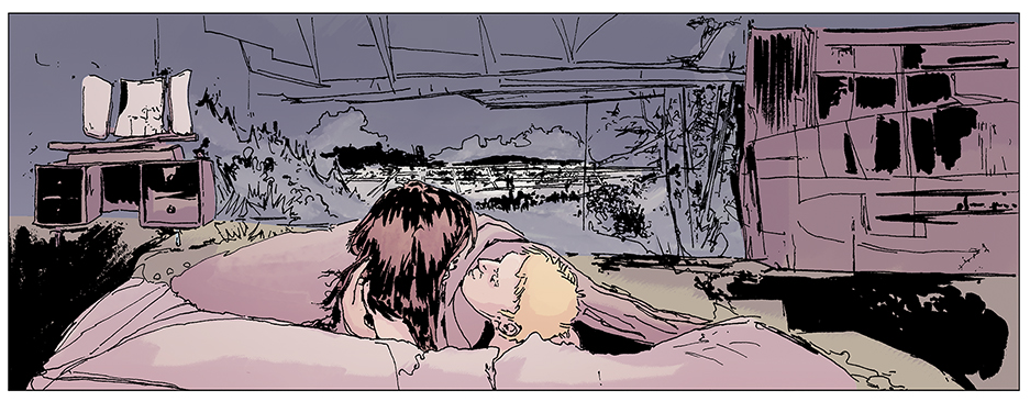
Really important. All the art was finished before Jason came on board, and as far as I was concerned, the art would tell the story well in black and white. However, our story is not a black and white story. Jason's take is unique and like the rest of us, he treated this as "not a monthly comic". We had wanted a fairly soft edged watercolor/European look and I'd talked to a number of colorists, about basing a scheme on the work of Hiroshi Yoshida. Jason came back with this sample that was unexpectedly beautiful. He had colored a couple of Prophet covers. People who painted other worlds bringing their skills to bear on Planet Earth seemed like the right approach for our book (Joseph Bergin III, the regular Prophet colorist, painted our covers over my lines, and Ian McQue, from Rockstar North, painted our retailer variant cover).
In order to find a palette, think about the story and maintain an overview, Jason went away for a while and produced a color script for the entire comic. I would probably have been happy to leave it at that (and we include it at the back of our book for people to see), but we needed to add more detail and bring the work into focus. Since the art in the book is an instinctive take, it seemed like a good idea if Jason took the decisions on the color on a similarly emotional basis. This script sums up Jason's approach- I particularly like the way skin tones change from page to page with the mood. I'd probably thought of the story as slightly gothic, but Jason's take was more thoughtful, and sunnier, unworldly and ambiguous, which I think lends depth to the story. I made color notes and we went through each panel on the phone, so we all knew what were trying to achieve, but it was really more a conversation about what was what. The coloring is clearly Jason's idea of the story, and a filter on everyone else's take.
There is a hallucinogenic quality to some of your art. What inspired you when attempting some of these incredibly ambitious scenes?
The script. I think it depends what you mean by hallucinogenic. If you mean by "looking like it is moving," that would be very much the intention, as in the script things do move and change within the space of a panel. How do you show that? By co-opting art from the rest of the spread, and by showing things as they change or move from one thing to another, not in any one fixed state.
Perspective isn't a strait jacket, it's a tool for telling a story, no more and no less. In life the eye is always moving and often the viewer is too, so there is no reason to view a thing from a single point, or spell out the entirety of a space to the same level of detail. Nobody sees the world like that.
Looking back on the finished project, is there a scene that you are most pleasantly surprised to see how it turned out?
That I can still stand by and like my early pages, which are some of my earliest comic pages, full stop. The coloring as well. I had begun to think my work was uncolorable. I really didn't know where to start with finding a colorist, so I started by asking some very busy people, all of whom were unsurprisingly busy. Since my work had never been colored before, I had not drawn for a colorist, and I didn't know what would work. I was looking for colorists who could paint and design, with areas of flat color. This is not what you find a lot of on Deviant Art, and Yves Chaland was not available, so it was quite a tough search.
I found Ian Herring (part of whose whose sample is included in the back of Genesis- at that point it was the only sample I could get), then I lost him, for timetable reasons. Then I decided to start again and work with people who were much less known on side projects so they could get to know my work and develop a way of coloring it. Suddenly a whole load of really good people appeared at once and Jason came out of that search. The group of colorists that I have found through this job- Sloane Leong, Shari Chankhamma, Mike Garland, Ian Herring, Heather Breckel, others, I will work with them all in the future, they're all great.
I first became aware of your work thanks to writer/artist Jeff Parker seeing your work at a convention. How often have you been able to attend U.S. conventions and how satisfying was it to get such praise from someone like Parker?
I've only ever been able to go to one U.S. convention -- it was Emerald City Comicon in 2013. I enjoyed that very much. I didn't have a specific agenda, but I felt I got a lot out of the trip. It is only for financial reasons and being a comics outsider that I haven't been to another U.S. convention, really. I was completely blown away by the response my work got, and perhaps feel the best reaction to that was to go and make some more work, and that is where I am.
Jeff Parker is one of my favourite writers working on comics today. As far as I can tell, all his writing has this streak of lightness that runs through it, that makes his work super-approachable. That is such a skill- if an artist is entertained by what they are drawing, it will show in the work and make much, much better work. That's it: Jeff knows how to get the best out of the artists he works with. Who would not want that? I'm hugely flattered Jeff Parker might like my work, as I am sure he knows his onions.
If the opportunity presents itself would you want to tackle a monthly comic, or would your schedule not allow for such a heavy load?
My schedule could be adjusted, and yes, I would. I love making pages. Although design work is my main experience,it can be applied to more things than covers. I feel like I've barely scratched the surface with where I'd like to go with storytelling and interior page design.
The 64-page graphic novella, which comes out April 16, has a final order cutoff date of March 24--and will be available at comic shops (FEB140504) and bookstores (ISBN number: 978-60706-995-9). Sampson offers order details and forms at the Genesis Tumblr.


