One of the great strengths of comics is that they belong to a visual medium, with the greatest stories showing a perfect fusion of words and pictures. Unlike in the movies, financial considerations don't have to thwart what can appear on the printed page. From alien worlds to fantastic machines, comic artists can let their imagination run wild and indulge their creative muse. A vital part of the superhero oeuvre is that of the superhero costume. This helps distinguish the hero from the common man on the street, conveying strength, dignity and power (or, for characters created in the '90s, pouches, guns and more pouches).
RELATED: Runway Injustice: 15 Controversial Justice League Costume Changes
The greatest costumes are iconic, instantly recognizable to the most casual comics fan. But perfection isn't always achieved on the first attempt, while sometimes creators can't help putting their own stamp on characters, altering a design that is already perfect. For every character whose costume change gives them a new lease of life, there's another who has gone from fashion Adonis to costume-party reject. We've looked back at Marvel and DC superheroes through the ages in order to find seven characters whose appearance has improved with age, and eight whose appearance has gone oh so very wrong.
15 WORSE: SUPERMAN

Superman's original costume survived for 70 years with only minimal alterations, creating the template for countless superheroes that followed. Debuting in 1938's Action Comics #1, by Jerry Siegel and Joe Shuster, all the familiar elements were there from the start. The red and blue color scheme looks great, the long red cape conveys an image of strength and nobility, while the "S" emblem on the chest is up front and bold. While the chest symbol would later be enlarged and recolored, essentially this costume remained intact for years.
Then, in 2011, came DC's line-wide relaunch with the New 52 reboot, which saw many characters revamped or redesigned. Superman was not immune. While Jim Lee's changes were comparatively small, they were significant: Superman lost his red trunks. As an attempt to modernize a character and get away from stereotypical "underwear on the outside" jokes, it's perhaps understandable. It's just that Superman without his trunks looks so wrong, even in his newer post-Rebirth garb, not pictured.
14 WORSE: SPIDER-MAN

Debuting in 1962's Amazing Fantasy #15, by Stan Lee and Steve Ditko, Spider-Man's classic costume is one of the most distinctive in comics and is instantly recognizable. Not bad for an outfit sewn together by a 15-year-old high school student. The black/blue bodysuit was broken up by eye-catching red on the boots, arms, face and torso, complete with the web-line motif that troubled even the most talented artists, including Jack Kirby. Add in a front and back spider emblem and the blank yet expressive eyes, and you have a true classic.
The costume has received many alterations over the years but the most recent was by Alex Ross as part of the relaunched Amazing Spider-Man title. This enlarged the chest spider, made the eyes and emblem glow, and modified the boots with a higher cut. It's an interesting take, but there are some designs that just can't be improved upon. Luckily, Spidey has recently returned to his iconic, non-glowing/shiny look.
13 WORSE: HAWKEYE

Marvel's master of the bow and arrow first appeared in 1964's Tales of Suspense #57, from Stan Lee and Don Heck. While Hawkeye's costume has often been mocked, primarily for its purple coloring and somewhat goofy face mask, for Clint it just worked. As an ex-carny and a born showman, it made perfect sense for Clint to wear a uniform that stood out from the crowd.
While the modifications made to it over the years were mostly cosmetic -- exposing arms or varying the length of the tunic -- this remained the outfit that Clint always returned to. When a revamp did come, it was seemingly inspired by the pared-down Hawkeye of the MCU. Out went the face mask and tunic and in came a more military style uniform. More practical, perhaps, but it did nothing to help Hawkeye stand out from the crowd.
12 WORSE: HARLEY QUINN

Harley Quinn first debuted not in the comics, but in a 1992 episode of Batman: The animated series. As the Arkham psychologist who became besotted with the Joker, Dr Harleen Quinzel donned a jester costume. What better way to persuade the Joker that they were meant to be together? This striking costume, coupled with Harley's captivating personality and developing backstory, helped her stand out from the crowd and make the transition from TV to comics.
In the years since, the popularity of Harley has rocketed, with high-selling comics and an increased public profile due to Margot Robbie's performance in Suicide Squad. While Margot's impressive performance captured the essence of Harley, the look replicated the more sexualized revamp that had debuted with the New 52 in 2011. A popular choice with certain segments of fandom, this look lost much of the character's distinctive charm.
11 WORSE: UNWORTHY THOR

What are Thor's defining visual traits? Big muscles are a given, but there's also the flowing blonde locks, the winged helmet and the chestpiece with these strange domes on it. What are they for? Who knows, but they're as much a part of Thor as Mjolnir. There's a reason that Thor's costume underwent mostly cosmetic changes in the decades after his 1962 debut (well, excepting his abomination of a suit in the '90s) -- his unorthodox style really worked for him, conveying power, strength and otherworldly nobility.
Such traits are a world away from the current Unworthy Thor now featured in Marvel's titles. Now no longer worthy of picking up Mjolnir, this Thor is stripped of his regal trappings, rocking a bespoke regal hobo look and an ebony metal arm. Of course, it's entirely likely that this look will last only until Thor's inevitable reunion with Mjolnir. Let's hope that he's reunited with more of his apparel: there are not many Marvel heroes that can carry off a winged helmet with such panache.
10 WORSE: DRAX THE DESTROYER

Now best known as a member of the Guardians of the Galaxy, Drax first debuted in Iron Man #55 (1973), by writer/artist Jim Starlin. His early appearance was far removed from the tattooed strongman of movie fame: he was big and green, yes, but he also rocked a more traditional superhero costume, resplendent in purple and -- somewhat unusually for a Marvel hero -- complete with a flowing cape. This was the costume that Drax maintained throughout his early space-faring adventures and into his '90s membership of the Infinity Watch supergroup.
When Keith Giffen revamped Drax in 2005 as part of Marvel's Annihilation event, Drax was portrayed as a stripped-down streetfighter, his fancy costume replaced by scars and tattoos. Unfortunately, this just left him as yet another muscly Marvel hero with a strange skin color, depriving America's youth of the chance to see Dave Bautista rocking a cape and oversized belt on the big-screen.
9 WORSE: KARNAK

As a group of characters, it's immediately apparent that the Inhumans were created by Jack "King" Kirby. When the Fantastic Four first encountered the Inhumans during Stan Lee and Kirby's legendary run on The Fantastic Four, each member of the Royal family was a study in frenzied creativity. Black Bolt, Medusa, Triton, Gorgon and Crystal all looked amazing, but Karnak had one of the most intriguing designs. Able to identify the flaw in everything, Karnak's green and white colour scheme and enlarged head gave him a look that was part warrior monk and part superhero.
When Karnak returned from the dead in Inhumans #13 (2015), followed by a solo series from the pen of Warren Ellis, the overt superhero trappings were gone. Karnak's new costume was essentially just a green hoodie. Hey, Karnak. Maybe next time you can identify the flaws in your dress sense?
8 WORSE:HERCULES

Ahh, Hercules. Legendary fighter, drinker, carouser and womanizer. Able to fight all day, party all night and then start all over again, laughing in the face of hangovers, Herc's a pretty simple guy. Thus, it's not surprising that his typical costume is fairly low key: essentially consisting of a sash, a war-skirt and two long boots. He won't be winning any points for fashion, perhaps, but it's an integral part of Herc's character.
Let's face it, his clothes are either going to be shredded in battle or ripped off by amorous admirers, so an understated approach is probably best. That is why the recent revamp of Herc's outfit, first showcased in the 2011 Herc series felt so wrong. Herc's chest was covered! He wore trousers! Who was this Olympian impostor? We say thee NAY! his more practical military look and adoption of more modern weaponry and fighting techniques is slightly better, but not by much.
7 BETTER: WASP

Designed by Jack Kirby and first appearing in 1963's Tales to Astonish #44, Janet Van Dyne's first costume as the Wasp had a red and black color scheme and a stinger shaped helmet. Jan's keen love of fashion was a key part of her character, leading to her constantly updating her costume and trying to do the same for her Avengers teammates.
While some results were respectable, others were just plain weird, putting Janet second only to Kitty Pryde in the poorly designed costumes category. Since her return from her Secret Invasion "death," Janet has largely stuck to a streamlined and classy black and gold design, something that suits her new status as the experienced mentor and parental figure to Nadia Pym, the new Wasp.
6 BETTER: GALACTUS

Technically, the Big G is more of a force of nature than a superhero, but the improvement in his costume is so great that he deserves a mention. Everyone is familiar with the blue and purple attire of Galactus, and his magnificent face mask/helmet with its pointy earpieces. Comic fans were not impressed when the Galactus featured in the 2007 film, Fantastic Four: Rise of the Silver Surfer, was a sentient cloud rather than the imposing purple protagonist of the past.
As familiar as this look is, it wasn't the color-scheme sported by Galactus when he first appeared in Fantastic Four #48 (1966). In this first appearance, his costume was made up of red and green, complete with bare arms and a skirt/shorts! Not quite as imposing as his later look, unnerving though the prospect of a pant-less giant may be.
5 BETTER: CATWOMAN

Although she first debuted in 1940's Batman #1, as a jewel thief known as "the Cat," it was some time before Catwoman acquired a staple costume. Perhaps the costume most associated with her earlier incarnation is that which accompanied her mid '60s return to the comic books, dovetailing with the popularity of Julie Newmar's portrayal in the Batman TV series. The familiar cat mask was in place, accessorized with a green cape and -- depending on the artist -- purple leggings or a skirt.
In truth, this wasn't a bad look, but the '90s reinvention of Catwoman as a cat burglar antihero coincided with the increased use of a costume that seemed perfectly fitted to her personality and role, managing to combine practicality and sex appeal.
4 BETTER: IRON MAN

If there's one superhero that's known for changing his look, it's Tony Stark. The challenge of keeping the Iron Man suit up-to-date with the latest technology, as well as the useful detail that Tony is one of the richest people in the MU, means that fans have been treated to countless Iron Man suits over the years. Not all of them have been improvements, but even the strangest have been a step-up from Tony's original suit of armor.
In a way, it's somewhat unfair to compare the designs. Tony built his original lumbering gray suit while in captivity, without access to the best technology and equipment. It's also true that technology has moved on quite a bit since this time. Even so, Tony's modern-day suits, with their array of capabilities and fresh look, are undoubtedly an improvement.
3 BETTER: GREEN LANTERN

When Alan Scott was introduced as the Green Lantern in All American Comics #16 (1940), his costume was reminiscent of the superhero fashion of the day. Alan wore a cape and domino mask, with a chest symbol highlighting his power lantern. This wasn't a particularly bad costume and was in vogue for the time, but it couldn't help but feel rather old fashioned when the Green Lantern concept was revised in 1959, when Hal Jordan debuted in Showcase #22.
Following in the streamlined footsteps of the new Flash, Jordan's suit was more functional and almost uniform-like, signalling his membership of the Green Lantern Corps rather than Scott's bespoke creation. The domino mask and chest symbol remained, but the green and black color scheme and snazzy white gloves took the outfit to a whole new level.
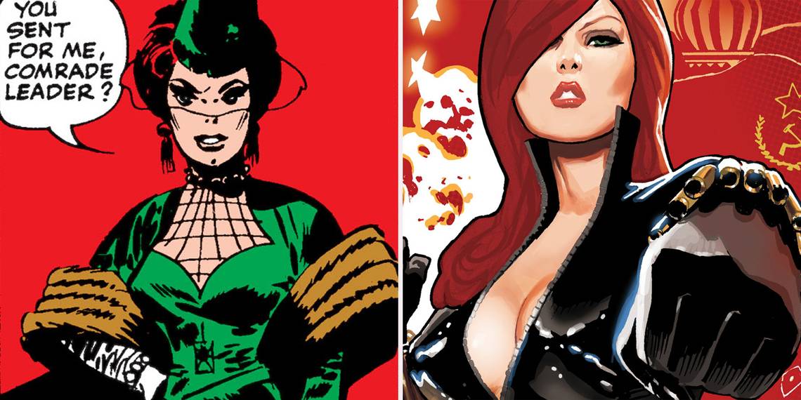
2 BETTER: BLACK WIDOW

When Stan Lee, Don Rico and Don Heck introduced the Black Widow in Tales of Suspense #52 (1964), her status as a villain wasn't the only difference from the character that would become a prominent member of the Avengers. Initially, the Widow didn't have a superhero costume: her attire was that of a lady of wealth and influence, the only clue to her real identity being a web pattern motif on an upper section of her dress.
This may have been suitable for seducing wealthy American industrialists, but when Natasha defected to the USA and became an Avenger, her wardrobe changed for the better. Her new attire consisted of a skintight black suit, accessorized with a golden belt and wrist cartridges that deployed her "widow's sting." Despite infrequent changes, this is the costume that Natasha invariably returns to, also serving as the inspiration for Scarlet Johannson's costume on the big screen.
1 BETTER: FLASH

Following in the footsteps of Superman and Batman, Jay Garrick burst onto the superhero scene in the pages of 1940's Flash Comics #1 by Gardner Fox and Harry Lampard. Unlike the majority of his superhero brethren, Garrick's costume didn't include a cape -- a wise choice for a speedster. Instead, it was a relatively simple blue trouser and red top combination, set off with a lightning bolt emblem on the chest. One curious addition was Jay's winged helmet, inspired by the god Mercury and somehow remaining attached to his head.
When Barry Allan was introduced in 1956 as a revamped Flash, he also received a new costume. The lightning bolt motif remained but unlike Jay, this was an all-in-one suit, predominantly red with yellow boots and belt. It looked then (and still does) sleek, streamlined and modern -- a perfect costume for the fastest man alive.
Have we made the right choices or do we need to go back to (fashion) school? Let us know your thoughts in the comments or on Facebook!