Right, back to the nuts and bolts. Last time I talked about how I came up with the page beats. But what do you do with them then? Well, you write a script. It's that easy, right? Well, kinda. You use the page beats to figure out how the pages will work out, but then you have to contend with the actual fitting of all your wonderful story to the script. I tend to take a pretty minimal approach to the actual scripting. Have you seen an Alan Moore script? Well, that's not me. I got past that point in my work (and I didn't start out as a cartoonist, which gives him a leg up, I suppose.) I put in my script that which I want to see on the page, and not a whole lot more.
Let’s look at page 1 of THE THIRSTY, not because it’s particularly wonderful (it actually makes for a pretty poor one page hook) but because it’s right at the start.
Here’s the page beat for it, as written up in my original outline:
Cedar Creek Inkeeper and husband fighting. Night, late. She’s cut him off and is berating him for being his own worst customer. He’s drunk, telling her he doesn’t have to take that from his wife, that she should be a good wife, give him what he wants. She says she’s a good wife and is giving him what he needs. Douses him with a bucket of water and boots him out the door. He reels, drops to the ground. Don’t come back ‘til you dry out, she warns.
Now, here’s the script page:
PART 1 – TOWN WITHOUT CHEER
PAGE 1
PANEL 1
Interior, frontier town tavern/bar. Quiet, getting to the end of the night, not too many customers saying too much. There’s a Woman behind the bar, Penny Rybandt. She’s the wife of the head inkeeper and part-owner of the bar and she’s not happy right now. Standing on the other side of the bar is her husband Joseph. He’s drunk to the gills, slouched, and asking for more. And he’s angry.
JOSEPH
I’m still thirsty!
PENNY
Don’t know how that’d be with all you’ve drunk tonight!
PANEL 2
Closer in, Joseph pleading.
JOSEPH
I ain’t had all that much.
JOSEPH
Still upright.
PENNY
A feather could fix that!
PENNY
You said “come with me and open a bar!” Not “come with me and drink it dry!”
PANEL 3
Joseph is really angry now. How dare she!?
JOSEPH
It’s my liquor as much as it’s yours! You got no right!
PENNY
And you’ve got no right to waste yourself like this!
JOSEPH
I need…
PANEL 4
Penny is reaching under the bar for something as Joseph leans forward to see what it is.
JOSEPH
Oh, getting the good stuff, eh?
PENNY
Nope.
PANEL 5
Penny comes up with a bucket of washing water.
PANEL 6
And dumps it in his face. Joseph is a spluttering mess.
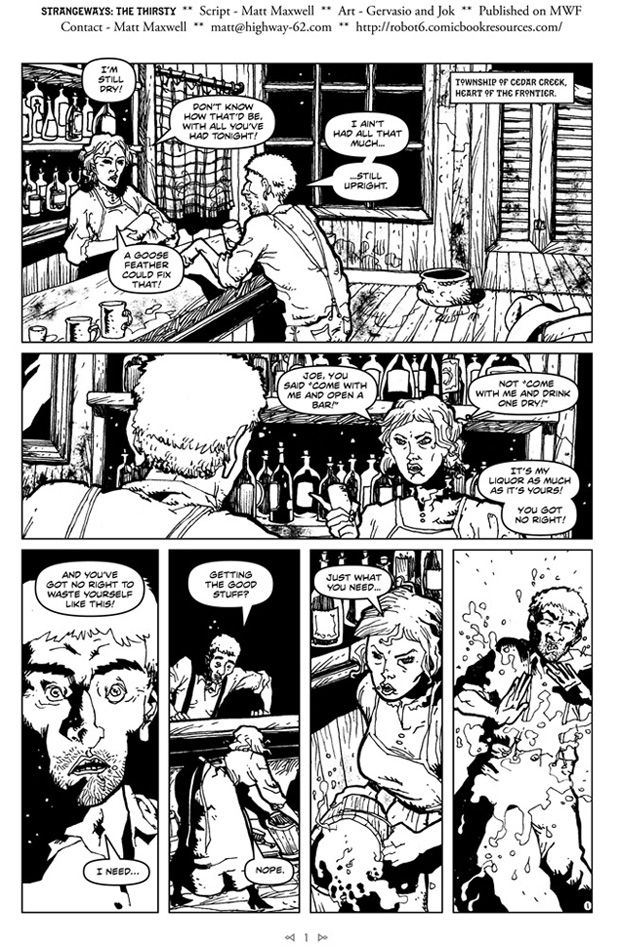
And finally, here’s the page itself:
Panel one is a large, establishing shot, anchoring the story and characters with detail. In the script, I’ve got two pieces of dialogue there, but if you look at the page, you’ll note that a lot of dialogue got shifted into that panel. You want to know the secret of why?
Because it’s big. I’m only kidding a little. But dialogue fitting is one of those things that I screw up on a regular basis. The majority of the dialogue that had been planed for Panel 2 got bumped up to Panel 1, to preserve the character (and expository) notes that I wanted to retain. This is an advantage that I get to enjoy as the letterer of my own writing. Particularly useful if you’re still learning the ropes and put too much dialogue into to small a space otherwise.
I suppose I could just use a six-point typeface instead…
But that’s just cramming of another kind.
Of course, one of the pitfalls of this is that the art may not allow you to move dialogue without it becoming meaningless or, even worse, a distraction. However, you can also find that the dialogue you wrote in the first place is stale and really needs to be something else entirely.
Not that I ever do that. Ever.
Now in terms of working from the page beat itself, the notes were pretty close to what ended up on the page. Though when it came to scripting, I probably decided that we didn’t need to have that last panel of him being tossed out actually happen on page one. It could happen on the page turn and that’d be fine (even better, as it allowed a bit more room for page 1 to breathe.)
Let’s take a look.
2 [and boots him out the door. He reels, drops to the ground. Don’t come back ‘til you dry out, she warns.] He curses, wet and muddy, yelling uselessly at the door that’s been locked in his face. Behind him a shadow moves. He notices it. Who’s there? What do you want? You got a drink for one of the downtrodden?
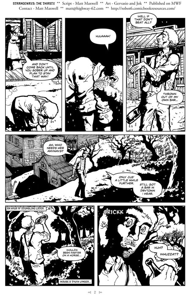
So the action of him getting tossed hits on panel 1 of page 2 now. Otherwise, not too much deviation.
Okay, now the script.
PAGE 2
PANEL 1
Outside the bar, Joseph is falling/being thrown out the front door. Me might see Penny’s hand open, having tossed him.
PENNY
And don’t come back until you sober up and plan to stay that way!
JOSEPH
Huuaaah!
PANEL 2
Joseph face down in the dry ground, lit by the tavern windows.
JOSEPH
Ooof!
PANEL 3
Joseph is coming to his feet.
JOSEPH
Well if that don’t beat all?
JOSEPH
Ah, who needs her anyways?
PANEL 4
Time has passed, Joseph is wandering the streets outside town. Lonely, dark, spooky. Plenty of shadows for something to be hiding in. Joseph is tired, near passing out.
CAPTION
An hour of stumbling later.
JOSEPH
Jus’ a little further. They got a bar in Drytown, I hear.
JOSEPH
Woulda been faster on a horse…
PANEL 5
Closer in, on Joseph, being watched by something. He’s unaware, lost in drunken oblivion.
SFX
Rustling of leaves
PANEL 6
Same POV. On Joseph, surprised, but slow, drunk.
JOSEPH
Huh? Whuzzat?
I stayed pretty tight to the plan here. Broke up a couple of things to give it a beat, particularly on the “Woulda been faster on a horse” line, which works when delivered later, and wouldn’t have in panel 4. Hmm. That lettering could be a little cleaner.
One thing I’ve gotten in the habit of is adding little touches of dialogue to make balloons work a little more smoothly. If it can be done without making the dialogue feel even more unnatural than it already does, that is. So in panel 4, it becomes “ONLY jus’ a little while further.” But then looking more closely, I see that “Still got a bar in Drytown I hear” could lose a word and fit more elegantly.
Oh, and you’ll notice that the artists take my stage direction as suggestion, but will change things up to make them more visually interesting, or to increase the atmosphere. For instance, I ask for panel 5 and 6 to have the same POV and framing, but instead, they (rightly, I add) press in on the luckless drunk, increasing the tension. If I was a good visual thinker, I’d figure this out on my own. This is why I work with artists and am thankful that I can.
Another note, I added narrative captions to indicate the passing of time more clearly, and even inject a touch of humor. I try not to use a lot of those, though I will have characters do internal monologue in narrative captions (but in different presentations/typefaces so that they’re not confused for the main ‘narrator’, who does little more than set time and place. I’m still not sure why the internal is so avoided in most comics and have rattled on about it at length before. I suspect it has a lot to do with how comics were over-written previously, so we’ve got a much more minimal style in mind now when we think about comic writing.
Now, page 3 in beats.
3 His own wife cut him off. Got a drink? Hey, this isn’t funny. Come on out. A shadow rises up behind him and then falls upon him, consuming him.
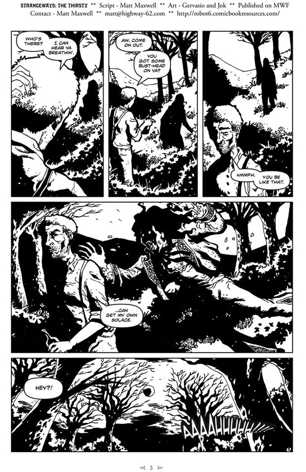
Short, but then this is a part where art and atmosphere do the heavy lifting.
PAGE 3
PANEL 1
Long panel. Joseph, trying to see who’s there. Shadows seem to be moving behind him, but they’re indistinct.
JOSEPH
Who’s there? I can hear ya breathin’.
PANEL 2
Joseph, leaning in to some nearby shrubs, mistaking them for a person. The shadow is more distinct now, looking like a man in silhouette.
JOSEPH
Aw come on out. Maybe you got a little bust-head on ya?
PANEL 3
Joseph, pulling back from the bushes. The shadow is tighter, as if materializing into a human form. It’s a powerful man, long hair, handsome features.
JOSEPH
Hmmph.
PANEL 4
The man materializing behind Joseph reaches two arms out, as if to seize him. His mouth is open, revealing long fangs glinting in the moonlight. There’s something savage about him, even in his noble human form. Keep most of him in shadow, don’t want a full reveal, but convey as much information as you can with him in the dark. This, by the way, is RAPHAEL GUZMAN de MEDINA, who we’ll see a lot of later on.
JOSEPH
You be like that. I can get my own solace.
PANEL 5
Pull back, long shot on the scrubland in the moonlight.
JOSEPH
Hey!
JOSEPH
AAAAHHHH…*
Pretty close to the original plan, all things considered. I think the first three panels could use a fourth for a beat to see that the vampire isn’t going to answer the drunk before he turns away.
The differences here are pretty subtle. Though I’ll say that I try to keep these introductory sequences pretty tight and interesting so that we can get right into the story and not worry about being burdened with introductions. Hopefully I dole out just enough information to keep total confusion at bay, but not so much that the reader ends up bored.
If you take one thing away from this, take away the fact that your script isn’t necessarily some perfect gem of perfection and that maybe your calls aren’t the best Your work doesn’t end with the script, at least not in terms of the writing (and if you’re pubishing/promoting, then your work NEVER ENDS.) The script is a good foundation, and the artists construct the building, and even do most of the decoration. But sometimes things need to be moved around to take some new development into consideration.
This used to be referred to as “the Marvel style” for scripting. Writer and artist spitball an idea. Writer generates a rough storyline, artist breaks it down into chunks, scripter puts dialogue on. Granted, I deviate in that I write a full script and not a rough story (I’m not good enough to get away with that little work and still have it hold together.) But the final pass of dialoguing and lettering, that’s essential stuff. Don’t skip over it if you have the chance to work at that level.

