Marvel Comics' Spider-Man patrols the mean streets of New York City, but his adventures take him into every corner of the Marvel Universe -- from the cosmic to the supernatural. As the artist tasked with bringing Spidey's adventures to life, Ryan Stegman must be ready to draw anything.
In the recent "Superior Spider-Man" #10, Stegman and series writer Dan Slott sent readers into the underground kingdom of the villainous self-proclaimed Goblin King. After a brief break, Stegman returns to the book in September's "Superior Spider-Man" #17 for a story that brings the title character face to face with a representative of a possible future, Spider-Man 2099.
CBR News spoke with Stegman about his process for bringing the Goblin King to life, taking on fellow "Superior" artist Humberto Ramos' design for Spider-Man 2099, the challenges of drawing two Spider-Men at once and more.
CBR News: Ryan, in "Superior Spider-Man" #10, you got to draw one of Spider-Man's biggest rogues, the Green Goblin, who now appears to be operating under the new alias of the Goblin King. What was it like bringing this character to life? As an artist what did you find most interesting about the character?
Ryan Stegman: It was an honor to bring him to life, quite simply! Every once in a while when you're drawing one of these iconic characters, you have to pinch yourself and wonder how this all happened. Green Goblin is a wonderfully designed character and he has such a rich history. [He's] Possibly Spidey's greatest villain unless Ock eclipses him with this current story!
What I find interesting about the character is that I can really let go of reality and grab onto my cartoony nature. Goblin can't look "real." He needs to look sort of otherworldly, monstrous. I get to go deep into my head and pull things out. Sometimes being married to reality is a hindrance, and I think with a character like Green Goblin I draw more from my "unreality" than I do from reality.
Long story short: It's a very liberating way to draw!

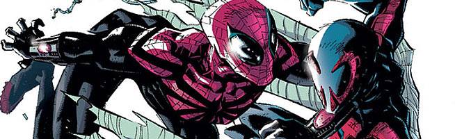
"Superior Spider-Man" #17 and #18 feature an encounter between Spider-Man and Spider-Man 2099
You also got to redesign the look of the Vulture's former winged assistants as the Goblin King's "Cherubs." These characters already had a creepy vibe to begin with. Did you hope to amplify this vibe with their new look? What do you want your art to say about these guys?
Well, I designed the original characters when they were Vulture's assistants, so I just wanted to take that design and push it towards Goblin. It was Dan's idea to give them bat wings, which I think reflects the look of the Goblin Glider. I took their original design and pushed it to look more like the Green Goblin, which in turn made them even creepier.
I thought the original ones were creepy, but the elongated face I gave the new ones really sells it. I want them to be scary. They are minions of the Green Goblin, after all!
The Cherubs are just one part of the Goblin King's ever-growing army. He's also got a number of tattooed foot soldiers. In issue #10 the guy who popped out of the sewer with Goblin tattoo on his forehead seemed to have an especially unsettling feel to him. Was this classic, seedy, professional and unhinged criminal vibe something you were consciously going for in your designs?
Yeah, these things run through my head without me being overly aware of it but, now that you mention it, that was definitely there. I mean, with any bad guy I'm always trying to draw them less attractive than the good guys. I want you to get a vibe from them at an instant. They are ugly and bad. I also want them to look unhinged because that elevates the creepiness of them. Plus, I envision them as sort of brainwashed by Green Goblin. That's not Dan's note or anything, just the way I see the characters in my head.
The Goblin King and his army primarily operated underground in issue #10, but the action took place in a variety of environments. What are your overall feelings on background and environments in a story? How important of an element are they in your work?
Backgrounds are tremendously important. You have to give the reader a sense of where they are to engage them. I enjoy drawing backgrounds. Some can be tedious, but as long as you're being creative and trying to really create an environment and a mood you stay mentally engaged and they can be a lot of fun.
Edgar Delgado colored your work on "Superior Spider-Man" #10 and your other issues of the series as well. What do you feel he adds to you work and the overall story and why is he a good fit for your work?
Edgar is one of the best in the business, plain and simple. He's great to work with. We've done a couple side projects here and there. I mean, I even asked to work with him in the first place because I've been a fan of his work for a long time. And he always delivers. Never turns in a page where he hasn't put in max effort.
He's particularly great because he is very aware of the storytelling when he colors. He emphasizes the important elements and subordinates the others. His palette is great and he changes with the mood of the story. Nothing makes me happier when the pages for an issue start rolling in from him.
EXCLUSIVE: Ryan Stegman's interiors for "Superior Spider-Man" #17
Your next issue of "Superior Spider-Man" is September's #17, which kicks off the Spider-Man 2099 story. This issue will be the first time you draw the new Superior Spider-Man costume, which debuts in issue #14. As an artist, what elements do you find most interesting about the redesign?
It's a great design and Humberto outdid himself with it. I love drawing it. My favorite part is the uneven webbing on the mask and chest area. It just gives it a sort of unbalanced look that is really cool. I can't wait to draw it more!
Will the Superior Spider-Man have a new attitude to go with his new attire? Does he move differently or have a different body language in this new costume?
Not really, no. I've already tried to apply a more aggressive look to the way he moves in his previous costume. I'll continue being somewhat angular with him. It's a new costume that will speak for itself. The black eyes add enough to his character on their own!
Obviously, a major draw for fans of both Spider-Man and his 2099 counterpart is their eventual encounter. What is it like drawing these two characters in direct physical opposition with each other? How different are their fighting styles?
I haven't drawn them fighting yet, but I'd say that they are probably fairly similar. The difference is that 2099 can glide when in mid-air. So an aerial battle would definitely be interesting to draw. They both have finger talons though, so there should be some shredded costumes if and when they do engage in battle.
Working on "Superior Spider-Man" has been a real honor and a thrill for me. Thanks to everybody who has been reading and enjoying it. Thanks for the kind words.
"Superior Spider-Man" #17 hits stores in September.