ON DRAWING COMIC ART
It's tedious work drawing a comic page. It's a series of exhausting decisions, every one threatening to destroy every other decision you made on the rest of the page. Modern technology might make it easier, given that you can shrink or enlarge art on the computer in post-production fairly easily. But some decisions cannot be unmade. Some are so structural that you have to run with it and adjust as you go along. Besides, there's a monthly deadline to hit and no time to redraw that page.
And when the page is done, all you see are your mistakes.
Art is a cruel world. So far, this sounds a lot like my inking rundown a couple months back, but it's not. This is about drawing an actual page of sequential art.
When Ron Marz put out a page of "Shinku" for everyone to try their skills on, I decided to go for it. Just to keep it do-able with my limited art skills, I drew the two characters as Smurfs. Sorry. I was trying to give the little blue guys a rest in this column for a while, but this proved to be too juicy a topic to let slide by.
Here's Marz's original column with the script sample.
Here's his final column with three dozen art samples.
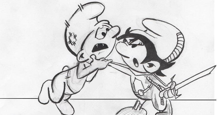
Here's my final page:

Some things I learned from drawing it:
- I can't draw small. In all the months I've been drawing Smurfs for fun and inking them to learn some of those skills, I've always drawn them fairly large. My sketchbook is 9 x 12 inches, and I tend to get two full character drawings on a page. When faced with drawing five panels on a comic book page, I realized I had to shrink those drawings. That wasn't comfortable for me. So --
- This page is a Frankenstein. I drew the panels separately and then composited them in Pixelmator after the fact. In fact, you can see where I forgot to erase the panel numbers on the page in the upper corners of panels 2, 4, and 5.
- I'm most proud of the fact that I didn't break the 180 degree rule, which is something Marz said a lot of people did fail on. That's something I was conscious of as I laid out the panels. And I did do a stick figure like layout. Sadly, that page went into the garbage, so I can't show you the before and after.
- Near the end, I toyed with the decision to do gray tones in Manga Studio. I first studied the art sample from Lee Moder to see how he handled drawing a black costume in shades of gray. Then I tried to replicate that musculature on a Smurf. I got so far with the gray tones as to add a small shadow under one character in Panel 4. I probably should have erased it before sending the page in. I left the pencil work uninked where I could have gone in with the gray tones.
- I didn't draw backgrounds. I have to admit that I just don't know how. I couldn't figure out how to draw a background pattern that wouldn't compete with the characters in the foreground. Keeping it spare and using a very thin line would be two obvious tactics. I chickened out and then I ran out of time to even try. Ah, well. Just picture a dirty brick background or something on the page, OK? I at least drew a couple of horizon lines! I did that in software, by the way.
- I did the panel borders in the computer, too. Should have done the lettering, but I'm out of practice on that and didn't have time in my schedule to pick it back up again.
- This is a boring page. Yes, it gets the job done, I think. There's an establishing shot. The camera moves in and out a couple of times. The final panel frames the shot in a somewhat interesting way with that badly drawn sword. But it's too head-on. It's played too straight and needs some more dramatic angles. It needs a diagonal somewhere. That first panel needs greater urgency. ShinkuSmurf is standing too straight up and down. This is the second attempt I made at the first panel. The original attempt was too ramrod stiff. I moved in the right direction, but not far enough. Lesson learned: Always go too far, because your natural instincts will pull you back from going over the edge.
- I just noticed the tangent of Shinku's hat on the panel border in the second panel. That's a silly digital mistake to make. I could have shrunk down the art for that panel another 5% and avoided the whole thing.
- With a few minor exceptions, the inking is awful. I should have just left it at the pencil stage.
The point is, I took something like three weeks to draw this page, in dribs and drabs. It's a relatively simple page, yet it was still overwhelming. I critique this stuff all the time. I know a lot of the dumb mistakes. I've seen them a million times. But when it's my own stuff, I don't see some of it until after the fact. It's very hard to see our own faults.
This small exercise leaves me more empathetic towards comic artists. Their "mistakes" might often be things they'd agree with you on, but the realities of a monthly deadline leaves little free time to fix those things. Sometimes, 'good enough' is good enough.
I wonder if so many of the more vindictive verbal bomb throwers on-line would have a new perspective if they ever tried to draw a comic themselves? It's easy to maintain that separation between analyzing and practicing, but letting those two blend together just a bit can add so much more to the mix.
This isn't, by the way, to say that a reviewer who doesn't also do that which they review is uninformed or incorrect. Many of the best reviewers were not practitioners of the crafts they analyzed. I just think that some extra doing might help a reviewer see more things, understand more of the compromises, and be a more considerate human being. I don't see the weakness in any of that.
And remember, Roger Ebert write a movie once, too...
SYBIL: THE BACKPACK FAIRY

Nina is having a rough first day back at school. She nearly lost her backpack before the day started. The cool girls are mean to her. Her mind wanders in class, only for her teacher to call on her. (Murphy's Law, right?) Her mother is newly separated and trying to juggle a career and two kids. Oh, yeah, and nobody can see the little green monster and helpful fairy who have newly shown themselves to her alone. That initial jarring introduction gets Nina in trouble with her teacher and principal.
It's a cute set-up: Middle school girl has instant unbelievable friend capable of grand adventures on a fantastic scale.
The problem is, there's not much else there. Michele Rodrigue's story obviously has an entire fantasy world happening behind the scenes, complete with forces of good and evil. It's possible that Nina has been chosen as The One. There's a fun rollicking adventure with an Egyptian king let loose over the town which Nina has to chase and attempt to cover up. As it turns out, that's the main story for the book, though it doesn't feel like it should be. It's odd.
That silly fun is welcoming and energizing, but the diversions into what is clearly being set up as the series' mythology rob the book of that fun and excitement. Too much of it feels too random, like it came out of nowhere. There's no explanations made, and the adventure isn't so great that you forget to ask about their origins. Yes, as much as the origin story has become the bane of forward progress in comics and comic-based other-media hijinks, a quick explanation might have helped this book feel more grounded and less like it's being made up as it goes along.

There's also a helpless feeling with Nina not being in control of anything. She shows she can think quick and that her mind can wander enough when given a chance to pick up on important clues, but she's passive in this book, reacting to a crazy amount of stuff that's just thrown at her. She accepts it fairly quickly and adapts, but I'd like to see her be a more active participant, with enough knowledge of what's going on around her to help steer her own course.
There are four books in this series so far. While the pacing of this first book might feel a bit off, I hope that the mythology of the series can take center stage in future books (which I haven't read yet) and carry the book along.

The thing that buys this book that chance is the beautiful and lush artwork from Antonello Dalena and Manuela Razzi. They're the same artistic pairing that you might remember from another Papercutz title, "Ernest and Rebecca." Picture the most straight-forward traditional comic book storytelling pages from that book and expand that to the entire feature story here. It's a treat for the eyes.
The more traditional all-ages friendly line work with a more modern manga-centered influence give the book its bright and interesting freshness. The large expressive eyes, the action speedlines, and the detailed backgrounds borrow stylistic elements from Japanese comics storytelling. The lush background art, the more traditional sequential storytelling with medium shots and wide shots, and the more Spirou-like style maintain the Franco-Belgian influences. Dalena drops out the backgrounds from time to time, but it's always in service to the story. It usually helps to freeze the moment and isolate the characters in it, before returning to the detailed inclusive art in which the environment is as present as it would be in a live action piece where the backgrounds can't be avoided. It feels like a natural piece of the scene.
I'm also distracted by Nina's family. She lives with her mother and less-than-a-year-old brother. Mom and Dad just separated within the last two months. I'll go with the cliche about how they thought having a second child would rekindle their love, but it didn't, and now she's a single mother to a baby and slightly older child. That has to be exhausting, but not so exhausting that she can't make it out for a second date with this Richard fellow, who Nina (not surprisingly) doesn't like. It's also a date scheduled for the first day of her daughter's school year, mid-week. And Nina is left to babysit in the meantime. I know I'm over-protective of my daughter at times, but I wouldn't let a 10 - 12 year old babysit her when she wasn't even able to walk yet. I'd be afraid that an Egyptian king and a bunch of Egyptian animals might overrun my living room... Maybe I've read too many comic books.

How does Mom do it all? For starters, Mom is very quick. Check out this sequence. In the time her daughter goes to answer the door, she's able to run to her bedroom, get changed for her hot date, throw her jacket on, and walk out the door. That's impressive. (In reality, there's likely a bit of dialogue that was needed but overlooked to help explain the time shift away.)
And the fact that this all piques my curiosity tells me that there was something missing in the main story that should have grabbed my attention more.
"Sybil the Backpack Fairy" is a book with much potential. If it can focus in future books on the story at hand and explain a little more about what's going on without dragging the speed down, it could be a great book. This first volume asks a bit too much of the reader and the reader's patience, I think. The art is good enough for me to give it another chance, though. I love this style.
NBM has four volumes out so far. While they stay committed to keep the books available in a hardcover format with 48 pages for $10.99 or $11.99, the book does unfortunately shrink in physical dimension to get there after the first two books. It's a comedown from 8 x 10 to 6.5 x 9 inches. That doesn't sound like much until you do the math and find the book's page size drops from 80 square inches to 58.5. That's more than a quarter of the page being lost. It kept the price down to $10.99 after jumping up to $11.99 for the second volume, but it's still disappointing. I'd happily pay the extra dollar -- or even two -- for the extra breathing room on the page.
For more on the "Sybil" series, check out Papercutz's site, complete with sample pages and creator biographies.
A PAIR OF PIPELINKS
- Gabriel Hardman visits the zoo and takes his sketchbook with him. He follows that up with more animals. Love this stuff.
- Cyclops doesn't do so well at 3D movies.
Twitter || E-mail || Pipeline Message Board || VariousandSundry.com || AugieShoots.com || Original Art Collection || Google+