There were so many good books last week, guys!
Seriously, I did not even make it through my whole reading stack, and still I had too much trouble trying to pick just one to write about for this week's column. So instead we're going to do a tiny bit on several, including some gorgeous images. One of these books is actually NOT a pick, but I wanted to talk a little bit about why it skates so close to being a pick and then 2 panels at the end completely ruined the whole book for me. Very disappointed.
So let's get to those books!


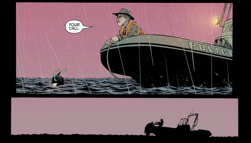
DEADLY CLASS #1
Rick Remender, Wes Craig, Lee Loughridge, and Rus Wooten. Cover by Wes Craig. Image.
A really strong and beautiful start for Remender and Craig’s Deadly Class! High-concept and a little bit weird, it feels definitively like a passion project in that it’s unconventional and well, passionate as all get out. A great introductory set up to our lead protagonist (as well as our other leads) and the general concept and it takes the building blocks of something X-Men-ish and turns it nicely on its ear in a fun new way. Wes Craig is bringing an incredibly stylish and focused vision to the book while Lee Loughridge’s colors are simply divine. My favorite page (of many) in this first issue:


HAWKEYE #16
Matt Fraction, Annie Wu, Matt Hollingsworth, and Chris Eliopoulos. Cover by David Aja. Marvel.
And with Hawkeye #16, Kate Bishop continues her epic and not at all stealthy climb up my list of favorite comic book characters. She’s simply magnificent. There was a ton of badass action in Hawkeye #16, but it was this page below that made me swoon. Fraction and Wu brought in a beautiful issue all around and there's no doubt that Kate can anchor her own title with ease. Her adventures here are one part superhero and one part Nancy Drew and there's no end to their fun. Kudos to Wu, because David Aja is an incredibly tough act to follow, but Wu does it well. Hollingsworth continues to kill on colors. But in the end, it’s all about the character. Ah, Kate, be mine!


BLACK WIDOW #2
Nathan Edmondson, Phil Noto, and Clayton Cowles. Cover by Phil Noto. Marvel.
Second issue and we are CRUISING. Another beautiful, standalone stunner. Another job for Natasha and thus more complexities and grey area, and thus more wonderful character work. I like that Black Widow’s first two issues feel complete unto themselves and can stand so gorgeously on their own, but I confess I want a bit more feeling for where we’re headed. Something larger. Still, I’d be a fool to complain. Smart crisp writing, fine nuanced character work, and out of this world visuals, the kind Natasha has always deserved, by Noto. I hope this book as got staying power, because it’s off to a hell of a strong start.


PRETTY DEADLY #4
Kelly Sue DeConnick, Emma Rios, Jordie Bellaire, and Clayton Cowles. Cover by Emma Rios. Image.
So weird and beautiful. DeConnick is certainly not afraid to push on boundaries with Pretty Deadly. She and Rios play with storytelling and you can tell they’re doing exactly what they want to at every moment. The book is weird. Beautifully weird. There are moments when I catch myself wanting thinking that I want it to be more traditional or easier to follow, but why? So many books are exactly that, we have plenty of that. Better that Pretty Deadly cuts loose and lets its freak flag fly. I have no idea where DeConnick and Rios are going and maybe that’s best. It’s been a while since a comic book REALLY surprised me. I’d bet Pretty Deadly is gonna be the one to do it. Oh, and can we talk about Jordie Bellaire’s incredibly evocative color work on this book? The page below is gorgeously illustrated all around, but I picked it for Bellaire’s colors. Absolutely stunning:


UMBRAL #3
Antony Johnston, Christopher Mitten, Jordan Boyd, and Thomas Mauer. Cover by Christopher Mitten. Image.
Umbral continues to be super fun with a really strong voice. You all should jump on board now, it’s still early! High fantasy but with a slick modern voice and a hell of a YA Protagonist in Rascal, Johnston and Mitten are doing lovely things with Umbral. The art (and colors) have a grittiness that gives it a texture and the impression of layers that are missing from so many books these days. My favorite element however, has got to be how Johnston has chosen to realize the magical language in Umbral, which you can see in the panel below. Absolutely awesome:


BATMAN #27
Scott Snyder, Greg Capullo, Danny Miki, Plascensia, and Steve Wands. Cover by Greg Capullo and Plascensia. DC.
Many of you know I’m a Scott Snyder superfan. I think he’s an exceptional writer and a fantastic fit for Batman. In Synder’s capable hands, Batman has remained one of the few books I’ve had no problem sticking with in the New 52. He’s got a dark sensibility and a flair for horror that makes him the ideal writer for Batman - probably at any point in time, but certainly the overly dark and gritty “New 52.” I like that he doesn’t give up on humor and hope entirely though. There’s always Alfred to lighten things up with a joke:

Greg Capullo is pretty much killing this book. I think when Capullo was first announced as the Batman artist I was skeptical. There were things about his style that I thought would work well, and others I was concerned about. But he has really pushed himself as an artist and storyteller with Batman. This page perhaps isn't the best example of the storytelling aspect as it's largely "splash" but it's gorgeous nonetheless:

And our miss this week, but SO CLOSE to being good - SPOILER ALERT on this one:

ALL-NEW X-MEN #22.NOW
Brian Michael Bendis, Stuart Immonen, Wade von Grawbadger, Marte Garcia, and Cory Petit. Cover by Stuart Immonen, Wade von Grawbadger, and Marte Garcia. Marvel.
So this issue, with stunning visuals by Stuart Immonen, Wade von Grawbadger, and Marte Garcia is a really unfortunate case, because it’s great fun and action-packed. Tasked with being both new reader friendly (despite being issue #22) and rolling the Guardians of the Galaxy into the tale at the end. But Bendis handles it all with surprising ease. It doesn’t even feel forced, which is impressive. The book is filled with nice simple character work:


And a lot of humorous writing that shows off the relationships and chemistry of the characters:

Unfortunately, on the second to last page, two panels (see below) yanked me right out of the book and cast a pall over the whole damn thing.
I’m not going to get super into it, but you can read my CBR Review here if you’re curious for the longer take. The short version is, as a reader it’s impossible for me to believe that Kitty Pryde doesn’t almost immediately understand WHY the Shi’ar would take Jean. It’s convenient writing that ignores character – both because it undermines Kitty as a character, making her less intelligent than she is/should be and it ignores what she should obviously know given her position and experiences.

Changing Kitty’s lines in these panels from “Why would they take Jean and leave us?"
To something more like: “What are they doing here? Why would the Shi'ar...oh my god. No."
Changes everything and makes the book a huge success. Instead, it shattered my suspension of disbelief, something that is already a very delicate balance. In the end it’s still a beautiful book that succeeds on many levels, but it’s a shame that a simple line change (one that makes the book better in my opinion anyway) wasn’t made that can save the whole book.
***
So, those books were the best of my pull last week - and one that just missed the mark - what were your top books for the week?
Also, don't forget that we're headed into Week 2 of the Kickstarter for my novel STORYKILLER. We funded in under 72 hours, but we've got three weeks left, so check it out if you're into crowdfunding stuff. Thanks!