OR...The Six C's of a Badass Comic Book Cover!
We all have our own tastes when it comes to art and comic book covers are no exception. Thanks to a lot of drinking and looking at comic book covers over the last few years (in my Drunk Cover Solicits In Three Sentences or Less feature on my blog) I've thought a lot about comic covers over the last few years and what really makes me respond to something, or alternatively turns me off. So here are 6 C's that make of the anatomy of a great cover for me - along with a slew of gorgeous examples. I focused on more recent stuff from the last few years, both because that's where my focus has been for the feature on 1979 Semi-Finalist and because while I there are obviously tons of gorgeous covers through the ages, I think we're going through a pretty great time for comic book covers. A few classics snuck their way in anyway. It should also be said that while I broke these covers up into groups based on what I was talking about, many of them could fit into multiple categories - they're just that cool.
Enjoy!
COLOR
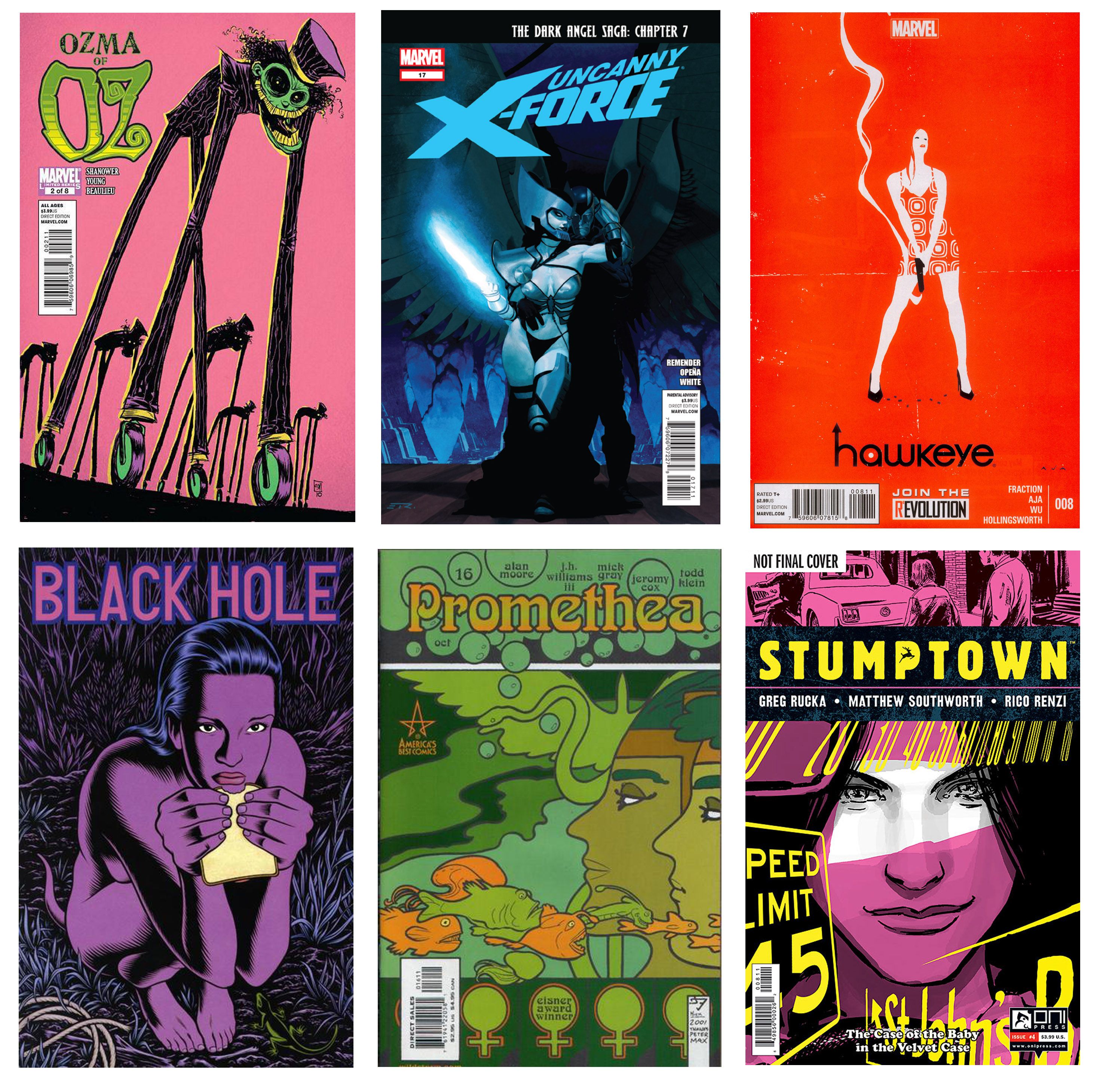
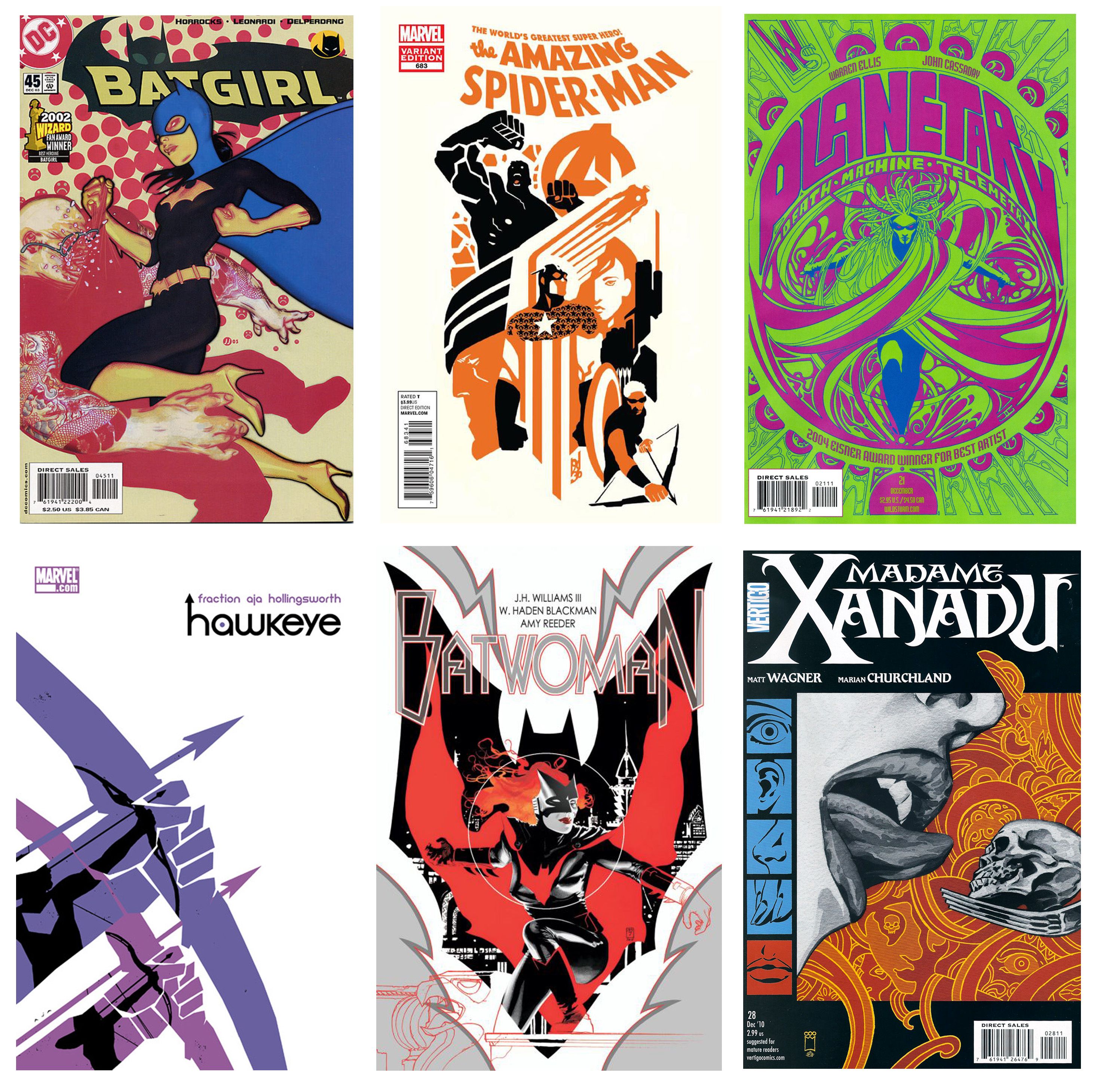
I'm a sucker for a limited color palette. Monochromatic tones, contrasting colors, or the use of just one bold color along with some black or white make up some of my absolute favorite covers. Even when they come in totally different styles, color alone helps distinguish the best of the best for me.
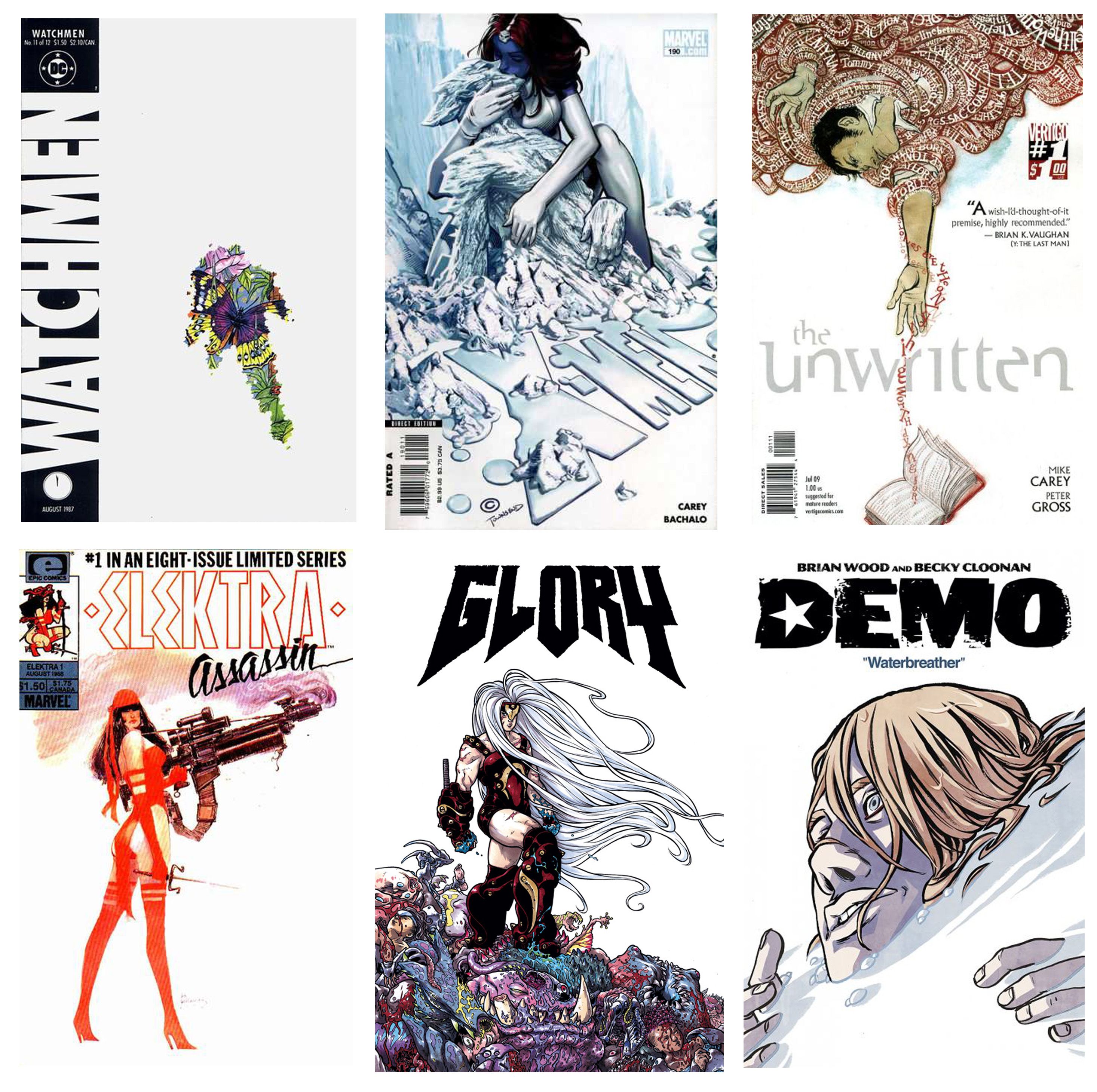
Another thing that impresses me greatly when it comes to color (or the lack thereof) is the boldness required when an artist chooses to go with a whole lot of white. The negative space created by a whole lot of white is not for the faint of heart, but when handled well, it makes an absolutely striking cover. Sometimes less really is more.
COMPOSITION
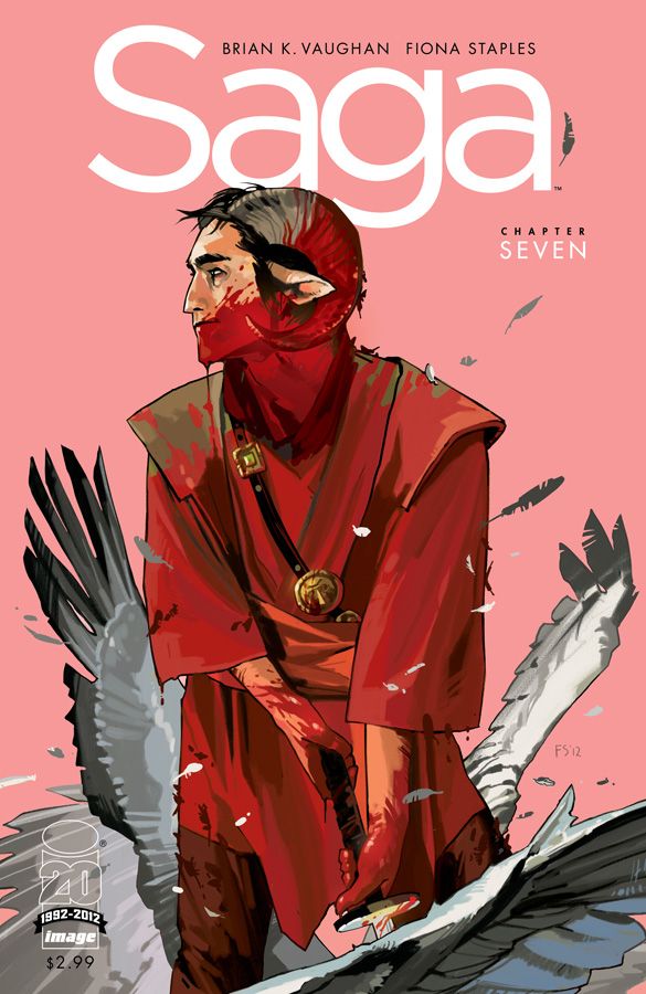
Next to color I am most swayed by an excellent composition. Interesting positive and negative space is a must, and either absolutely perfect execution for a complex cover, or the restraint to go simple are my two favorite extremes. Interesting angles, off-center compositions, and the illusion of movement are all on display in the examples below.
Another compositional trick that's been seeing a surge over the last 10 years or so is the heavy influence of strong graphic design elements and sensibility in comic covers. J.H. Williams III is easily one of the standouts here, but we've also seen a lot of stunning examples in very cool offerings from John Cassaday, James Jean, David Aja, and many others.
One of my favorite developments that combines both a strong sense of composition and a strong consideration of graphic design sensibilities is "text integration." It probably deserves its own category, but since it doesn't fit in with the whole "Six C's" thing I'll merge it with composition. Not a lot of covers are willing to play with their title integration, thanks to "brand recognition" concerns, and worries about consistency and ease of reading, but for me, nothing shows better design and a more well-considered cover than one that has integrated the title into the work. Sometimes this means simply where the usual title is placed, taking into account the illustration work and choosing the best place for it, even when that's not at the top of the book as is generally standard. Other times it means literally working the text into the illustration.
CONTENT
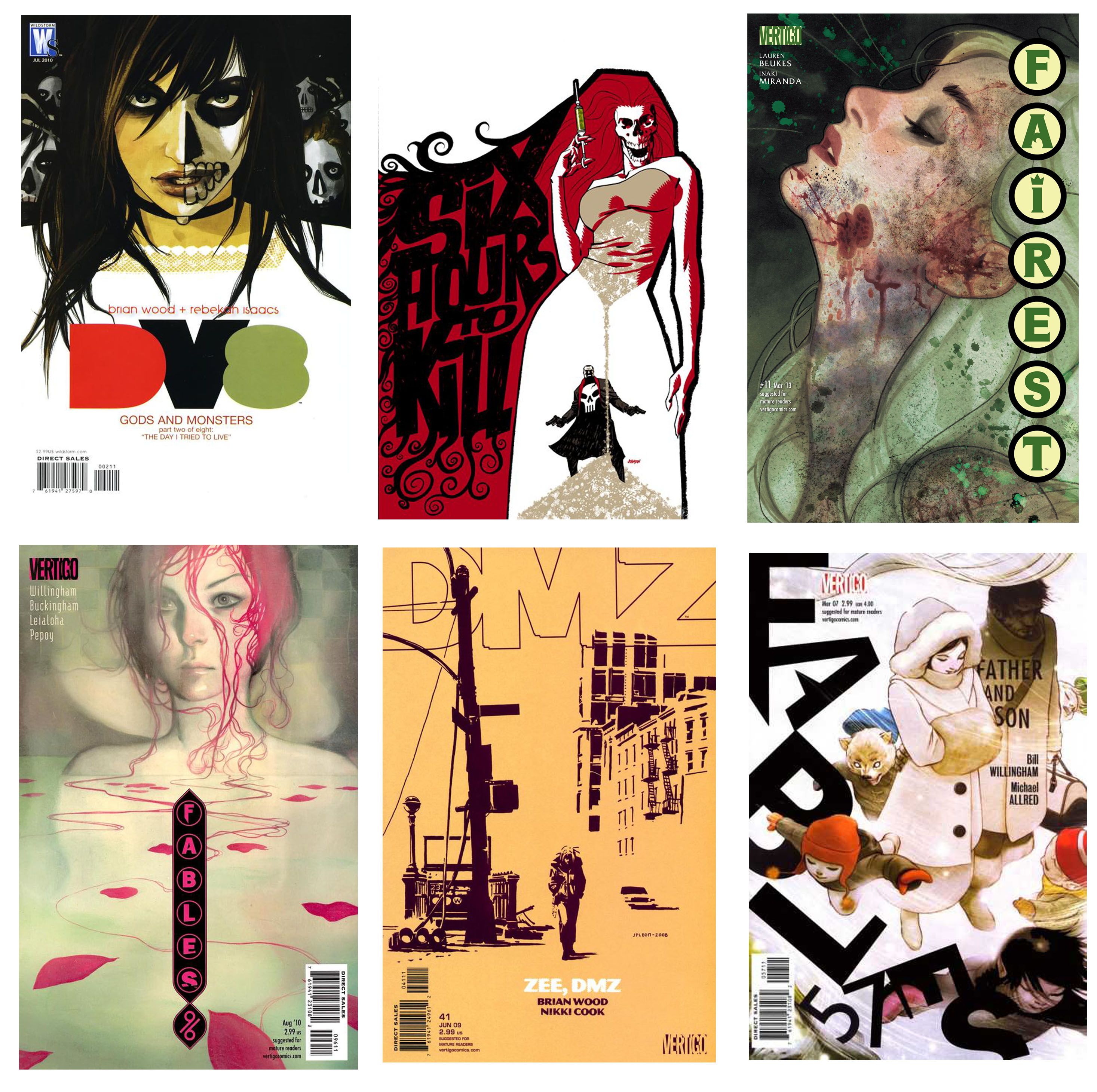
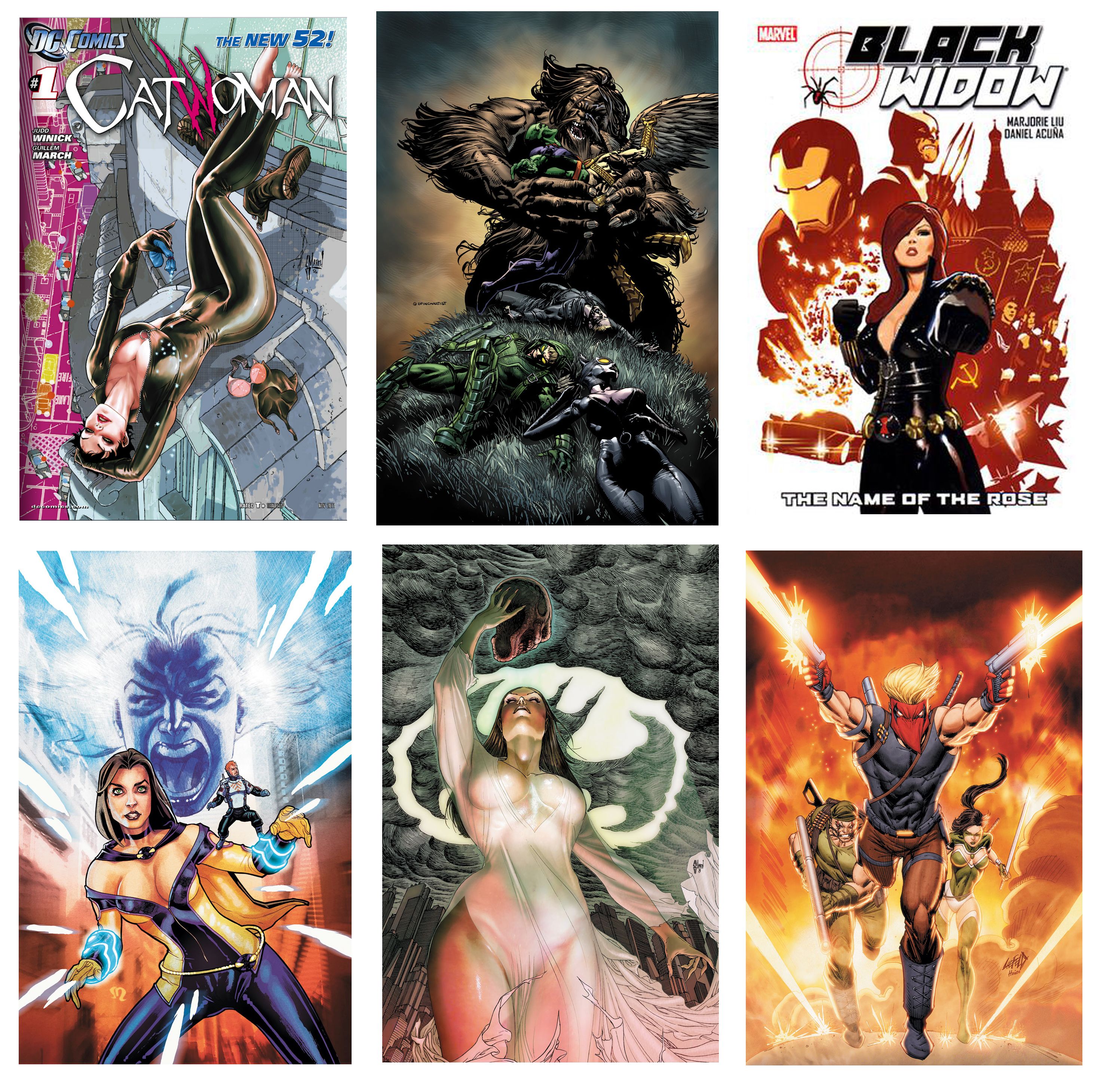
This one is probably the trickiest and perhaps the most "salt to taste" - we're all turned on or off by different things. If you read my column (or the Drunk Cover Solicits that inspired this post) then you all know I'm pretty quickly turned off by sexist covers, which is not to say that I have anything against sexy covers. But that line is different for everyone. Instant turn offs for me are excessively male gaze focused posing, zippers that defy the laws of physics, female costumes that make no sense (especially when contrasted with a slew of practical male costumes), and overtly T&A-ish stuff with no contextual reason behind it. Truth be told I'm also pretty turned off by covers that feature a huge group of characters - all of them male. When it comes to simple visual elements I am generally turned off by poorly executed work that feels hurried or ill-considered and also by overly fussy work with no clear focus to hold the eye. Too many unnecessary lines and ideas feels like overcompensation and insecurity to me...and it makes me sad.
ETA: As a commenter mentioned, I really glossed over some of my most hated aspects of a cover - mostly because they are less offensive and more biased - sometimes with reason and sometimes without. Top of that list are "floating heads." I DESPISE a floating heads cover, they are almost always horrible and generally feel exceptionally lazy. Also up there on the list would be the "background/no background cop out cover." This is when an artist doesn't commit to no background - with just color or white space, but makes a terrible (half-assed) attempt at a background (see: almost all of Liefeld's covers). Other pet peeves include cliche shots of superheroes solemnly at the grave of someone and horrible giant artist name plates (another Liefeld sin). I also tend to dislike covers with a character's face "split in half" - though there are examples of that done really well, and covers with the reflection of a character in something (especially a sword). Again, however, sometimes an artist can nail the reflection idea. Terrible anatomy, posing that's impossible (even for superheroes), a misunderstanding of perspective as well as how many teeth are in the human mouth, etc. The list of pet peeves go on and on! That said, as with everything, there are exceptions to every rule!
CREATIVITY
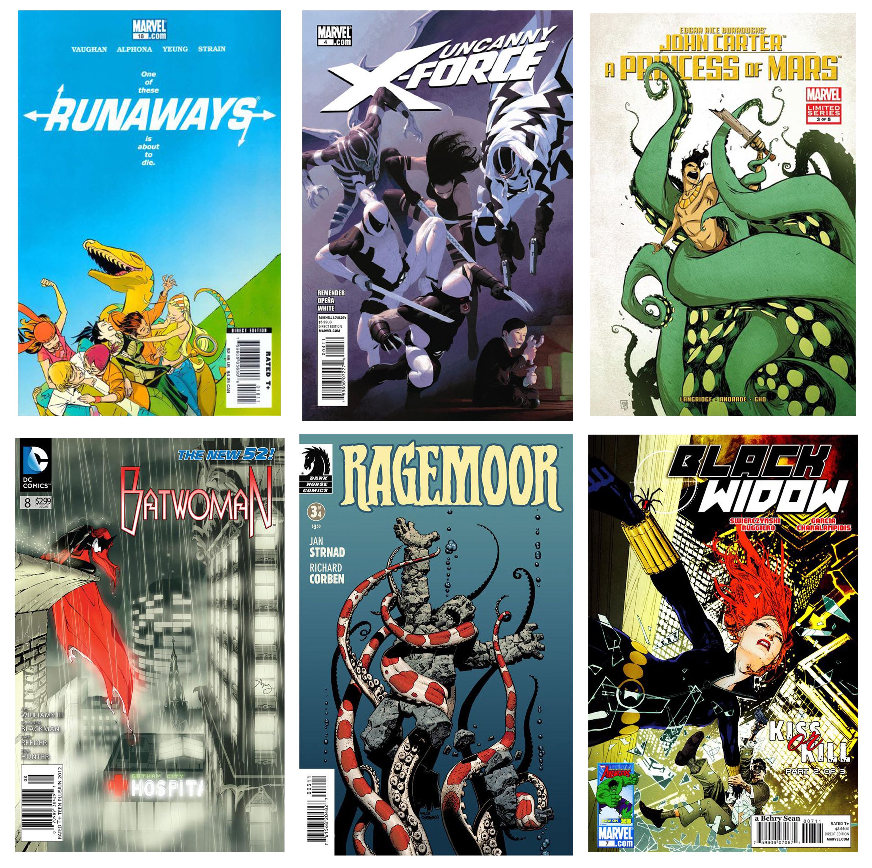
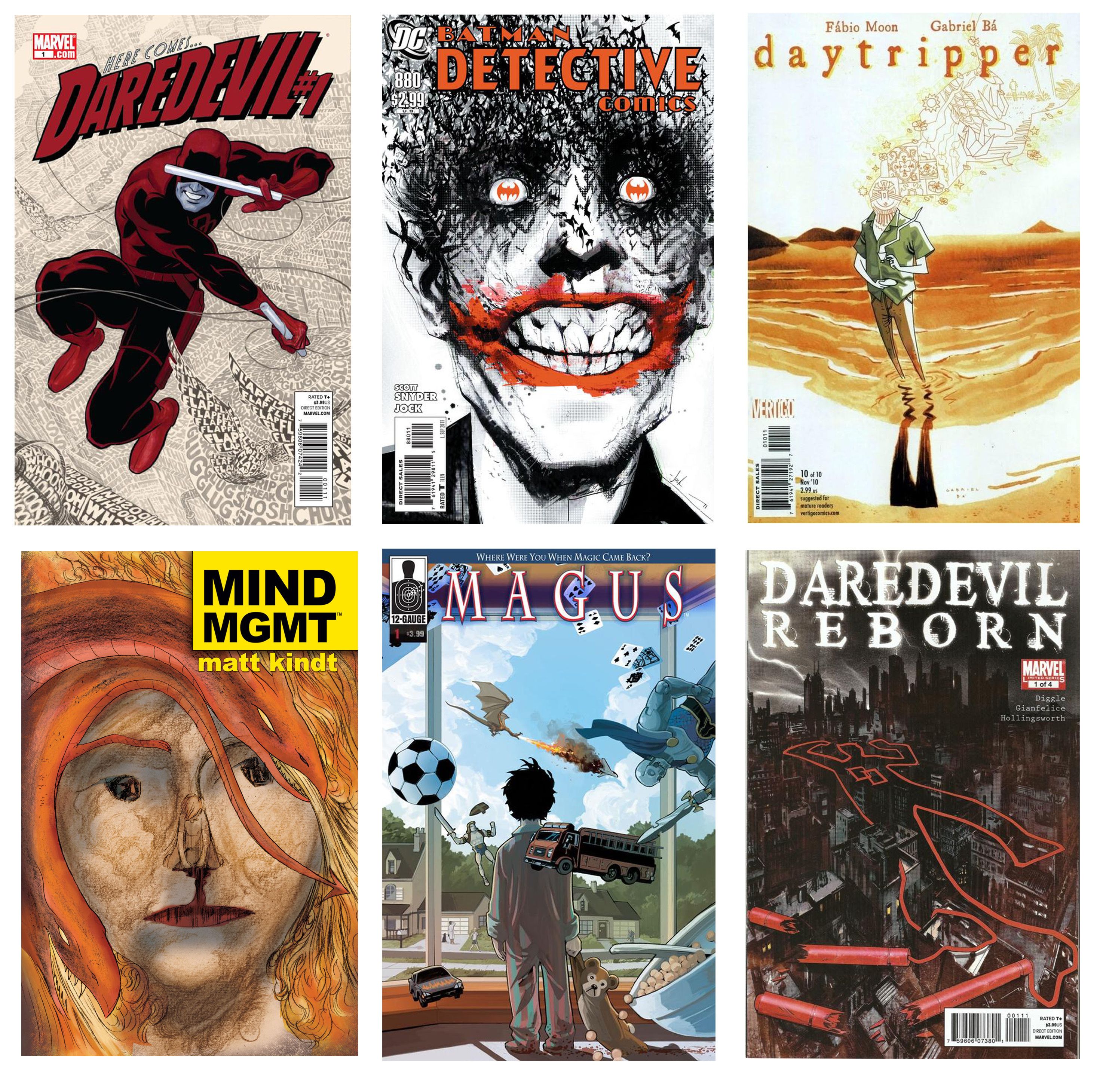
It's SO hard, especially when dealing with properties that have been around forever and a day to find a new way to express something in such a small space. And yet I see covers every week that blow my mind with their ability to take what we all know so well and turn it on its ear. Simply visual, simply emotional, and frequently both, these covers really go the extra mile in making you think or smile, or be horrified. Whatever their goal, I'm constantly impressed by covers artists abilities to re-invent the wheel with regularity.
COMEDY/CUTENESS/CHARACTERS
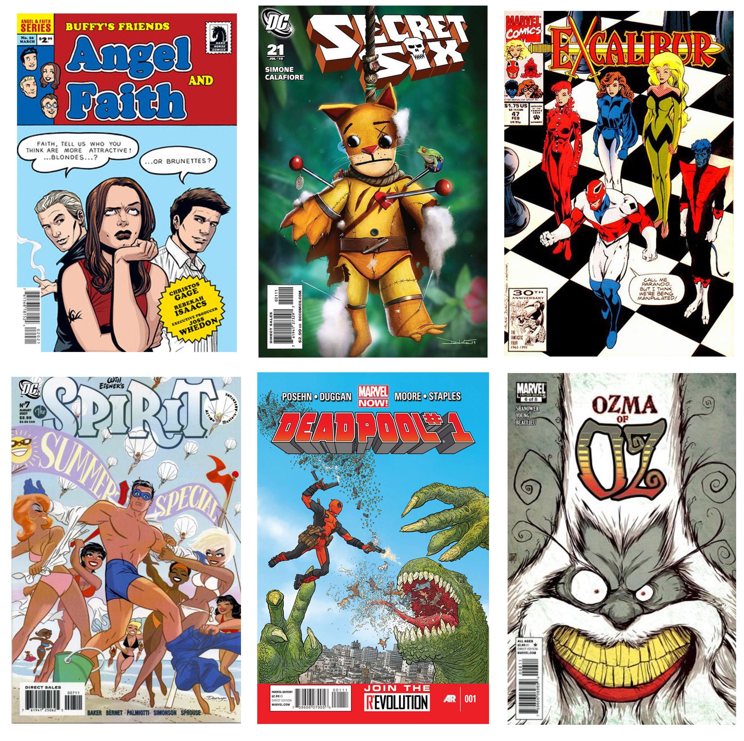
Not every book is a great fit for a comedic cover, but man can those issues be fun. I don't know about you guys, but there are simply not enough laughs in my life, so a cover that can make me chuckle is worth its weight in gold. Whether we're talking about clever referential recreations like Rebekah Isaacs' "Angel and Faith" meets "Archie Comics," simple visual jokes like Geoff Darrow's Deadpool fighting a dinosaur that seems to be vomiting kittens, or Alan Davis' old school non-subtle but totally hilarious actual joke on the covers of "Excalibur."
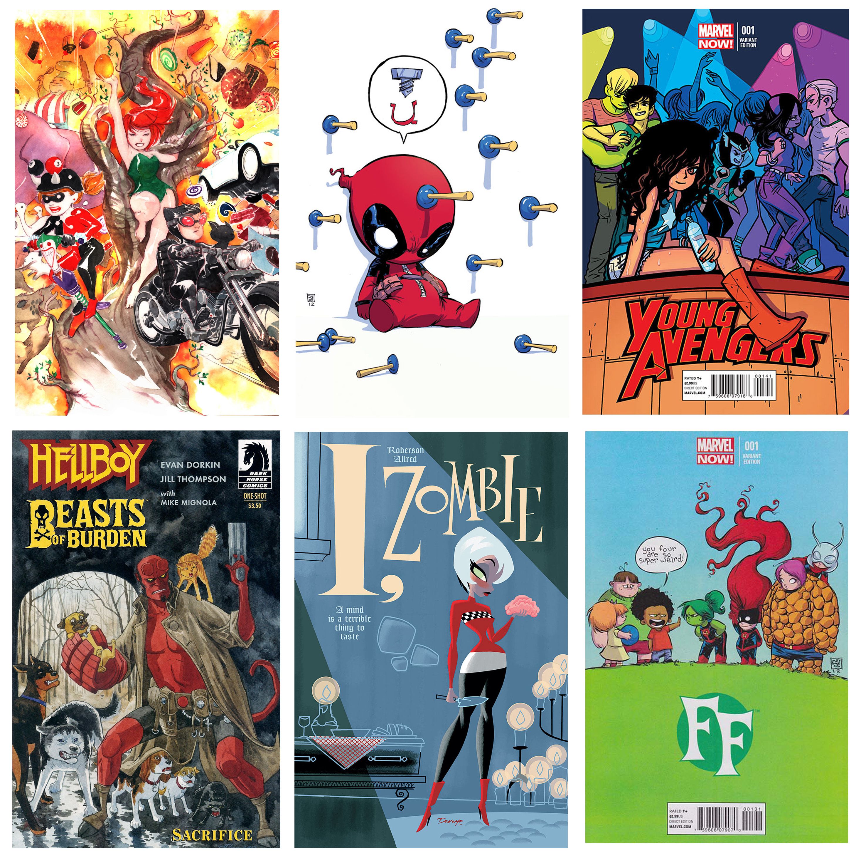
Maybe it's the chick in me but I love an adorably cute comic book cover. This of course makes all Skottie Young's covers very popular in list of things I love. His baby X-Men (etc.) just never get old. But anything that makes me secretly go "awwwww" under my breath and makes me want to actually cuddle it, scores big points. My life needs more fun AND more cuteness.
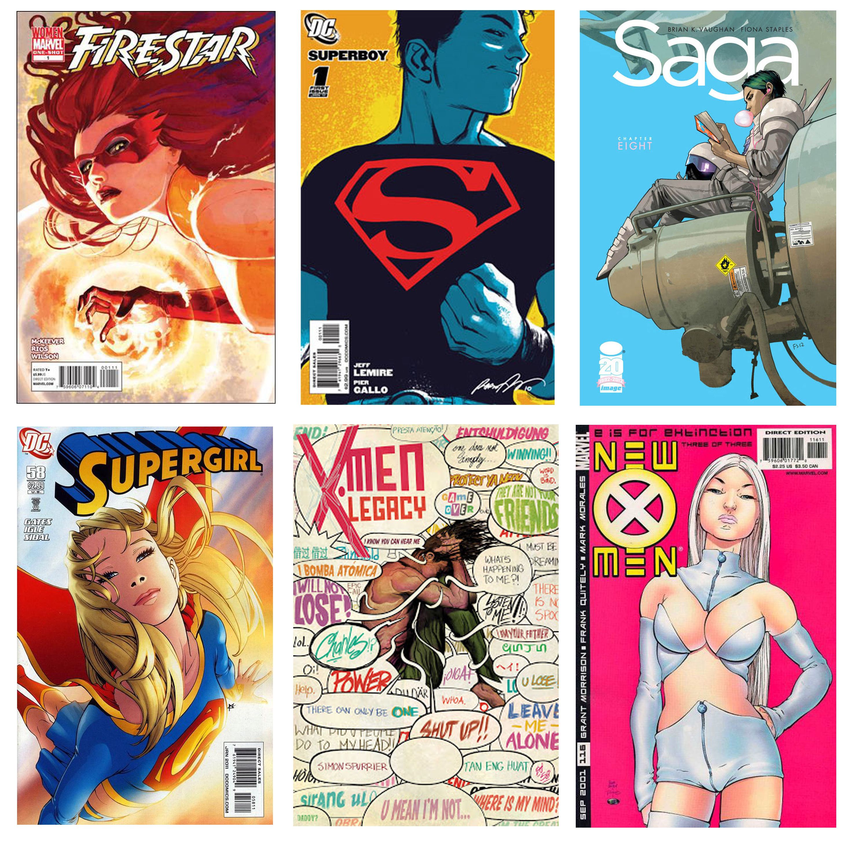
Another thing I'm a real sucker for is a the single character cover. At the end of the day characters are what comics are all about for me, so those standalone, make it work just on the basis of a single character covers strike a tone with me. Even better is when they're all crazy bold or controversial (I'm looking at you Frank Quitely's Emma Frost New X-Men cover!). But to be honest, I think I'm as entranced whether they show something unexpected or unique, shining a light on something I didn't know about a character, or when they simply capture with perfection what I already did know and love about a character.
CHOICES
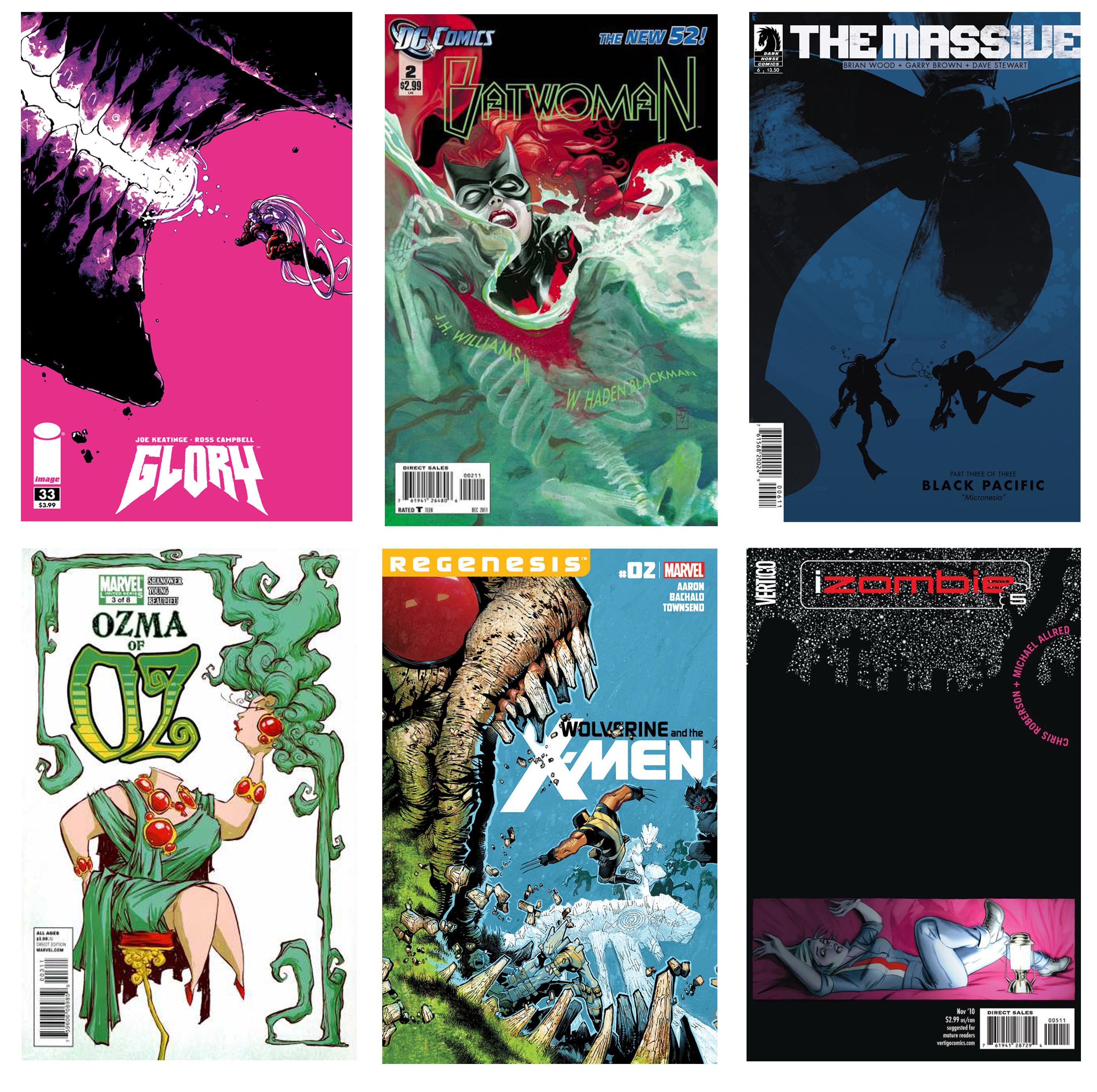
Bold ones, that is! Sure colors and composition are key, but let's face it, what helps you sit up and take notice more than a bold cover. A striking color choice, a heroine shown half normal and half stripped down to the bone (literally). The simplicity of just black shadows, headless cartoon women (which you'd think I'd be against - but not when done right!), or buried heroes, and heroes jumping into the gaping mouths of a living island. Whatever it is, unconventional is good. It's fresh and new and exciting to see artists - both new and old - pushing the form. These covers aren't always going to be for everyone, but they tend to be some of my favorites.
I hear/read people talking about comic covers not being works of art, or not being very impressive with surprising (and distressing) regularity. In some cases I can just assume they don't really know what they're talking about and haven't seen what's out there - it's when I see real comics fans dismissing comics covers that I get truly bummed out. Sure, I hate it when a gorgeous illustration is ruined by crappy text or giant "event banners" or worse, movie (etc.) advertising, but that doesn't mean we shouldn't reward and celebrate those who are making an effort to get it oh-so-right. There is some truly beautiful and impressive stuff out there - and it deserves praise!
What about you? What kind of categories help define what you look for in a great comic book cover? What are some of your favorites over the last few years? Do you see the comics we have today as innovative and breaking boundaries, or do you feel the classics were best?

