
You know, I was talking last week about what a golden age we live in today when it comes to collected volumes of comics. This is true not just for comic books but also for newspaper strips.


All kinds of stuff is getting collected in lovely hardcover volumes built to last... but there's one glaring exception.
The Spider-Man newspaper strip that started in January of 1977.
It's not that it goes uncollected. In fact there have been several different efforts to put it in book form, starting in 1980. It's just that each try at collecting it in a book is worse than the last.
The first attempt, from Pocket Books in 1980, wasn't actually that bad.


There were two volumes, each containing two storylines from the strip-- volume one had the first and second, featuring Doctor Doom and Doctor Octopus respectively, and the second had third and fourth arcs with the Rattler and the Kingpin. These were part of the series of Marvel paperback collections that were coming out at the time... kind of the last gasp of that program, actually.


I wrote more about those books here. I won't go over all that again except to note that the flaw in this presentation was the same as in the other Marvel Pocket paperbacks-- they were simply too small. However, the newspaper strip didn't suffer from the shrinkage as much as the actual comic-book pages did, and you got all of them in color, even the dailies.
The next try was in 1986, a large trade paperback from Ballantine called The Best of Spider-Man. This is the one I like the best, but it comes with its own set of formatting problems.


This was a pretty large book, first of all, so at least you can see the art and read the stories without too much trouble. And there's a lengthy introduction from Stan Lee telling how Spider-Man in general and this newspaper comic greatest-hits collection in particular came to be, with a lot of fun photographs.
Most of the book is in black-and-white, with the Sunday color strips somewhat reduced in size.

This is... okay. It's not ideal, but it's not horrible. You can read it well enough, and since I care more about reading the stories than having some sort of archival art book, that's fine by me. I wish that the book had just presented the run of the strip in order, instead of choosing random storylines from over the years, but that's not horrible either.
What IS horrible is the insane way the color section is laid out. One arc is selected to get a color presentation, and it's a fun story that I don't think has any comic-book analogue. But instead of taking the time to color the daily strips and present that particular storyline intact, we get this instead.

Come on. Seriously? You pay for color separations and printing and doing a special insert section-- which was a big goddamn deal in 1986, believe me-- and then half the page is BLANK? What the hell? The 'book designer' is one Gene Siegel, and I don't know whether he worked at Marvel or at Ballantine but that is some piss-poor design work right there. The idea of having Stan do commentary on a sequence is interesting enough but... Jesus. What an insane way to lay it out. I have half-a-dozen middle-school students in my class that know better than that.
Then, just recently, we've had two hardcover collections reprinting the strip in its entirety, in order, from 1977 to 1981 between them. I have no idea if more volumes are planned.


So the plus side is that the whole run is there, and reprinted at the largest size yet. Everything is black-and-white, even the Sundays... but the real problem with the book is the design. I was rude about Gene Siegel's work on The Best of Spider-Man above, but there were at least some things he got right. These two latest hardcovers, though... it is honestly baffling to me how in God's name anyone who worked in publishing or printing could have ever thought this layout was a good idea.
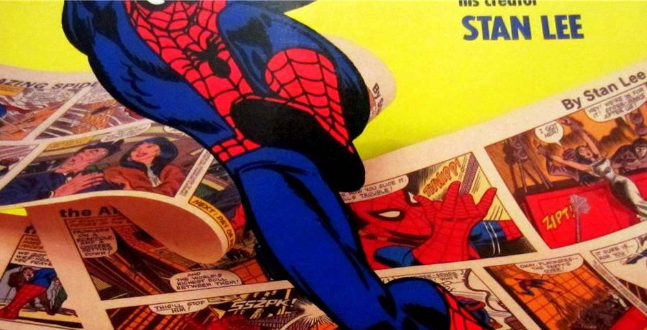
Specifically, this.

That's right. The whole book has the strips printed sideways. You have to read it like a calendar. Daily and Sunday both, in a page-size proportion that doesn't work for either one. You can see the Sunday layout on the left in the photo, and then three dailies on the right.
There are so many wrongheaded things going on here I hardly know where to start.
Note, first of all, that the Sunday panels have clearly been cut up and moved around to make them fit this ridiculous design. So there's that. But the thing that's even crazier is that every page is in color-- except for the comics themselves. Even the Sunday strips have been DE-colorized. The way these pages are designed, the most prominent element, the thing the eye is drawn to, is the page number. That gets highlighted with the brightest pop of color on the page-- red-- and it's a starburst. The background is also printed in color. But not the comics.
Excuse me for a moment, I'm hyperventilating a little.
Let me spell this out for you from the perspective of someone who's worked in printing and production design for the last twenty-five years. There is absolutely no difference in cost between printing these shitty pages the way they are and printing the entire run of comics in full color. In fact, it probably would have cost a little less, because on these grotesque pages, the color bleeds out to the edge, which means you have to print on oversize sheets and then trim them down later.
You see? Marvel could have printed the strips in full color, left the borders white and NOT run the color out to the edge, and it would have been cheaper for them. The cost of doing digital separations and plates would not have changed-- plating a page for full color is the same whether it's designed well or designed badly. What's more, they could have saved even more money by simply leaving the dailies in black-and-white and laying them out on the page more effectively. Like, oh, almost every other newspaper reprint book published in the last fifty years.
Peanuts Treasury. Remember that one? From 1968.


Or an old favorite of mine, The Collected Works of Buck Rogers. That one came out in 1969.

It's a lovely archival hardcover. Color Sunday strips reprinted in color. Dailies in black-and-white. All the strips nicely placed on the page, easy to read. No bleeds.


Both books had to be a hell of a lot easier and cheaper to put together than these new Spider-Man collections. Each one looks infinitely better. And remember, these books came out over forty years ago. It's not like we haven't cracked the technology, for Chrissake. We know how to put nice newspaper strip collections together. Publishers have been doing it for decades now.
But for whatever insane reason, Marvel has chosen to give their flagship character the single worst-looking hardcover collection I've ever seen. Ever. In forty years of reading books like this I have never seen a reprint collection put together this badly. It's like deliberate sabotage.
Worst of all, after idiotically running up the print costs in a dozen different ways for no good reason, and designing the book so as to look awful and be as awkward to hold and read as possible, Marvel has the sheer brass-balled effrontery to try and sell these grotesqueries for $39.99 each. I bought mine remaindered, for about eight bucks, and I still feel cheated.
It's a shame. Because the Spider-Man newspaper comic, especially in the early years when John Romita was drawing it, was a terrific strip. Stan's writing was in fine form and you could tell the challenge of the project energized him.

It deserves a nice hardcover collection. But these two books sure aren't it. You'd be better served to go find the old Pocket Books versions. They were tiny, but at least Pocket Books back in 1980 had an art director that understood how a page was supposed to look.
I have been very hard on the current DC Comics output lately-- and with reason-- but here is an area where they are doing terrific work and have been for years. This is how it's done, Marvel. Pay attention.


Putting it in small words: You figure out a way to put the strips on the page at a size so people can read them easily. You design the page in such a way that there's more content than white space. If you use color, you use it to showcase the ART and not the goddamn page numbers.
If your designers still can't grasp those simple principles, then for God's sake fire them because I assure you they are drooling incompetents. These books aren't even as good as fan scrapbooks I've seen that collect the Spider-Man strip.
The hell of it is, these Spider-Man newspaper comics tell some great stories. They're definitely worth the read. But not like this.
I'm still waiting for a truly all-around good package for these particular comics, but these newest two books are pathetic. I know Spider-Man's whole schtick is that he can't catch a break, but that should be left in the stories. The strip itself deserves better. Certainly, the readers do.
See you next week.