
You may have caught the fact that we're planning on moving because we've outgrown our house - the kids are 13 and 10, and my older one needs bigger equipment if we're going to move her around, and our house is just too small. So we're staying in Arizona but moving into a bigger house. April was busy already, and it didn't get any better toward the end of the month, so I couldn't really do a big review post with all the trades I read during the month, but several mini-series ended, so I figured I'd check those out. So here we go!


Dark Corridor #1-7 by Rich Tommaso (writer/artist). $3.99 each, FC, Image.
This wasn't supposed to be a mini-series, but an ongoing, but the sales just weren't enough to make it happen, so Tommaso ended it with issue #7. It's too bad, because I thought it was one of the best titles of 2015 and the final two issues, though rushed, did nothing to dissuade me from that opinion. Tommaso writes a somewhat standard gangster story, with a lot of Tarantino-esque flourishes, but he does it really well, with several compelling if morally challenged characters. The main characters are the "7 deadly daughters," a group of women whose families were killed by the mob in the corrupt city of Red Circle and who have been plotting revenge against said mobsters. Obviously, Tommaso had longer plans for this group and their vengeance, but he's forced to wrap it up rather quickly, so things get very violent very quickly in issues #6 and 7. But the way he tells the story, with side trips by spendthrift thieves to strip clubs and flashbacks to murders past to simply the same plot points told from different perspectives, makes everything feel more interesting and exciting. We see some events and only much later learn how we got there, and Tommaso is always checking in on different characters to show how they fit into the larger story. While he doesn't get much time to delve into the characters too much, he does just enough so the gut punches of the final two issues work well. Even the fates of characters we know are "bad" hit hard because Tommaso has done enough with them. Obviously, with more time their stories would have more impact, but such is life (and the vagaries of the comic book industry).
I mentioned a while back that one aspect of Tommaso's art that is so appealing is its ugliness, which is not meant as an insult. Tommaso obviously knows how to tell a story, and his art is full of wonderful details that give us a great sense of the the city itself and the people who inhabit it. He thinks about how the characters would dress based on their personalities, from Carter's cowboy hat to Mia's thick sweater. He's able to show the haves and the have-nots of Red Circle very nicely, as he gives us sleek, beautiful houses juxtaposed with seedy strip clubs and small apartments. His shading and coloring is terrific, too, as he keeps the comic bright but doesn't skimp on the blood when he has to. When I write "ugly" I mean that he doesn't draw people in the traditional, comic-book manner, but he's not quite R. Crumb levels of "ugly" either. His characters look lived in, with unusual noses and different hair styles and thick bodies. His women aren't drop-dead gorgeous, but they're attractive in a way that makes them look real. We can believe his characters have been through difficult times, as they all look hardened by life. Tommaso's style means that his action isn't that fluid, but it also feels rawer, as people tend to move awkwardly when things go sideways, and Tommaso's characters don't look comfortable as they try to kill each other. It feels righter than having them all do beautiful round-house kicks and hitting everything they shoot at without aiming.
It's too bad that Dark Corridor didn't find a bigger audience. It doesn't end quite as well as it begins, mainly because Tommaso had to wrap things up, but it's still an entertaining and clever comic, with a gripping ending that, if it doesn't feel quite as powerful as it could, is still a good punch to the gut. The trade should be a nice read, and Tommaso's new comic, She Wolf, promises to be interesting. So there's that!
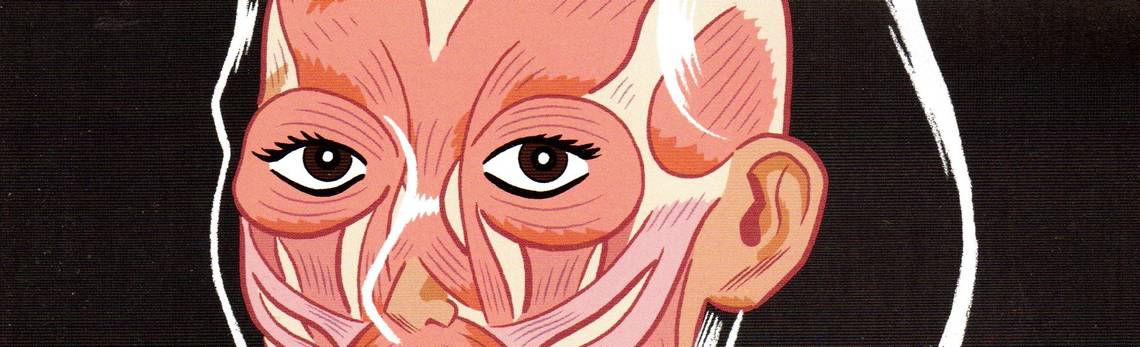
Rating: ★ ★ ★ ★ ★ ★ ★ ½ ☆ ☆
One totally Airwolf panel (from issue #7):


Four Eyes: Hearts of Fire #1-4 by Joe Kelly (writer), Max Fiumara (artist, issues #1, 4; colorist), Rafael Ortiz (artist, issues #2-3), Juan Cruz Rodrigeuz (art assistant, issue #2), and Thomas Mauer (letterer). $2.99 each, Bl/R/W, Image.
The first Four Eyes mini-series came out several (I mean several, as in 2008-2010) years ago, and it was quite good. But it promised a sequel, which has finally come out. On my part, it's a mixture of happiness, trepidation, and disappointment, even though I think the series is still good and I hope it's not too long before the next mini-series shows up (as this ends on a cliffhanger, unfortunately). I was happy, naturally, that Joe Kelly and Max Fiumara could get back on the same page long enough to put out a new mini-series (Duncan Rouleau, one of Kelly's studio mates at Man of Action, hasn't come close to finishing The Great Unknown, and while Four Eyes still isn't finished, at least there's more of it!), as Kelly is a good writer and Fiumara is a good artist (I can't remember if I first saw his work on Four Eyes, but I'm always keen to see his art). Plus, the hook - it's Depression-Era New York, but with dragons - is really good, and the idea of a young boy training a dragon to fight helps get us into the story and also brings up a lot of social issues, which Kelly has done a good job exploring. I was worried because it had been so long, and who knows if Kelly and Fiumara could still work well together. And then, when I finally got the issues, I was disappointed, as Fiumara draws only the first and last issues. Ortiz, his replacement, is perfectly fine as an artist, but juxtaposed with Fiumara, he comes up a bit short, mainly because his style doesn't quite fit the subject matter. Fiumara's crisp, angular, almost brittle line work feels right for 1934 New York, where most of the characters are living on a razor's edge of poverty. It also makes the undertone of Art Deco more obnoxious, as Fiumara doesn't need to make the distinction between the rich and poor too obvious, but it's there. His angular style makes the cartoonishness of some of the art - Enrico's head is far too large, for instance - less of a distraction, as the crispness of the line heightens the oddness of the art without trying to make it too "realistic." In issue #4, interestingly, Fiumara's line is softened a bit by some thicker and lusher inking and nice grayscale work, but his sharp line is still good enough to keep the tone. He also uses some beautiful washes on a few panels to show us how Four Eyes - a vision-impaired dragon - "sees" the world, and it's a clever trick. Ortiz, on the other hand, has a slightly less angular style, which is just enough to make the silliness of Enrico's head size, to return to the previous example, look somewhat silly. His Fawkes is a bit more grotesque than Fiumara's, which again seems to be a function of his line being a bit softer, and it's disconcerting. His dragons are perfectly fine, as is his depiction of New York and its seediness, and in issue #3, it seems that Fiumara (who's credited as the colorist even though there's not a lot of color in this book) uses some more grayscales (which show up again in issue #4, as I noted above), which adds a bit more nuance to the work. Ortiz does decent work on the book, but he's not quite as good as Fiumara, and that's part of what makes the book a bit disappointing.
This feels very much like a "middle third" of a trilogy, as in the first series, Enrico found the dragon and saved it from death (it was runt), convinced Fawkes to help him train him, and we met all the principal players. In this series, Enrico has to learn how to train Four Eyes, and he gets some harsh lessons about how that's accomplished. His mother also gets a new man in her life, and if you think that's good news for Enrico, you've never read a work of fiction before. What's great about the story is that Kelly traffics in clichés (unfortunately) but he makes them work because he's a good enough writer to overcome them (but not good enough, apparently, to avoid them in the first place). I mean, almost everything that happens in this story is easy to see coming, from the way Enrico tries to change to train Four Eyes to the way Four Eyes fights his first fight, but when you read it, the way Kelly writes the characters and how they interact with each other turns it into something better. A small scene like Enrico's "stepfather" standing up to the local gangster, with whom Enrico shares an unusual past, is terrific, because there's so much going on behind the characters' eyes. When Enrico talks to Four Eyes after the fight, even though we know what's coming, Kelly has made Enrico and even the dragon compelling characters, so it works. Plus, because he sets this in a time when class and race were much rawer themes than today, Kelly can use Fawkes's race and Enrico's status to illuminate how they move through life, and because so much of that is still relevant today, it resonates with readers in a way training dragons to fight might not (even if those visuals are cooler). Unfortunately, because Kelly doesn't actually finish the story, a lot is still up in the air - Fawkes's relationship with Boccioni, Enrico's brother and what he's doing, the girl, and, of course, Enrico's fate itself. But the main plot, as standard as it is (we've seen a lot of training montages and impossible fights in movies, and Kelly doesn't avoid those), works pretty well, and there's a lot more going on under the surface, which is always neat.
I hope we don't have to wait another six years for another installment of the series, but we'll see. It's too bad, because Four Eyes is a damned keen comic, and it would be nice if Kelly and Fiumara get to finish it!
Rating: ★ ★ ★ ★ ★ ★ ★ ½ ☆ ☆
One totally Airwolf panel (from issue #4):


Gutter Magic #1-4 by Rich Douek (writer), Brett Barkley (artist), Jules Rivera (colorist), Nic J. Shaw (letterer), Andy Schmidt (consulting editor), and Bobby Curnow (consulting editor). $3.99 each, FC, IDW/Comics Experience.
Comics Experience has put out quite a few very good mini-series over the past few years, and Gutter Magic is just another one of them. Its ending is a bit ambiguous and begs for a sequel, which I do hope is in the pipeline, because Douek and Barkley have created a fascinating world, and it would be nice to spend more time in it. Douek gives us a world in which magic is fairly common, where World War II was partly fought with magic until the world was almost destroyed, and which is now ruled by the wizarding elite while the vast majority toil away. If you're wondering if Douek is trying to make a point about our "One Percent," well, you're not wrong. But that's okay - metaphors are fun! His hero, Cinder Byrnes (yes, really), is trying to gain magic, as it runs in his family - his grandfather was a famous wizard during World War II, his father was a wizard, and his cousin is currently one. The book is about Cinder trying to cobble together a spell to get magic, and of course the big secret about wizards and his own family that he eventually discovers. He's assisted in his quest by Blacktooth, a goblin (the world has gotten weirder), who acts as his voice of reason and his guide through some of the less savory parts of New York. He's opposed by The Morgue, a shadowy figure who has an agenda, but it's not exactly the one Cinder thinks she has. It's all very twisty and turny!
Douek doesn't forge any new paths in the book, exactly, but he does write the hell out of it. The relationships between characters are always more important than the plot, and Cinder and Blacktooth have a fine friendship, one that has shades of John Constantine's with Chaz, not only because Cinder is trying to gain magical abilities. In a very short time, Douek makes us believe that these two people would go out of their way for the other, and so when they do, it doesn't feel forced. Blacktooth tells Cinder what a dope he's being, but he stands by him, and Cinder does the same. As they move through the story, Douek does a decent job showing how the upper crust lives, how the 99% scrape by, and how magic has affected the world (the cover of issue #1, which shows the Empire State Building with the spire floating above the foundation, is just a nice visual metaphor for how crazy the world has become. Douek gives us plenty of action, sure, and the entire thing has an Indiana Jones feel to it, but there's absolutely nothing wrong with that, at least in my book. Cinder and Blacktooth might be gruff, but they're not assholes. Even when the villains come into it, Douek adds some nice depth to them, as well, so they're not just crazy people who want to hold onto their magic. There's a very good reason they're "villains," and it's nice that Douek makes sure that they are more than just cardboard cut-outs.
Barkley's art, along with Rivera's coloring, is very nice, too. Barkley has a fairly clean line that he uses to fill each page with details about the partially destroyed New York in which the story is set, and he is able to show the differences between the more downtrodden areas of the city and the rich areas, too. His character designs are terrific - Shiver, the young girl who menaces our heroes throughout the early part of the story (she works for the main villain) is terrifying, partly because she's a young girl and partly because Barkley nails the insanity that shines out from deep inside her. The Morgue is a cool villain, too, as she epitomizes the absolute arrogance of the upper class even as she slowly becomes sympathetic as we learn more about her. Even then, Barkley makes sure to keep her aloof and haughty, which she just naturally is even if she's not as horrible a villain as we think. Barkley also gets to expand his imagination a bit, as in issue #1, he gets to draw a dazzling double-page spread as Cinder and Blacktooth escape through the goblin market, and in issue #4, he shows us what happens when Cinder seemingly succeeds in his quest, and it's amazing (and beautifully colored, too). He also gets to draw a big-ass dragon fighting an airship, so, you know, that's pretty keen.
I know this is Douek's first comic, but I'm not sure if it's Barkley's, but either way, it's an impressive debut for the writer and a wonderful book to look at. Despite the feeling that Douek is treading familiar ground, the way he writes the characters overcome that, and he throws just enough twists into the narrative so that the book becomes something more. The trade should be out soon, and I encourage everyone to pick it up.
Rating: ★ ★ ★ ★ ★ ★ ★ ☆ ☆ ☆
One totally Airwolf panel (from issue #4):


Limbo #1-6 by Dan Watters (writer), Caspar Wijngaard (artist), and Jim Campbell (letterer). $2.99 each, FC, Image.
Limbo is a terrific series, a contender for best mini-series of the year, and the kind of comic that makes me want to see what the creators do next, either together or separately. Watters gives us a fairly standard story - an amnesiac is trying to find out who he is, and sinister forces seem to want to stop him from doing so - but the plot isn't necessarily the point, as we find out early on that he's toying with genre conventions. Pop Culture Rule #1 (Never Trust the Woman!) is invoked, but in such a way that it becomes clever, especially when we're not sure what said woman's game is. Watters is much more interested in what our protagonist's (his name is Clay, a very deliberate choice, it seems) identity means and what kind of person he is than in solving the case put before him (he's a private investigator, a cruelly ironic occupation given his condition). He gets a case in the first issue, but that's just a way for Watters to get into the heart of the story, as Clay is taken on a magical mystery tour through the city of Dedande, where he lives, and realms beyond. Watters examines his identity through the detritus of pop culture, as Clay meets with a "teleshaman" in issue #2 who tries to distract him from his mission by dragging him into a television and Sandy, his protector, uses mix tapes to commune with her voodoo gods. Sandy has a protector, too, and it's an action figure, while the swamp monster Dagon has a television inside its mouth. There is a mystery to be solved, of course, and Clay eventually comes to a crossroads, but Watters isn't too interested in the larger plot about what the gangster called The Thumb is up to. Clay has his own demons to confront, and Watters does a dazzling job with that. The book is marvelously layered, from the title of the series itself to some of the names within (like, as I noted, the protagonist). The idea of Clay having to travel through television in issue #2 is done very well, as Watters implies, not so subtly, that Clay (and all of us) has to find his identity through external modes before Clay is able to reject the notion. The search for identity is a common theme in comics, as well as all of literature, and Watters not only taps into that, but gives us an examination of what makes up someone's identity, as well, and whether someone is molded by nature or nurture. Clay, as an amnesiac, needs to figure out not only who is he, but what kind of person he is, and it makes the book extremely compelling. Watters ends it with a disturbing and upsetting thought about how we define ourselves, and it's a great way to bring it to a close. Watters also comes up with some clever ideas, like the Second Line, a voodoo assassin band ... a literal band, I mean - they kill with music. It makes Dedande a bizarre place, one that we know can't be real, but which is a hard place to pin down. The odd reality of the place keeps us off-balance as much as it does Clay.
Wijngaard does an excellent job with the art - he's another newcomer to comics, but he's already done some great work on this and a few other books, and I imagine he's already in demand. His design work is brilliant, as he gives us horrific visions in a twisted Day of the Dead parade, a terrifying attack on Clay and Sandy by snake-filled mannequins, creepy Dagon-worshippers living in the swamp, Dagon itself, eerie and full of televised visions, a gorgeous femme fatale, and our tortured protagonist, who looks as lost as Watters writes him. Dedande is a murky place, and Wijngaard uses the cathode ray glow of television to light a great deal of the book, giving it a strangeness that matches the narrative. His tour-de-force is issue #2, when Clay gets sucked into the television, as he uses full-page splashes to upend Clay's world, several familiar cartoon characters as annoyances, a terrific double-page spread with several channels through which Clay has to navigate, partially narrated by Max Headroom, and a clever confrontation with the "teleshaman." Wijngaard's fine, crisp line makes everything look almost too real, and when he scratches static over several images, it's almost a relief. His gods of Dedande are crass and scary, unworthy of worship yet possessing great power. As Watters is writing so much about identity, Wijngaard puts many characters in masks, either the entire time (The Thumb wears a luchador mask, which is a bit of a cliché but, like so much of the book, is also a subversion of that cliché) or at certain crucial moments in the book. Wijngaard makes the masks creepy and terrifying, adding to the unreality of the entire series. It's a very nice-looking comic.
The trade of Limbo comes out in June, and it's definitely worth a look. It's fun and exciting, but at the same time, Watters has a lot on his mind that makes the book deeper than just a weird mystery/thriller. And it looks great. That's not a bad combination at all!
Rating: ★ ★ ★ ★ ★ ★ ★ ★ ½ ☆
One totally Airwolf panel (from issue #6):


Mayday #1-4 by Curt Pires (writer), Chris Peterson (artist, issues #1-2; breakdowns, issues #3-4), Alex Diotto (artist, issues #3-4), Pete Toms (colorist, issue #1), Marissa Louise (colorist, issue #2), Dee Cunniffe (colorist, issues #3-4), and Colin Bell (letterer). $3.99 each, FC, Black Mask Comics.
Curt Pires is an interesting writer - he seems fascinated by fame and what happens when a person becomes famous and what some people will do for fame. I don't know if he lives in Los Angeles, but his comics have a distinctive L.A. vibe, in that they deal with this theme quite often. Even a book that's not expressly about fame - The Fiction comes to mind - is in some ways in this vein, because famous people, for better or worse, create stories about themselves (or have them created for them), and Pires is fascinated by that, as well. It makes his comics a bit less traditional, but they're also pretty interesting, because Pires is trying to figure things out in his comics that many other writers only circle around. As I noted just above, so much of fiction is about identity, so other comics writers don't ignore it, but Pires tends to tackle it head-on. The idea of fame changing a person's identity isn't new, but we don't see it too often in comics, so the fact that Pires really digs the theme makes his comics inherently more interesting.
He doesn't necessarily pull things off, however. Part of the problem is that his plots aren't the greatest, so when it's time to actually end the story, his plots tend to limp toward the finish line a bit. Take Mayday, in which an Oscar-winning director, Terrance Gattica, witnesses a murder by two cultists and gets caught up in their scheme. Later, he's at a bar when the same dudes come in and kill the bartender, but Terrance saves the life of Kleio, the second bartender. Kleio figures out that the dudes are killing people in precise locations that form a pentagram, and so they decide to stop them. You know, like you do.
It's a weird plot, sure, but it's nothing we haven't seen before. What makes it work is that Terrance and Kleio know they're in an action movie, and Pires adding this veneer of self-awareness to their actions, as well as a bit of metafiction, too. At the end of issue #2, Kleio corrects Terrance, who believes he's safe from harm because he's a white male protagonist in an action movie - she notes that it's not an action movie, it's a comic book (she gets cut off before she can complete the phrase, which is weirdly clever on Pires's part). Pires can get away with this, to a certain degree, because he's a clever enough writer that we believe that both Terrance and Kleio would be wise enough to recognize the standard plot they're in, even if the plot doesn't work as well as it could. So far in his comic writing, Pires seems to be able to come up with interesting ideas but drop the ball at the end, opting for opacity and forced quirkiness instead of seeing things through. In this case, it's switching to Terrance's movie in issue #4, and while his point is fine - another layer of reality in a town that is all artifice - it doesn't quite work. Similarly, the characters' quests for identity is not quite on point, because Pires thinks Terrance is far more interesting than Kleio, but he's not. Terrance's journey is clichéd - the hot-shit young director can't figure out what his next story will be, and he devolves into a drug-addled, sex-crazed douchebag - while Kleio's is only hinted at - we're supposed to believe that she's transgender, mainly because of two pages in issue #3, but Pires never really gets into what makes her tick, as she's the sidekick who is more competent than the hero, a phenomenon discussed here. In fact, the other main characters in the story - Benicio del Cocaine, the villain (who first appears announcing that he just got done masturbating to the new Charli XCX record, because why not?), and Mike and Landry, the two cops who follow Terrance and Kleio to their confrontation with the cult - are more interesting than Terrance. That's not to say that Terrance is a bad character, it's just that we've seen the tortured artist who can't repeat early success no matter how many drugs he ingests. We don't really need to see it again.
If I seem conflicted about Mayday, it's because I am. It's stuffed with nice little bits, and the plot isn't bad, but Pires doesn't seem to quite have a handle on the material. Perhaps it's the length of the comic - everything I've read by him so far has been four issues long, and every single one feels like it might need to be five. He tries to wrap things up very quickly after setting things up very well, and it always feels like there's more he could do with it. I don't think he needs to go too long with it, but an extra issue might help flesh out his ideas a bit better. Mayday is a good example of it - Kleio ought to feel like an equal partner, but she doesn't because Pires has so much to get to. I've enjoyed reading his comics so far, but I always get the feeling that he's either not able to quite bring off what he wants or he's constrained by the page count. That's too bad.
(I haven't written about the art, so I apologize. Peterson and Diotto are perfectly fine - everything is readable and every character has a distinctive look. The James Dean who shows up is on point, and Los Angeles has a grubby feel to it, which helps drive home Pires's point that it's not everything it's cracked up to be. It's just that the art is just solid but unspectacular. It works for the story, but doesn't wow you.)
Pires is a fascinating writer, and Mayday is worth a read, even partly because it ends so oddly. Pires is obviously bucking conventional plotting trends, which is always appreciated, even if he doesn't quite pull it off. Mayday, like the other comics of his I've read, shows more potential than actualization, but it's still keen that Pires is willing to try these strange things in his comics. It certainly makes me want to read what new comics he has coming out!
Rating: ★ ★ ★ ★ ★ ★ ½ ☆ ☆ ☆
One totally Airwolf panel (from issue #4):

As I noted at the top of the page, we're in the process of moving, so my time is not my own very much right now. I would love to review more stuff, and I have a stack of things I really want to get to, but who knows when I'll be able to. I hope you got some good ideas for comics to read from this post, and I'll try to do more soon! Have a nice day!