There's nothing more fascinating than ... architecture!!!!
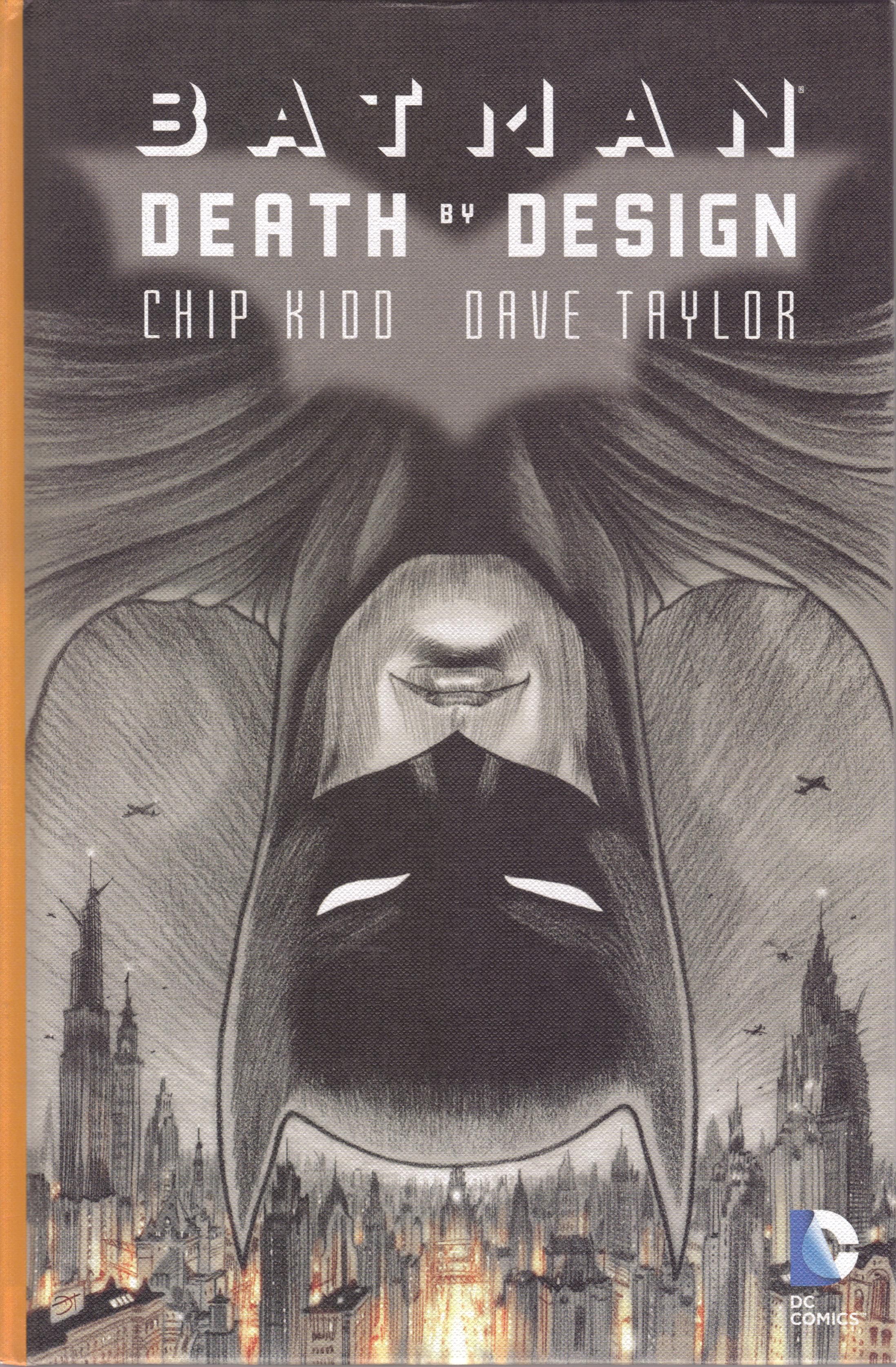
Batman: Death by Design is written by Chip Kidd, drawn by Dave Taylor, and lettered by John J. Hill. It costs $24.99, and knowing DC, it will never get released in softcover. Man, DC, what's up with that?
While Death by Design is a solid read, it also sounds a bit better in the description than the execution.
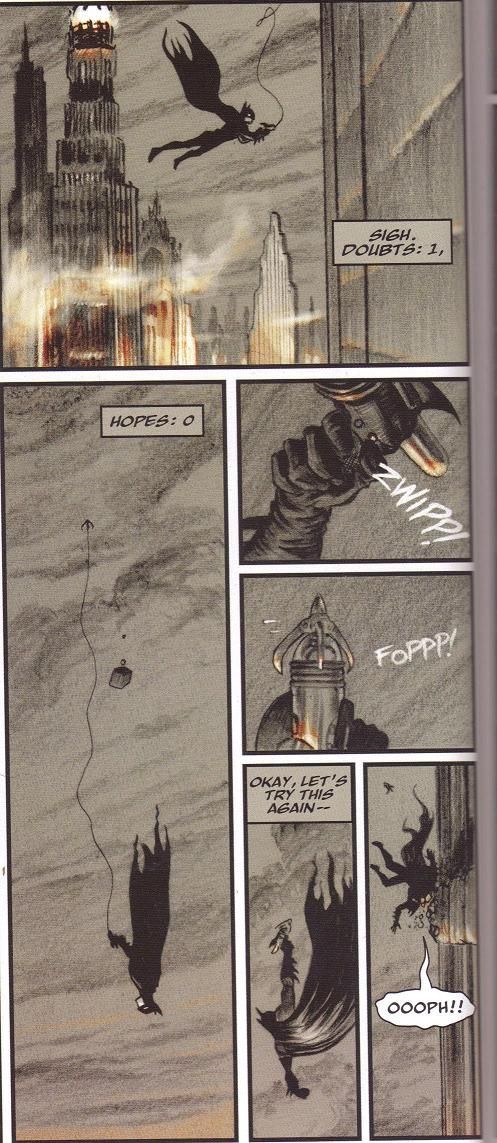
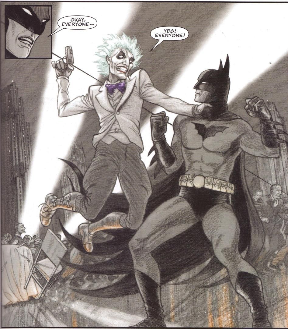
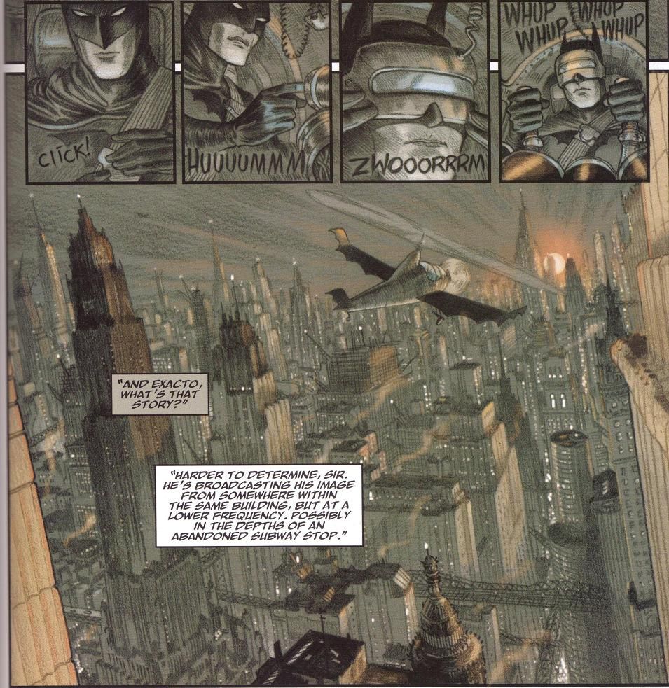
Too many little things hold it back from being a great work, but it's well worth a read. Taylor, for instance, turns in the absolute best work I've ever seen from him. I haven't read too many Dave Taylor comics, but those that I have featured serviceable but fairly workmanlike art. As usual, time is a factor - Taylor worked on this book for three years, so of course he could be a perfectionist, and it shows. His Gotham City is tremendous, for instance. In a book about architecture, it helps to have a good vision for the buildings in the story, and Taylor does a wonderful job with that. It takes a bit from Batman Begins, which featured the best Gotham City of Nolan's movies (I haven't seen the third one yet, but I doubt if Pittsburgh, as nice a city as it is, can surpass the cityscape of the first one), but it's mostly Taylor's own. The book is set in a strange non-time, kind of like Dark City (man, Dark City is a cool movie), where 1930s/1940s/1950s tropes exist alongside modern and even futuristic technology, which gives Taylor the freedom to have a bit of fun. He gives us classic old buildings, sturdy and powerful, dominating the city like ancient sentinels. He also dresses people in stylish clothing from that era, including plenty of fedoras, and gives Batman (or "Bat-Man," as he's referred to in the book - another example of the old-fashioned feel of the comic) an olde-tymey computer with all sorts of vacuum tubes and weird dials. One of the bold designs in the book is "The Ceiling," a new night club that is simply a sheet of glass suspended above the city streets, a vertiginous experience if there ever was one. Taylor has a fun time designing all sorts of gadgets for Batman and Exacto, the vigilante who wants to save the old Wayne Central Station, which Bruce is in the process of tearing down. Curiously, Taylor never gives us a wide view of this supposedly magnificent building - we see a few panels of the interior atrium area, but nothing of what Cyndia Syl, a preservationist, calls "the single best example of patri-monumental modernism in America." I guess Kidd and Taylor just couldn't fit it in! Taylor also redesigns the Joker very well - his hair stands on end, he wears a white jacket, a purple bow tie (for part of the book - at a different time he's wearing that Colonel Sanders thing he always wears), jodhpurs, and boots. It's a cool look.
Taylor's line work itself is very good. His pencils are lush and the shading thick and dense, which allows him a lot of nuance and subtlety in the work. He's extremely precise throughout, so his large spreads (such as the first look at The Ceiling) allow us to drink in his details. In the back of the book, he puts inverted commas around "inked," which makes me wonder how exactly he inked this - digitally, I would imagine, but at times it appears this is just raw pencils. He contrasts the sturdiness of Gotham City's architecture very well with the characters' fragility, using much lighter and thinner lines for the people as opposed to the surroundings.
This makes something like Exacto's explosive device on his belt, which he uses to force Batman to release him, all the more threatening - the explosion created is marked by thick, harsh lines, tossing Batman backward like a rag doll. One of the few problems with the artwork is that the characters often don't look the same throughout the book. Bruce Wayne, for instance, isn't consistent all the way through, and it's often momentarily confusing. It's not a huge deal, but it is somewhat strange. Plus, one character seems to have the ability to grow facial hair by force of will, which seems done deliberately so Kidd and Taylor can keep Exacto's identity secret for far longer than they should be able to. It's strange. Anyway, Taylor colors the book, too, and while much of the book is charcoal gray and white, the touches of color help immensely. Cyndia Syl wears a delicate lavender shirt when she meets Bruce Wayne for the first time, and the Joker's pale green hair stands out when he tries to rob the patrons at The Ceiling. The eerie orange glow from the streets of the city adds a touch of surrealism to the book, because it reminds us that this story takes place far above street level. It's a gorgeous comic book, and I'm glad that Taylor was able to take so much time making it so.
Kidd's story is intriguing, too. Bruce Wayne is planning to demolish the Wayne Station to build a new one, part of his attempts to put his own stamp on the city rather than maintaining his father's legacy. At the groundbreaking ceremony, a crane collapses and nearly kills him, and a reporter named Richard Frank, an architectural critic for the Gotham Gazette, just happens to be there to report about it, so he gets the story. Meanwhile, a woman named Cyndia Syl is trying to convince Bruce to save the station rather than demolishing it, but Bruce remains unconvinced. Finally, the architect of the old station, Gregor Greenside, has disappeared. Bruce comes across Greenside's son, Garnett, and learns that the old station is decrepit because the corrupt union boss skimped on the materials so that his union would get to build another building once the first one fell apart. Meanwhile, the architect of the new station might not be as good as everyone (including him) says he is. Into this mix comes the Joker. It's very unclear what he's doing there, except so that he can put Cyndia in jeopardy late in the book. Seriously, I have no idea what he's doing in this comic. Or how he survives an early encounter with Batman. It's vexing.
It's a pretty good story, and I like that Kidd takes an unconventional look at Gotham City and Bruce Wayne.
The architecture angle is a good one, because Gotham ought to be a unique city in the DCU, and with some exceptions over the years, writers and artists haven't done enough making it interesting. Kidd's Bruce Wayne is interesting, too - instead of simply falling for Cyndia and fighting to save the old station, which would seem to be the way many writers would go, Kidd makes him sympathetic to Cyndia but resolute in his desire to move the city forward. This is a Bruce Wayne who doesn't wallow in nostalgia, and it's oddly refreshing. Kidd's mystery vigilante, Exacto, is fairly interesting, especially as he seems to be ahead of Batman in technology - while Batman is fooling around with guns out of Flash Gordon, Exacto has perfected hologram technology. There are some problems with the narrative, of course - the aforementioned character who can grow facial hair very quickly; the Joker's presence in the comic; Richard Frank's abrupt disappearance from the story, which makes me wonder why he was there in the first place - but they're not deal-breakers. They keep the book from being a brilliant piece of fiction, but not from being a very worthwhile comic to read.
I do wish that DC (and Marvel) would do more graphic novels like this. It's a fascinating book, different from a lot of what's out there, and it's beautifully illustrated. Death by Design shows what an artist can do when you give him time to put his best effort into it and when you allow a writer to do some different stuff with Batman. For that, I can certainly Recommend it. Give it a look!


