A TRIP TO Millarworld (AND HOW NOT TO DO AN ART BOOK)
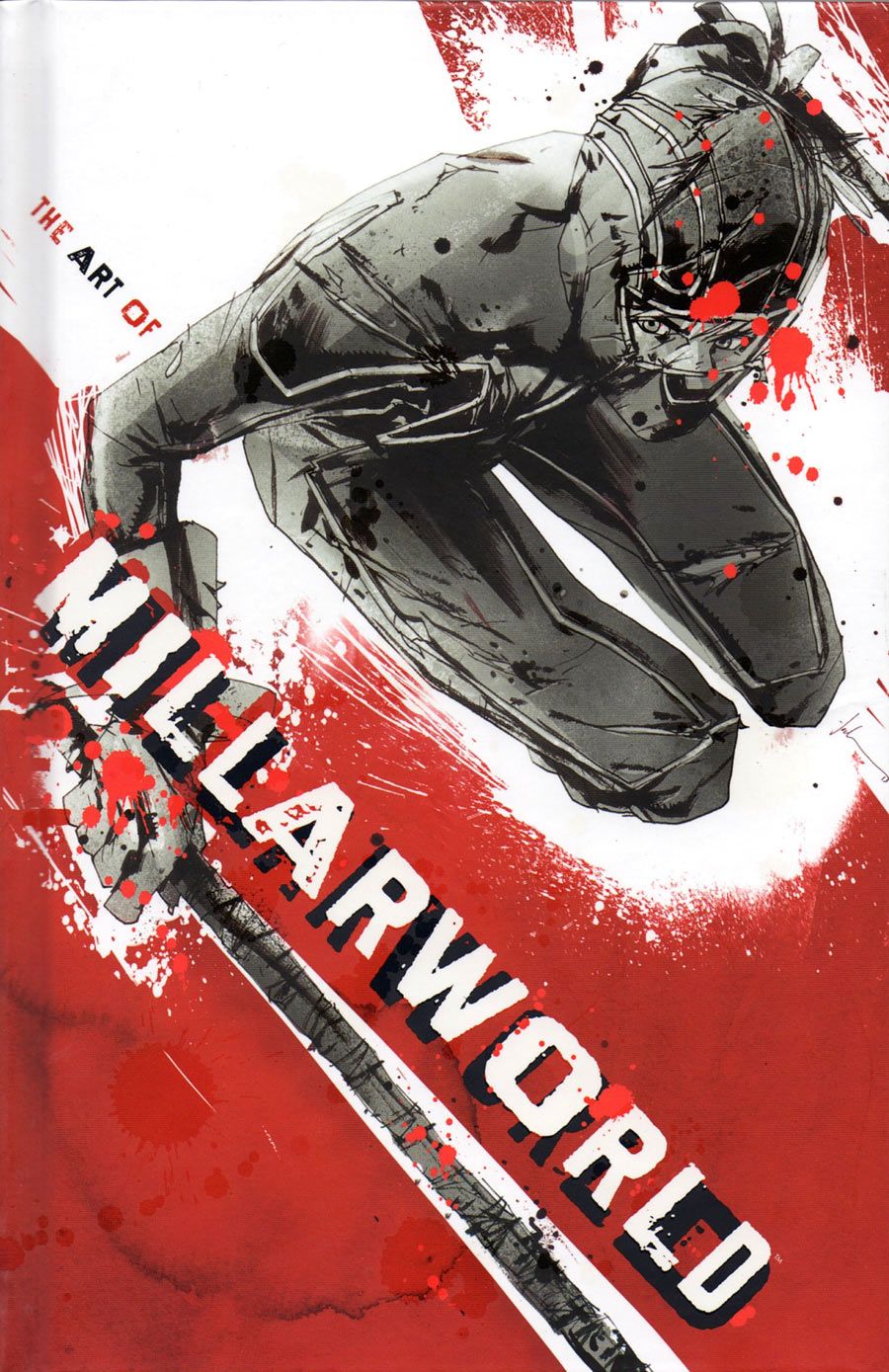
"The Art of Millarworld" is a $40 hardcover collecting work from across Mark Millar's family of titles. When you have the likes of Steve McNiven, John Romita Jr., Leinil Francis Yu and Frank Quitely in your corner, it would be a shame not to celebrate it. That's what this book tries to do by reprinting all of the covers used in all of the Millarworld titles so far.
On the bright side, it's a hardcover book with no dust jacket. The cover image is printed on the cover. This is something I've changed my mind about over the years. I like the look of a dust jacket. It made comics feel more like they belonged in a library somehow. But the truth is, they're cumbersome. I take them off when I read those hardcovers, and they're annoying to put back on, even if it only takes a few seconds. Printing images directly on the cover is the way to go.
There are short interviews with many of the artists before their books are featured. I like to have a little context in my art books. By featuring these interviews on pages apart from the art, there's no interference going on. Everything can stay pure.
Unfortunately, that's it for the good news.
The bad news is that it's an art book printed at the same size as the comics. Art books should be bigger so the art is more easily seen and details might be noticed for the first time. Some covers work well for the way they're designed. They do not, however, make for a great art book. Some covers are 75% white space. As an art book, seeing a sliver of art jammed onto the top of a small page is just too much.
Worse, even the full-cover images aren't always printed as full size. The book is done full bleed so that a full-page image will cover everything, but that's not always used. When you reprint a Geoff Darrow alternate cover and then shrink it down to fit on about 75% of the page, you're missing the point of an art book.
They shrunk down a Geoff Darrow cover. Roll that around in your mind for a minute and ask yourself what that says about the design of the book. Geoff. Darrow. Art. But smaller. That is not a winning combination.
Funny enough, "War Heroes" -- an abandoned book after three issues five years ago -- gets a generous 14-page section, including an interview with Tony Harris who talks about one day finishing the story, the standard two-page spread introducing the title, and a blank page. That's not a blank page used for negative space as a design feature to make the next image stand out more -- it's a blank page for pagination purposes, because the alternate first issue cover was a wraparound. They wanted to present the normal cover first and then all the covers in order. So there's a blank page on the left to sort that out. The "Jupiter's Legacy" section has the same problem.
As a Millarworld Completist, you might enjoy having so many alternate covers shown in one place, but as an art book, it utterly fails.
Skip this one.
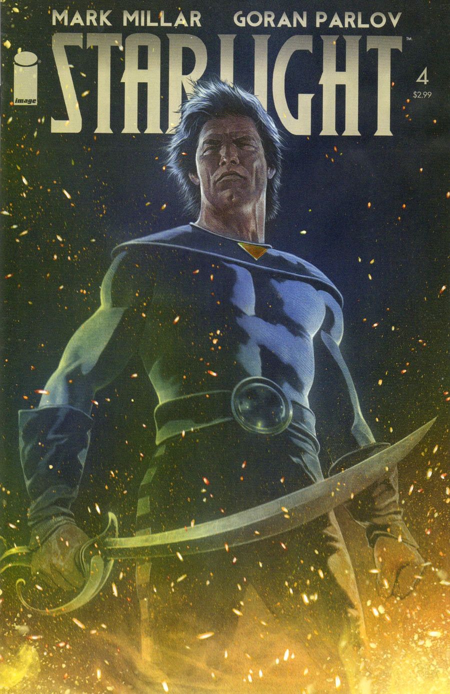
Having said all that, let me say this: "Starlight" is my favorite Millarworld title to date. It is such a pretty book, with a roller coaster-good story. The fourth issue just came out, and Goran Parlov's art is just as great as ever and steals the show. Millar's script continues to make Duke McQueen a perfectly likable character who you want to root for. Even when he's a grumpy old man, there's a good reason for it, and you can't wait to see him get his second shot at glory. Millar gives McQueen reasons for his every move, so it never feels like he's doing something out of plot necessity. This is clearly well plotted in advance.
The big ending to this fourth issue is a surprise that probably shouldn't have been, but the book moves at such a nice pace that you don't really stop to think too hard about the situation. You want to enjoy the action and the colorful scenery. You want to explore the colorful strange world. You can easily forget that the plot is moving forward, too.
It's a lot like Dynamite's "Flash Gordon" series, which I'm also a fan of. It's an imaginative sci-fi/fantasy romp with great action sequences, strong characters, and a straightforward plot that runs like a classic serial would. And like "Flash Gordon," "Starlight" has the best of all worlds in its writing, art and coloring.
OTHER IMAGE ODDS AND ENDS
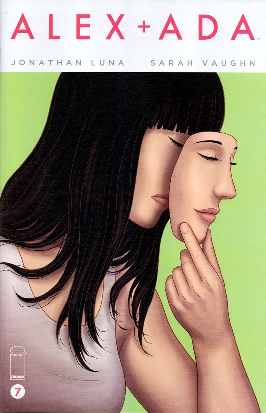
"Alex + Ada" is a strong series from Jonathan Luna and Sarah Vaughn that I unfortunately haven't written at greater length about before now. It's the Image series about a lonely man who can't quite get over his ex-girlfriend, so his grandmother sends him a female robot to keep him company. After all, her youthful male companion robot keeps her very happy. Wink wink, nudge nudge.
While there is that odd sort of romantic tension between Alex and the robot he names Ada, it's not the point of the series. This is more an exploration of the impact of a society with robots, personalizing it with Alex's story. He doesn't want one, but he feels bad sending it back. And then he feels bad about the robot not having its own mind. That leads him to some other research trips that are slightly more dangerous and questionable.
This is not a rock 'em, sock 'em adventure. This isn't Will Smith in "I, Robot." The robots in the book hew basically to Isaac Asimov's Three Rules of Robotics, and if you don't know what those are, I implore you to read the words of the science fiction grandmaster.
This is quiet book, with the tension coming in the background from some current events where robots have been seen wandering off on their own, in one case causing a mass casualty of humans. This is about Alex's interactions with the robot he doesn't quite know what to do with, and the assumptions his friends make about his situation. It's an interesting look at those angles. It's less about the overall plot and more about the people.
Now, having said that, the seventh issue (due out this week) is setting up some more dramatic stuff. I get the feeling these first six issues will be seen as the set-up as the book heads further down its road. Will it turn into an action/adventure piece? Or a robot on the run story? I don't know. I'm along for the ride, though. The book has earned that much.
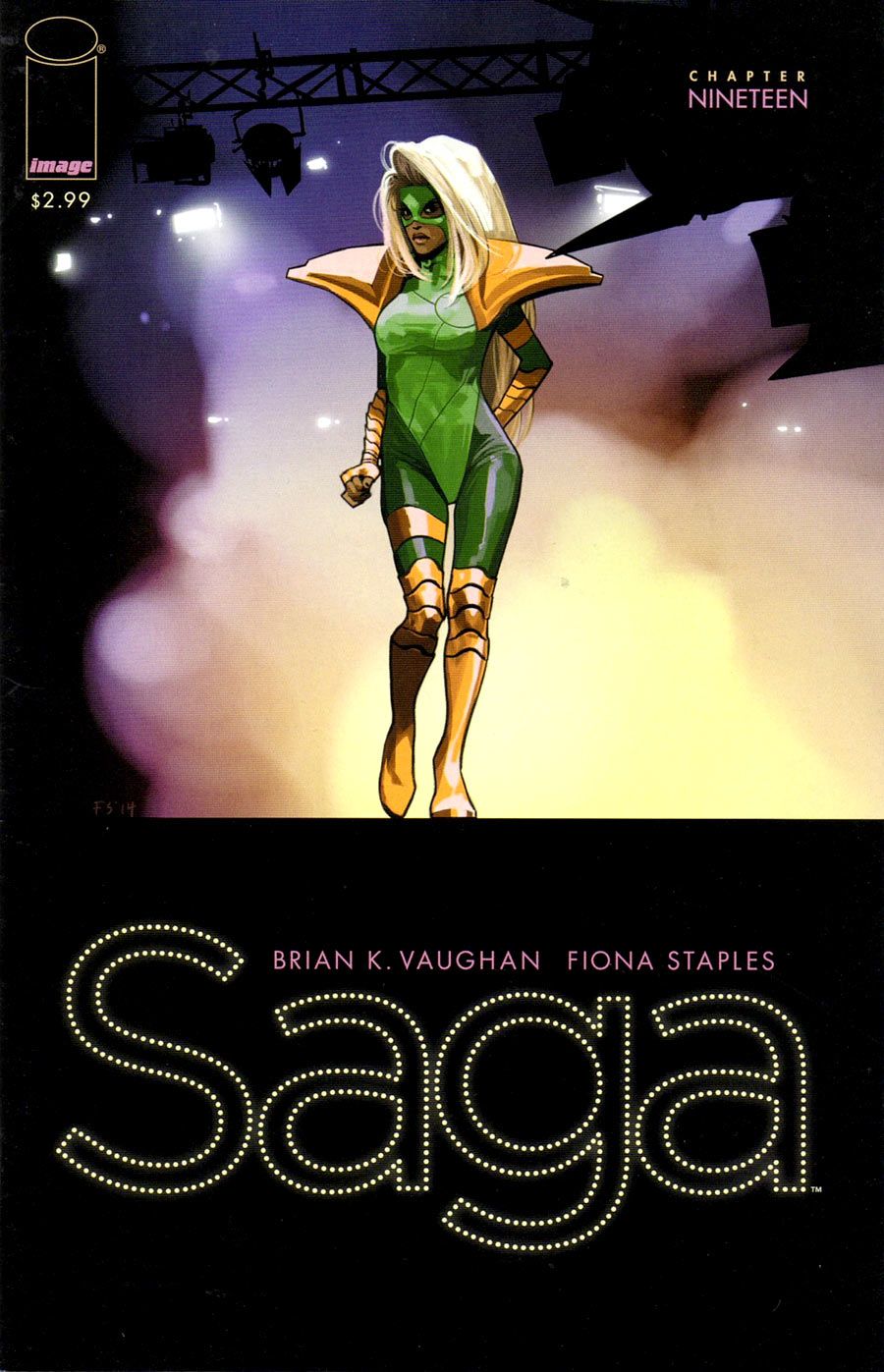
"Saga" is a series I had to play catch-up on. I couldn't remember where I left off, so I went all the way back to issue #13 and read from there. It's the 19th issue, though, that got me. With its classic Brian K. Vaughan twist on the last page, I gasped out loud. Not that the series had to sell itself to me anymore, but that page certainly did the job again. It's a good thing when a series takes a little jump and reminds you of why it's so exciting.
Vaughan is just that type of writer who wants to rip your heart out, and will do so when you least expect it. To him, I can only give a small golf clap. Well played, good sir.
Fiona Staples defines the book in so many ways. Her digital painting and imaginative creatures and situations are not gloss over the story. They're a part of the story, with some nice effects in this issue including simulated rack focusing and the continued hand-drawn look to the child's narration. When the lettering breaks out of the balloons and arrows point to the things she's talking about, it's even cooler.
My only complaint about the series right now is that the letters column puts the letters in italics and Vaughan's responses in the plain version of the font. That seems backwards to me.
Now, for a quick meta-comment: I just reviewed a book, including its lettering and letters column. Welcome to Pipeline 1999!
I know I don't need to sell anyone on "Saga" anymore. I just wanted to put this marker here to mention that it's still great and Vaughan and Staples aren't letting up or resting on their laurels. This is a book that isn't afraid to change to keep things interesting.
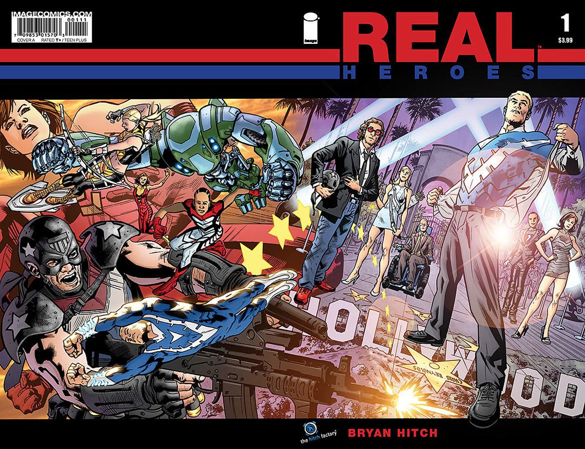
I also read Bryan Hitch's "Real Heroes" #1-3 last week. The conceit behind this one is that a group of actors from a Hollywood superhero movie have been shunted over to another planet where the team they play in the movie was real -- and are now dead. After a bit of misdirection, they find themselves taking up their roles as the real thing.
The breakdown of the first three issues is pretty clear: The first issue establishes the group of actors and shifts them to the other earth to realize the horror. The second issue tells us what they're there for, and ends with a meeting with the Big Bad Supervillain. And the third issue is where the actors comes to grips with the fact that they now have their characters' superpowers and things just got real. So next issue should be about learning to use the powers, and the fifth issue will see them using those powers to defeat whoever the bad guys winds up being. A twist at the end will make it feel like all is lost, and the big bombastic triumphant finale will be issue #6.
Hitch wears his influences on his sleeve pretty clearly here. This feels like a Mark Millar script through and through, right down to the Hollywood references and the final page splash images with a single line of dialogue. There are hints of Warren Ellis strewn throughout, too, mostly from his "Authority" days. And a lot of is pure Hitch art, with the white borders and the realistic depictions of people and buildings everywhere. If you thrilled to "The Ultimates," you'll see a lot of parallels here.
But most of all, it's a Big Two artist going off on his own to do a creator-owned book, and writing it himself. Both of those are impressive accomplishments. I don't know how sales are going on the title, but I'd love to see Hitch do more creator-owned works.
NEWS AND NOTES
-
The best comics news of the year came this weekend at the Special Edition: NYC show, where Valiant announced a "Quantum & Woody" Omnibus edition to pair up with a new miniseries from Christopher Priest and M.D. Bright. I reviewed the series in a retrospective If you weren't around for the funny books of the late 90s, jump on this chance while you can!
- Tweet of the week: The first look at Francois Schuiten's next work, "Revoir Paris." Looks beautiful, as always.
Altaplana.be is proud to present you the exclusive first look at the frontpage of the new album by François Schui... pic.twitter.com/ilyj5ClS90— Joseph Le Perdriel (@citesobscures) June 3, 2014
- Pipeline turned 17 years young last week. They grow up so fast. If my math is right, this installment is the 892nd consecutive week of writing this column. This column is older than a few of its readers, most likely. Pardon me while I go put my dentures in...
- Next week: We return to "The Amazing Spider-Man" as we get to the "Inferno" tie-in issues.
- Tweet of the week: The first look at Francois Schuiten's next work, "Revoir Paris." Looks beautiful, as always.
Twitter || E-mail || Instagram || Pipeline Message Board || VariousandSundry.com || AugieShoots.com || Original Art Collection || Google+

