SPANDEX VERSUS LEATHER
(There. That ought to get all the search engines' attention!)
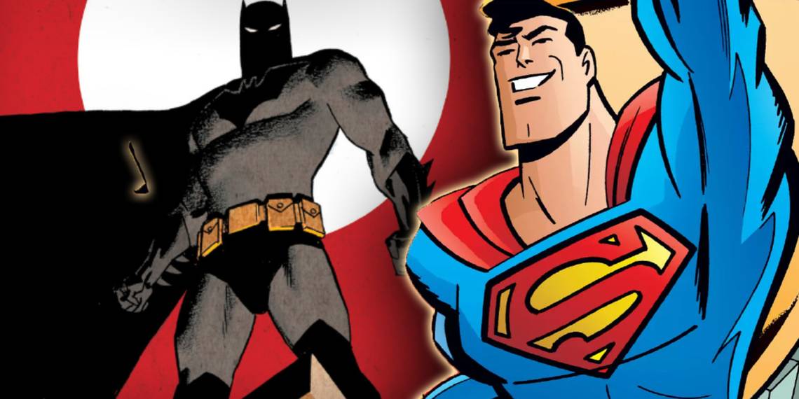
I don't cover many of the comics-related media spin-offs here. For the most part, it's because I don't care. I love the comics and the media recreations are usually underwhelming, the exception being the SUPERMAN and BATMAN cartoons.
And when it comes to live-action, it's generally beyond the pale of pathetic. In fairness, though, I thought David Hasslehoff was passable as Nick Fury and did enjoy that television movie. (Yes, the original BATMAN movie and Christopher Reeve as SUPERMAN were well done, too.)
The biggest topic of debate now, of course, is the X-Men movie coming out this summer. In fact, it's being talked about ad nauseum. We get near-daily updates from our Canadian friends who live in the area of the shooting on who's there wearing what in what building. Heck, I even know how it ends already! By the time the movie comes out, we're going to know everything. Why bother getting excited? I generally keep ignorant of the news, but you just can't help seeing it all over the place.
Sir Ian McKellan's picture in the Magneto costume, however, has been circulating for a week or two since it first appeared on his website. Yes, it looks hideous. It looks like an old man in a set of frumpy-looking sweats with a drab cape around his shoulders. McKellan looks bored in it.
People are jumping ugly already.
Backtrack even further:
It came out last month that the cast wouldn't be wearing the costumes you see in the comics. They'd be wearing something that everyone is comparing to "The Matrix" costumes - lotsa leather. As we know, nobody wore leather before "The Matrix." (Note my subtle sarcasm there.) People are whining already that they want to see the traditional costumes.
|
"As we know, nobody wore leather before "The Matrix."" |
![[Keanu Reeves in the Matrix]](http://images.comicbookresources.com/moto/keanu_matrix.jpg?q=50&fit=crop&w=750&dpr=1.5)
|
Well guess what, folks? It would looks ten times more stupid if they did. The easy way to prove it is thusly: Go out and buy yourself a pair of leggings in some color other than black. Put them on and look at yourself in the mirror, if you have the guts to. If this doesn't work for you, go to the local gym and look at the guys with high opinions of themselves wearing some form of spandex.
Are you throwing up yet?
I have this general guideline that men shouldn't wear spandex at all. Maybe under a pair of shorts or something, but our bodies aren't build for something that form fitting. Heck, most women's bodies aren't, either. (Do overweight women truly think that wearing spandex has a slimming effect?)
I'm wandering now…
The point is that the actors would look ridiculous in costumes that fit like a second skin. At some point, reality must set in on this. Costumes work in comics because the artist can make them work, by ignoring certain realities involved with them, by lighting scenes in certain ways, and by drawing characters at certain angles.
The Batman costumes used in the movie, as well as the Flash costume used in the television series, got around this by being padded. It was even a small plot point in the Flash that Wally West wore the costume to help protect his muscles. In Batman's case, the costume is defensive and dark. So it works either way. But in neither case were the costumes spandex.
In the Real World (no relation to MTV, whose Real World people wear no clothes half the time), spandex doesn't protect and it looks silly. It gives you the advantage of not letting your fighting opponent lay a hand on you and adds to your flexibility to a certain degree, but that's about it.
Leather is possibly the next best thing. (And I won't even argue for the sadomasochistic urgings associated with it analogous to the male power fantasy that is comics. I don't want to go there, thanks.) It's tight fitting, but more forgiving. It's slightly more protective. And you can accessorize it in enough different ways to hide it. Long trench coats can cover up that belly or that big butt. Generally speaking, it gives a similar enough look to be passable. (The actors will probably be just as uncomfortable in it, too.)
Finally, it looks good on film. In his column this past weekend, Roger Ebert comments that one of the reasons rain appears so often in movies is that it's the best way to make streets look good at night - make them wet. Leather costumes - see "The Matrix" - can look really good on film. They provide for great contrast to daylight scenes and have a texture all their own and aid in providing for a dynamic mise en scene.
Simply put: Making a movie directly from a comic is not only financially impossible, but would end up being incredibly silly looking, even before we get to the problems of the special effects. Humans aren't superheroes.
Oh, and the Magneto costume - yes, it looks silly in that posed shot. But don't decry it just yet. It's amazing what a good cinematographer/director/lighting guy can do with the right angles and lighting.
SOME REVIEWS - MOSTLY BAD
Now that I've gotten that out of my system, back to some reviews.

SUPERMAN #154 is Ed McGuinness' first issue and the second part of the Y2K storyline started in last week's questionable SUPERMAN: Y2K one shot.
McGuinness's stuff looks great. His Superman is a bit beefier and rounder, with a huge chin reminiscent of Tim Sale's Clark Kent. It's also much cartoonier than the other Superman books right now, along the lines of Paul Pelletier's artwork. In my first reading of the issue, I had some problems with his storytelling, but the second reading didn't give me any problems. I'll keep an eye out on the next issue for that, though.
Jeph Loeb writes a last page so terrifically funny that it makes the whole issue worth the price of admission. It pokes fun at the recent past of the Super-titles. Even if you don't buy the book, flip open to that and read for the meta-text.
The CGI Brainiac returns and I just don't like it. Yes, they've done a great job in keeping him darker than your typical computer graphic shot and attempting to blend him in, but the dichotomy between it and the comic page is still too much. It's distracting. It's just as distracting as if you inserted an Alex Ross-drawn Brainiac. It's not strictly a CGI thing for me; it's a question of style.
DANGER GIRL SPECIAL was mostly a waste of time. It's two filler stories looking for a point. They're mildly entertaining in their own stylistic ways - one story from Art Adams' pen and the other from Joe Chiodo's paintbrush - but when all is said and done, I was bored. The problem with it might just be that the trademark Campbell storytelling isn't there. This book is synonymous with ludicrous action scenes, and this special issue delivers none of those on the scale of the "regular on-going series."
It's for the Art Adams or Danger Girl completists only, I'm afraid.
RISING STARS #4 is another nice story from J. Michael Straczynski. He forwards the overall arc while telling a nice little story along the way. The same problems remain in that it reads more like a novel than a comic, but it's an interesting enough story that I'll take it. My main problems lie in the artwork and design. All Top Cow books have this same muddy earth tone look and it's really starting to annoy me. Even the blue on the front cover is washed out and dark looking. A guy lights up on fire inside the issue and the page doesn't brighten up any!
|
"All Top Cow books have this same muddy earth tone look and it's really starting to annoy me." |

|
Christian Zanier's art is not an improvement on Keu Cha's. His characters' powers all seem to be giraffe necks. Check out the cover.
There are also some sequential storytelling problems, as well. What happens on the top of page 7? The dialogue seems to suggest it, but all that middle panel looks like is a gratuitous leg shot…
Sam Kieth's LEGS is a big waste of time. He should stick with superheroes in pen and ink. Sure, it'll sap him of his "artiste" nature and creative freedom, but at least then it might be readable and enjoyable. Remember the Wolverine/Cyber story he did in MARVEL COMICS PRESENTS that was written by Peter David? I think his art has gone straight downhill ever since. When he started doing oddball pages in paints instead of pen-and-ink for no discernable reason in THE MAXX, you knew he was losing it. ::sigh::
I'm starting to get really grouchy now. That's it. I'm done. Class dismissed. Go enjoy your day.