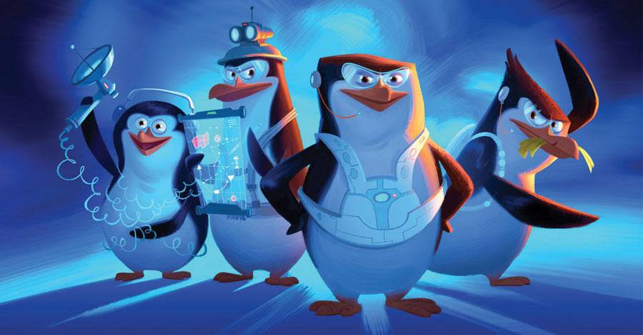
THE ART OF THE PENGUINS OF MADAGASCAR

CGI animation leans a lot on color and lighting. Reading "The Art of the Penguins of Madagascar," I came to appreciate color in a new way. There's not a chapter in the book that doesn't point out the color scheme for the movie. It is different: Where other movies concentrate on using a specific color with a specific scene or location, the upcoming "Penguins" movie keys the color off the characters. The scenes change color when different groups of characters collide. As you read the explanations alongside the images in this book, you also find out about more of the subtle variations and cheats they needed to pull this off. How do white animals pop off white backgrounds? How do you handle harsh red light in a reflective environment with lots of white animals?
There is character design talk in the book, too. The phrase "straights against curves" gets used so often that you'd get drunk in any drinking game associated with the book. If you need an explanation for what that means, former Disney animator Aaron Blaise will explain it to you. Long story, short: Draw straight lines next to curved lines when creating your characters. Bruce Timm did a lot of that, for example, in his designs for the animated DC Universe. (Picture how so many arms have straight inside lines and curvier lines to highlight the muscles on the outside.) The Madagascar movies have always relied on it, giving the characters a distinctive and very cartoony look.

The book basically breaks down by location, with diversions into character and vehicle designs, and even architecture and graphic designs for all sorts of signage. You get a good variety of design paintings, storyboards, color scripts, character sketches, and background layouts. The text explaining it all is a celebration of the movie, not a challenging critique of it. The "Art Of" book is usually more for publicity than the historical record. What else would you expect? Robertson does point out many areas in which the movie changed over its development, including how it didn't even start as a movie in the "Madagascar" universe, how the penguins had to be redesigned, and how the main villain of the piece changed drastically in every way from animal to motivation to evil planning. Such drastic development happens in most animated movies, though, so I won't hold that against this one.

The book is bound on its wide side, with each page running 11 inches wide and about 10 inches tall. When an image sprawls across a double page spread, it's epic, even when it's a roughed-out color sketch. The scenes set in Venice, for example, seem to get the most love and attention, from the wide view of the city webbed in canals to more water-level views of the buildings lining the way.

"The Art of the Penguins of Madagascar" is available today (for $45) from Insight Editions (who also did the gorgeous Blue Sky Studios book), but there is an obvious warning here: If you don't want to spoil the movie, don't read the book first. When I see the movie (it's due out next weekend), it'll be a different kind of experience. I know the basic plot now. I'll be watching the movie a lot for the things I learned about in this book, and to see how everything looks in motion. It's not a bad way to go, but you may want a different experience.
PIPELINKS AND ONE-LINERS
- I liked Maleficent. The folks at "Honest Trailer," however, skewered it pretty good. Agree with them or not, the video is very funny. If I'm reading the tease at the end right, they're going after "The Little Mermaid" next! Can't wait. (Also, did you know "Mermaid" celebrates its 25th anniversary this week? Yes, that makes me feel old, too.)
- In last week's review of "Big Hero Six," I wondered what Mark Henn did on the movie. Right after that, I found this article about his role at Disney these days. Basically, someone has to teach these computer kids how to actually animate something. Converting everyone from paper to the Cintiq won't solve everyone's problems, after all.
- In my more Quixotic moments, I dream of a world in which "oversized" means the pages are physically larger, not that there are more of them.
- I don't ever want to write a superhero comic for Marvel or DC for one reason: Every time I hear a new writer talk about reading the complete series of "The Avengers" or "Iron Man" or someone else to be sure they have the character and continuity right, I want to take a nap and not read comics for a month.
- Subjects that will turn me off from your comic: Faces being ripped off, zombies ("The Walking Dead" is the exception, not the rule), demons.
- The first season of "Marvel's Agents of S.H.I.E.L.D." arrives on Netflix this week. I plan on catching up with it, and then wondering how to deal with the second season. If I start DVRing the series now, I'll only have to buy a few episodes off the iTunes store, I guess.
- Todd McFarlane drew Spider-Man on his Facebook page this week. It's beautiful. Oh, how I wish there was a way to get him to draw a Spider-Man project again. I know you can't go home again, but I'm willing to try on this one.
THE EPIC "ALL STAR BATMAN AND ROBIN THE BOY WONDER" RE-READ, Episode Three

Black Canary takes over more than half the issue, while Batman and Dick Grayson drive, dive, and fly back home. Also, Superman is super-ticked off.

Black Canary Will Only Take So Much: Batman's influence on the citizens of Gotham is a big part of "All Star Batman and Robin." In the third issue of the series, the focus falls on Black Canary and just how much she's fallen under his spell.
"Black Canary" is the name of a bar in a seedy section of Gotham City. Its sole bartender plays the part, with a uniform made of fishnets and a halter top with a short leather jacket. And a mask. There are plenty of themed restaurants to be sure -- think "Hooters" here -- so this concept isn't too far a stretch.
The clientele of this fine establishment is your basic group of mouth-breathing Neanderthals, all of whom think they have a chance with the good-looking lady behind the bar. They're the kinds of people who only have on thing on their minds, and it's actually not the current state of video game journalism.
Miller uses a neat trick to set the scene. He leaves floating word balloons all over the page with random snippets of patrons' utterances. (It feels like classic Claremont-era "X-Men") They surround and engulf Black Canary on the page, all with descriptions of how good she looks to them. It's rampant misogyny on display, with repeated balloons of "sugar" and "Mommie" and "honey baby" and, most curiously, "love chunks." It's filled with terrible attempts at pick-up lines. They repeat over and over, mostly because this particular brand of jerk isn't that creative. Miller is banging hard on this drum, creating a din in the reader's mind as much as in Canary's.
Inbetween all the panels of this nonsense are inset panels of a stick of dynamite. Its fuse is lit, but is shrinking with each turn of the page, until --
One patron goes too far. All the words in the world someone patron goes too far and makes a grab for her backside in addition to using the pet name of "love chunks," things get violent. It's a two-page spread with Canary kicking the guy in the head, his teeth flying across the page. That's followed by four more pages of Canary showing the gentlemen of this bar what she really thinks of them in the form of high heeled pointy boots to the face, elbows to the back of the neck and, er, well, more boots to various body parts. It's a rampage.
And the best part is, you can hear the crowd reacting to this. After pages of their single-minded objectification, their defense is, "It's just words; We didn't mean anything by it. Don't be mad. Please don't kick me in the -- OUCH!"
"All Star Batman and Robin the Boy Wonder" was #NotAllMen long before Twitter even existed.
It's rough and tumble, but delivered with a slight sense of humor. My favorite moment is near the end of the fight, as the caption boxes begin to describe how Canary has changed in recent months.
That caption in an arrow shape cracks me up. I love the way Miller phrased what he wrote inside of it: "She kicks this last one harder than there's any call for."
In the middle of this rough fight, with short repetitive insults being used to punctuate everything, there's this almost proper sounding sentence that breaks the fourth wall, in a way. The narrator suddenly has an opinion, and the breaking of the usual caption box paradigm is playful. It's like the Goofy Gophers are running color commentary for a moment, and it's just what the scene needs to keep from getting repetitive.
But this page is also the point of the issue. Black Canary is fighting back because she is inspired by Batman's new and sudden appearance on the scene. She's inspired to not take the seediest part of Gotham as being what it is. She's ready to help clean it up, in some small way, especially if it means throwing a few elbows or fists around.
Not that she's perfect at this. She does tend to handle things more personally, such as feeding one of the newly-knocked-out gentlemen his own wedding ring before she throws the bar owner out the window, steals a motorcycle and rides off into the night.
Frank Miller can't help but throw an extra dose of double entendre onto the fire as Canary rides away: "The Harley's a roaring lion between her legs."
Hello, Nurse!
The Art Gets Bigger: Those last two pages of the opening are full page splashes. Neither needs to be. It's the beginning of a series of needless full page splash images used in the series. When you read it as part of the whole, it's noticeable but not bothersome.
If you read these issues as they came out, with months between installments, losing forward progress with full page splashes might not have helped the book's popularity. It would easily stretch the patience of even the most devoted reader.
The Other Two Thirds of the Art: The bar scene calls attention to the two supporting regulars in Jim Lee's art that can be too often overlooked: colorist Alex Sinclair and inker Scott Williams.
Sinclair keeps the scene inside the bar in tan tones. Colors are muted. Outside the bar, he continues to use colder and brighter colors, with the city in shades of blue, and signs in bright reds and yellows. But on the inside, he's evoking the feeling of a shady dive bar. It doesn't have swinging doors in the front like one in a Western might, but that's about the only lost opportunity. Inside, everything is wooden. The background is hazy, with wisps of smoke rising to the ceiling.
Likewise, look behind the main players in the scenes to see some of the key work Williams is doing in this issue with his inks. We're used to seeing Lee's superhero art and how he draws faces and people. That part of this issue is familiar. But look behind them at the textures all over this bar. Look at the brick work on the wall in the background. Check out the ceiling with its tight lines around the wooden beams.

A lot of these details might be considered distractions by others. The coloring doesn't do anything to play them up. They blend in with the general noise of the background. But I see them. I love to see a comic artist who can drew backgrounds with as much detail and interest as the foreground characters who capture most of the readers' interest. It's not lost detail for me. It adds to the natural look of the pages, and gives the scene a more realistic setting, even with a scene that's played a bit cartoonishly over-the-top.
Then there are the inking mechanics involved with so many of the comic book tricks employed here, from motion lines to speed lines to the white-ed-out areas that break up some of those lines. I love the way bricks can be inverted to look black in the shadows with the grout inbetween looking white (Miller popularized that with "Sin City"), or the way Canary's jacket can look leathery by the way that Jim Lee draws its folds, but also by the way Williams inks it with room for highlight colors.


Shipping Eventually, When Time Allows, At Some Point: All that detail and thought means this is not an issue that feels rushed out or hacked out to meet a deadline. It's also the last issue of the book that shipped on a reasonable schedule. After these first three issues were released in the fall of 2005, the fourth issue didn't see the light of day until March 2006. OK, so that's not so bad. Only three months.
Issue five was released a year and four months later.
All told, three issues of the series were published in 2005, only one came out in 2006, three came out in 2007, and the final three arrived in 2008.
Jim Lee blames distractions from a video game, which would make him the second coming of Joe Madureira, I guess. OK, OK, to be fair, the problem was that Lee devoted so much of his time to making a DC-based video game, not playing one. Sadly, the end result is the same: fewer good comics.
Funny enough, DC announced that the series was going to finish in 2011, with six more issues released monthly once they were banked up. iFanboy even had some of the promo images that it appears the DC blog has since lost.
Obviously, that never happened, either. In my heart, I'd like to believe those issues are all but finished and are just awaiting Jim Lee's final couple of pages, but -- well, Jim Lee is drawing something else again.
But if Lee is being truthful and he is the cause of the delay ("100 percent of the blame falls upon my shoulders"), then there are likely a couple or three scripts written by Frank Miller sitting in a drawer somewhere. DC should put together a Kickstarter to publish a script book with those issues in it.
One More Thing: Superman: Things end with a ticked-off Clark Kent in Metropolis burning a hole in a newspaper with a headline of Batman's abduction of Grayson.

And this is the only point in the ten issue series that made my brain hit a speed bump. I don't get too caught up in continuity, but -- how does that work? How is Dick Grayson's picture on a milk carton and Batman's name in the headlines in the time it takes Batman to drive home?
There is a line in issue #4 where Dick Grayson says "it feels like it's been days" since they got in the car. I didn't take that literally, but maybe I should? But that wouldn't make sense, either, because Alfred is still not settled in at the hospital he and Vicki Vale were taken to last issue.

Next issue: We reach the Batcave, and Jim Lee goes nuts on it. More importantly, we get back to a full issue of snarky Batman versus smart-acre Dick Grayson.
Twitter || E-mail || Instagram || Pipeline Message Board || VariousandSundry.com || AugieShoots.com || Original Art Collection || Google+