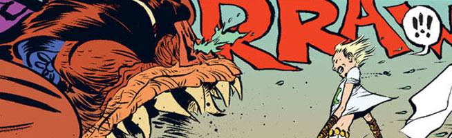
"Battling Boy," the book everyone's talked about, the book everyone's had on their Amazon wish list since it was first announced in 2006, finally arrived last month ago to near-universal praise, and by now, has been read and re-read (is anyone else's spine cracking?) by children and adults alike. With a simple premise about a special boy with totem-infused t-shirts defending a city up to its neck in monsters, "Battling Boy" hit the #1 spot on the New York Times best-seller list, and at least one spin-off project has already been announced. But what else do expect when you have sprawling scenes like the one where Battling Boy goes against Humbaba? Or monsters rallying in a bar, playing poker and taking stiff, poisonous drinks? The book landed like a storm, a whirling dervish made from ink and charm and color that hasn't stopped spinning -- and won't stop for a long time.
But there's no time for celebration. The architect behind the book, Paul Pope, has fortified himself in a new, bare studio to complete volume two of the eponymous hero's adventures in Acropolis. Pope's labors -- whether creating his own typeface for the book or working alongside his colorist in shaping the book's color palette -- aren't over. In a conversation with CBR, Pope spoke about the inspiration that went into his story of a boy-god who traverses a city of monsters, the upcoming prequel "The Rise Of Aurora West" and his fortress of solitude.
CBR News: Now that "Battling Boy" is out, how do you feel about the final product? It's been over six years since the book was first talked about, and now, holy cow, it's here.
Paul Pope: I'm glad it's getting out there and the initial response to the book has been really positive. It's great to finally release this book, since for so long, only about a dozen of us have been able to see the work.

Paul Pope discusses the process behind creating long-awaited "Battling Boy"
More importantly, how are you going to celebrate?
There hasn't been a moment to celebrate, really. We got back from a two-week, five-city tour. We had NYCC, then a book launch in Toronto with The Beguiling and we got back and went right back to work on the second book. I was literally in a production meeting when the call came telling me the book hit #1 on New York Times.
The entire book is so incredibly charming -- it's full of fast-paced action, humorous moments and rad monsters, all glued together by those little touches -- like BB's dad summoning the suitcase through the lightening portal with a special whistle -- that just make the entire story sing. Several times, I found myself smiling, even in the "darker" scenes. I'm trying to figure out how you managed all of the above. What was your outlining process like?
I just knew going into it, I wanted to put into this as much and anything I really loved as a kid. "Battling Boy" has a big mash-up of manga, old Kirby comics, old Disney films, "Star Wars," French comics, opera, mythology, fairy tales, science fiction -- I knew if the story was relatively simple, the world could be elaborate and complex.
I admire that you ink your own work, and that you letter your own work. Several artists do the former, but not the latter, and I'd like to know the reason behind doing either. Do you feel that the work is more complete, more organic, if your involvement is this ubiquitous?
I did hand letter all of "Battling Boy," although I wanted to also have a computer typeface built using my brush calligraphy for some of the more wordy scenes. The book is laid out in a combination of hand-lettering and a type treatment placed digitally using a font called PPope, designed by John Martz. That was a choice we made for legibility's sake. Also, knowing we'd have numerous European-language editions coming, I wanted to be sure the foreign editions looked like the hand-lettered pages on the originals. Personally, I prefer the cartoonists who draw and letter their own works, like Robert Crumb and Chester Brown and Alex Toth. It just looks more complete that way.
RELATED: Paul Pope's "Haggard West" Closes One Door, Opens Another
Color also plays a pretty big part in the book. How hands-on were you during the coloring phase?
Hilary Sycamore and I initially agreed on a palette which has elements of both classic European comics and Miyazaki films, such as "Spirited Away" and "Porco Rosso." We had a few marathon coloring editorial sessions where, after she'd color a huge chunk of pages, we'd laboriously go over everything together, page by page, and either approve or adjust details as needed.
Pope wears his Kirby and Moebius influences proudly
A big factor was establishing the time of day for a scene; that shifts everything for her palette. I think one scene which plays really well is the scene where Battling Boy and the Mayor step outside his office to have a private discussion on his veranda. We go from a well-lit office to a porch at dusk. The colors shift in a very natural and pleasing way, I think. We all agreed the book ought to be bright and colorful and the colors should be pretty "flat" for the most part, to keep the contrasts simple and clear.
Battling Boy is put in an extraordinary coming-of-age situation: Rid the city of all its monsters. Throughout the story, through the different situations he's faced with, he reacts just the way I'd imagine a boy his age to react. Is he based off anyone in particular, or is the character an amalgamation of personalities?
He's based a bit on myself and my nephew Ben, when Ben was Battling Boy's age. There's a lot more going on in Battling Boy's head than he lets on. He can be a bit monosyllabic, unless he falls into quoting his Dad, who speaks in sort of a quasi-Shakespearian/Stan Lee vernacular, which is a bit flowery and ridiculous. I wanted BB to seem like a "normal" kid, so he has normal reactions to things. He isn't a fully formed adult hero, so he is a bit shy and reserved and even lazy at times.
How did you tackle the unique design of the monsters Battling Boy faces, like Gilgamesh's Humbaba?
I was thinking of these stone "devil dog" statues I saw in Tokyo when I was living there. Something about Humbaba's design is vaguely Asian, in my eyes, I wanted him to have a bit of that. He's like an Oni or Chinese dragon-dog monster. I also wanted him to feel a bit like a huge Muppet. He has a touch of that one big Muppet who is seen in "The Muppet Movie" at a used car dealership, carrying around a Volkswagen.
I like that you wear your Kirby and Moebius influences on your sleeve, and some of the characters and set pieces are nice nods to the masters. I also sense a little bit of Frank Herbert's"Dune"in the story, specifically the use of esoteric door locks. Was there anyone else or any other piece of work you studied or referenced during the production phase?
Every aspect of "Battling Boy," from layouts to colors to lettering, was carefully considered
Lots of classic Disney cartoons, as well as 1930s Universal and RKO film serials. "The Masks Of Fu Manchu" and "The Mummy's Curse" with Boris Karloff. The classic UFA German Expressionist films, such as "Faust" and "Die Niebelungen." As for comics inspirations, as you say, it's all about channeling Moebius and Kirby.
Several of the supporting characters feel like they could have their own book, Paul. Especially Aurora West, the late Haggard West's daughter. BB's dad could have his own ongoing series --
We announced the second series last week, "The Rise Of Aurora West," which is a two-book story detailing her relationship and early training with her dad, Haggard West, who is killed in the first scenes in "Battling Boy" #1. Her first book will be out next year, before the second BB book, then the second Aurora book drops. Together, the two series tell one long, interconnected story. In some ways, Aurora is the real star of the book, since she has a story which develops throughout all four books. Battling Boy sort of drops into the story halfway through her story.
"Battling Boy's" Aurora West Scores Her Own Prequel
Finally, what's your work station look like now that"Battling Boy" is wrapped?
I just moved studios, in part to have a designated work space which is Internet-free, so the new space is pretty much just a table and a reading chair and my reference books. It's just a pretty bare art studio room. My former studio got to be a huge mess, books and junk everywhere. Mainly, I realized I needed to have a space with no WiFi in order to concentrate more clearly. I find the Internet to be pretty detrimental, even destructive, to creative concentration. I wanted to rid myself of that aspect of life. It sometimes annoys people -- we've been conditioned to immediate responses. My girlfriend or my editor can text me on my phone if they want, but otherwise, it's a fortress of solitude.