THE ONES YOU LOVE: BIG HERO 6 and UNCLE SCROOGE

You're always hardest on the ones you love, right? The desire for them to be perfect leads you to ignore the fact that they're still better, at their worst, than 95% of everything else out there. When they hit a sour note, it's cringe inducing. You know they could do better. Missing such an obvious thing seems impossible.
This week, I want to talk about two books that I love to pieces, but which have little issues that drive me mad. These are books that should be perfect -- that could be perfect -- that are so close to perfect -- but which stumble in one way that might seem minor to others, but that drive me up a wall.
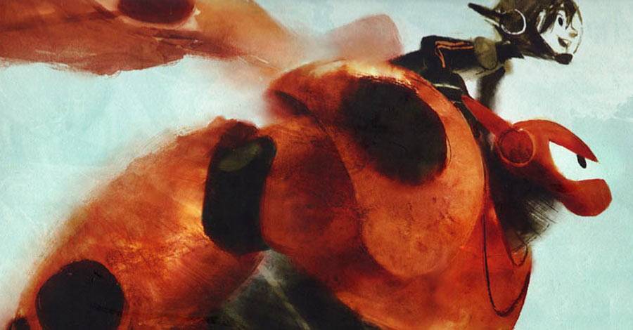
Let's start with "The Art of Big Hero 6". I loved the movie. Lots of visual development art pieces have popped up online in the last couple of months, and they show a production filled with terrific artists drawing ever-evolving ideas with interesting characters. The art book that accompanies the movie proves that out.
The backgrounds, I think, are the star of the movie. The development of San Fransokyo is the most interesting visual part of the movie. Very minor details have been thought though for specific reasons, such as the exaggerated hilliness of the city or the homes with larger first floors just to give the building more visual interest. Every last detail of the movie is the product of a lot of thought, including the appropriate trophies in Fred's bedroom, all the scientific tooling in the labs, how The Portal looks and works, and even the signage seen in the city.
The other half of the book is devoted to the characters, showing their evolution from initial concept to the final movie product. Most are fairly dramatic, but the art, itself, is a joy to look at. There's such life present in even the simplest exploratory sketch for what an outfit might look like, or how a character might show their emotions.
There's s short bit at the end of the book about the movie's cinematography that I think could be expanded into a whole book by itself. Disney wrote a new rendering engine for this movie, and that alone deserves more than the two pages it's given. You'll have to settle for this Engadget article for more information.


Of interest to comics fans, the opening essay documents the earliest days of the movie. No art from the original Marvel comics is shown, but Jeph Loeb shows up to give a quote and tell a story about how Joe Quesada's general idea for the core of the movie stuck. Geof Darrow and John Romita Jr. are also name checked.
So, all in all, it's a beautiful book. It's done in that sideways hardcover format that is popular with this genre of book. The pages are bright and shiny, showing of all the colors in the art clearly. It's $40 for 162 pages, packed from beginning to end with art that will often make your jaw drop.
Sadly, though, there's a massive screw-up in the design of this book. They picked a bad font.
After the introduction and development notes for the movie, there's not all that much text to go along with the art. Most of it is in the form of quotes from various people who worked on the movie.

For those quotes, they chose to go with a font they thought would be reminiscent of comic book lettering.
The very thought of that makes me shudder.
You know what you get when people start thinking like that from outside the comics industry: Comic Sans or Whizbang. The good news is, this isn't either of those two. The bad news is, it's not much better. No, I believe this font is the one called "Captain Comic."
With a name like that, I'd almost think the book's designers just found it with a Google search and stopped right there. I'm sorry, but it's hideous. Also, it's mis-used. In the classic beginner's blunder, they go straight for the crossbar-I in the middle of words.
The cover, curiously, handles the "I" correctly. It's still ugly, but at least someone knows how comic books are lettered. Either that, or the cover designer is the one who didn't type in all the text in ALL-CAPS, where you would get the crossbar from. Actually, that thought is even sadder: Imagine a book designer thinking he has to hold down the SHIFT key while typing a font that isn't mixed-case to get the desired "comic booky" ALL-CAPS effect. I think I'm offended.
The font is also used for the captioning of all images. You can't get away from it. It draws your eye on every page. The eye is attracted to the area of greatest contrast, right? So pick a spot on the page where the most beautiful art stands next to the most ugly font selection, and you'll get a natural contrast that can't help but pull the eye in. Ugh ugh ugh.
It's Ugly with a capital "U". It's distracting. It's a sore spot in front of far too many otherwise pretty images. And it's on nearly every spread of the book.
Most people will be able to get around that. Most of the reviews I've seen of the book in animation circles love it and don't mention it. Like I said, I am who I am, and I'm not getting past that. The art inside "The Art of Big Hero 6" is beautiful. The text that surrounds it, sadly, might as well be a kid with a box of crayons scribbling all over it.
The book is available today wherever finer movie art books can be found. If you like to look at development artwork, particular the kind of stuff that shows how much thought is put into the environment, this is a worthy book for your library.

The other book I wanted to mention is the glorious "Don Rosa Library," Volume 1. The indicia names it Walt Disney's Uncle Scrooge and Donald Duck Volume One: "The Son of the Sun". Take your pick. Most people are buying this for Rosa's name.
This is the beginning of a multi-volume effort to collect all of Don Rosa's Duck work in one series of books, in chronological order, with no stone left unturned. The second volumes gives you an idea of the extent to which they're going with this series, but we'll get to that another time. I want to talk about this first volume, which has, at the very least, Rosa's first few major stories and a few one and two page gags he also contributed. That's a 150-page chunk of the book.
The other 50 pages is all Rosa writing about his work and his life. Every story has notes from Rosa, including memories of how he made the stories and what hidden gags he inserted in them. It's amusing to hear him tell about how he drew the first story by using a morgue of Carl Barks artwork. That's followed by a cover gallery of his earliest Gladstone work, and then the first ten pages of Rosa's autobiography, up to and including his "Captain Kentucky" comics.
This series promises to be one of the best ever collections of a single creator's work, a self-aware treatise and the ultimate in historical detail.
What probably impresses me most about the volumes is that they're published at the same size Gladstone once printed their albums at. Whereas the "Carl Barks Library" comes in at, more or less, standard comic size, the "Don Rosa Library" goes the next step larger, which is helpful, given all the little details Rosa through into each story, often at a very tiny size. It's all done on strong white paper, not the glossy slick stuff. The colors reproduce beautifully, and everything is easy to read. It's a joy to know that a series like this exists and that I'll be able to own it all in the coming years.
But there's one big problem with it, and it's one that is a serious blemish on an otherwise beautiful book. When the "Carl Barks Library" project came together, Fantagraphics hired Rich Tomasso to recolor all the stories in a style that ieoked the original printings, but would look good with the modern printing standards we have today. Tomasso has done an admirable job, giving that series a real period feel that doesn't feel dated. He's proving that simple can work.
Much Don Rosa's stuff was originally printed at a different time, when a busier coloring scheme was in vogue. Gradients ruled the day, particularly in backgrounds. Multiple brighter colors dominated, but they gave the stories an easy readability and a pleasant and inviting look.
Tomasso is back with the Rosa Library, but his efforts are not nearly as heroic. The original colorists of most of the stories are credited, split between Susan Daigle-Leach (the predominant Disney Comics colorist of the late '80s and throughout the '90s) and Gary Leach. For the most part, the colors remain the same. Some schemes are changed in minor ways. They're mostly little things that don't bother me. I could argue for them, either way, such as using a yellow or blue background behind a character. They don't matter a whole lot, as long as they're not distracting.
Six of the stories, however, are credited not to their original American colorists, but to N.E. Katina, Greek publishers of the Duck books. They're horrifying. It's like the Duck books suddenly became Vertigo titles. The browns are relentless. The life and brightness of the coloring on the stories has been sucked out at every opportunity. It's so bad that you can flip through the book and immediately pick out which stories were colored by them, because they stick out so badly.
The biggest offender, by far, is the title story of the book, "The Son of the Sun." It directly impacts the readability of the art and of the story. It takes art that popped off the page and looked three dimensional, and muddies it up into a single layer, where the only gradients go from tan to very dark brown. Mountain rages soak up entire panels with their leaden looks. There's no color in the comic that N.E. Katina can't "improve upon" by changing to a darker shade of brown or a close darker color.
Let me show you some examples. I'm placing the original Gladstone album printings below the new Fantagraphics brown printings.


It's a travesty.
I hope it's not coincidental that N.E. Katina has half as many credits in Volume 2 as this first one. I'm hoping Fantagraphics realizes what an embarrassing mistake these coloring jobs are and are adjusting as they go along. Still, I'd happily take a second printing of this book with just the original colors restored on "The Son of the Sun."
One thing's for sure: I'm not getting rid of those albums from 18 years ago, now.
But don't let this screed deter you from the book. If you can get past the first story's coloring, the rest is readable. The book itself is a great production, otherwise, and Rosa's stories are enjoyable, often reading like they were created by a man who assumed his every story might be his last, so he packed as much stuff in as possible.
If you read them in their original comics printings, this book is vastly superior. The paper isn't newsprint, the colors register correctly, the art is crisper and bolder. If you have the album versions of these stories, this series will still hold the advantage of having hardcovers and an awful lot of bonus material.
You just need to suppress those ugly feelings you get when reading anything colored by the Greek publisher.
MY #FOURCOMICS
Tweet four comics that influenced you when you were growing up. #fourcomics pic.twitter.com/qAqfLLOfst— Jim Zub (@JimZub) January 22, 2015
Last week, Jim Zubkavich had an idea for people to share the covers of four comics that "influenced you when you were growing up." The thing went viral, becoming a trending topic on Twitter.
I deferred at first, figuring it would be impossible to come up with just four. It's an overwhelming choice to make, but turned out to be great fun. It's meant as a conversation starter, after all, and not an encyclopedia entry. Once you realize that, it becomes easier.
I gave it a go:

- "Uncle Scrooge" #14: I was new to reading comics when this came out. "His Majesty, McDuck" is the story that sold me on Uncle Scrooge comics as being more than just "DuckTales" episodes on paper. Yeah, I know how wrong that was to think in the first place. I was much younger and new to comics. I learned quickly. In the "Don Rosa Library," Rosa worries that all the people who call it their favorite comic of his think he peaked too soon. I understand the concern, but Rosa went on to some magnificent comics after this. I just happen to have a soft spot for this one as an early favorite. Thankfully, it's a story that holds up to repeated readings, not merely a nostalgic thing.
- "Amazing Spider-Man" #318: I just spent the better part of a year reviewing this series. I'll just link you to the issue's write-up. Long story, short: It's my first comic.
- "Youngblood" #1: It's the start of the Image Revolution. I remember calling the comic shop weekly for a couple of months to ask if it was out yet. Depending on who answered the phone, the answer was either "Not yet" or "What comic?" I had bought other non-Marvel and DC titles before (I miss you, "Boris the Bear"!), but this one really started me off. Being in on the ground floor of all those big name comics from all those big name creators I had been following for the last two years? It was like comics heaven.
- "Savage Dragon" #5: My first "Dragon" letter was printed in this issue. Erik Larsen probably published more than 100 of my letters in the following years in that title alone, plus more in various spin-offs (including my beloved "Freak Force."). I still get emails from people occasionally asking me if I'm the same guy they remember from those letters columns, two decades later. There were other titles I had letters published in -- some even regularly -- but "Savage Dragon" always felt like home.
I hope there are future installments of #fourcomics. It seems like the kind of thing that could have multiple iterations and be just as much fun.
Twitter || E-mail || Instagram || DeviantArt || Pipeline Message Board || VariousandSundry.com || AugieShoots.com || Original Art Collection || Google+