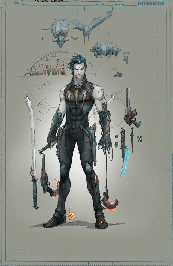
Online backlash to DC Comics' younger and slicker "new look" for Lobo may have been a little premature, as writer Marguerite Bennett assures fans the lewd and violent interstellar bounty hunter "is much bigger, meaner and nastier" than the concept art would lead them to believe.
In fact, she contends the character that appears in September's Justice League #23.3: Lobo one-shot doesn't look like the Kenneth Rocafort design unveiled Friday on the DC blog, or the Aaron Kuder cover.
"I was not in charge of the Lobo redesign. Ben Oliver was not in charge of the Lobo redesign," Bennett wrote in a blog post that's since been deleted. "I wrote my script, and after it was completed, I was shown what the new character would look like. For the record, the images you’ve seen — Ken Rocafort’s design and Aaron Kuder’s cover — are not what Lobo actually looks like in the book. I respectfully disagree with the decision to release that image."
In introducing the "new look," DC Comics Editor-in-Chief Bob Harras explained that this version of the character is "the real Lobo," as opposed to the one that made his New 52 debut in Deathstroke #9. "A ruthless killer, Lobo is on a quest to kill the man who has taken his name," he wrote before explaining the new design: "Ken updated Lobo’s facial tattoos and weaponry by adding laser edges to his blades and gloves that’ll give him extra strength with their mechanical usage. In the end, Ken transformed Lobo into a lean, mean killing machine."
While echoing the latter sentiment -- "He's nasty, vicious, and bloody, but he's always had a certain violent charm" -- Bennett underscored on Twitter that, "The image circulating is a concept illustration. Our Lobo is much bigger, meaner, and nastier."
Justice League #23.2: Lobo goes on sale Sept. 11.
(via ComicsAlliance)


