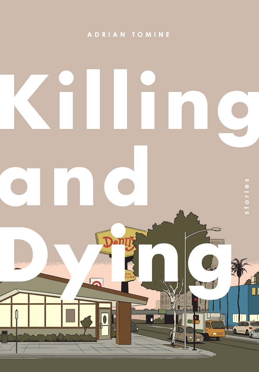
Adrian Tomine's latest book, "Killing and Dying" (available October 6 from Drawn & Quarterly), collects issues 12-14 of his comic series "Optic Nerve," and a reworked and retitled story from "Kramers Ergot" #7.
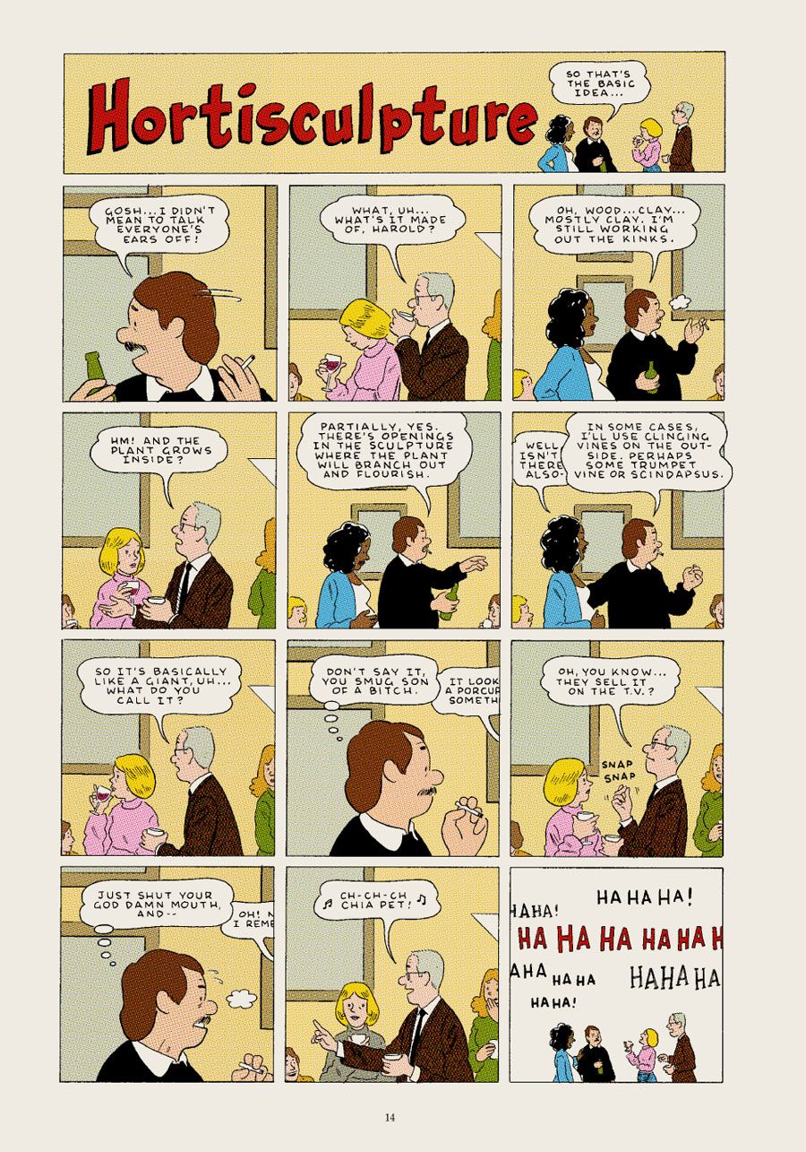
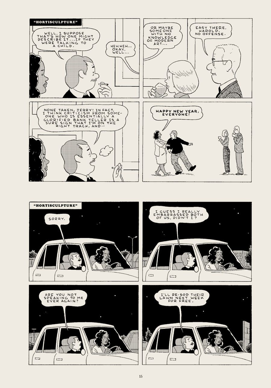
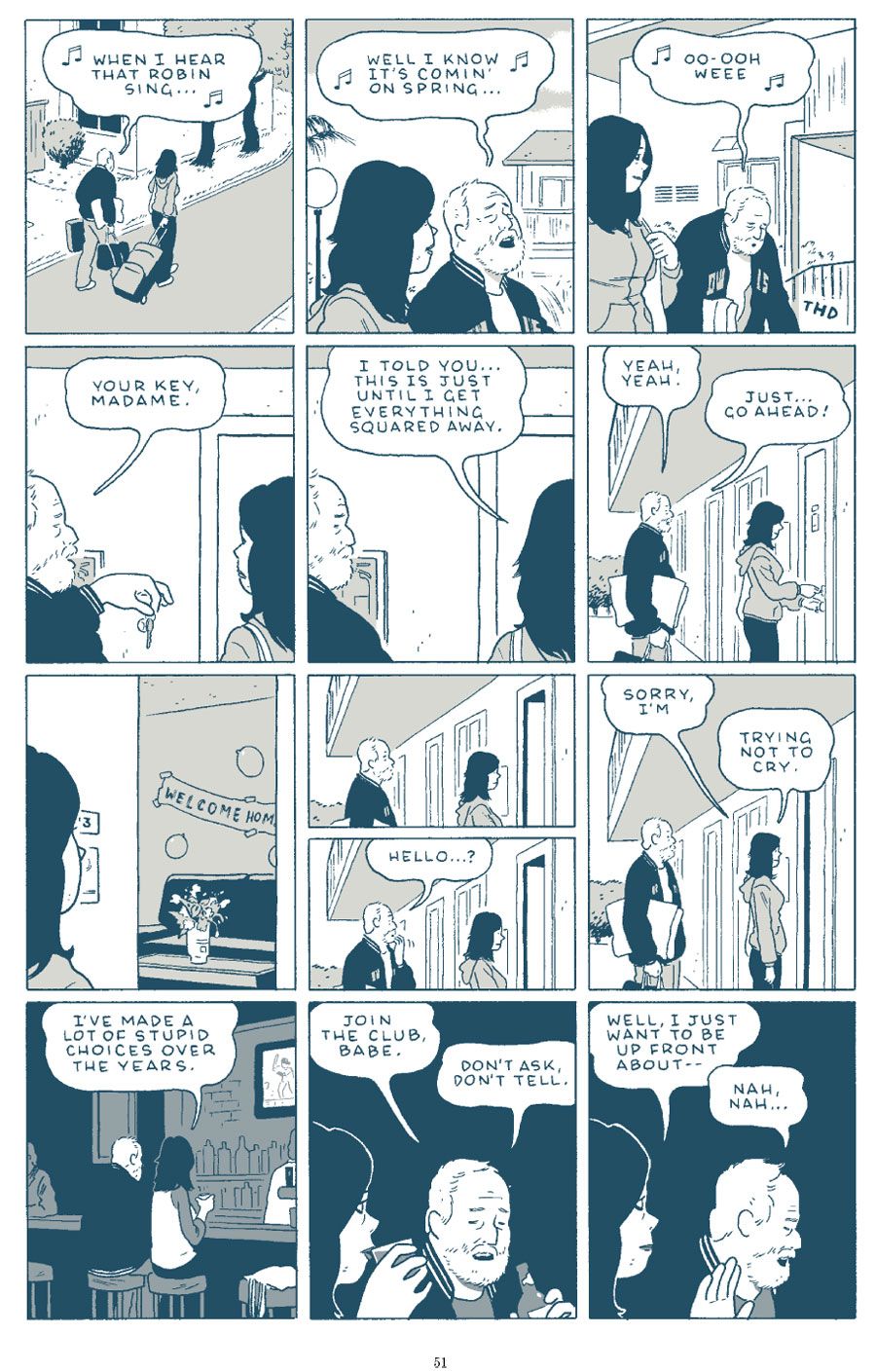
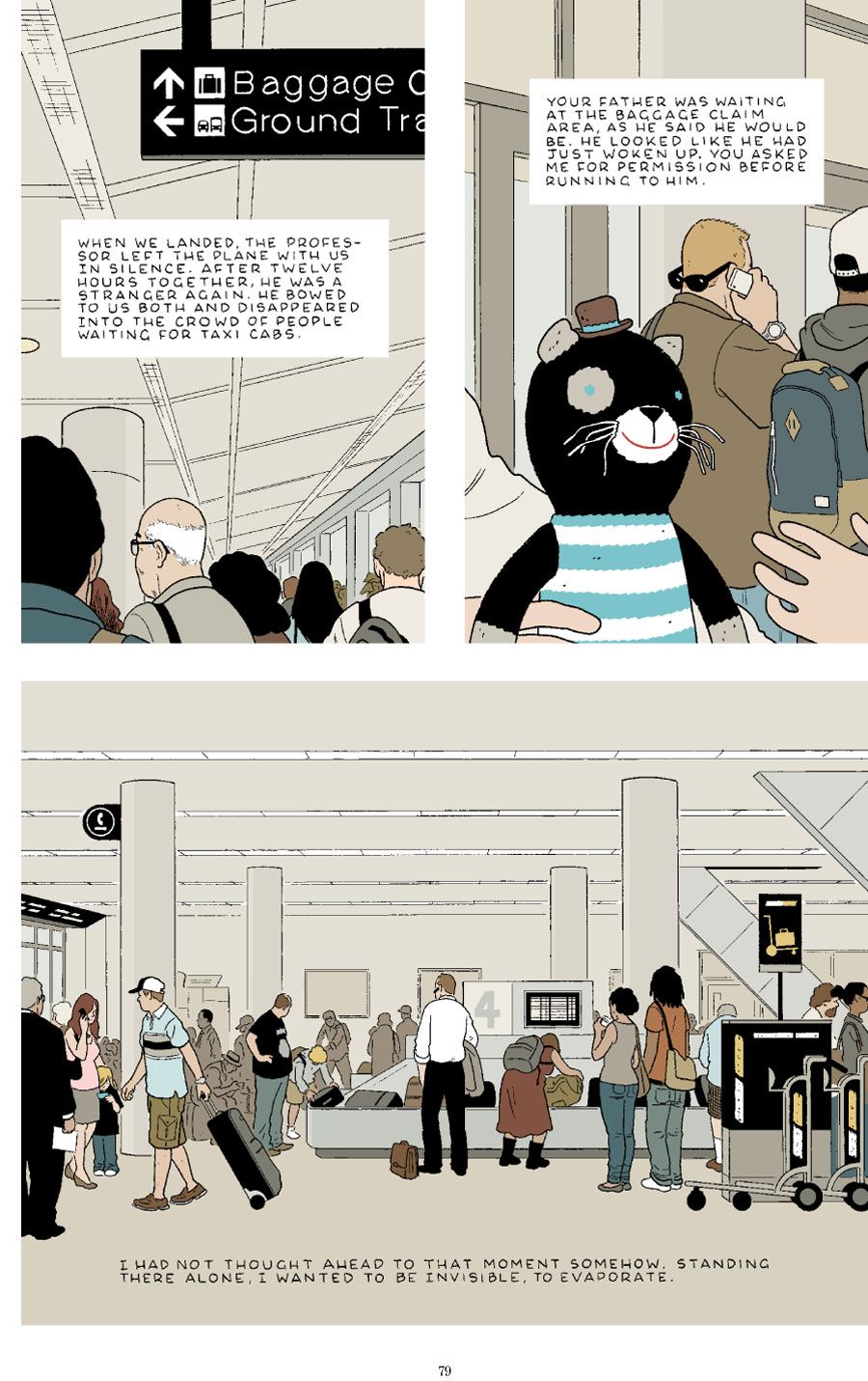
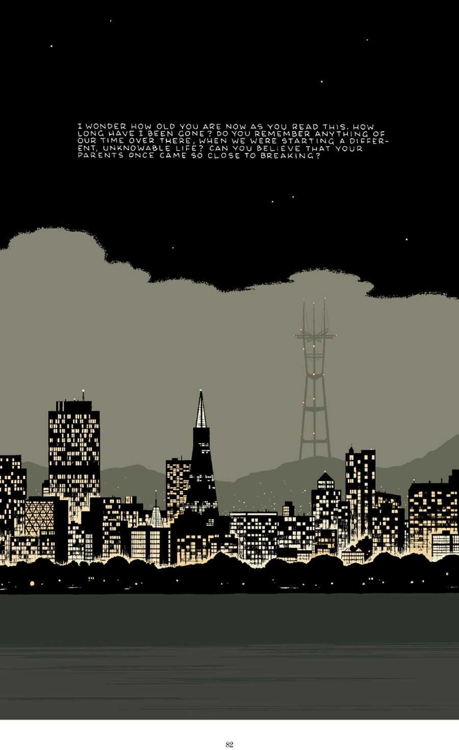
In short, "Killing and Dying" presents six of Tomine's most ambitious short stories to date. While longtime fans will appreciate the mistaken identity of "Amber Sweet" and the sordid relationship of "Go Owls," or the title story's awkward familiar dynamics, Tomine also branches out artistically from previous comics with the impressionistic, illustrative "Translated, from the Japanese" and the comic strip-styled "A Brief History of the Art Form Known as 'Hortisculpture.'"
CBR News spoke with Tomine about challenging himself as an artist, the stories that happen behind the story you're reading, and how fatherhood has affected the way in which he approaches his cartooning.
CBR News: You're usually such an invisible cartoonist -- no obvious bells and whistles beyond a good story and good artwork -- so I was struck immediately by "A Brief History of the Art Form Known as 'Hortisculpture.'" Why did you decide to approach that story in the form of a daily newspaper strip, complete with -- not quite a daily punchline, but certainly at least a sense of ironic conclusion to each "day"? And with color Sunday pages!
Adrian Tomine: I think it was mainly a reaction to having been locked into a very specific drawing and writing style on "Shortcomings." I knew that I wanted a little more freedom in that regard with this book, and I happened to be reading a lot of comic strip reprint books at the time, particularly "Annie" and "Gasoline Alley." I was also inspired by the cartoonist Jonathan Bennett, who did a story like that for "Kramers Ergot." It was so well done, and then they didn't even end up using the whole thing, so that rhythm of a bunch of black-and-white dailies punctuated by a big, color Sunday strip was lost.
I think it's just a really effective way to convey time passing without having to show a lot of unnecessary events or using a lot of narrative crutches, and it made sense that this particular story would be essentially made up of a lot of little, embarrassing, funny moments.
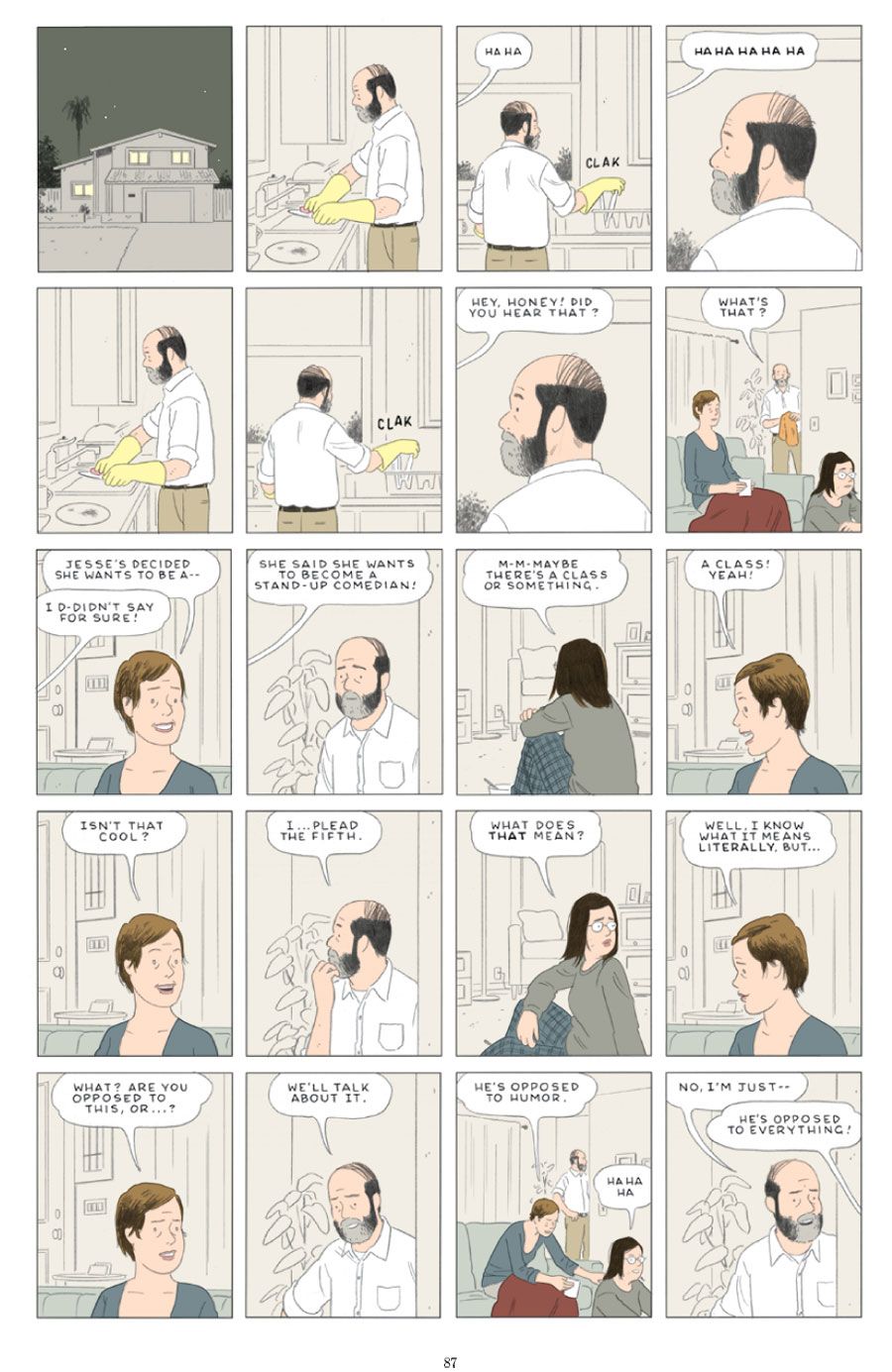
The title story "Killing and Dying" is very powerful. The mother's illness is very understated, progressing through the background while the daughter's life is the focus of the narrative. Others might've focused on the big dramatic sickness, but that's not the focus in this story, is it?
There's a few common threads that run through the stories in this book, and I think one of them is this idea of narrative misdirection. I hope the stories are interesting in their own right, but I kind of had this idea that a lot of the stuff that the stories were really "about" was happening off the page, or even between the panels.
You have two daughters now, correct? While your comics are fiction, you've said that your life reflects itself in much of your work. How much of "Killing and Dying" grew out of learning to relate to them?
Yeah, I have two daughters, and I'm sure that these stories wouldn't exist without their influence. To some degree, everything about the book, even down to the short story format, is a direct response to having them in my life. I have to stop myself from getting too sentimental here, but I've definitely learned a lot from them.
"Go Owls" is interesting, because it sees an addict moving away from substance abuse, but still making questionable relationship choices. It seems to suggest that relationships can have a similar role, a user and a used, doesn't it?
I'm not sure that either character is really moving away from substance abuse, although maybe it's a matter of degrees. We don't really know for sure what either character's life was like before that opening scene, do we? But yes, there are many questionable choices that both characters make throughout that story, almost in every panel!
How does the color scheme for each story come to you? "Amber Sweet" and "Translated" feature somewhat more natural coloring -- still comic book flat, but relatively representative of reality -- while other pages are in black & white or, like "Go Owls," in a simple monochromatic scheme.
It's a combination of thinking about what's appropriate for the story and also trying to arrive at a somewhat diverse-looking book. I think the top priority for me when I'm making aesthetic choices like that is, "Is the story clear and readable?" For some stories, like "Go Owls," it would've been too dense and muddled if I did really realistic, detailed coloring in every panel. But something like "Translated" had enough breathing room for me to kind of go nuts and treat each panel like an illustration.
The story "Amber Sweet" is different from the version that appeared in "Kramers" -- were any of the other stories modified from their initial publication? Is it hard to resist the opportunity to tweak your past stories when they're compiled for book publication?
There's a bunch of little changes and corrections in the book, but I'm fairly certain that no one will ever notice them. And yes, it's definitely a temptation to go down the rabbit hole of endless revision, but I know myself enough to set some limits. Otherwise I'd probably still be revising and correcting the stories from my first book.
What's next for you?
Nothing I'm ready to talk about just yet. It's a nice feeling to finally finish a project that I've been slowly chipping away at for many years, so I'm kind of relishing the sense of freedom I have now.

