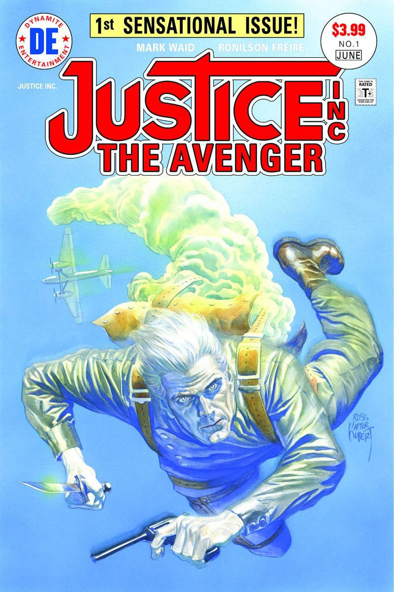
Billed as "the pulp hero [Mark Waid]'s waited his entire lifetime to write," the debut issue of Dynamite's new "Justice, Inc. Avenger" is steeped in throwback storytelling styles, right down to the cover, where Alex Ross homages the DC Comics series of the 1970s. Waid's script is full of purposely over-the-top narrative boxes that revel in offbeat situations from the pulp revivals of his youth. There are genuinely funny moments in this period piece, like the elderly woman more shocked by a chemist kindly serving a minority couple than she is by his inventing mad science in the parlor. Little touches like this remind readers that Waid is in on the comedy and balances the dark, odd turns the book takes.
Ronilson Freire illustrates the issue in a style reminiscent of mid 2000s DC house style; it's fluid and readable even in chaos, like the train fight that opens the issue, but lacks any real cartooning. It isn't bad, but the realistic style he uses does take away from the goofier elements of the story, like the Clarinetist, a criminal that uses a sonically weaponized clarinet. It enhances the gorier elements, though, like the Ghost, a villain whose skin is invisible. Freire also has an uphill battle illustrating a series whose lead has a bleach-white face that is incapable of emoting, aka the Ultimate Goth.
Part of what's enjoyable is the palpable glee with which the weird ideas are thrown at the page. Part of making a period comic involves tapping into the tone of those stories, warts and all. The book hits readers over the head with much of its information and overdramatizes smaller moments of terror, because that's what books of that era did. Waid is a gifted writer, adept at creating stories in just about any voice. He opens the series in classic spy style -- with big exploding train action -- and slowly lets the weird seep into the story; by the time readers get to the full page reveal of the Ghost, the tone has been established to expect some strange shenanigans. It's understandable if Waid is indeed writing based on the DC Series; it was so strange for the time that it lasted four issues, illustrated by Jack Kirby at the tail end of his full-time comics career.
Everyone does good work but the whole doesn't quite yet gel. Maybe it's a tone difference; it's a 70s script with a more modern art style. In that light, it's understandable that the art seems to be a little off from the script. Marco Lesko's color follows Freire's lead, the palette and texture hewing closer to the current era and less to the flatter styles of the past. Fans of either creator will definitely have something here to enjoy.
"Justice, Inc. Avenger" #1 does its best to recreate a bygone era of pulp translations for a new era. Readers ready to have some fun with some old-school storytelling will get a kick out of the series.

