Marvel's June and July solicitations have been out for long that their August solicits are out, too, so let's make some prejudgments for all three month's worth of comics based just on the covers (as we all love to make prejudgments, don't we?).
To save on your load times, I'm breaking them into three parts!
Here's July!
___________________________________________________
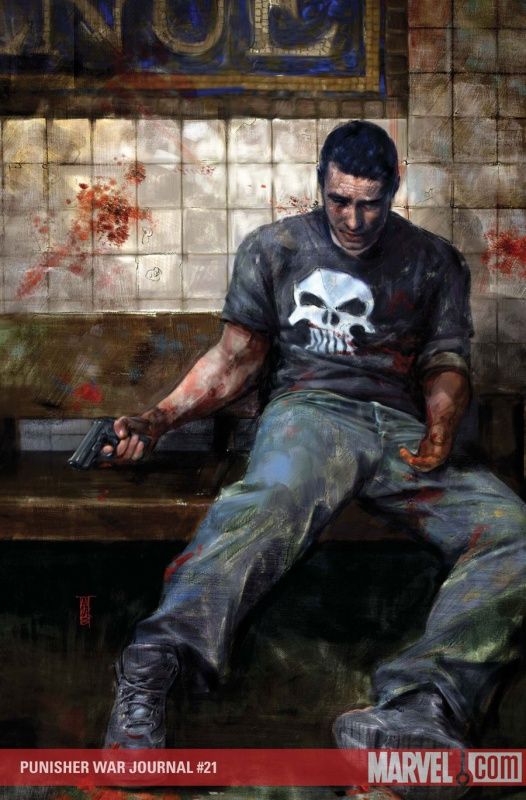
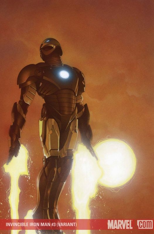
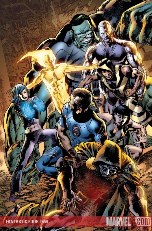
I think Alex Maleev does a fine job with the storytelling on this cover.
___________________________________________________
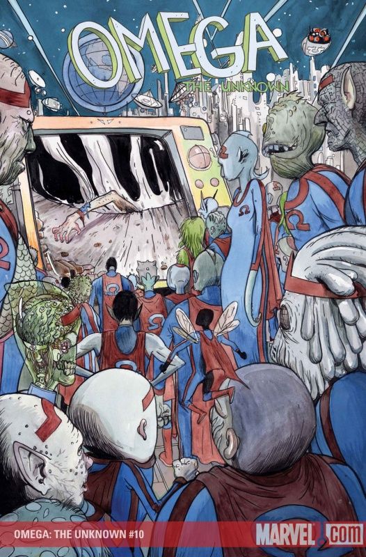
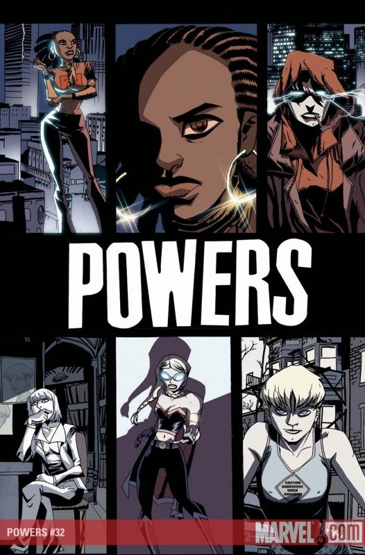
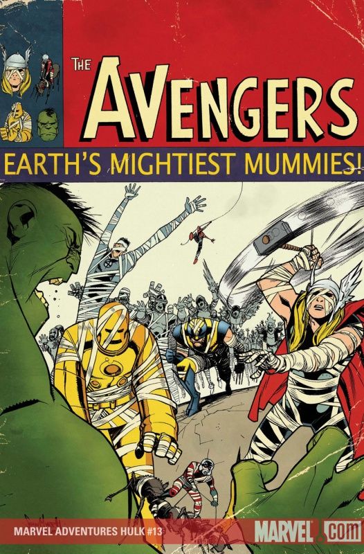
I love seeing Farel Dalrymple just cut loose and come up with crazy concepts!
This is a fun cover.
___________________________________________________
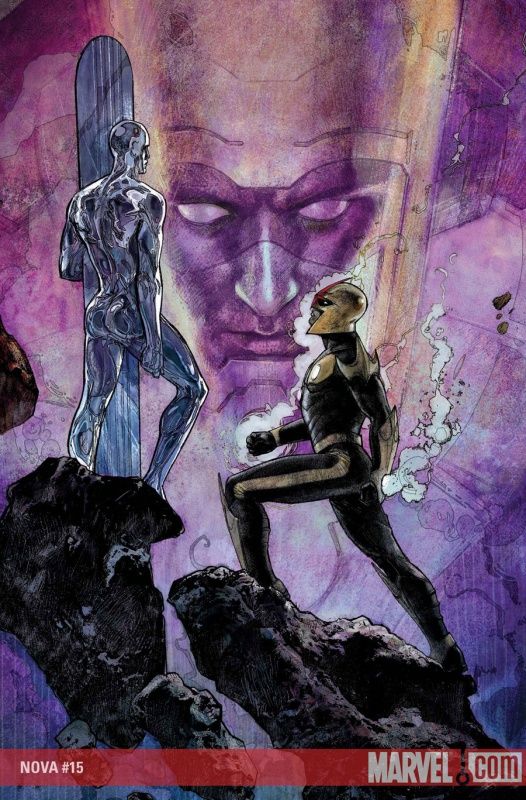
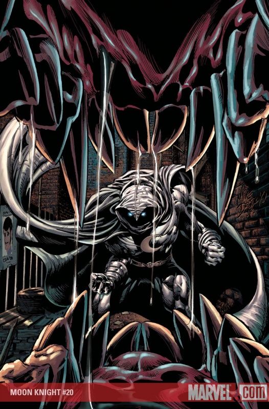
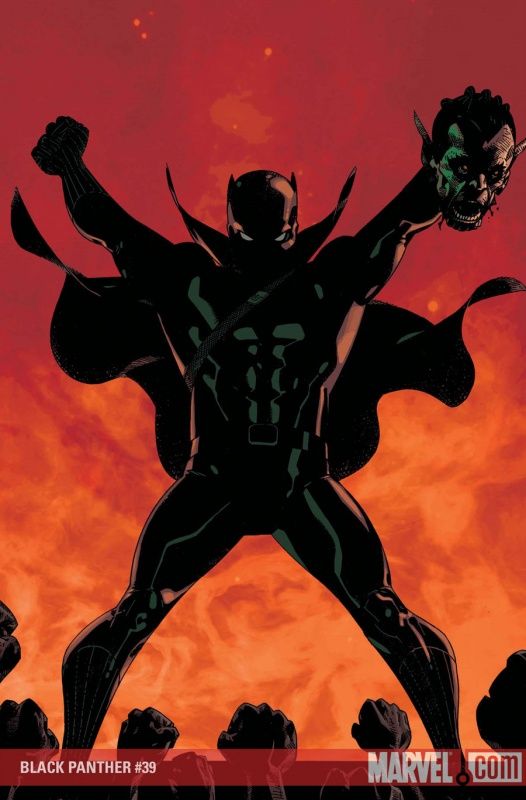
Not as imposing as his previous cover, but still a strong cover by Maleev.
I especially like the use of shadows.
___________________________________________________
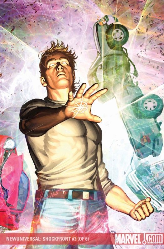
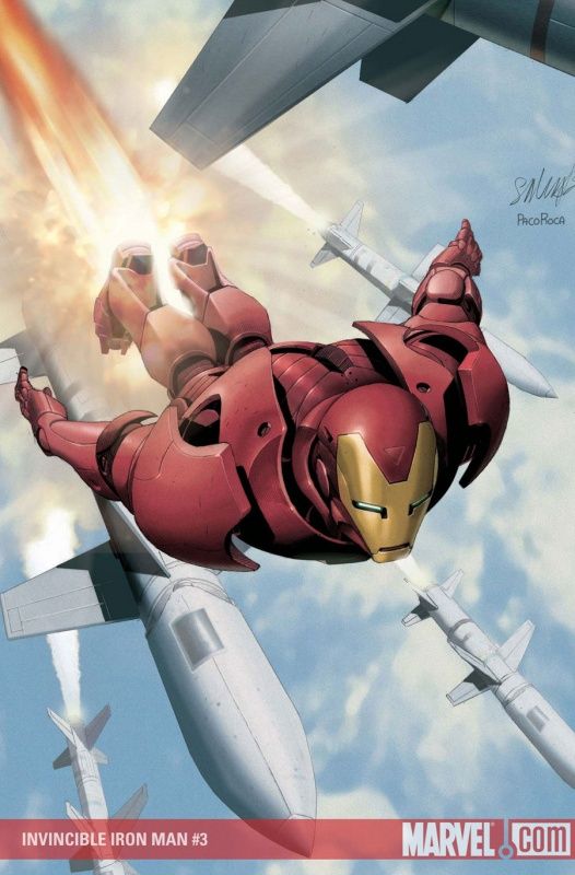
A little too stiff of a cover for me by Brandon Peterson.
I remember him being a better artist when it came to human figures during the 90s, but for the past decade or so, he seems to be not as strong in that area - with his best work being done with non-human figures (his Iron Man drawings are quite good, for instance).
___________________________________________________
I think Peterson does a better job with the character work on this cover.
The characters give off a bit more detail here.
___________________________________________________
An homage, but a well drawn one by Nic Klein.
___________________________________________________
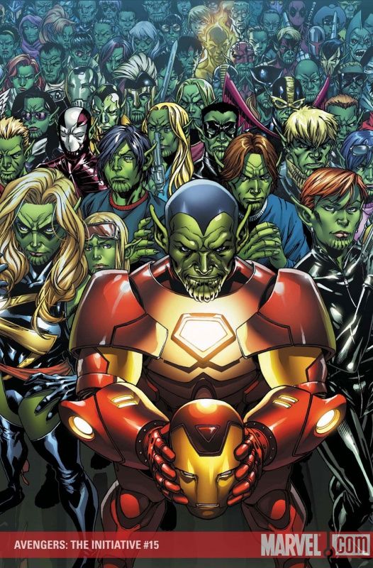
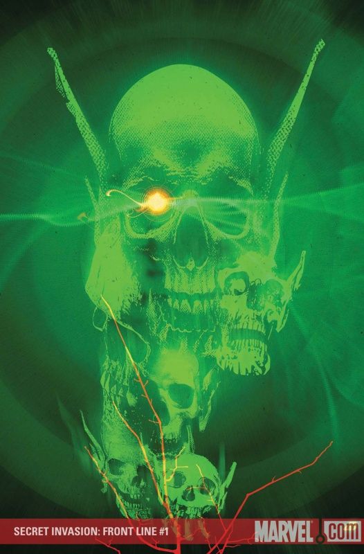
I'm sorry, fellas - while Aleksi Briclot, Marko Djurdjevic and Mark Brooks did otherwise fine work (particularly Briclot and Djurdjevic), Skrull homage covers are automatic fails.
___________________________________________________
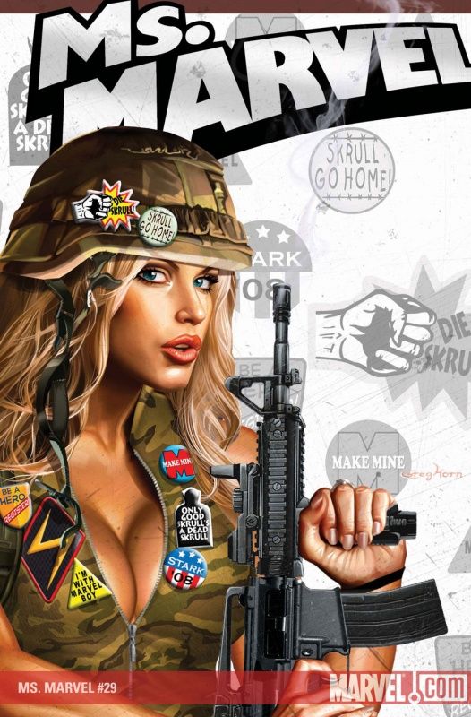
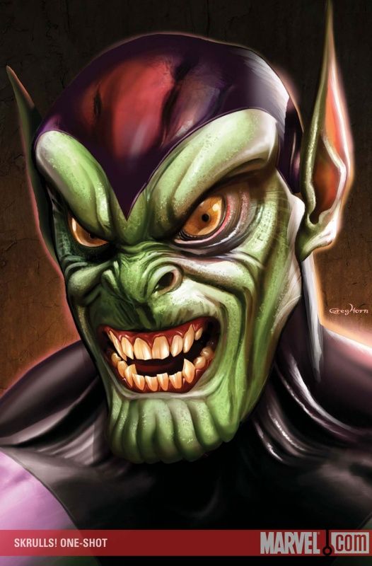
I don't like this Greg Horn cover (dude, what's up with the cleavage? Totally strange there), but hell, at least the man is trying original ideas!
___________________________________________________
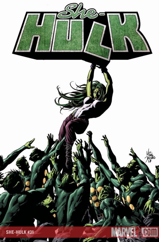
Pretty good cover by Deodato.
Odd perspectives are always fun!
___________________________________________________
It's a bit of a disappointment to see so many Paolo Rivera covers where he is BURSTING with energy and then have the finale of the series be such a restrained cover.
Nice drawing by Rivera, though!
___________________________________________________
Kind of a thrown together cover here by Dave Wilkins.
___________________________________________________
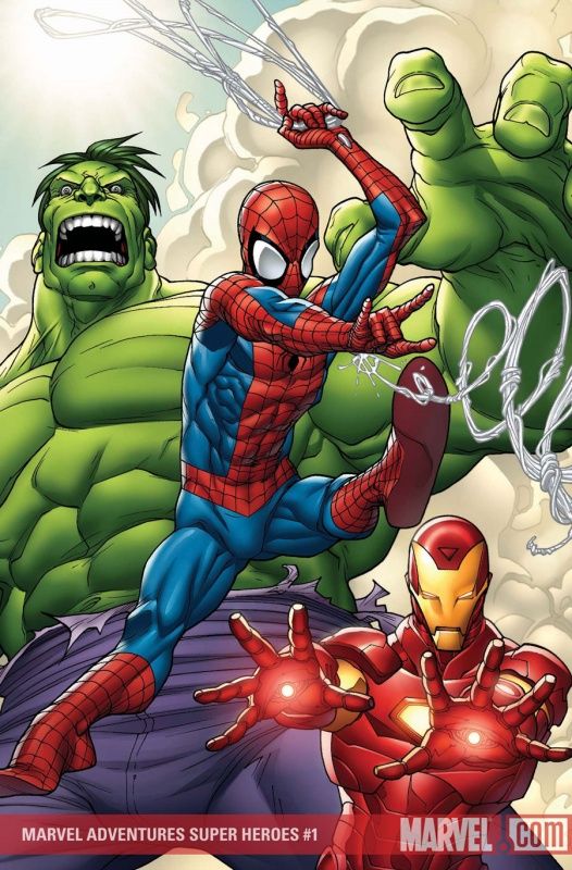
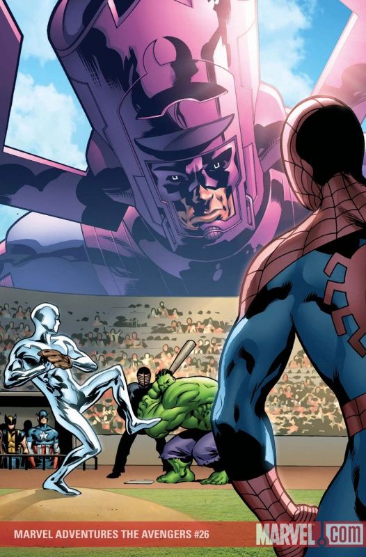
I hear that this book was originally going to be titled Marvel Adventurs: Spider-Man, Iron Man and Hulk.
Wouldn't that have just been the best name ever?
Pretty good Roger Cruz cover, although I'd love to know what Spider-Man is swinging from.
Maybe he's swinging from a star, like the theme song to Out of This World (which was a cover of a Bing Crosby 1944 classic)!!!
___________________________________________________
I dig me some Sean Murphy, but while this is a fine drawing, I think it is a bit too restrained to work well as a cover.
You gotta stand out a little more.
___________________________________________________
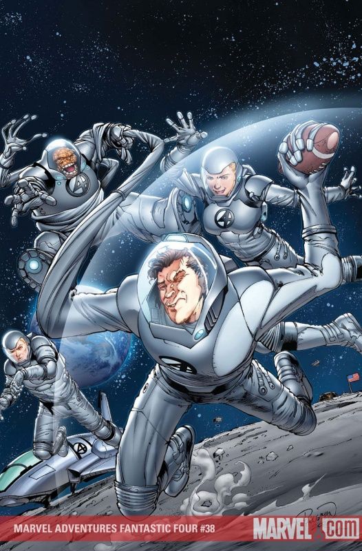
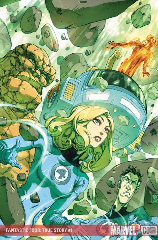
Man, Sue could really be an AWFUL prankster if she wanted to, couldn't she?
Think of all the pranks involving plastic wrap - now imagine the same pranks with an invisible force shield?
You'd always be tapping the toilet bowl before you go!
Fine cover by Carlo Pagulayan.
___________________________________________________
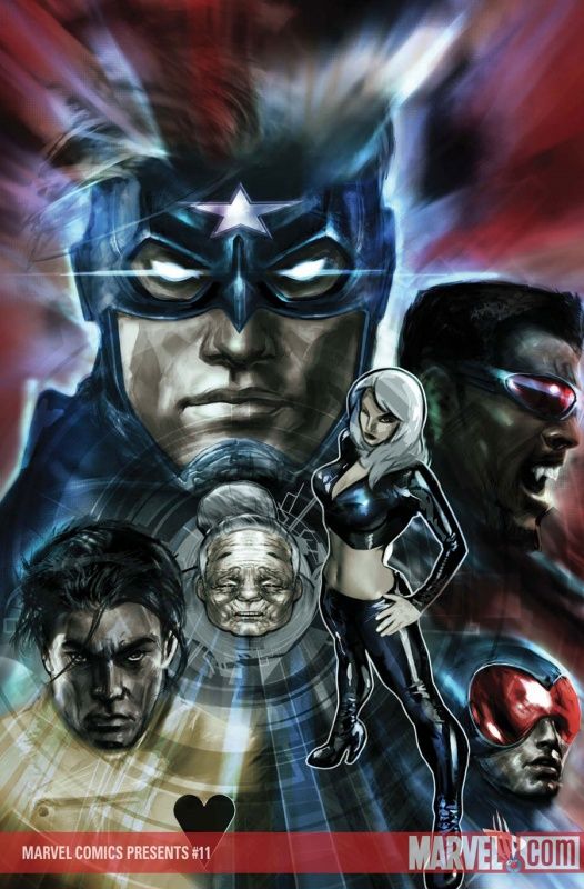
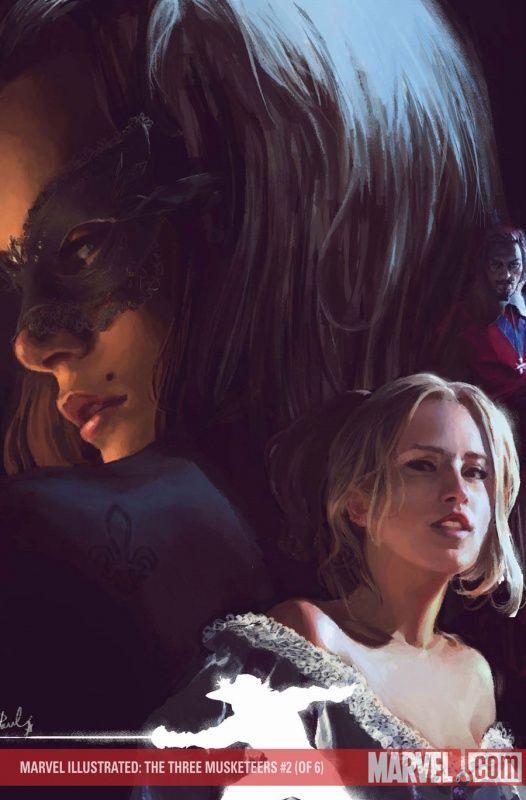
Gerald Parel really pulls off photo-realism in his work - the character's faces may be taken from a photo (I dunno if they are or not), but they really work for his covers.
___________________________________________________
What Marvel universe character is the blonde woman on this Tommy Ohtsuka cover an analogue of? Carol Danvers? Gwen Stacy?
She shouldn't trust Proctor - he is a liar!!
I'll keep making Proctor jokes as long as Ohtsuka keeps drawing him like Proctor!
___________________________________________________
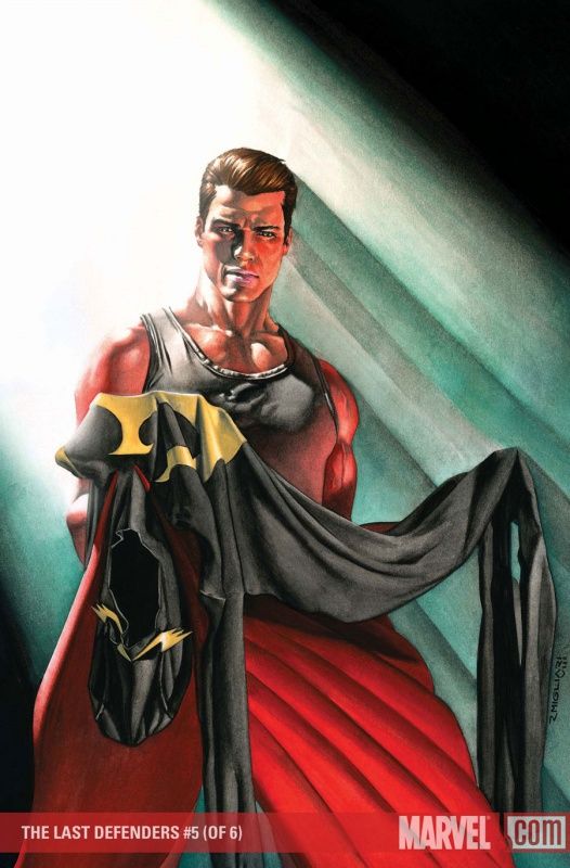
Cool cover by Rodolfo Migliari!
___________________________________________________
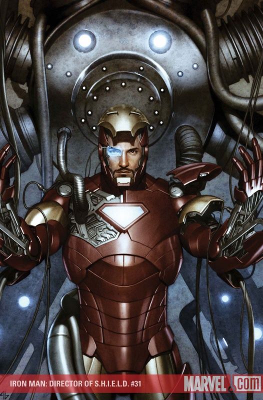
Adi Granov!!
Sorta kinda sorta kinda adding some uniqueness to his Iron Man cover!!
___________________________________________________
Don't worry, Travis Charest and Salvador Larocca are right back to the generic Iron Man covers that we know and love so much!
___________________________________________________
Nice Lim cover.
I dig the mystical marks.
___________________________________________________
Gotta give Travel Foreman credit - he certainly has a way of making an entrance!
___________________________________________________
Too much of a "panel" cover by John Romita Jr. for me.
Heck, this wouldn't even be much of a PANEL.
___________________________________________________
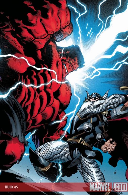
I'd love it if either Jeph Loeb or JMS could write both Hulk and Thor, because then we'd have this hilarious fight where they would try to make each character look bad so that the other character would look good - it would be like commanding a robot to harm a human.
Fine cover by McGuinness, although I think I'd like the action on the cover to be expressed a bit sharper - make it EVIDENT that Thor is calling down lightning to hit Hulk. That is not evident on the cover, and it is such a cool idea that it'd be a better cover if it WAS evident.
___________________________________________________
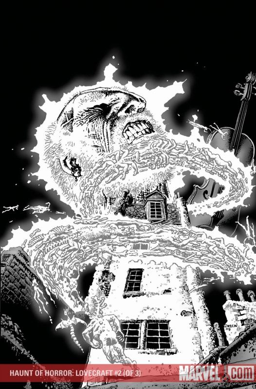
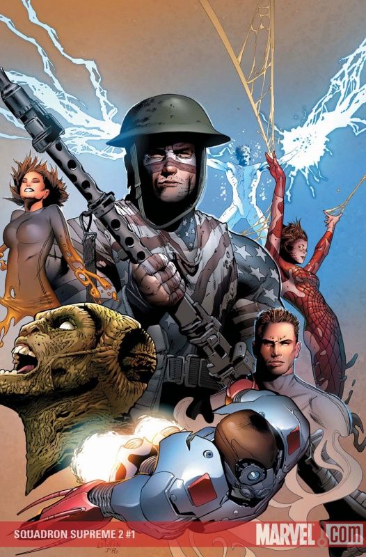
Strong issue two cover by Corben.
___________________________________________________
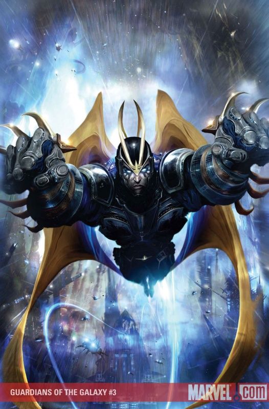
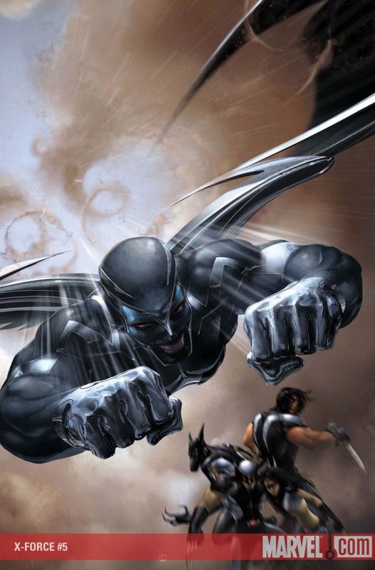
Holy cow!
Is that Archangel from this month's X-Force?!?
Can't say that I'm a fan of that Clint Langley cover for Guardians of the Galaxy - I don't love Clayton Crain's X-Force cover, either, but it has a lot more spirit to it.
___________________________________________________
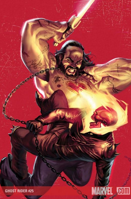
I love how much energy Djurdjevic brings to a lot of his covers.
I don't exactly love the cover, but look at the subjects of the cover - it Ghost Rider fighting just some dude - it is a testament to Djurdjevic's talents that he made this fight look THIS interesting!!
___________________________________________________
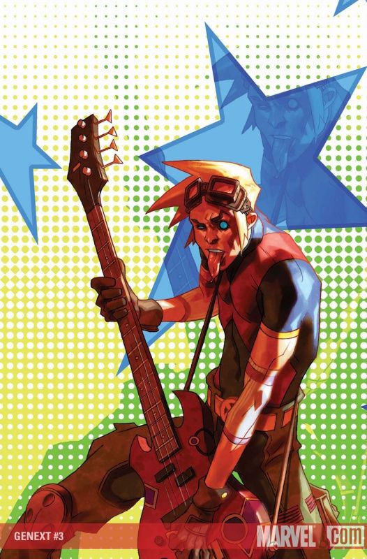
Doug Alexander continues to give his cover characters a ton of personality.
___________________________________________________
Suitably imposing Tomm Coker cover - although with Paul Azaceta doing the interiors, why not just let Azaceta do the cover and have Coker do another book?
I assure you, Paul Azaceta can pull off "imposing" for a cover - so just let him do it and use Coker on a book with a bad cover artist.
___________________________________________________
Wild angles, Hitch!!
___________________________________________________
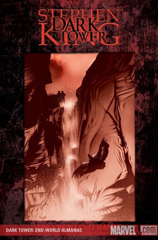
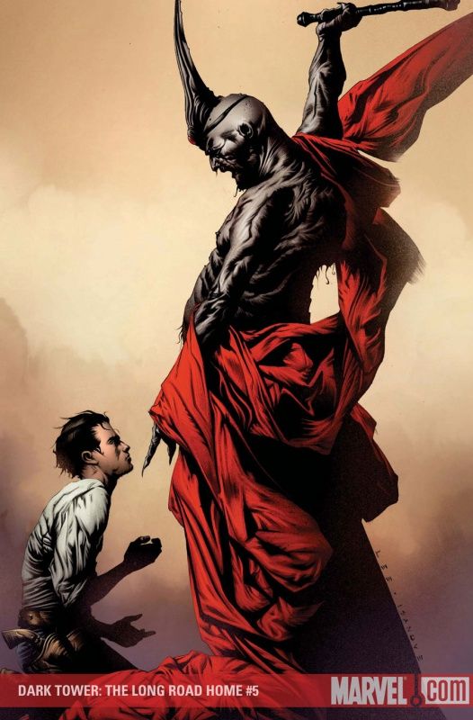
I'd like to visit this Dark Tower after seeing this travel brochure cover!!
___________________________________________________
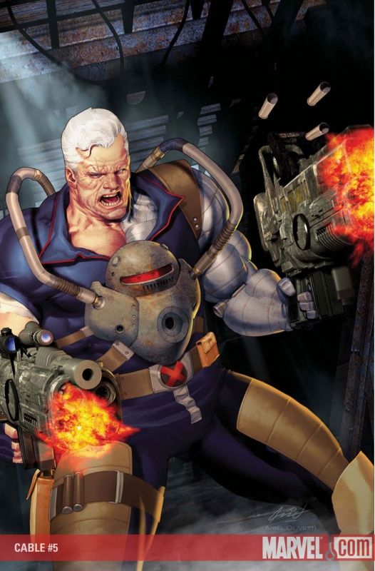
I like how it took Cable this long to decide to armor the baby.
And I also like that Olivetti still thinks babies are the size of kittens.
___________________________________________________
Cool Jason Pearson cover.
___________________________________________________
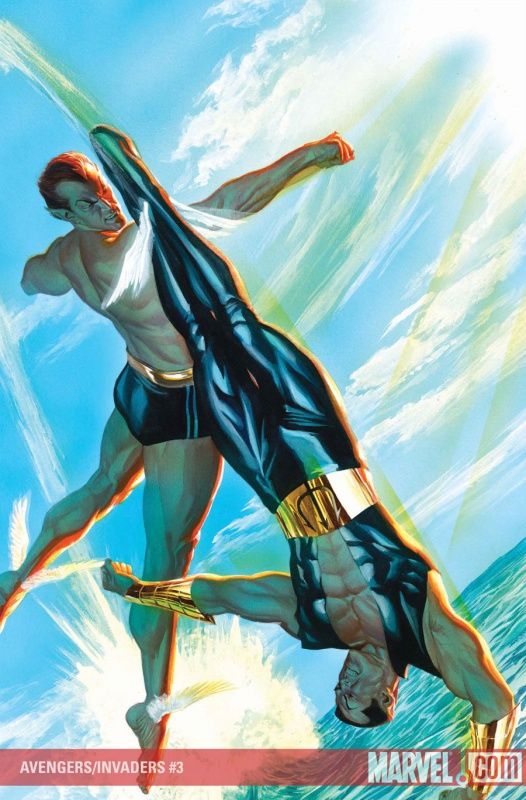
Nice piece of work by Alex Ross.
One of the finer examples of aerial fighting I can think of - showing someone swinging like they're actually in a fight but showing the flying avoidance of that punch, too - good stuff.
___________________________________________________
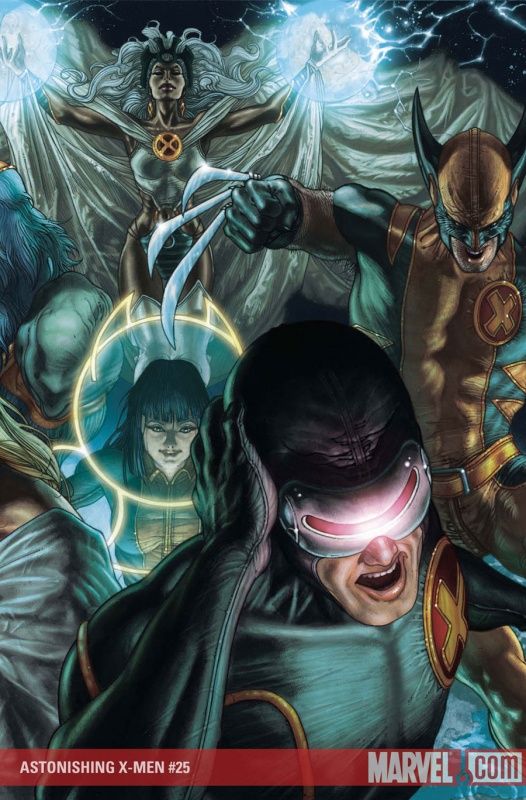
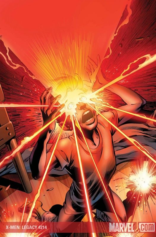
Simone Bianchi's overdetailing gives Cyclops a headache.
I can sorta relate.
___________________________________________________
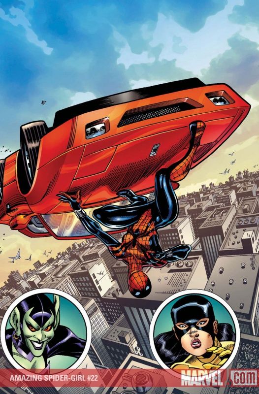
Ron Frenz knows what all people know deep in their hearts.
Flying cars are cool.
___________________________________________________
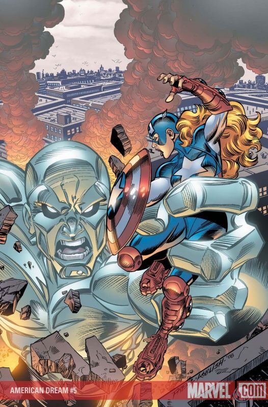
Ron Frenz is mistaken, though, in thinking giant crystal men are cool.
That was 1997.
It's Giant Crystal DOGS that are cool now.
___________________________________________________
There's a fine line between an intriguing cover and a "that's just weird" cover.
I think this is just a weird Spider-Man cover by Jimenez.
___________________________________________________
It's funny - I really dig a lot of the Dodsons' work on this cover.
The background stuff is spot on - their Sunspot is spot on - but the main foreground fight seems off - what is actually happening?
Are they swinging and missing? Is the other guy swinging and missing and flying?! I don't get it.
___________________________________________________
Am I wrong, or did Alan Davis do a very similar cover in the past? Maybe with Apocalypse and Cyclops or something?
Anyone know what I'm thinking of?
___________________________________________________
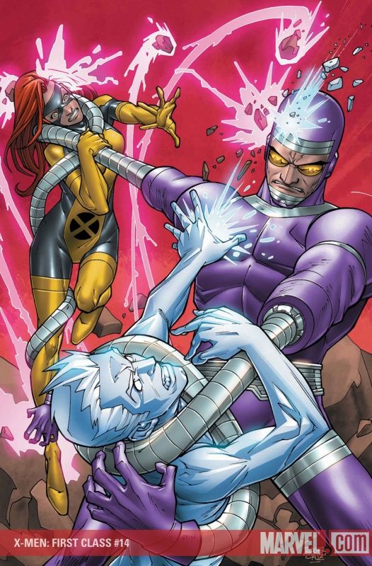
Jeff Parker better watch his ass - if Machine Man doesn't talk like in Nextwave, Burgas will be pissed!
And yes, X-Men First Class is set in the past, but, well...so's your face!!!
Good Roger Cruz cover.
___________________________________________________
Sorry, Boo Cook - drawing the cast of a book as Skrulls is only cool once, not for the umpteenth time.
___________________________________________________
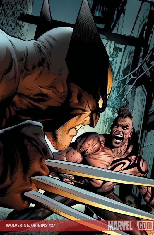
A decent Wolverine Origins cover by Land, except for the fact that Daken is in it, which results in the subtraction of many cool points.
___________________________________________________
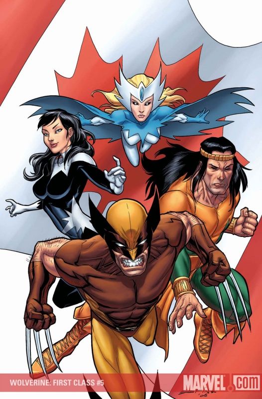
Pretty good Salvador Espin cover, although Van Lente better watch his ass - I'm sure this issue will contradict SOME Alpha Flight continuity some how - few teams as minor as Alpha Flight have had their continuity examined as much as the Alpha Flight folks.
___________________________________________________
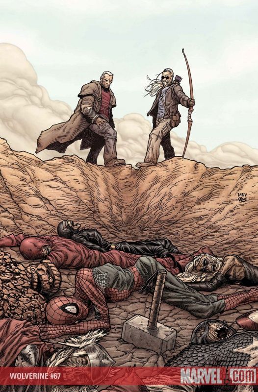
Strong McNiven cover for Wolverine.
How many fans saw this cover and said, "SEE! CAP COMES BACK!! PROOF!!!"?
___________________________________________________
Wolverine must have just seen his haircut for the first time!
Decent Gabriele Dell'Otto cover.
___________________________________________________
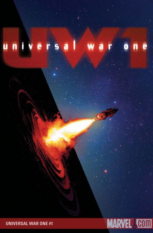
Interesting Denis Bajram cover for Universal War #1.
___________________________________________________
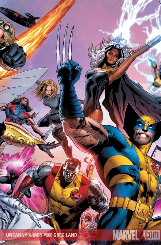
Covers featuring a lot of people are usually the worst thing for Land - the more people on a cover, the worse it gets, as he tends to fall back on uninteresting poses and less than subtle swipes.
___________________________________________________
Stuart Immonen is awesome, but even he can't make the Beetle look cool.
___________________________________________________
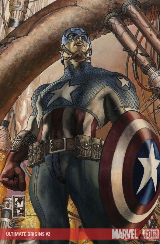
Yes, Simone Bianchi, that IS Ultimate Captain America.
___________________________________________________
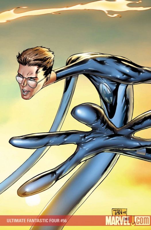
His Mr. Fantastic part of the quadtych is the best so far for Billy Tan.
___________________________________________________
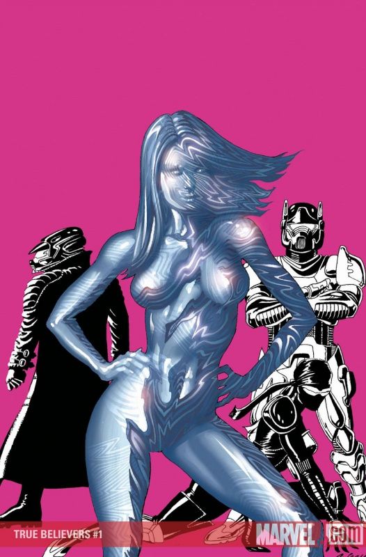
I don't know what amuses me more - the main character of a book called "True Believers" facing front or Paul Gulacy hiding everyone's face!
I think it is the former, but the latter IS funny.
___________________________________________________
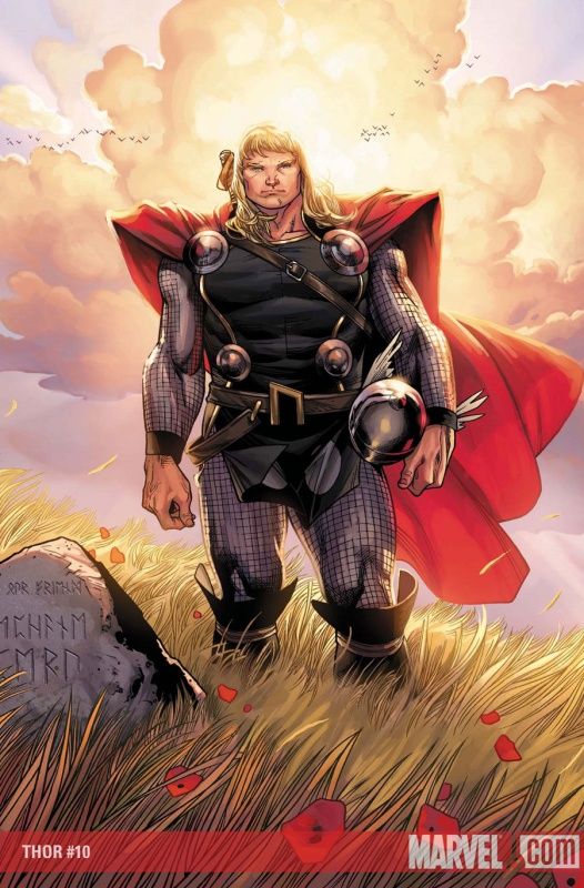
I think there are better ways for Olivier Coipel to get across a contemplative Thor that would have made for a more interesting looking cover.
For one, he could have tried some different perspectives.
___________________________________________________
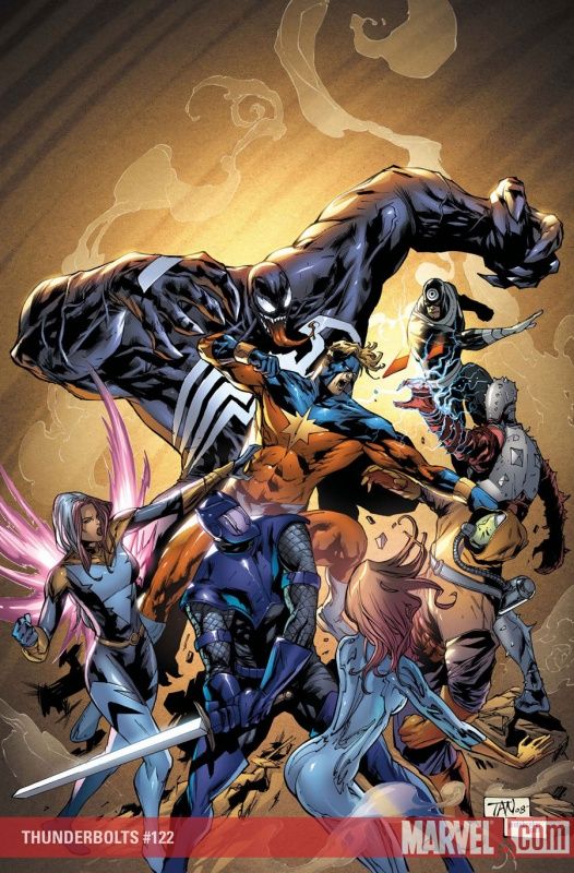
Yikes - first the book loses Ellis and then it loses Djurdjevic's covers?!?!
HARSH!
Not one of Tan's better covers.
A weird design mixed with odd anatomy choices - Captain Marvel's body does not seem to make sense, exactly.
___________________________________________________
See what I mean?
Less people is better, Land!! LESS!!
___________________________________________________
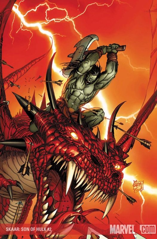
Pretty sweet looking Skaar cover by Ron Garney.
___________________________________________________
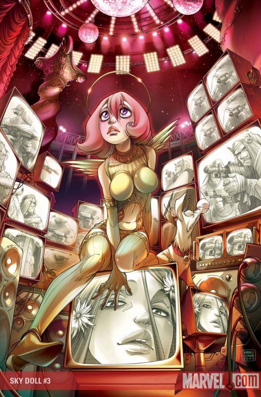
The details really make this Alessandro Barbucci cover.
The screens are used to great effect.
___________________________________________________
It's weird - on the one hand, it's not a cover homage, but on the other hand, it's just a Skrull.
I guess it is easier to come up with cover ideas when you can just dress a lady up in sexy poses.
___________________________________________________
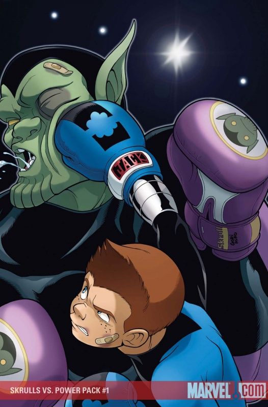
Cute cover by Gurihiru!
___________________________________________________
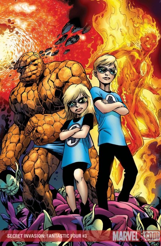
I've always said - Valeria Richards never gets enough of a chance to kick ass.
___________________________________________________
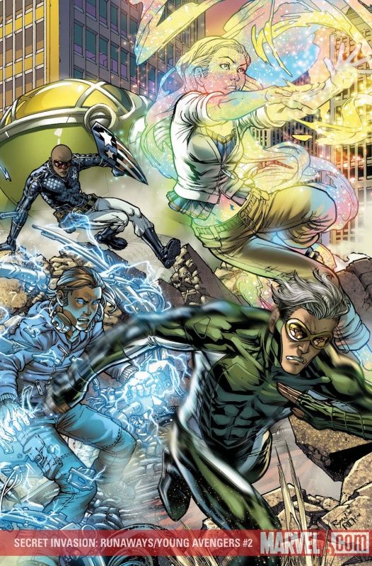
Another strong piece of the triptych by Michael Ryan.
I'm really impressed with the forcefulness of his work here.
___________________________________________________
I feel like this Juan Doe cover is trying to hypnotize me.
BACK OFF, COVER!!! My mind has been far too warped by reality television to be hypnotized!!
___________________________________________________
I worry for Christian's girlfriend that she is not on this cover.
Nice work by Oeming, by the by.
___________________________________________________
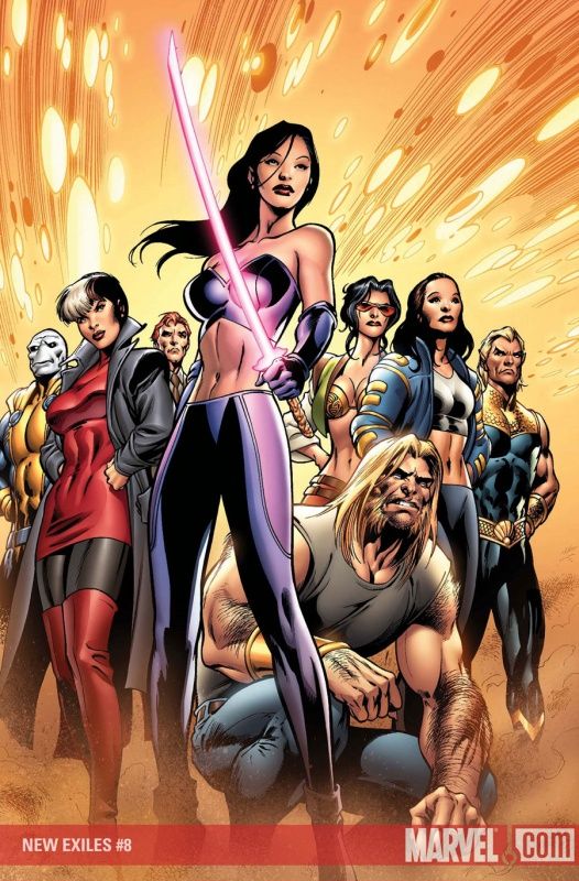
It's one thing when Sage's new costume looks silly when a bad artist is drawing it (like the latest issue), but it even looks bad here with Alan freakin' Davis drawing it!
So, yeah, get a new costume, Sage.
You looked classier when you were running around in a bodice and stilettos!
___________________________________________________
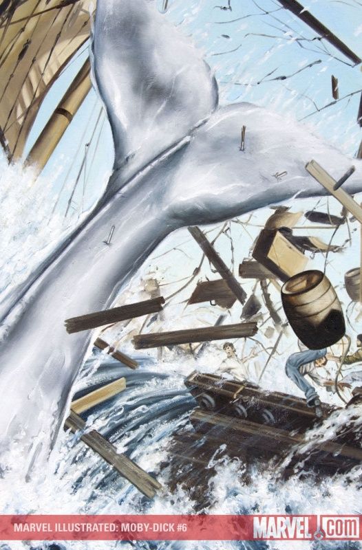
Great Moby Dick cover by John Watson - maybe he just needed to lose humans from the cover focus to deliver some dynamism?
___________________________________________________
Cool cover by Niko Henrichon.
I especially dig how FULL the cover is.
___________________________________________________
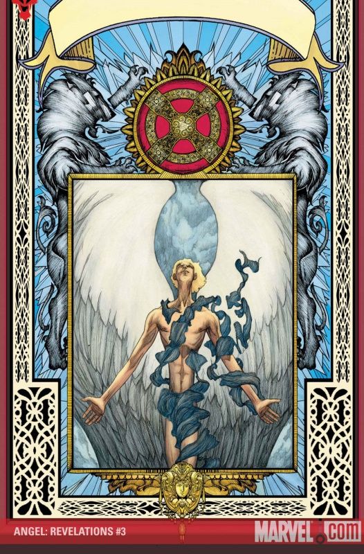
Adam Pollina puts it all together on this neat Angel cover.
The inner image is as cool as the ornate surroundings.
___________________________________________________
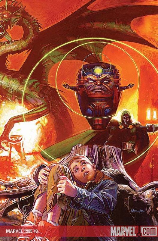
I like the way Tommy Lee Edwards captures the anxiety of the kid on this cover.
___________________________________________________
HONORABLE MENTIONS
___________________________________________________
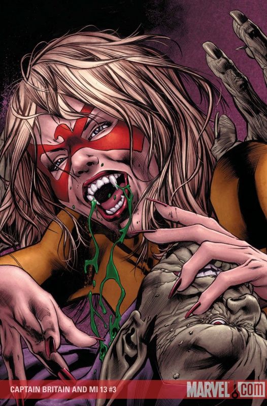
Totally bad ass Captain Britain cover by Hitch.
___________________________________________________
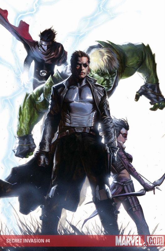
It appears as though Mike Deodato did not get the memo that your Secret Invasion covers are supposed to be either homages or just your regular cast as Skrulls!
So he gets extra points for trying something clever like this.
___________________________________________________
You can give some of those points to Gabriele Dell'Otto for his imposing (and not an homage) cover here.
___________________________________________________
Eric Nguyen is giving off a bit of a Joe Mad vibe on this cover - it looks nice.
___________________________________________________
Daniel Acuña has always been able to handle these bold type of designs - I just fear for his storytelling abilities.
But when it comes to strong, bold cover images - he's quite good.
___________________________________________________
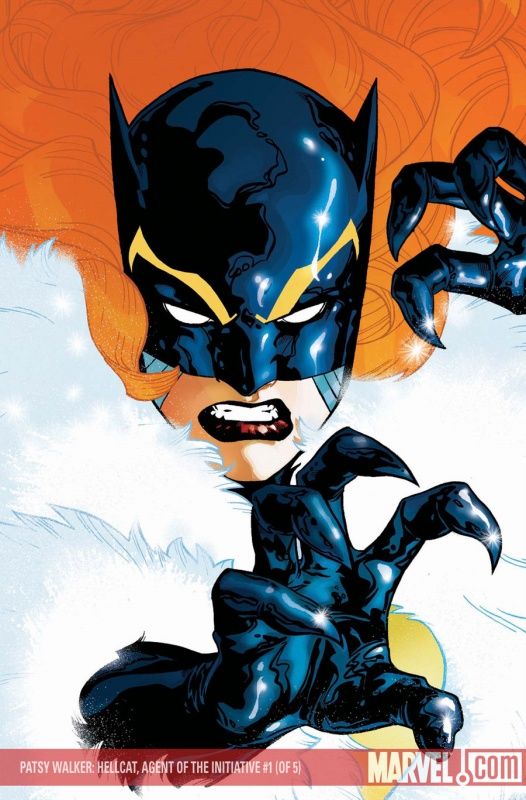
This Stuart Immonen cover is also a strong, bold cover - and while I enjoy how he worked in the book's concept (that Hellcat is heading up an Initiative team in Alaska, hence the fur coat) - I would have liked it more if it was clearer that was what is going on on the cover (that she's wearing a fur coat).
___________________________________________________
LOVE the use of negative space by Bradstreet.
___________________________________________________
Very cute concept by Leonard Kirk - it doesn't really do anything PAST the cute idea, but still - good enough of an idea for an honorable mention!
And to think, for a time, I was complaining about Kirk's Avengers covers being dull!
___________________________________________________
Djurdjevic uses the split screen here extremely well.
Strong images - great design.
___________________________________________________
Nice cover design by Jae Lee, but the characters carry the cover - very striking character poses.
___________________________________________________
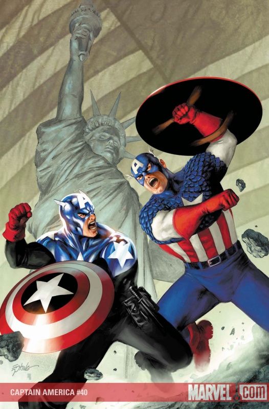
Very cool Cap on Cap fight by Epting.
Although, with Cap now carrying a knife, I think that schoolchildren might emulate Cap and start stabbing each other.
___________________________________________________
TOP FIVE!!
___________________________________________________
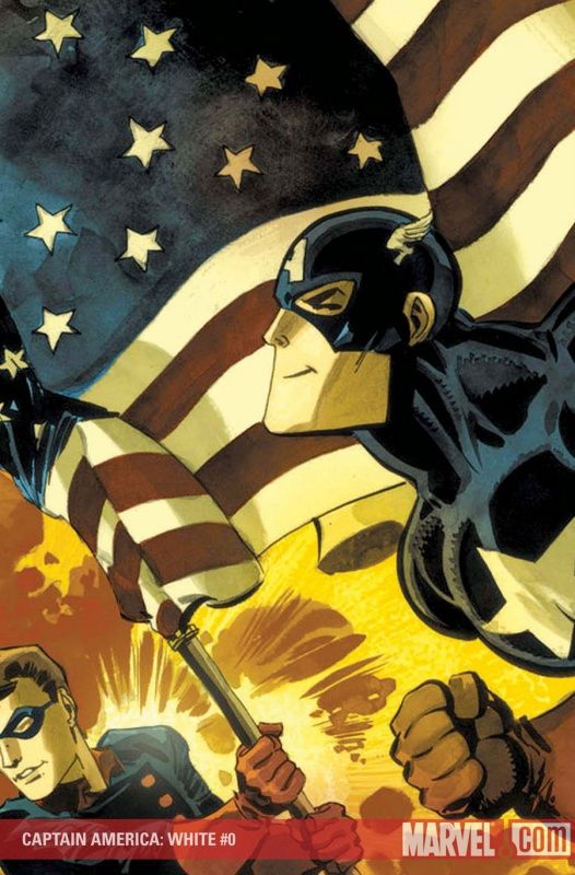
5. Extremely interesting style change by Tim Sale for this cover.
Impressive work by Sale to use such a different style of drawing.
___________________________________________________
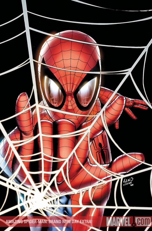
4. SEE!
When it is just a single figure, Land is not half bad!
A very striking cover for this Brand New Day one-shot.
___________________________________________________
3. Sean Murphy comes through with this classic Hulk cover.
___________________________________________________
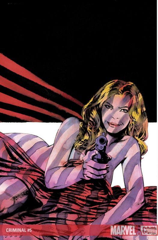
2. Wow, Sean Phillips hit two Criminal covers out of the park in a row!
The cover design, mixed with that facial expression? DEADLY!!!!
___________________________________________________
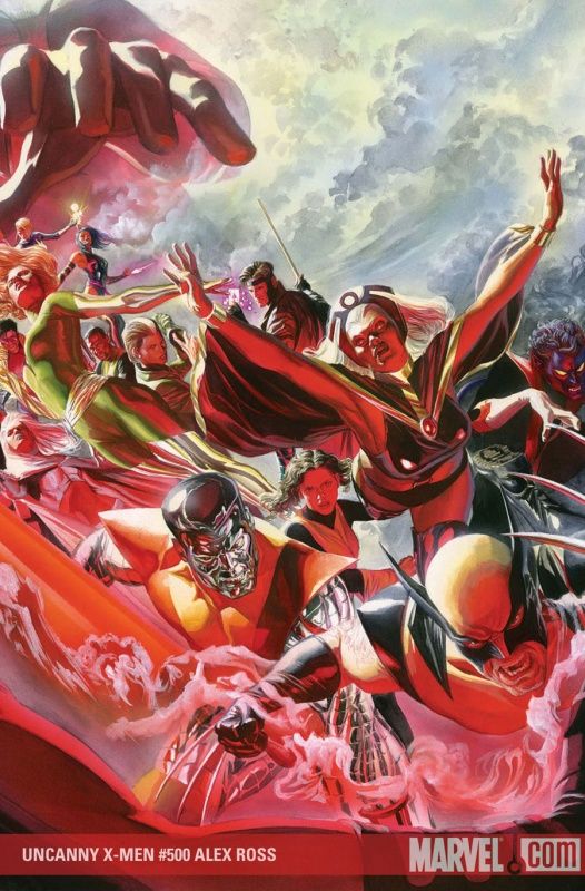
1. A tough assignment, but Ross does a wonderful job with it.
___________________________________________________
Okay, that's it! Feel free to share your prejudices (and your top fives)!


