Marvel's June and July solicitations have been out for long that their August solicits are out, too, so let's make some prejudgments for all three month's worth of comics based just on the covers (as we all love to make prejudgments, don't we?).
To save on your load times, I'm breaking them into three parts!
Here's June!
___________________________________________________
I really don't like the new design of Rockslide (was it the same at the end of New X-Men? I forget, either way, I don't like it) or the wolf kid.
Dust looks good, though.

And it's a fine designed cover by the Dodsons.
___________________________________________________
Jimmy Cheung continues to amaze with his aping abilities on these Young Avengers covers.

___________________________________________________
Holy crap, it's Alan Davis month, apparently!!!
FIVE covers from Davis this month!
First, a fairly generic cover with Gambit and the Marauders (are they still together? Wasn't there a comic where Scalphunter was working as a short order cook or something?).

___________________________________________________
Next, a very fun looking cover with Wolverine and Kitty Pryde ready for battle.

That's a well-designed cover right there.
___________________________________________________
Pretty boring FF cover here, although I love the effect of the flames kicking up where she makes contact.

And as a pure drawing, it's well done (as usual - Davis is a really, really good artist) - it's just boring for a cover.
___________________________________________________
Good old fashioned cover for this Clandestine one.

___________________________________________________
And finally, a striking Black Panther cover.

Nice layout.
___________________________________________________
Decent enough Bryan Hitch cover.

Why is everyone covered in chocolate sauce, though?
___________________________________________________
It's weird how everyone on this Roger Cruz cover has the exact same opening for their mouths.

Still, it's a fun cover. Beyond everyone having the same mouth - their reaction shots are great.
___________________________________________________
Glenn Fabry sure can create some interesting faces.

I dunno if they work all mixed together, but that Siryn is deservedly prominent on the cover.
___________________________________________________
Strong work by Greg Land.

While not his fault, of course, the cover still gets demerits for featuring Daken.
___________________________________________________
Clever use of the claws by Boo Cook.

It's amazing that Marvel has this many extra Wolverine stories laying around that they can have three ongoings and still have room for plentiful amounts of one-shots.
___________________________________________________
Not a bad cover by Mike Choi.

I like the hair - his characters could use a little rough edges to them - often, they look way too smooth.
___________________________________________________
What's weird for me about this Simone Bianchi cover is that Marvel has been hyping this image.
I mean, don't get me wrong, it's a fine drawing of Wolverine, but it's not THAT interesting - and not something I'd be plastering over postcards, etc.

I've seen Bianchi do some amazing cover designs, so I know he's capable of it.
___________________________________________________
Is that a spray tan on Invisible Woman on this Billy Tan cover?

That looks odd.
___________________________________________________
Strong Paolo Rivera cover.

It reminds me of Gerald Parel's work.
___________________________________________________
VERY cool looking Green Goblin by Marko Djurdjevic.

Good cover overall.
___________________________________________________
Not a bad cover by Salva Espin, but not great either.

And the inset is pretty garish.
___________________________________________________
Is Michael Ryan getting inked by someone else here?

It's a dynamic, forceful cover (and part of a triptych, I think - or at least a diptych).
___________________________________________________
I can imagine the editor chiding Deodato.
"Mike! You have shadows covering her breasts! What the hell, man?!
And you can't even see her ass!!!"

Seriously, nice work by Deodato. It's a stand out cover.
___________________________________________________
Oh dear lord - I think Skrull covers have officially trumped zombie covers for the most boring cover motif.

I am sure this was what Phil Jimenez was told to draw, and it wasn't like he thought this would be a cool cover idea - but man, is it is a terrible cover idea. Well drawn, but a terrible idea.
___________________________________________________
I like the design of this Alessandro Barbucci cover.

The way the figure is hiding the weapon - her expression - her posture - that's some strong storytelling right there.
___________________________________________________
I think Gurihiru properly gets across the sense of impending doom on the cover.

___________________________________________________
Likewise, Farel Dalrymple gets across the Mink's sad situation well.

___________________________________________________
Nice change of pace by Nic Klein.

Some excellent characterization on this cover.
___________________________________________________
Brandon Peterson seems at home when working with technology-based characters, and it works well with this cover.

Spooky but effective.
___________________________________________________
I love the vibrancy of this Michael Golden cover, as well as the expressions, but the poses (and Sage's lame costume - NOT Golden's responsibility) are not great.

___________________________________________________
Skrull homage covers = automatic fail.
Sorry, Aleksi Briclot! You did well with the lame assignment you were given (especially Briclot's unique choice of a cover to homage), but the automatic fail still applies!

___________________________________________________
The computer graphics on this Greg Horn cover are a little too evident.

Still, a nice layout.
___________________________________________________
Decent Yanick Paquette cover.

Sorta reminds me of the old school Marvel Comics Presents wraparound covers.
___________________________________________________
A fine cover by Tommy Lee Edwards, but he's not exactly breaking new ground here.

___________________________________________________
Yet another stiff John Watson cover - he does a GREAT job with posed stuff - but when he has action shots, it really doesn't work.

___________________________________________________
There's more sense of movement in this posed shot by Paolo Rivera than in John Watson's action shot.

___________________________________________________
Cute Leonard Kirk cover.

___________________________________________________
Damn, Hulk, it isn't enough to be the strongest, now you want to be the fastest there is?
You have some issues, man.

Fair enough cover by David Nakyama (as Tom DeFalco's Champion story gets told again).
___________________________________________________
How can this be comfortable for Sue? It seems a bit unsettling, really.

And where's Reed's left arm, Graham Nolan?!!? Where is it?!?!?
___________________________________________________
Tommy Ohtsuka does an okay job with this cover.

The basis set-up of the cover is nice, and I guess I can't quibble too much about the execution.
___________________________________________________
I dunno if I buy Atlas' stance on this Phil Jimenez cover.

Even if that's an anatomically correct pose, it doesn't look right (just like how no one draws Mister Miracle's mask the way a mask like that REALLY word work - because it wouldn't look as cool).
The background work is stellar, though.
___________________________________________________
Get ready, because Brandon Peterson, Salvador Larocca and Adi Granov are about to blow your minds with....GOOD BUT GENERIC LOOKING IRON MAN COVER GALLERY!!


___________________________________________________
Adi Granov mixes things up a bit with actually including a bit of plot in this cover!!

___________________________________________________
Ron Lim (as inked by Bob Layton) gives us a stronger cover for their Iron Man cover.

___________________________________________________
Land has certainly had worse covers than this one.

The idea of a "Hulk fights Thundra" one-shot amuses me greatly.
___________________________________________________
Impressive design work by the great Richard Corben, but it is not one of his more striking works.

___________________________________________________
Interesting John Romita Jr. cover - he seems to be channeling Alan Davis a bit on this one.

___________________________________________________
Fine Clint Langley cover.

Did I misremember, or didn't they make a point of saying Groot was dead for good this time?
___________________________________________________
I dig the laid back approach by Djurdjevic.

Clever.
___________________________________________________
Okay, wait - if the concept of GeNext is that they all age in real time - how could this kid be Colossus' grandson?
Colossus fathered his kid, when, 28 years ago? 29? So how could that kid already have a teenaged son?
Am I missing something? Is this NOT about the characters aging in real time? Did I just imagine that?

Good cover by Doug Alexander, either way. It's a cute bit.
___________________________________________________
That's an excellent drawing of Doom by Hitch.
Well done, Hitch!

I dunno if it is dynamic enough for a cover, but as a drawing? Top notch!
___________________________________________________
I would be very pleased if Acuña put it all together on this project. The cover is strong, but I fear that the interiors will not be as good (and based on the previews I've seen so far - that fear is well founded).

Also - Gaiman to the Knaufs? I can't think of a similarly disparate drop-off, unless you count Austen as "succeeding" Morrison on New X-Men (Austen did two fill-in issues). I guess Pollack from Morrison. Veitch to Wheeler? Does Loeb/Liefeld from Waid count on Cap?
And I think the Knaufs are quite good, really, so it's more me praising Gaiman than knocking them.
___________________________________________________
That's a great cover design by Jae Lee.

Super spooky.
___________________________________________________
Pretty standard fare from Djurdjevic on this cover.

Granted, a standard fare Djurdjevic cover is still quite good, just saying...
___________________________________________________
Cool looking Captain Britain cover.

Is Hitch really so far ahead in his FF work that he can be doing covers for this AND X-Force?
___________________________________________________
If you're attempting a character assassination, Bishop, you have the gun pointing the wrong way!

Not a bad Olivetti cover, really.
___________________________________________________
Holy cow, it's almost like ANOTHER Alan Davis cover!
The credits say Mark Brooks, and I can buy this as Brooks' art, but damn, that's a fine Davis impression right there!

And a good cover, overall.
___________________________________________________
A lot of this Alex Ross cover is awesome.
Partially the arrangement of figures, but mostly the little character bits, like Wasp tenderly touching Cap's face, shocked to see him still alive.

And a lot of it is just way bizarre, like Sentry's expression and Wonder Man's expression.
On the whole, though, good job by Ross. That's two good covers in a row on this book!!
___________________________________________________
It's weird, Claire Wendling absolutely NAILS certain parts of this cover, like the facial expressions - but it is almost like she spent so much time doing that that she didn't come up with anything else, leaving us with two figures against a boring plain background.

Not a great total package - but her figures - excellent.
___________________________________________________
Bianchi at least makes his covers interesting!!!

Can't say that I think it looks particularly GOOD, but it's certainly different from most every other cover out there! That's something!
___________________________________________________
Good collage storytelling effect by Frenz.

He's quite adept at that cover approach.
___________________________________________________
McKone's Spider-Man looks oddly like Tony Harris' Spider-Man.

Anyhow, McKone is given a great visual hook for his cover - but I can't say that I think he does much more than a competent job with the great hook.
___________________________________________________
Yep, that's a Ron Lim cover.

___________________________________________________
Another intricate design by Adam Pollina.

Overall, I think it does make his covers for this series stand-out, but I'd love for his figures to be a bit cooler looking. I can't say I'm thrilled with his approach of how he's depicting Angel.
___________________________________________________
I don't get it, Frenz?!?! Why does American Dream want traitors to vote?!!?
I must read this comic to find out why an American icon wants traitors to vote!!

So job well done, Frenz!!
___________________________________________________
Cheesy cover by Maleev?
Perhaps.

But still an amusing cover.
___________________________________________________
HONORABLE MENTIONS
___________________________________________________
Perhaps just as cheesy of a cover as the Maleev one, but dammit, it's Dave Johnson!
He makes everything awesome!!

___________________________________________________
David Aja looks like he took some design tips from Kaare Andrews' strong Iron Fist covers.

___________________________________________________
There is a lot that I love about this Patrick Scherberger cover - the crater in the ground, the implies heft of Thor's hammer - but I think it could have done for a bit more fantastical approach - something grander than just Thor's helmet being on Spider-Man's head.

___________________________________________________
When he's not doing silly zombie homages, Arthur Suydam can design some strong covers.

___________________________________________________
Great first issue cover by Carlo Pagulayan

Evokes a dramatic and imposing mood. Impressive work by Pagulayan.
___________________________________________________
Bradstreet is milking all the drama he can out of the last few issues of Ennis' run, isn't he?

___________________________________________________
Oeming does a great job here of re-establishing the identity of the book, in this sort of faux-homage to the first issue of Powers.

___________________________________________________
Bold cover layout by Maleev.

Works quite nicely.
___________________________________________________
More or less a standard looking cover, but I just love how Gerald Parel adds in those little touches of characterization into the faces of his drawings.

___________________________________________________
That's a darn fine cover by Gabriele Dell'Otto.

He makes it tough not to give this issue of Ultimate X-Men a glance, just to see what's up with the characters on the cover.
___________________________________________________
TOP FIVE!!
___________________________________________________
5. Very clever cover approach by Marcos Martin, who I think is awesome and should draw Spider-Man always.

___________________________________________________
4. I might be giving Gabriele Dell'Otto extra credit just because he is doing Secret Invasion covers without homages!

That said, I still think this is a striking cover image.
___________________________________________________
3. Not as striking of a cover image, of course, as this Captain America cover by Epting.

You know a cover is good when Marvel is using it as a full-page ad.
___________________________________________________
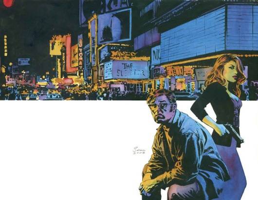
2. I love how this Criminal cover brings together both the personal attention of the figures as well as the sweeping nature of the city behind them - using the neutral space to make the figures AND the city pop is a brilliant design idea.

Great work by Phillips.
___________________________________________________
1. What a clever cover - Venom as a horror film, with Immonen's ability to convey emotion bringing across the fear of the situation beautifully.

One of the strongest covers by Immonen on this book yet!!
___________________________________________________
Okay, that's it! Feel free to share your prejudices (and your top fives)!
On to July!!