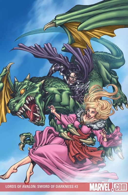
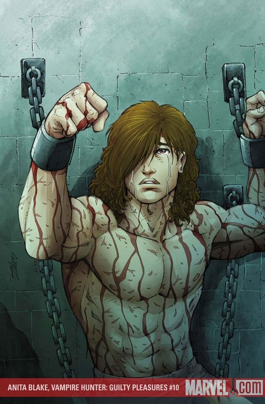
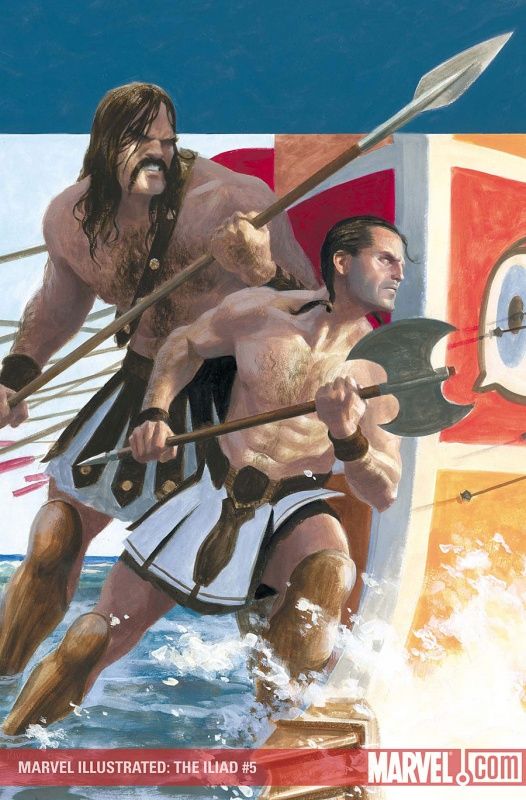
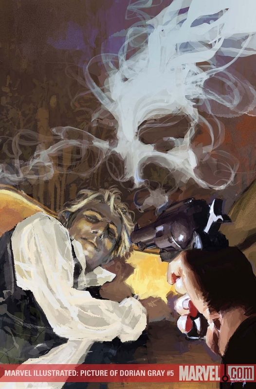
Marvel's April solicits have been up for so long that May is coming up, well, now, so let's hurry and make some prejudgments based just on the covers (as we all love to make prejudgments, don't we?).
Let's begin!
___________________________________________________
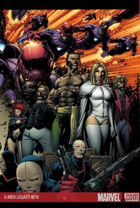
Wow, Dave Finch is drawing a pretty damn big cover series here!
Is it going to last 12 issues?
That'd be remarkable.
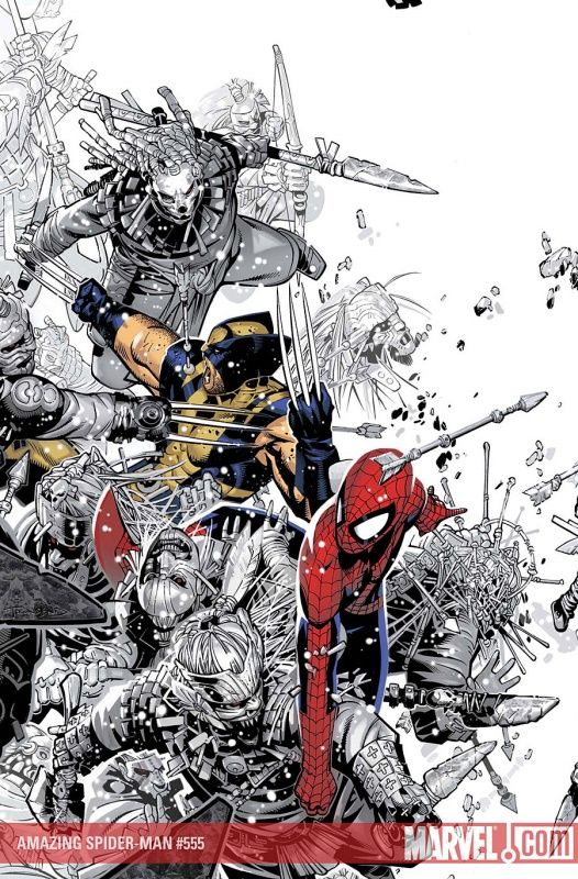
Seeing the Hellfire guards that Wolverine killed reminds me - I think it was pretty clever of Claremont to bring them back as the Reavers. That's the sort of continuity I dig - it was a nice touch for those people who remembered them, and totally unnecessary knowledge for any who didn't remember them.
___________________________________________________
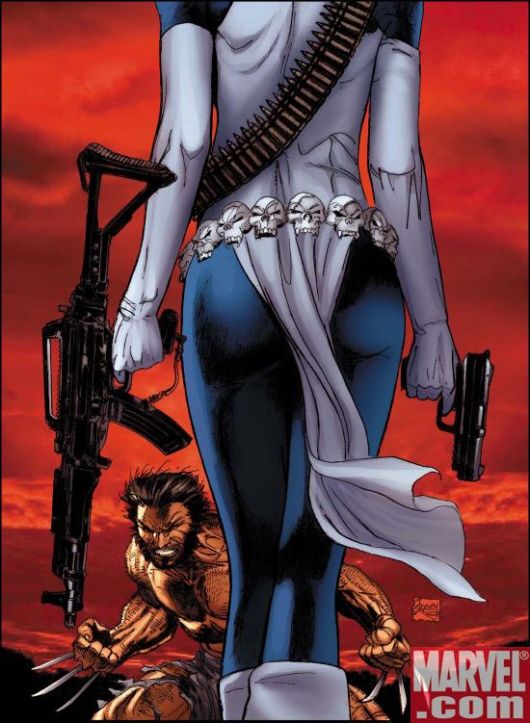
ASS SHOT BATTLE!!
Ron Garney takes a commanding lead with this stylized cover featuring Mystique's ass.
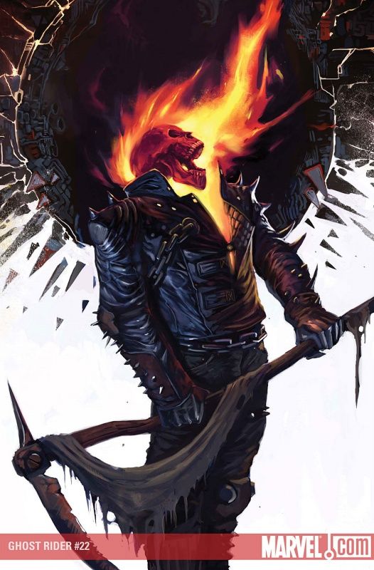
It's not just me, Ron Garney has changed his style, right? It's more similar to when he was doing Ghost Rider, as compared to the style he used on Amazing Spider-Man (and Captain America and the Justice League).
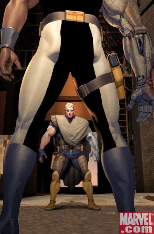
Ariel Olivetti cannot counter, with this cover, although impressively, his Cable appears to feature fairly normal proportions, which is nice.
And Bishop does look kinda cool, even if the whole "Bishop as a bad guy" riff is lame.
WINNER - GARNEY!!!
___________________________________________________
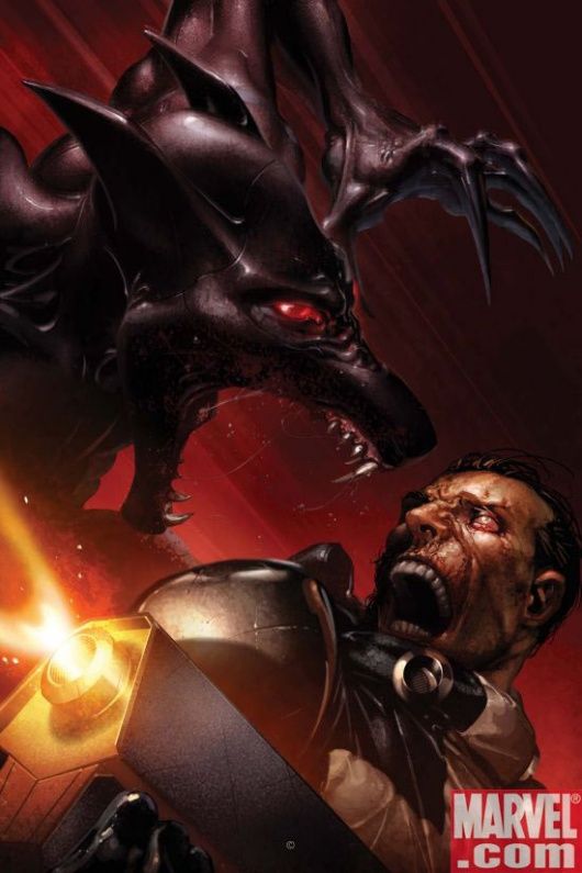
You've lost me, Clayton Crain - that does not look like Wolfsbane at all.
Unless, of course, it is a brand new alien character, in which case, my apologies, Clayton Crain.
___________________________________________________
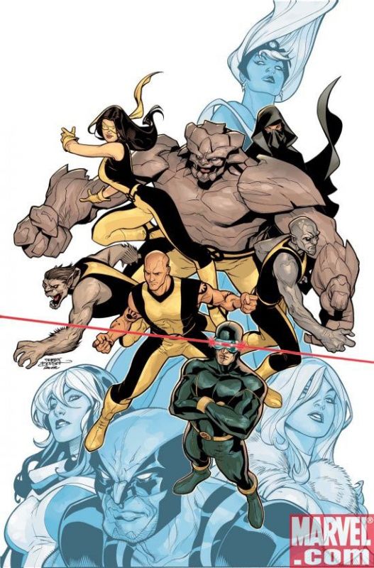
I love how everyone is always so ROUND on a Terry Dodson cover.
___________________________________________________
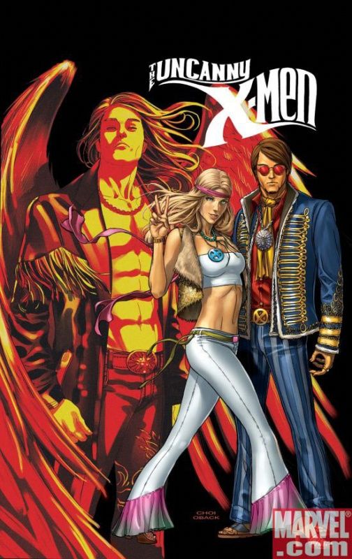
I agree with Greg's comments on this cover - nifty idea, not so nifty execution.
Mike Choi is way too talented of an artist for his work to always be so computerized. The whole "everything looks shiny" deal is not a good look.
___________________________________________________
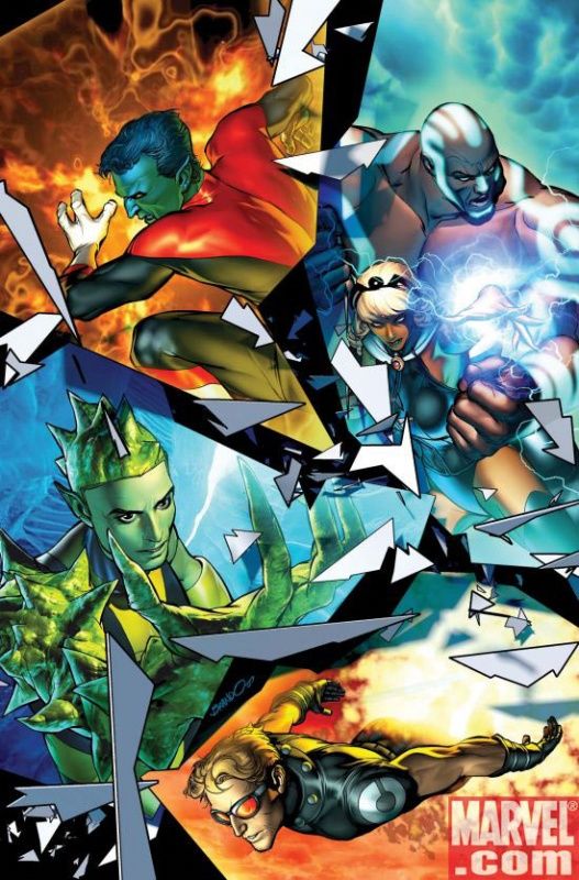
Brandon Peterson sometimes has a similar problem with computers, but for the most part, I think he avoids any issues with this cover.
It's a nice split cover - the various images flow well.
___________________________________________________
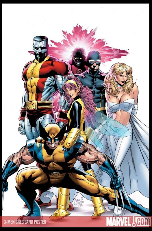
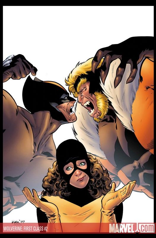
I love how Wolverine is almost positioned as though to say "no, Land! She's a kid! No ass shot!"
That's an awesome looking Colossus by Land.
___________________________________________________
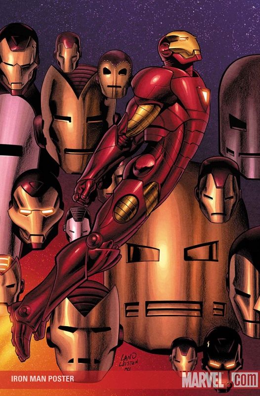
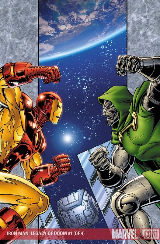
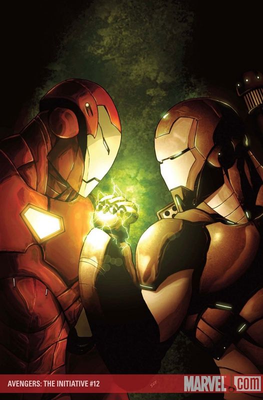
Decent Iron Man poster by Land, if a bit too "by the books."
___________________________________________________
I'm glad they managed to repurpose this Yu promotional piece for Secret Invasion.
It's a strong piece of artwork. Definitely captures the reader's eye.
___________________________________________________
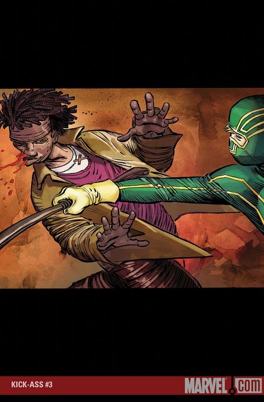
I'm not feeling these Kick Ass covers.
Hopefully the interiors will be more interesting!
___________________________________________________
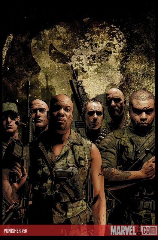
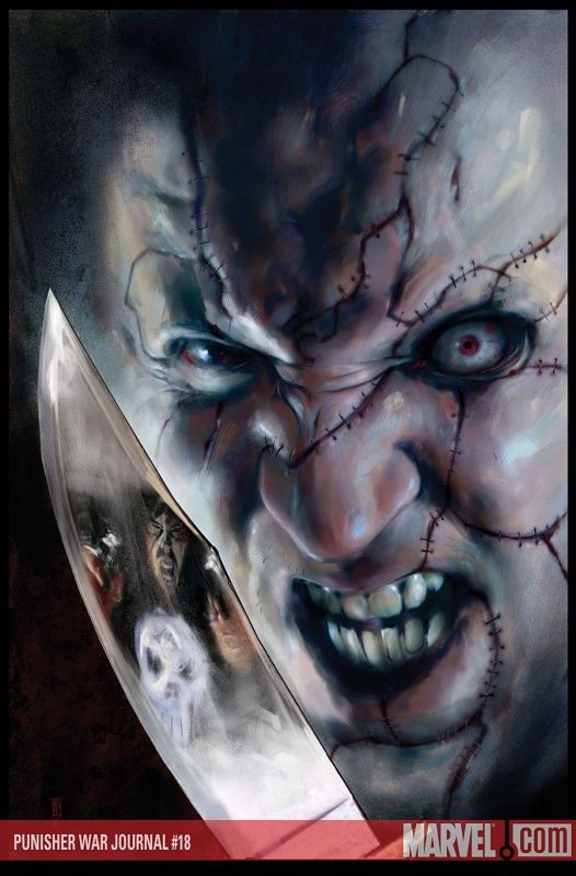
I bet the interiors of this Punisher issue will be cool, but the cover by Bradstreet is a bit too on the low key side.
___________________________________________________
Come on, Kaare Andrews! You gotta give me something more than just some interesting folks on the sidebar!
___________________________________________________
While he still seems to be overdoing it a bit with the computer effects, this is a much stronger Michael Golden cover than last time around.
Heck, the computer stuff actually probably HELPS this cover, which is nice to see.
___________________________________________________
Is Sage wearing a pasty on this Alan Davis cover?
Besides that unsettling thought, nice cover by Davis.
___________________________________________________
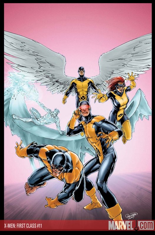
Interesting take on the X-Men by Carlo Pagulayan - it seems like somewhat of a change for him, style-wise.
Reminds me of Tom Raney.
___________________________________________________
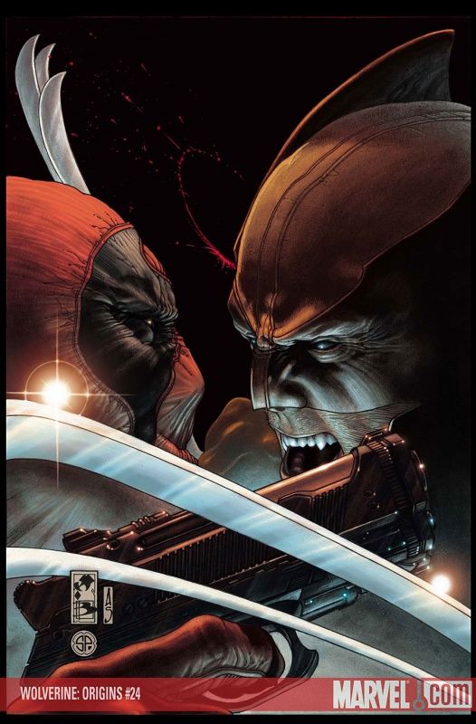
You know, we've already gone past the point of when a "Wolverine and Deadpool should quit acting like Maddie and David and just go for it - this sexual tension is driving me nuts!" joke would be a working reference.
But how long before a "Sam and Diane" reference ALSO stops working?
Will it ever?
Or will "Sam and Diane" endure a la Honeymooners and I Love Lucy?
___________________________________________________
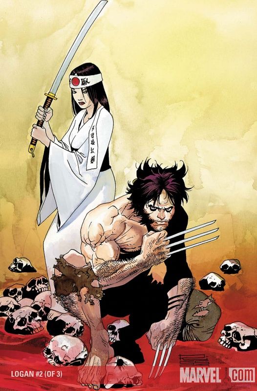
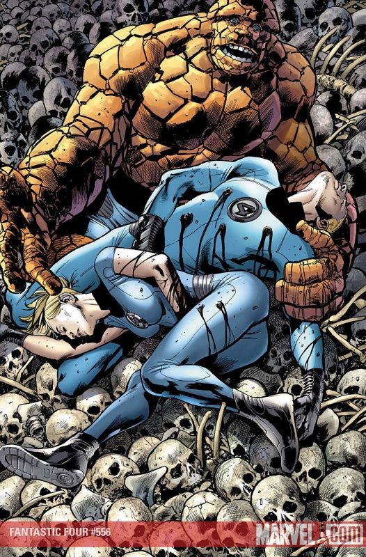
It's striking the amount of Wolverine covers recently that involve him appearing lackadaisical about some pretty crazy crap.
"Yep, I'm just chilling in a pile of skulls and bloody water. S'up with you?"
Otherwise, a good Risso cover.
___________________________________________________
Your aping skills are the greatest, Jimmy Cheung!
I applaud you!
This cover reminds me of how impressed I am by the interview shtick in The Order. When you repeat almost anything, it will eventually get boring, like these Cheung covers (all on their own are quite lovely covers, featuring excellent aping of old artists, but month after month of the same basic cover, it gets old) - and yet I don't think the interview shtick HAS gotten old.
Cheers, Matt Fraction!!
___________________________________________________
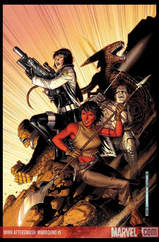
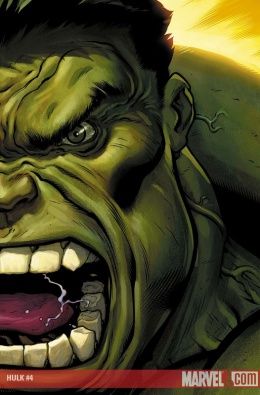
I'm less impressed with this Cheung cover for the Warbound.
What is going on on this cover exactly?
Are they sliding down the hill? Are they backing up the hill?
Some of them look like they're advancing, some look like they're pulling back and some (the Brood one) don't look like either!
___________________________________________________
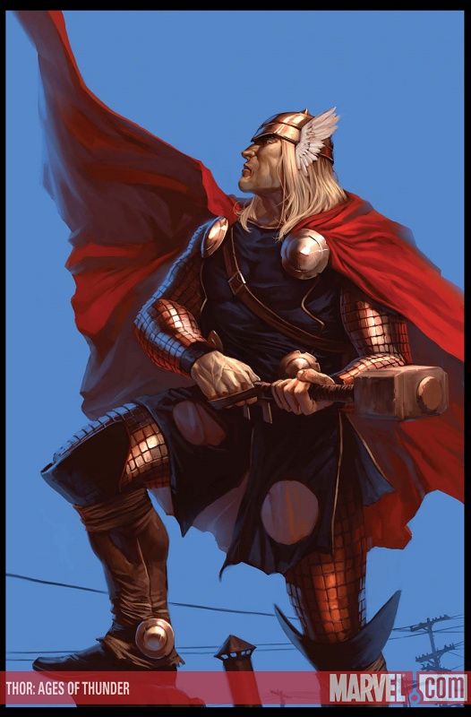
I like the idea of mixing a classic Thor pose with the modern day phone lines in the background.
CLEVER, DJURDJEVIC! CLEVER!!
I see Zircher is drawing this. Hopefully he's busting out his Terror Inc. style to explode people's brains with his newfound awesomeness (not that he wasn't a good artist before, but now he's awesomerageous).
___________________________________________________
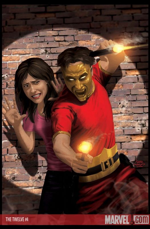
I like this Kaare Andrews cover for the Twelve. It's a good step up from last month.
It is a
cover.
___________________________________________________
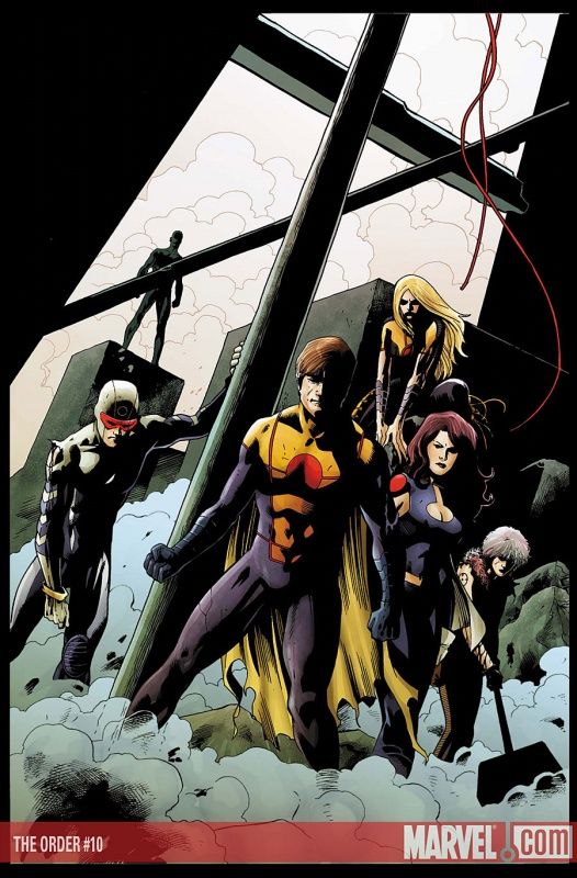
Goodbye, the Order!
I will miss you!
And it's a pretty decent cover to send them out on!
___________________________________________________
Eddy Barrows, take heed! Mike Deodato is on the ball! He'll tell you how to work ass shots into covers!
Knowing Barrows, he'd probably have her, like, facing forward or having a piece of debris covering her ass.
That hack.
___________________________________________________
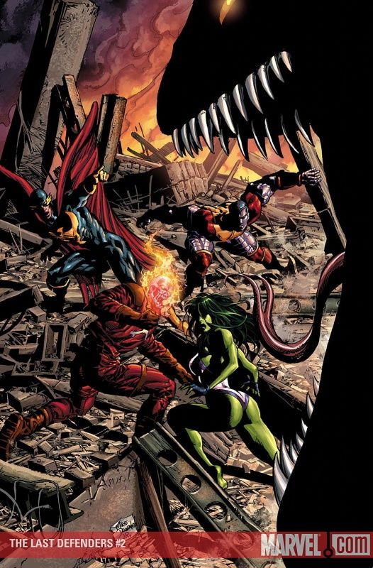
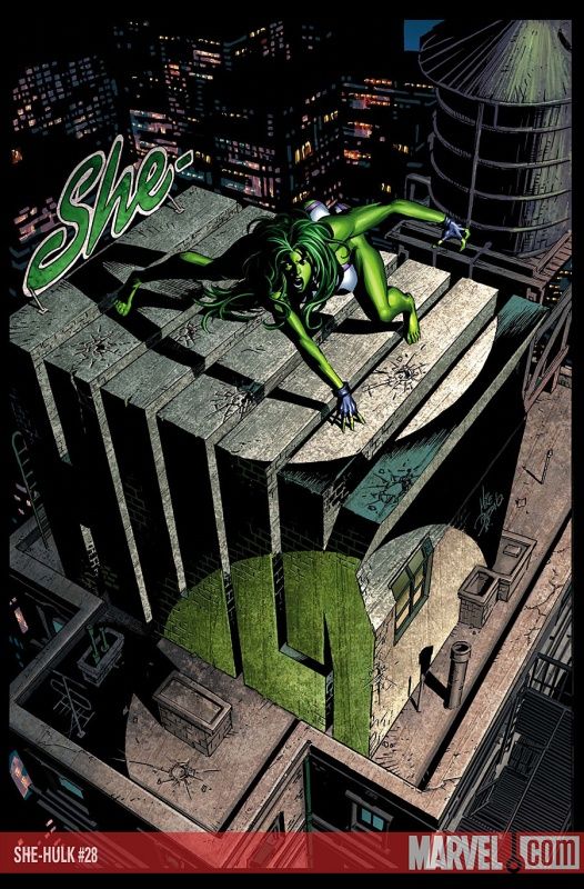
Deodato further puts Barrows to shame by working in an ass shot even as She-Hulk is facing forwards!!!!
Pure genius.
Deodato tries to draw away from the genius by doing a very clever piece of working the logo into the cover, but he's just being modest.
___________________________________________________
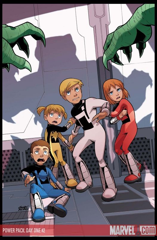
Fine old fashioned cover by Gurihiru.
Perhaps not
, but still, a fine cover!
___________________________________________________
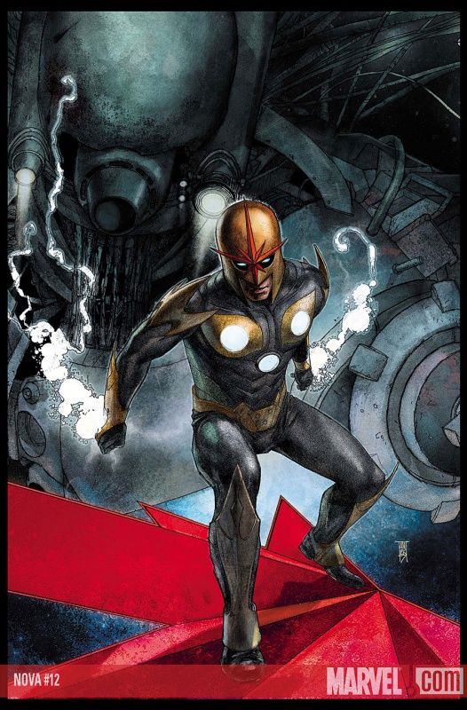
Next to sharp protrusions from his shoulders, the one other thing Nova has always needed is a surfboard shaped like his helmet logo.
Kudos, Alex Maleev, kudos.
Seriously, cool cover by Maleev.
___________________________________________________
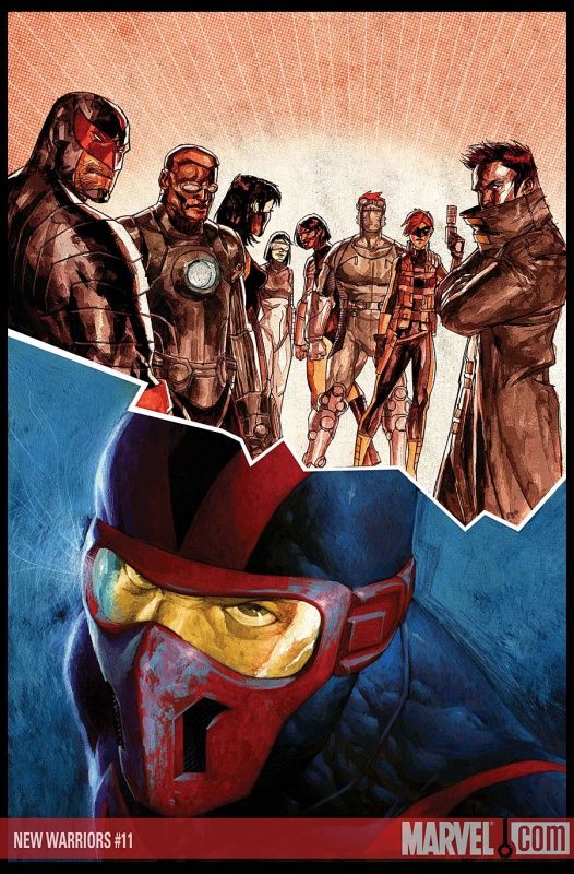
I'd like to view this cover as Night Thrasher having a nightmare about how garish the New Warriors look.
That said, this is a strong Nic Klein cover. Really gets the point of the divide between Thrasher and the group across.
___________________________________________________
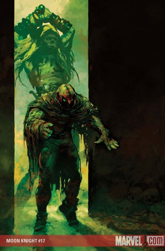
Homage or not, this Suydam Moon Knight cover works a lot better than last month's.
Eminently, effectively and appropriately moody!
___________________________________________________
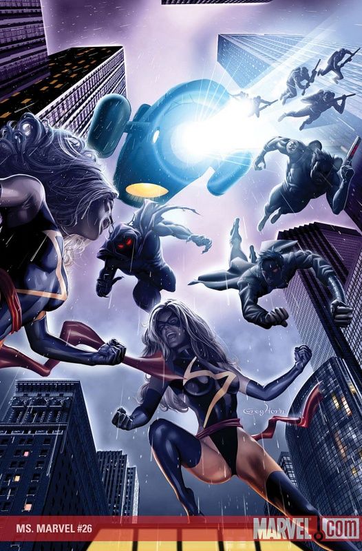
Greg Horn impresses me yet again!
This is a good Ms. Marvel cover.
I especially like the use of lighting. Impressive stuff.
___________________________________________________
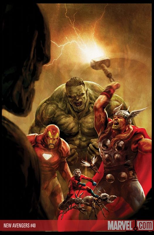
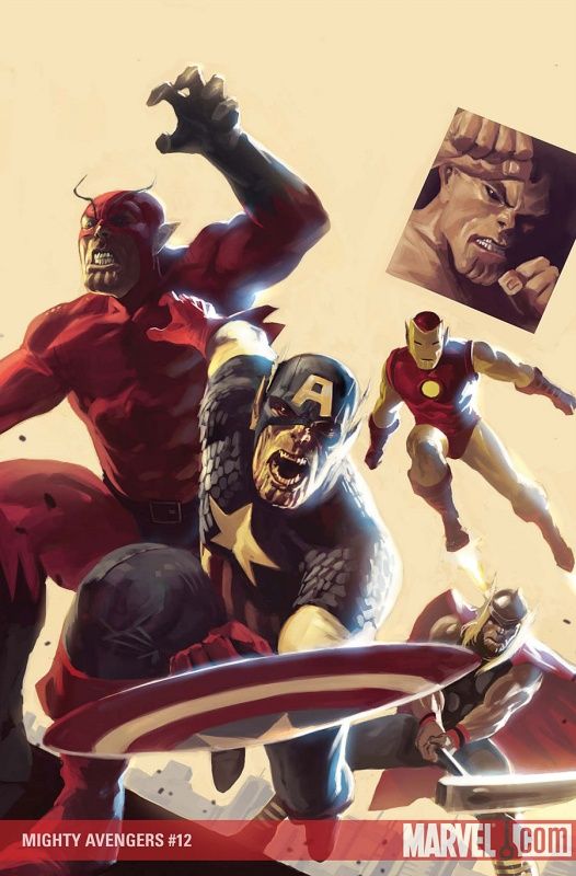
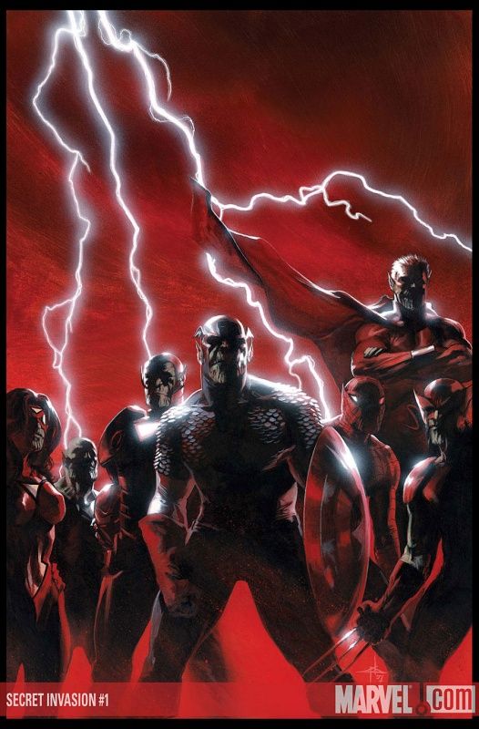
Okay, let me just get this out of the way...
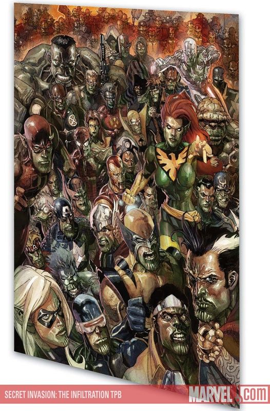
If this is what Marvel's going to do for their Secret Invasion covers, then I am just going to be so irked.
Really?
MORE homage covers?
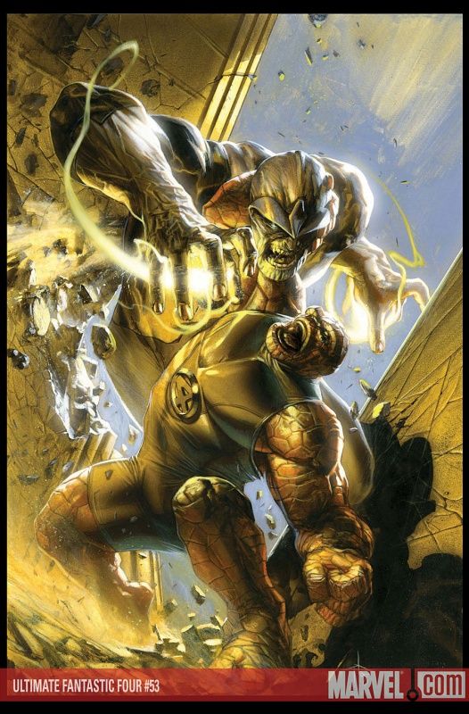
We just saw Arthur Suydam run the concept into the ground, then run it about twenty feet below the ground, and now we're going to do it AGAIN, only with Skrulls instead of Zombies?
I cry foul.
FOUL, I CRY!!!
Homage covers work when they're unique and surprising, not when they are rote and predictable.
___________________________________________________
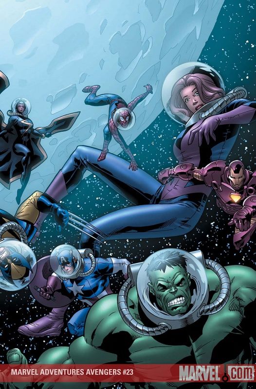
Nice to see Leonard Kirk spice things up a bit on this Marvel Adventures: Avengers cover.
A strong improvement over the sorta boring pin-up covers he had been doing.
___________________________________________________
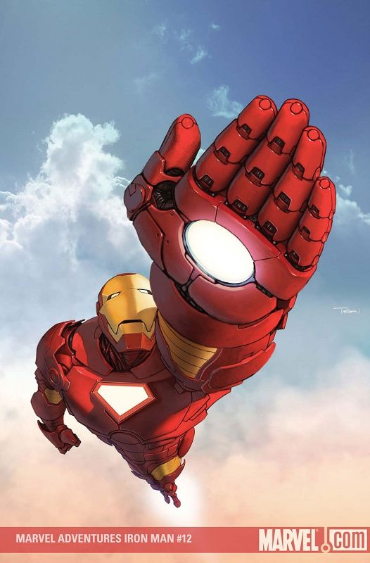
Francis Tsai's perspective is totally dead on.
He's correct.
That is how it would look.
Still looks weird to me! :)
Sorry, Francis!!!
___________________________________________________
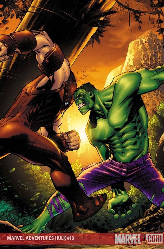
You know I dig me some Sean Murphy artwork, but come on, that Juggernaut is just waaaaaaay too skinny.
It throws off the entire cover.
___________________________________________________
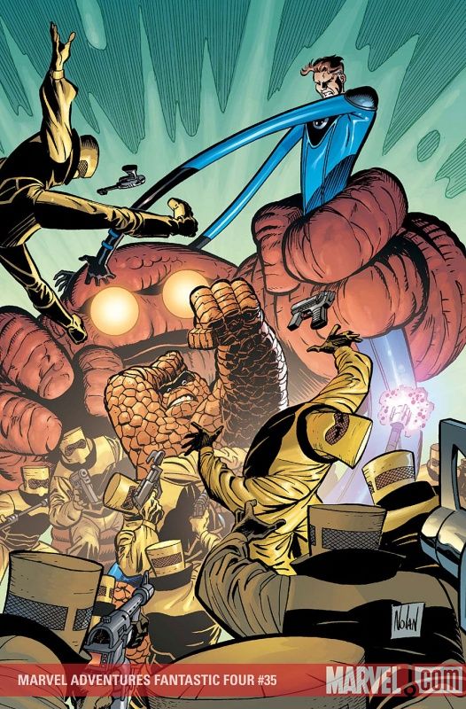
I bust artists sometimes for when they make the Thing look different, and I don't mean to infer that I think every artist should slavishly copy Kirby, I just think that, if they're going to make a change, make it look cool - some of the tiny head Thing drawings were not cool looking.
Graham Nolan's more monstrous looking Thing, on the other hand, looks cool to me, so I'm good with it.
___________________________________________________
Is this cover Ron Lim?!!?
If so, wow, Bob Layton is a freaking inking master!
___________________________________________________
I absolutely adore this drawing by Gerald Parel, but comic book covers are not the place for esoteric ideas.
You have to appeal to the quick glance, and this cover doesn't do that.
___________________________________________________
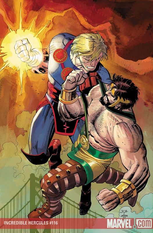
I love the idea of getting John Romita Jr. to do a cover when the guest-star is an Eternal.
Cool cover.
___________________________________________________
Clever Djurdjevic cover.
He IS trying to evoke angel wings on this cover, right?
Because if he isn't, then I take back my compliment!
___________________________________________________
A brilliant use of negative space by Kaare Andrews.
___________________________________________________
An instance where the lack of red colored blood really hurts a cover.
It's like they're leaking oil.
___________________________________________________
Very forceful and efficient cover by Djurdjevic.
___________________________________________________
See?
Now this is a clever cover homage.
Alan Davis homages himself, only works in an unforeseen element to the familiar Excalibur cover, Forrest Gump style.
That's cute.
It's not "Zombies/Skrulls redo every notable Marvel cover ever."
___________________________________________________
Interesting Steve Uy cover.
Definite step up from last month's!
___________________________________________________
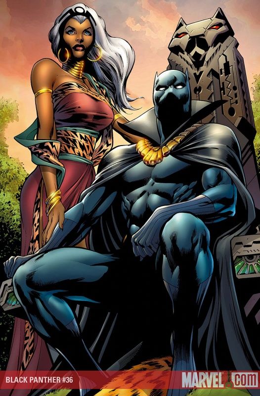
Come on, Alan Davis, give the lady a chair!
Wakanda is this super awesome country, but they can't even get a chair for their queen?
___________________________________________________
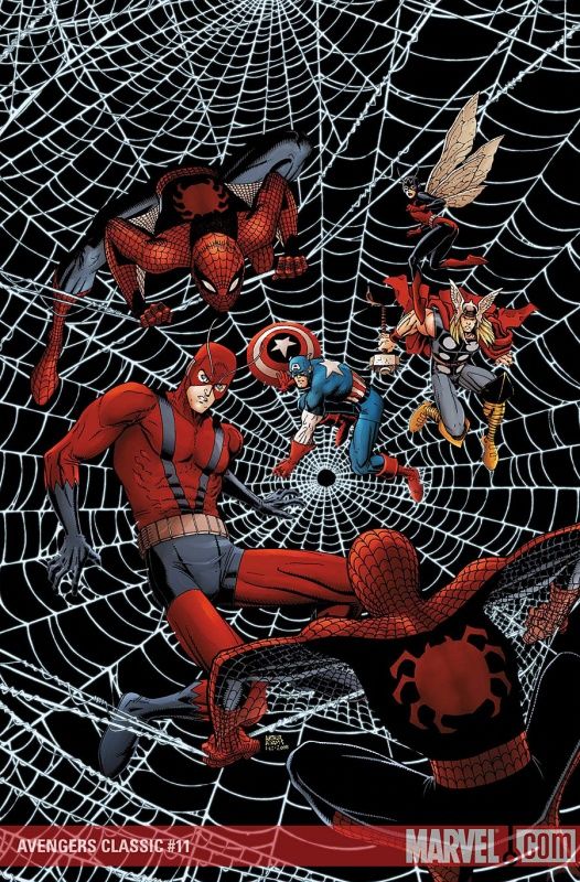
I love that Art Adams embraced his inner Ditko (do note that inner Ditkos prefer to be left alone normally) with the Spider-Men on this cover.
Nice cover.
___________________________________________________
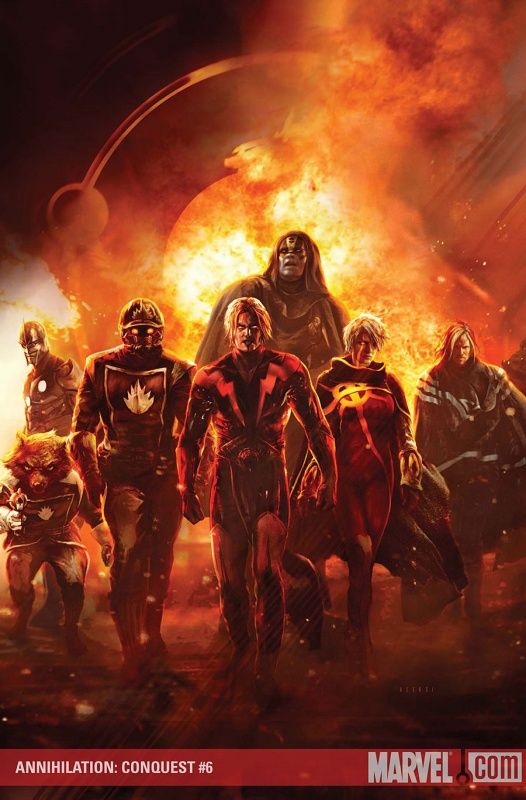
As you may very well know by now, I loves me the "slow walk."
So yeah, I dig this Aleksi Briclot cover!
This is my current favorite "slow walk" in comics, though!
___________________________________________________
Great character work by Tony Harris.
___________________________________________________
The negative space really accentuates the action on this Ron Frenz cover.
___________________________________________________
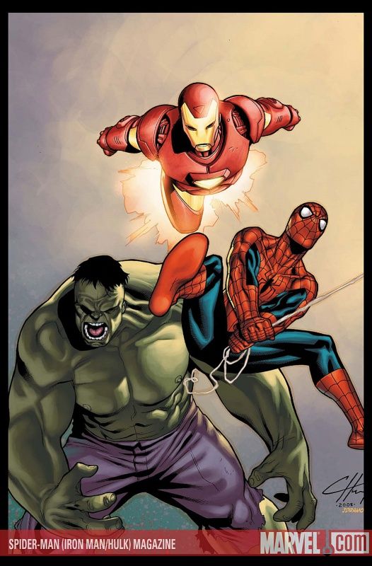
This is possibly the greatest comic book title ever - Spider-Man (Iron Man/Hulk) Magazine!
Now if only there was a Spider-Man (Iron Man/Hulk/Thor...plus Captain America/Wolverine/Storm/Ant-Man....with Thing/Deadpool/Namor...featuring Gambit/Rogue/Banshee....introducing Cyclops as Colossus) Magazine, then the discussion would be moot.
Title silliness aside, that's some of the strongest Clayton Henry work I've seen. Good job, Mr. Henry!
___________________________________________________
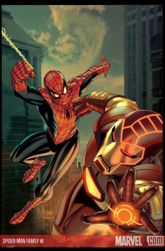
Impressive David Williams cover.
I want to see more David Williams covers!!
___________________________________________________
Joe Madureira follows up his impressive showing last month with a sweet gatefold cover.
___________________________________________________
It's like the Three Stooges.
Apocalypse is telling these two numbskulls that he'll have to moider them..
___________________________________________________
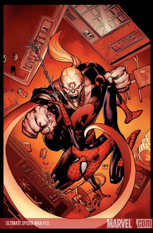
Greatest Omega Red cover ever?
Dubious distinction, Stuart Immonen, but it's A distinction!!!
___________________________________________________
Dude, she's not your Gann Josin! Let her go!
Seriously, fine drawing by Tommy Ohtsuka of...well...whatever this is supposed to be.
___________________________________________________
My goodness! This time, I know this IS Ron Lim, and yet it still looks like Brett Booth!
That's some fine quality aping right there!
___________________________________________________
I really like this Paolo Rivera cover.
It gets across the times quite well.
___________________________________________________
Gerald Parel's facial expressions for the win!!!
How awesome is that look?!!?
___________________________________________________
An imposing cover by John Watson.
___________________________________________________
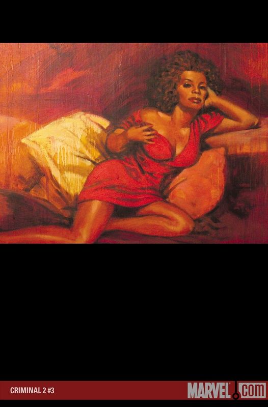
Sean Phillips keeps up his moody, evocative Criminal covers.
___________________________________________________
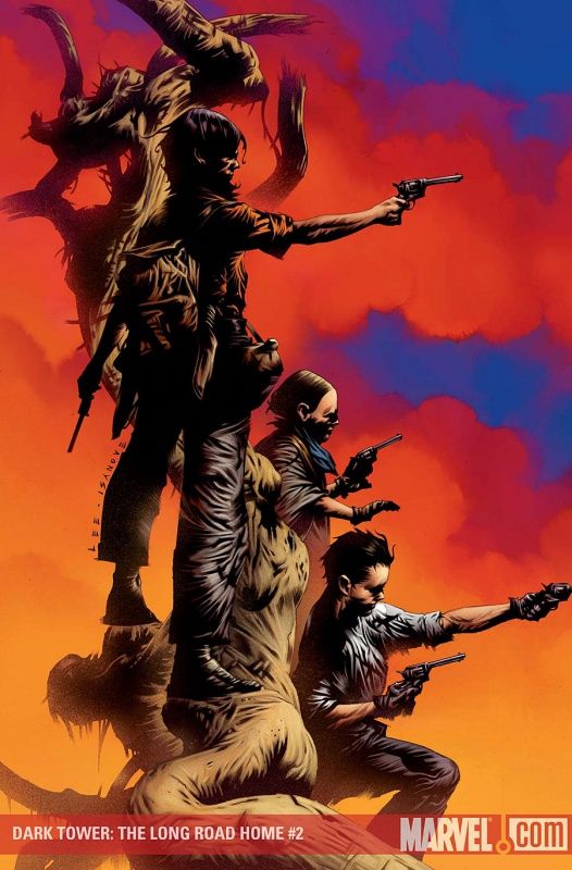
I'm very impressed with how Jae Lee laid this cover out.
Impressive design work.
___________________________________________________
HONORABLE MENTIONS!
___________________________________________________
Very nice moody piece by Cary Nord.
The use of the darkness is impressive, as well.
___________________________________________________
Imposing Gabriele Dell'Otto cover.
That's a badass looking Thing.
___________________________________________________
Really cute Leonard Kirk cover.
Love the expressiveness of Kitty.
___________________________________________________
Is this seriously Maleev?
Wow.
Not that his normal style isn't amazing, but it is staggering to me that he could do such a different art style (Djurdjevic-esque) and have it still look good.
Best cover to feature Jigsaw on it?
___________________________________________________
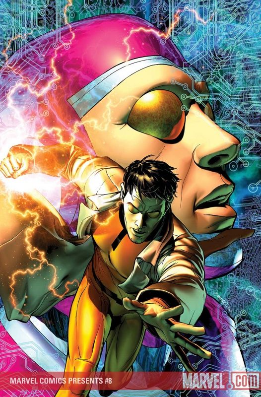
Thank you, Warren Ellis!
Can you imagine Machine Man starring on the cover of an anthology BEFORE Nextwave?
Great Brandon Peterson cover - the character really fits with Peterson's computerized style.
___________________________________________________
I think Djurdjevic should trademark that cover pose.
But consarnit, it is effective as all get out!!!
___________________________________________________
Boy, Fabry sure is good at drawing unsettlingly bizarre looking people, isn't he?
___________________________________________________
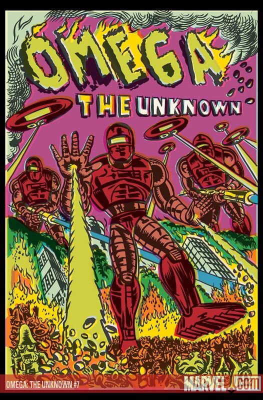
Great idea for a cover, and Gary Panter executes the idea beautifully.
___________________________________________________
TOP FIVE!!
___________________________________________________
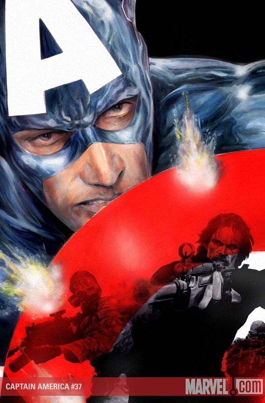
5. Jackson Guice's first cover for Captain America, and he's definitely mixing the style up, and it really works well.
An action piece, but a stylized one.
___________________________________________________
4. This Bachalo piece would be higher, if it weren't for the fact that the idea's been done a few times in the past.
But rarely as effectively as Bachalo does here.
___________________________________________________
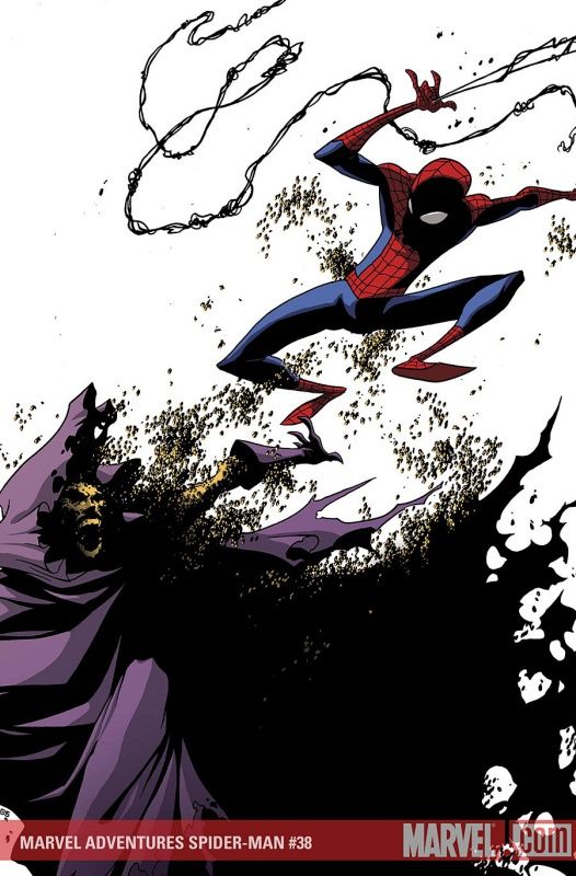
3. Skottie Young is one of those cover artists where you really just can't wait until you see what he's drawing next, he's that impressive.
The manic nature of a man made out of bees is perfect for Young's style, and the negative space works wonders for him here.
___________________________________________________
2. This cover disgusts me...
but this cover is awesome!!
Seriously, this McGuinness cover would be great if it was only one of them, together, it is a brilliant idea.
How come these things never seem to match up when you place them side by side?
___________________________________________________
1. I absolutely adore this cover piece by Bachalo.
Intricate, striking, it is just a stunning piece of artwork (even if it slightly goes against my whole "I don't like it when covers show commenced fights" thing, as it only SLIGHTLY goes against it, and really is more of a "this fight is about to REALLY become a fight" drawing).
Well done, Bachalo! TWO covers in my top five!!!
___________________________________________________
That's it for this month! Feel free to share your prejudices (and YOUR top five!)!


