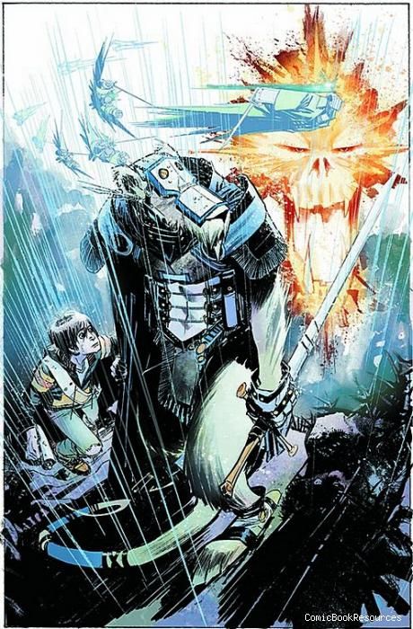
Based on Sean Murphy's art alone, "Joe the Barbarian" is worth a look, but Grant Morrison's writing is average fantasy fare and doesn't rise beyond the novelty of the book's premise. Joe is a young teenager suffering diabetes and is having some sort of odd side-effect from a lack of insulin that's resulting him shifting between the real world and a perceived fantasy world. In this issue, he manages to make it from his attic bedroom to the bathroom, while stumbling his way through the other world where his pet mouse is a warrior and he learns of his quest to save that world from dark forces.
Murphy's art carries the issue with his detailed, sketchy, energetic renderings of the madcap, never-slow-down pacing. One key element of his art is the use of panel borders and how they signify which world Joe is in at any given moment: black borders for the fantasy world and white for the real world. He sets that distinction on the third by having a single panel of Joe in the real world take up an entire tier by itself despite being a rectangle slightly wider than a square. It sits alone in a white void, standing out for the reader as a single instruction in reading before returning to the busier, fuller page layouts that mark the rest of the issue.
Most of the issue has Joe and Jack, his mouse, on the run; Murphy uses rain and speed lines to show the movement. His design of fantasy Jack is that of a warrior not unlike a samurai with metal plates protecting his torso and face, and a long, large sword as his weapon. Along with Morrison, the jump-cuts between the two worlds happen in the right places. A jump in the fantasy world is paid off with a landing in the real world and elements of each are reflected in the other.
Murphy's line work is detailed, but also bold and striking, limiting himself in the right places for a greater effect. Light and shadow play a big part in key spots and how he contrasts them in the two worlds is interesting where a giant golden being is simply a thunderstorm in the real world. The two lighting effects quite different, something that Dave Stewart handles with care and skill. Stewart's coloring helps the art greatly as it also points to the shifts between the worlds with the fantasy world using a wide array of colors and differing levels of brightness, while the real world is drab and consistent in being muted, heavy in grays and blues. The two make a great team.
Morrison's writing isn't bad here as he choreographs many of the changes that Murphy and Stewart pull off so well, but the effectiveness of those techniques is mostly in the hands of the artists. Morrison's development of the fantasy world and its story is very basic, the sort of thing that you've seen before in numerous fantasy stories. While it is the sort of world that a boy Joe's age would think of, not much of it is surprising or up to that level often associated with Morrison. His writing is effective at creating an interesting fantasy story with a neat twist, but without as skilled an artist as Murphy, it wouldn't read nearly as well since, so far, the story hasn't progressed beyond its clever premise yet.

