
As the average price of serially published, traditional-format comics has risen sharply over the past few years, I've gradually turned into a trade-waiter, my pull list shrinking to such a meager size that many Wednesdays I'll skip what was once a religiously observed weekly pilgrimage. It's not worth a trip to the shop for one or two books, after all, so I'll sometimes wait three weeks or so, allowing for a sizable stack to build up.
This was one such week, and I left the shop with a pretty good haul, about $45 worth of 14 comics, including a mess of DC weeklies, a pair of Marvel comics, a trio of high-quality kids titles, the latest issue of a locally produced horror series, a Batman/Green Hornet crossover and an issue of one of IDW's many Teenage Mutant Ninja Turtles comics.
My pull list is now so small and carefully cut that I rarely encounter a book I don't like any aspect of (generally, when I do buy a comic I have negative feelings about, they're generated as much by disappointment as anything else). The flip-side is that because I take relatively few chances as a consumer (as opposed to a critic; as a critic, I read pretty much anything with panels on paper that I find in front of me), I'm rarely pleasantly surprised by what I bring home.
This week, I read one comic that was so good that I was genuinely taken aback by its awesomeness; I was surprised and super-excited. I wanted to stand up and shout "Yeah!" but I was in a coffee shop at the time. I wanted to high-five the artist, but he wasn't within arm's reach. I wanted to scrap what I was planning to write about in this space today and champion the book instead. I wanted to take the opportunity to say, "Hey everyone! Stop what you're doing and read this comic right now!"
And then I read another comic that made me feel exactly the same way.
So this was a pretty good Wednesday.
In both cases, it was the art that made all the difference. Both comics were well-written genre works, featuring well-constructed, satisfying scripts that were entertaining, but, with different artists drawing them differently, wouldn't have been anything other than mediocre reads.
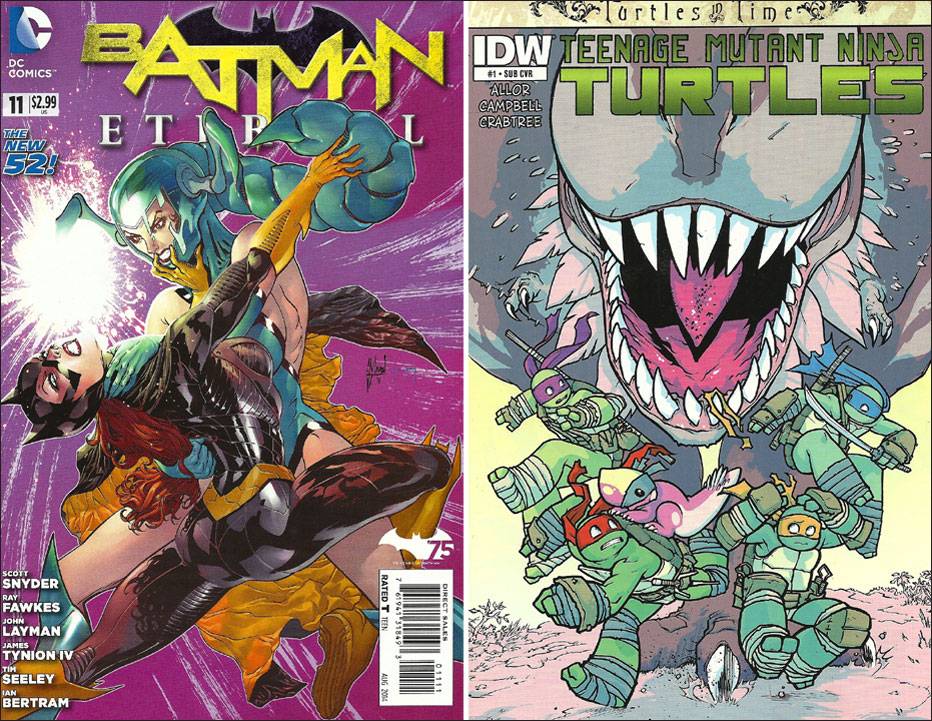
The first was Batman Eternal #11, the latest issue of one of the two weekly comics that DC is publishing. It's a tightly plotted, fast-paced series that makes great use of the decades of world-building that have gone into the publisher's Batman comics, featuring a huge cast of superheroes, supervillains, supporting cast members and the fleshed-out setting and history of Gotham City.
The killer deadline is, obviously, too much for any one artist to handle, and so the art has been pretty much all over the map in terms of style, the quality generally somewhere between "high" and "needs improvement." So far we've seen issues by Jason Fabok, Andy Clarke, Trevor McCarthy, Emanuel Simeoni, Riccardo Burchielli and personal favorites Guillem March and the Dustin Nguyen/Derek Fridolfs team.
And then this week we got Ian Bertram, the artist who drew the most compelling section of Detective Comics #27.
When I encountered Bertam's art there, in a short story about Batman's literal 75th birthday, I was struck by the way his big, weighty figures suggested the work of Frank Quitely or Chris Burnham, with his busy, delicate linework giving a tactile texture to everything, suggesting Rafael Grampa. Here I was mainly just surprised to see it at all, particularly on a rather random chapter of the weekly Batman family comic.
One need only glance at Guillem March's cover, of Batgirl battling Scorpiana (an assassin introduced during Grant Morrison's run on the franchise), to see just how different Bertam's art is from the usual New 52 fare.
His panel borders are hand-drawn, and he does some of his own lettering, incorporated into the artwork, making the pages seem more personal and organic; his artwork has an old-school, storybook-illustration feel to it. The figures are exaggerated into cartoony proportions — from the big-eyed, big-headed doll figure of Batgirl to the towering, broad-chested presences of Bruce Wayne, Batman and Red Hood — and they seem carved out of the page with a million little lines. His acting during the action scenes is remarkable.
Good thing then that he gets to draw so many characters, doing so many things, in so many different places: Batman and Selina Kyle meet in a downpour in a Gotham graveyard. Batgirl tries to rescue a telenovela star from nightmarishly redesigned Scorpiana in Rio De Janeiro; Red Hood, Starfire and El Gaucho assist, arriving in an alien space craft. Stephanie Brown discovers the secret origin of The Cluemaster in a Gotham County library, allowing for flashbacks to his early criminal career, the moment he snapped and ended his previous career and a childhood memory of Batman. Alfred and Julia talk inside the ornate, stately Wayne Manor during a rainstorm.
He draws Batman and Batgirl in their New 52 costumes, but with his own texture, so Batgirl doesn't look like she's wearing a suit of weird armor, and both bats look more like shadowy figures of action. Scorpiana is ... hoo boy ... look at his Scorpiana:

And how he draws Stephanie's memory of Batman roughing up her father in the middle of the night:

Additionally, refreshingly, he (and the writers) put a handsome man in just a towel for the majority of the book's length, and there's an unusual but welcome variety of female body types in Bertam's comic. Batgirl and Julia are slim, lithe, fit, with the bodies of models.

Starfire is skinny and small-chested, rather than the redonkulous alien Barbie she's usually drawn as.

There are plus-sized Brazilian models, portrayed as sexy. Catwoman is completely covered up throughout. Scorpiana wears a monstrous insect on her head.
In a way, I suppose its a shame Bertam's talent is spent on a random chapter of a Batman soap-opera comic, but it does elevate the proceedings astronomically, and makes me wish that excellent, exciting, unusual artwork was the rule rather than the exception when it came to superhero comics.
The other comic I felt like standing up and cheering for this week was IDW's Teenage Mutant Ninja Turtles: Turtles in Time #1, the first issue of a new miniseries set in the publisher's unique Ninja Turtle continuity. Written by Paul Allor and set after an annual that hasn't actually come out yet (oddly appropriate, given the premise of the series), it features the Turtles being bounced unexpectedly into a different time period by the ditzy apprentice time lord Renet, using a malfunctioning time-travel doohickey.
And it's drawn by Ross Campbell, who's not only one of my favorite comic book artists at the moment, but is also an artist who's doing incredible, forward-thinking, important artwork on series as diverse as his own Wet Moon and Shadoweyes and Image's recent reimagining of Glory. He's also a huge TMNT fan, which I imagine had to be a big factor in how and why his work keeps appearing on IDW's TMNT comics.
The first page of the comic is a ninja turtle punching out a velociraptor, and it only gets better from there.

The Ninja Turtles find themselves in the age of dinosaurs, caught up in a stampede and pursued by dinosaur-riding Utroms — those are the little brain-shaped aliens — who capture Raphael. It's up to the other three Turtles to rescue their brother, a friend/pet he makes while in dinosaur prison and the other captive dinos from the Utroms, who go about in various forms of robot-suits. They do so in part by riding on a gigantic pterosaur.
So you've got pretty perfect comic-book subject matter here, a wish list of stuff for an artist to draw: Dinosaurs, Ninja Turtles, time travel, aliens, robots, lasers, a pretty lady and an exotic setting.
Campbell knocks every panel of every page out of the park. His ever-evolving art style has changed pretty dramatically since he first started sharing pictures of Turtles he's drawn. His Ninja Turtles seem to have gravitated close to the designs of the current Nickelodeon cartoon incarnation, with smooth, oval-shaped, human-like heads and big, chunky extremities, tightly swaddled in wrappings and bits and pieces of ninja armor. In addition to being distinguished by the color of their bandanas, Campbell's Turtles are further distinctive in their dress, although these are all pretty small details.
His Turtles also have pupils, rather than the white-triangle eyes Kevin Eastman and Peter Laird originally gave them; thus, Campbell's versions are highly expressive.

Perhaps most remarkable, though, are his dinosaurs, which reflect current thinking among paleontologists, and thus look more realistic, while also appearing completely alien, as pop culture has rather rigorously avoided giving them feathers or fuzz (David Petersen's cover for this issue, one of the three it shipped with, for example, shows a leathery-skinned, reptillian-looking triceratops).
Almost all of Campbell's dinos have some form of feathers, even the rather fearsome T. rex-like theropod. His pterosaur even stands quadrupedally on all fours!

Whether you're a fan of the Turtles or of dinosaurs or both, this comic is an incredible treat, thanks in large part to Campbell's inspired art, which manages to be funny, exciting and cute simultaneously (colorist Bill Crabtree's work, which gives everything a bright, poppy, confectionary look, sure helps, as does, of course, Allor's script, which can basically be boiled down to "Cool stuff happens for 22 pages").
I'd still kinda like to cheer and pass out some high-fives, but I guess this raving will have to do for now ...