Guardians of the Galaxy was quite a bit different from other Marvel films and the sequel continued to set Marvel's cosmic branch apart from the rest of the MCU in the best possible ways. Some of the coolest parts of Guardians 1 and 2 were the visuals. The costumes and environments are magnificent aesthetic spectacles, boasting some impressive design work. There were quite a few iterations of our favorite A-holes that the concept artists went through before settling on what we saw in the first film, and the stages of development are fascinating to look back on.
RELATED: Green Lantern: 15 Unused Concept Images (That Could Have Saved The Movie)
It would take too much time to go through every character design from GotG Vol. 1 & Vol. 2, so we're just gonna hit some of the coolest highlights, focusing on the main cast of both films. Concept art is a pretty interesting step of design, since you can see how some elements are nixed in favor of others as a character's look develops from idea to final product. The design process of Guardians is just as cool! So, let's dig into some early concept art from both Guardians of the Galaxy's to see just how much the characters' changed during preproduction.
15 FIRST LOOK

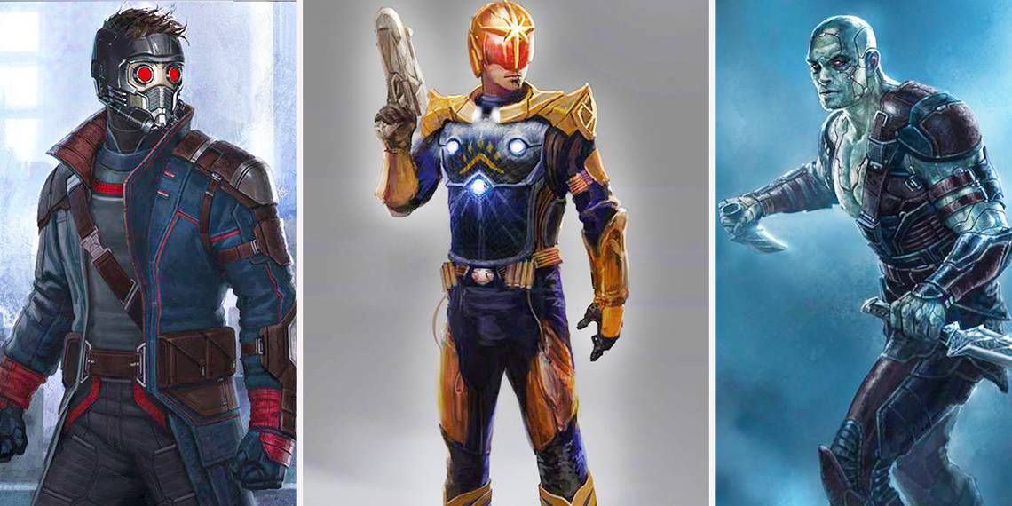
This was the very first piece of art Marvel released after the announcement that a Guardians film was in production, a fantastic way to grab fans' attention. It's a little bit of Star Wars and a little bit of Thor thrown together and it got people interested. MCU fans began to wonder who these characters were, what their backgrounds were, and how some strange space opera was going to fit into the MCU.
There's a lot to like from this initial look! Star-Lord's outfit makes him out to be a bit more cowboy than outlaw, Gomora looks pretty comics-accurate, Groot's massive size is as badass as it is frightening and the whole picture has a cool space-western vibe to it. In the end, though, not a lot actually carried over from this initial concept aside from the team lineup, Star-Lord's mask and the Nova Corps ships.
14 COMICS-ACCURATE STAR-LORD

Star-Lord has gone through quite a few looks (and hair colors) in his comics career, but the biggest deviation came from his depiction in Guardians of the Galaxy. In the film, Star-Lord is portrayed as a space-outlaw, a ravager who digs up old junk and sells it to the highest bidder. This is a lot different from his comics counterpart, who was written as a space-cop of sorts, his outfit here reflecting this depiction.
It seems that the film almost went in this direction with the character, at least with his looks. These designs show a very different Star-Lord, one with a much more comics-accurate look. We can't really say these make Quill look more cop-like, but clearly the designers wanted too see what they could do with some of his more signature looks.
13 COMICS-ACCURATE GAMORA

Similar to the look we saw in the initial concept art, these concepts evoke the outfits Gamora has rocked in the comics. When looking at the comics counterpart of Gamora, the film version is a HUGE departure in terms of looks. Though both versions have a similar backstory — the last of her kind, raised by Thanos to be a weapon, etc. — they couldn't look any more different.
Being a warrior, Gamora's comics costumes tend to lean more towards medieval space barbarian, while the film's versions of the character is somewhat of a leather-inclined fashionista. Though both versions are great, these initial concepts depict a much more badass, barbarian-styled Gamora. Though we gotta say, the comics-accurate yellow eye markings would have worked a lot better than the barely-visible silver markings.
12 EVOLUTION OF GROOT

You know, when they're all lined up like this, these different Groot concepts sort of look like an evolution chart of his species. Wether or not that's accurate to Groot's race, the evolution of his design is pretty fascinating. As a character, Groot has gone through his own strange development, starting out as a monstrous villain outside of Marvel's cosmic branch (heh, branch) and later becoming an iconic member of the Guardians of the Galaxy.
Each of these designs is interesting in its own right. The first one reminds us of Swamp Thing with some zombie elements thrown in. The second one has a kind of robotic vibe to it with it's strange proportions and leg anatomy. The last one is the closest to the final of the three, but with a slightly different head. It's fascinating to see just how our favorite tree alien has, pardon the pun, grown.
11 ROCKET'S EVOLUTION

These are just a few pieces of concept art, but like Groot, Rocket Racoon went through quite a few phases before the final product, each stranger than the last! The first concept is the craziest of them all, though there's still a lot to like about it. This Rocket looks old and tired, aged by his years as a mercenary or whatever he was up to. The braided fur is an interesting touch, as is the old-fashioned rocket launcher.
The second design is perhaps a bit too anatomically accurate to a raccoon, though it kind of works with the outfit. The visible cybernetics are a bit much, but otherwise this is a pretty cool design, especially if the other guardians had matching outfits. The last piece is the closest to the film version, with a few adjustments made to Rocket's anatomy for the final product.
10 JASON MAMOA AS DRAX

Here's a fun fact: Jason Momoa came this close to signing on for the role of Drax in Guardians of the Galaxy before dropping out, leading the part to go to Dave Bautista. Momoa is now set to appear as Aquaman in the DCEU, but this early concept art shows what could have been. The earliest released concept art wasn't designed around Momoa, but some elements carried over, specifically the segmented skin concept.
The Momoa design has a lot to like, especially the gladiator-like armor. The use of the segmented skin to change up Drax's markings is a nice touch, though it's taken a bit too far in some places. Otherwise, it's a pretty solid design, though Momoa's face might have been a bit too recognizable for the role. As much as we love Bautista in the role, Momoa would have also looked pretty cool as Drax.
9 YOND...WHO?

Of all the Guardians characters, Yondu is the one who perhaps deviates the most from his comics counterpart. Michael Rooker portrays the character as a sort of grizzled outlaw with a heart of gold, and his design reflects that portrayal. In the comics, however, Yondu was a founding member of the original Guardians of the Galaxy and had a much different look and personality. There, Yondu was a native of Centauri IV, a hunter armed with a bow and arrow he controls by whistling.
Yondu's look was also much more tribal, since he was part of a primitive tribe on his planet. It seems that before Guardians had decided on their depiction of Yondu, a comics-accurate designs was considered. There are some cool elements to this design, especially the eyepatch and the cape, but it probably wouldn't have fit with the rest of the film's designs.
8 A SECOND LOOK

After we were treated to a first look at the then-upcoming Guardians of the Galaxy movie, another piece of concept art was released not much later. This one diverges slightly from the first, but still piqued everyone's interest in the film by introducing possible new elements that we might see in the strange Marvel venture.
First of all, look at that Groot design! It's beyond scary in the best way possible. Rocket seems to be a bit more feral despite wearing gloves and Drax has a much more armored look to his skin. Not much has changed on Gamora, though she does seem to be wearing more armor. However, the real focus has to be Star-Lord's awesome space-bike. Seriously, where was that in the film, it would have been so badass to see Quill ride in on that thing!
7 A DIFFERENT GAMORA (AND NEBULA)

At some point in the development of Guardians, the comic-accurate take on Gamora was dropped in favor of a different look for the character. It seems like this look was developed before Zoe Saldana was cast in the role, but maybe it should have been applied to her rather than the final product. This version of the alien assassin sports blue markings and cuts an intimidating figure, especially in that first design.
We kind of wish the first design shown above was the final version since it's got some great elements going for it. The sleeveless top is pretty similar to the film and bottom has a cool "space assassin" vibe to it, not to mention the blades are super badass-looking. Plus, this version of Nebula looks a lot cooler than what we ended up with in the film. Seriously, what made them move away from these designs!?
6 THE NOVA CORPS

The MCU's Nova Corps are, for lack of a better term, kind of "nerf"-ed versions of their comics counterparts. Instead of being cosmic-force-wielding space cops, the Nova Corps were downgraded to simply being the powerless police officers of Xandar. The original concept art of the Nova Corps seems to imply that this was always how they were going the be depicted, but there's still something to love about these alternate designs.
The first one is a little bland, but would have given us the signature yellow helmets, adding some color that the final version severely lacked. The second design takes the space-cop concept in stride, giving us a militaristic-looking uniform with a cool twist on the Nova logo. The final one is the biggest departure, but it's interesting as hell, especially with how the logo is integrated.
5 STAR-LORD AND ROCKET

From the looks of this concept art, it seems the orb (and the infinity stone within it) were part of the plot pretty early in the film's development. It also seems that Knowhere, or at least some kind of space-marketplace, was also planned from early on. This piece of concept art gives us a cool look into the film's development, doing a lot with very little.
Though some elements remained, neither of these costume/character designs made it into the film, despite being insanely cool takes on Star-Lord and Rocket. The small glimpse of the alien marketplace featured in this piece really sets the mood of what the film was developing into, once again teasing some old-western vibes. Plus, look at how adorable Rocket looks!
4 VILLAINOUS EGO

This seems like another one of those designs that was done before the actor was cast, since this piece was an early concept of Ego's human form. Maybe this is meant to resemble one of the actors who was originally considered for the role, but we can't quite place it. Regardless, this take on Ego's human form is rather intense, even Shakespearean in a way.
Ego is intimidating in this design, looking down upon us from his planetary throne, paying more attention to his wine than us, like we are beneath him both literally and figuratively. It's a very villainous interpretation, which is probably why it was scrapped in favor of his final design, since it makes the twist of GotG Vol. 2 kind of obvious.
3 ALTERNATE MANTIS

Mantis was one of the best parts of Guardians of the Galaxy Vol. 2, her naive and playful personality along with her cool design made for an appealing and interesting addition to the Guardians cast. Pom Klementieff portrayed the character beautifully, rocking the bug-themed outfit and prosthetics perfectly. However, it seems her look in the film wasn't the only design Marvel had in mind for Mantis.
These alternate takes on Mantis are super interesting, especially the first one. Mantis' character got a bit muted in the film, since her comics counterpart was a super-strong, super skilled warrior and not just an empathic-powered servant. The earlier design seems to reflect the comics version of Mantis, rocking armor and a very unique color scheme. The second design seems a bit closer to the final version, but with a more nature-heavy aesthetic.
2 BLUE STAR-LORD

When it came time to develop a new look for Star-Lord and gang for Guardians of the Galaxy Vol. 2, it seems like Marvel was inclined to bring Star-Lord back to his roots. Peter Quill almost rocked his comics-signature blue for the sequel, as shown in the above concept art. However, the idea was eventually dropped and the MCU's Star-Lord stuck with his usual red look.
As cool as the blue and red jacket looks on Quill, we can guess why they stuck with just red, since the outfit is just a bit too close to Captain America. Side-by-side the two designs are strikingly similar, and since they'll eventually meet in Infinity War, the blue jacket probably wouldn't be a good idea. The red and blue might make for a cool Star-Lord design, but Cap rocks the look better.
1 THE LIVING PLANET

Guardians of the Galaxy Vol. 2 used some cool concepts in portraying Ego the living planet. One of the coolest aspects of Ego was how both he and Star-Lord accessed the power of the planet's core, how they connected to the main planet body and its unlimited energy. The final product in the film wasn't the only concept for how Ego worked, and these alternate versions are just as cool.
The first version is somewhat similar to what we saw in the core fight, but with a bit more organic integration to it, plus some horror aspects (he looks super scary in this piece!) thrown in. The second one is much more unique, much more surreal, showing just how alien Ego's humanoid form really is. This concept almost has an anime villain vibe to it and it'd be awesome to see how it would have looked on film.
Have you seen any other Guardians concept art that we should add to the list? If so, let us know in the comments!