And now for something completely different: reviews of sequential art books longer than individual, monthly-produced single issues! I know: can you handle the excitement?
Larry Young is on another promotional blitz, it seems, as he is sending copies of Giant Robot Warriors out to various people. I always like getting stuff from Larry in the mail. It makes me feel all warm and fuzzy inside.
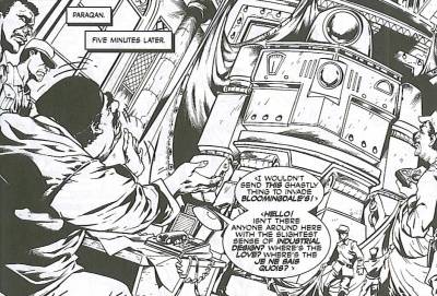
Giant Robot Warriors is written by Stuart Moore and drawn by Ryan Kelly. It's published, obviously, by AiT/Planet Lar, originally appeared in 2003, and costs $12.95. Larry is pushing it, presumably, because of Kelly's higher profile now that he's working on Local. Is Local all that high-profile, though? Either way, it's a chance to see Kelly's art in between the somewhat lengthy appearances of Local.

Giant Robot Warriors tells you exactly what to expect in the title. This is indeed about giant robots who are built and deployed by the United States military. The idea of giant robot warriors as substitutes for nuclear weapons, which is how Moore uses them, is pretty freakin' brilliant, actually. It's a wonderful idea, goofy yet slightly unsettling at the same time, and for the most part, Moore does a very good job with it. This is basically a satirical book, with plenty of asides about the Cold War, the situation in a certain Middle Eastern country, and even the nature of celebrity culture. It doesn't exactly break any new ground, but Moore and Kelly keep things zipping along, and it's an enjoyable read.

The problems start when you actually think about the book too much. Yes, it's a satire, but Moore chooses to go after some easy targets, and there the book suffers just a bit. Not enough to make it a bad comic, but enough to temper my enjoyment of it slightly. Moore goes after the president, and his solution for why Bush makes some weird statements occasionally is rather ingenious. However, it just seems too easy to go after the president. I'm no fan of Bush, so you would think I would enjoy this more, but what I really wish is for Moore to go after all politicians, because Bush is just an example of the crappiness of our elected officials. Moore's idea about Bush would work just as well with Kerry, to be honest. It might actually be funnier. The bad guys, who are ostensibly Muslim, are both strangely concerned with interior decorating. It's weirdly funny when one of them rants about it, but when his replacement does too, it's feels a bit off. But it's just a few panels, so I can deal with it.

Kelly's art is the real star of the show. His robots are hulking beasts, clunky yet fluid, and he jams details into every panel in the book, bringing this wild world to full-blown life. His drawings are a bit more cartoony than they are these days, but in a book like this, that's a plus. He has a wonderful sense of scale and perspective that makes the book interesting and unusual to look at without being disconcerting. And his robot battle near the end is truly magnificent. It's mostly Kelly's book, and all Moore does is hang a tale on his art and get out of the way.

This is certainly not the greatest book in the world, but it's a fun read with some nice jokes and some shallow political satire. It's almost worth the cover price for the art alone, and when you throw in a pretty decent story, it's definitely a fine book to check out.
Next up is Hip Flask: Concrete Jungle, which is published by Image andproclaims that it is Volume One, "The Big Here & the Long Now." It's written by Richard Starkings, with part of the script by Joe Casey, and fully painted by Ladrönn. Starkings, through Active Images, was nice enough to send this to me, and I'm glad he did, because this is a stunning piece of art. Really magnificent.

The nice thing about this big book is that you don't need to have any knowledge of the characters coming in, even though they star in a monthly comic book, Elephantmen (which is also very good). Starkings and Casey do a fine job introducing the characters and the concepts of this futuristic world without forcing it on us, and we're quickly immersed in 23rd-century Los Angeles, as well as the lives of the animal/human hybrids who walk her streets. Hip Flask, the hippopotamus detective, is the star of the book, but we also meet Obadiah Horn, the rhinoceros businessman, the giraffe shopkeeper, Lieutenant Trench, the zebra policeman, and Casbah Joe, the camel club owner (yes, Joe Camel). Starkings gives each of these characters, plus the many humans who populate the city, solid personalities and nifty little quirks, and although this is a pseudo-noir mystery (Blade Runner is the easiest comparison to make in the movie realm), none of the characters feel too much like stereotypes. The added dimension of these hybrids living among humans lifts the book up beyond just a simple noir-ish mystery and adds a nice level of ethical and racial issues. These hybrids are unwanted in the city and are subject to prejudice, but they soldier on. Hip Flask embodies this determination to get things done.

It's a thickly plotted book, too, with a time travel experiment gone wrong at the heart of it. This leads Hip Flask to investigate Casbah Joe, which leads back to Obadiah Horn's business dealings. Horn has a rival in his underworld dealings, a human named Serengheti, and there's a gang war going on. Plus, the scientist who created the hybrids has something going on, and he's confident that he's about to get out of prison. Add to this the underpinning of prejudice against the Elephantmen, which Hip Flask deals with throughout the book, and it's a nice meaty story to sink your teeth into.

Ladrönn's art is spectacular. He brings Los Angeles to life with startling details and impressive full-page spreads of sprawling freeways and towering buildings. There's also decay, of course, and on the ground in the city, we see the rottenness at its core. Ladrönn shifts easily from the beautiful African landscape to the alleys of the city to the penthouses of Obadiah Horn to the warehouses where brutal violence is practiced. And it's quite brutal, but Ladrönn does a good job making us squirm when he shows the effects of violence. His Elephantmen are wonderful, too, as it's always clear they are animals, but they look so human it's easy to forget. The human beings, especially the women, have a vague what I would call "European" look to them - I can't really explain it, but it feels reminiscent of European artists from the 1970s like Moebius. They look out of style. Check out Vanity, Hip Flask's companion:

It's not that thedepiction is bad, it just looks somewhat out of whack with the rest of the book. It's a minor point, not even really a complaint. It just struck me as strange.

The biggest problem I have with the book is really nothing to do with the book if you read it in a vacuum. I have been reading the monthly series, however, and I'm a bit puzzled where this book fits in with those. Several elements and characters from the monthly book are in this, and the biggest problem is that someone gets killed in this book who's still, as of last issue, alive in the monthly series. And the doll that features rather prominently in the montly series makes an appearance, but it doesn't seem to have gone on its journey yet. I assume this takes place after the events of the monthly series, but how will that story continue in conjunction with this one? It's weird. Plus, this is the first in what presumably will be a series of graphic novels. It ends on a bit of a cliffhanger (two, really, with the death of the character and a big event over Los Angeles), and another volume is promised. Considering that it probably takes Ladrönn forever to paint these kinds of things, I doubt we'll be seeing it any time in the near future. So will the events in the monthly reflect what happened here? These things bug me.

Taken completely on its own, Concrete Jungle is a beautiful and gripping graphic novel. It costs 30 dollars, which is a bit steep, I'll admit, but it's very much worth it. The cliffhanger ending notwithstanding, it's an excellent piece of art. I just hope we see the next one within a decent amount of time!
Up next is Sore Thumbs by Owen Gieni and Chris Crosby, which is published by Keenspot Entertainment (based in South Dakota!) and will set you back $12.95. It's also volume one, so presumably more are forthcoming. The people at Keenspot were nice enough to send this my way, so I thank them.

This is a bit of an odd duck. Everyone knows the expression (which is totally sexist and I would certainly never use in casual conversation!) of "why buy the cow when you can get the milk for free?" This is actually a perfect example of this, because Sore Thumbs is a webcomic that you can read for free, with a new strip appearing every Monday, Wednesday, and Friday. This volume collects the first eight months or so of the comic (from March to November, 2004), but it's not like you can't read it yourself, if you want to. Here's the link to the first page of this collection, and you can just go from there. So I'm not terribly sure why this is collected and sold, when you can easily get it for free witha simple Internet connection. Maybe this is for the poor sad people who don't have an Internet connection (in which case sending it to me isn't going to do much good). I'm no marketer, but it just seems weird.

Of course, the question is whether it's any good or not. Well, it's okay. Crosby's manga-esque art has a goofy charm, whether it's his ridiculously pneumatic Cecania, her round-headed brother Fairbanks, or the charming second fiddle Harmony. He does a nice job in the book with the gamers who show up at Fairbanks' video game store, showing them in all their nerdy glory, staring slack-jawed at Cecania's ample bosom. There's not a lot of action in Sore Thumbs, so Crosby has to be good at shifting our focus easily from one character to another, and he does this well. He also does facial expressions extremely well, another plus in a limited space like this. Fairbanks, interestingly enough, often gets the most varied palette of facial expressions, despite having a rather bland "normal" face. Maybe that's why Crosby cuts loose with him so much. One strange problem with the art is a lotof the backgroundsare very fuzzy, as if Crosby just sketched something vague and then added the figures in front. It's not that big a deal because so much of the book focuses on the characters, butit's a bit odd.

The writing is hit-and-miss, which is to be expected, possibly, from a comic thattries to tell a joke in one page everyother day. There are long storylines running through the book, but Gieni also wants to have each final panel end with a punch (not necessarily a joke, just something that ends the segment), so it feels very disjointed a lot. Andnot all of the jokes really work all that well. There areplenty of funny moments, but lots ofkind of dull moments too. Gieni uses Cecania, the super-liberal, and Fairbanks, the ultra-conservative, to take potshots at political figures (Fairbanks is far more the figure of ridicule than Cecania, but she's still a target), and some of the jokes are very funny, but thesatire isn't as razor-sharp as it could be.Wow, Fairbanks hasgay fantasies about the president! Isn't that clever?Picking on conservatives and video game players is kind of easy, after all (it's like picking on comic book nerds!),so although there are some funny moments, a lot of times it's like shooting fish in a barrel. Sore Thumbs is gleefully politically incorrect, however, and it's nice to see Gieni and Crosby at least going fullbore to offend everyone. Sometimes, however, it's just not that funny.

I can't really recommend Sore Thumbs, even though it's enjoyable. It misses the mark as much asit hits,and I keep coming back to the price. Why would you buy it? Go to the web site and read some of it. See if it's for you. There's no need to shell out 13 dollars for this.
Moving on, last week saw the re-publication of It Rhymes With Lust,which was originally published back in 1950. It's a pulpy noir book written by Arnold Drake and Leslie Waller and drawn by Matt Baker and Ray Osrin. Dark Horse published it this time around, and it costs $14.95. It would have been nice to see it before Drake died, butfor some reason,it was delayed a bit.

It's an interesting book to read even though it's not that great. I'm glad I bought it, but at the same time, I find it more interesting as a historical artifact than an actual good comic book. It's fascinating to see how little the pulp noir genre has changed in over 50 years (more, really, if you go back to the 1940s and earlier). The art and some of the writing has a distinct 1950s feel to it (no cursing, in other words), but if Sean Phillips re-drew this and Ed Brubaker, just for fun, slapped his name on the script and it came out over a few issues of Criminal, I doubt if anyone would bat an eye. It has everything a pulp noir book usually has, and if that's your thing, you'll probably enjoy this.

Our hero, Hal Weber arrives in Copper City from the East when an old flame, Rust Masson, summons him. Rust is your prototypical femme fatale, marrying a rich older man and then taking over when he dies (he's dead at the beginning of the book). She wants to take control of the state's political machine, and she needs to destroy her rival, Marcus Jeffers, to do it. She hires Weber to run one of the two newspapers in town - the one everyone thinks is "unbiased" - to smear Jeffers. Weber knows he's being played, but he can't resist Rust's charm (her name, after all, rhymes with lust!). His saving grace is Audrey Masson, Rust's step-daughter, who is, naturally, a blonde beauty with a heart of gold, who falls for Weber and tries to get him to do the right thing. There are double-crossings, murders, Weber falling into Rust's bed (tastefully off-panel, of course), and women slapping other women. Man, that Rust is mean! The politics of Copper City might be the most interesting part of the book. Of course, that comes from someone who thought the local politics of Chinatown and The Two Jakes were riveting, so take it with a grain of salt.

This is a remarkably modern book, both in the story and the art. The people, obviously, are dressed in the style of the times, but if we compare it to a lot of the monthly comic books that were coming out at the time, it's crisp, realistic, and everyone is well-proportioned and normal-looking. Too often with bad comic book art, the artist is trying too hard to squeeze things into panels that aren't the best size for it. Baker easily tells the story, and makes sure every person is where they should be. It doesn't look like a 1950s comic book, and it's very nice to look at. The story, as I've said, holds up, with people acting like people, and despite some purple prose, there's nothing here that makes us roll our eyes and shake our heads. Rust's power over Weber is a bit weird, especially after he realizes what a viper she is, but she's a red-headed sexpot - who wouldn't be in her power?

But I have written that it's not that great. Well, yes. Most of what I like about this book comes from the fact that it doesn't feel like something that was written and drawn in 1950. It's still a pretty standard story, with all the elements of a pulp novel, and nothing really comes as a surprise. If you're a huge fan of the genre, it's worth checking out, but it's not going to make you marvel at its originality or even its flair. Drake and Waller, neophytes in the comic industry, don't do anything in this book to make it stand out. Perhaps it's because they were neophytes, and they wanted to make sure they could still work in the industry. A little over a decade later, Drake created the Doom Patrol, and it's interesting to see how much better he writes in those stories than in this one. There's nothing really wrong with this book, but there's nothing really special about it, either.

However, like I wrote, as a historical curiosity, it's kind of neat. But that's about it.
Finally, last week we got are-issue of Solstice, by Steven T. Seagle and Justin Norman. It's published by Active Images and costs $12.95. If it weren't an old book that got a bit of a makeover for this edition, I would say it's in the early running for best graphic novel of the year. It's phenomenal.

Solstice was originally planned as a three-issue mini-series, but the company publishing it went under and it was never completed. It showsonce again that Seagle iswasted on big-time superhero comics, where his work(what I've read of it) is unimpressive. It's unfortunate that it's what pays the bills, but at least it allows him to write stuff like this and the Superman graphic novel It's a Bird ..., which is also brilliant.
This book tells the story of Russell Waterhouse and his son, Hugh, who have a contentious relationship, to say the least. Russell is a stereotypical domineering father who happens to be a multi-millionaire. He is obsessed with staying alive, and thebook is centered around his quest to find the Fountain of Youth. Russell takes Hugh on three different expeditions tothree remote corners of the world, and we see his ruthlessness and his contempt for weakness, as well as his unbelievabledrive to succeed. Russell is a harrowing portrait of an evil man, and we're not terribly unhappythat he falls(seemingly)to his death on the third page of the book.

Yes, Russell falls from a waterfall and dies. The entire book is told by Hugh inflashback, and he begins his tale in thejungles of Chile, where the third expedition has gone horribly wrong.Seagle's choice of starting it here means that he can circle around the events of the book, making this a wonderful puzzle to read. Hugh constantly jumps back andforth from the "present" (the expedition to Chile, even though that's in thepast too) to further in the past, and the non-linear style of writingmeans that Seagle can concentrate on the relationship between Hugh and his father, revealing moments between them that allows us to constantly shape our perceptions of Russell. Despite being a monster, he's also human, and when heshows his human side briefly, it's a powerful moment.Seagle also reveals a big secret about their family late in the book that shows us why Russell is so focused onfinding the Fountain of Youth, a secret that occurs early on in Hugh's life. It wouldn't be as emotionally wrenching if it camechronologically when it's supposed to. The entire book is like that, with Russell doing something horrible and then Hugh going back to an earlier event that reveals the context. It doesn't make Russell less of a horrible person, but it helps undercut our perceptions about why he does what he does. The final secret of his quest is revealed after his death, and it puts his entire life and his reaction to it inclear focus, and we realize that we've understood very little about what's been going on.

Seagle seems to do well with this kind of book. He is very concerned with the connections we have to family members and why we forgive them even when theycommit seemingly unforgivable acts.Seagle is primarily dealing with the relationship between and father and a son, and he does an excellent job showing how Hugh can still remain withRussell even after his father humiliates him constantly. It's not just because Hugh is weak - in theend, he turns out to be stronger than we thought. And it's not just because Russell is so domineering - he needs Hugh, and even though he berates his son, he alsotries to keep him in his life. It's a brutal relationship, one that is uncomfortable to read about, but it's real, and it remains intriguing throughout the book.

Norman's artwork is stunning as well. Heshifts easily from the South American jungles to the Siberian wastelands, anddoes a fine job showing Russell and Hughatdifferent times of their lives. As this is a book that jumps back and forth in time, Norman has to keep up with Seagle's shifts, and he does it admirably.On one page, he draws Russell's "walk," which Hugh recognizes ashis supremely confident walk, fourdifferent times with four different backgrounds, and it's a wonderful effectthat shows just how powerful Russell can be. Norman also does a very good job showing Russell's easy change from charming to monstrous, and as we look, it'sactually surprising to see thesame face changesoquickly and clearly. It's a wonderful book to look at, full ofinteresting little details and nuances.

This edition has a nice appendix, with the publishing history of the book andan interview with Seagle and Norman, in which we learn that Norman had to relearn his style from a decade ago to finish the book, and that Richard Starkings re-lettered the entire book once it was completed. Stuff like that, the nutsand bolts of creation, are fascinating to me (it's why I love good commentary on DVDs). It's a nice companion to the mainbook.

Solstice is a great comic book. It'sadventurous, it's thrilling, it's an honest and chilling look at a dysfunctional relationship between a father and son. Seagle can write all the mainstream superhero comics he wants. As long as he gives us something like this every few years. Check it out - you won't be disappointed.
Well, that's a bunch of bigillustrated books to get through! Ihope something here caught your fancy, becausewith so much keen stuff out there, there's no need to wait aroundto see who next draws Supergirl like a slut!
(By the way, I apologize for the poorlegibility of someof these pages. I'm not sure what the deal is.Bad paper quality, maybe? Or perhaps I'm using the wrong program toload pictures. I'm sure if I had more time I could figure something better out. Anyway, I'm sorry.)