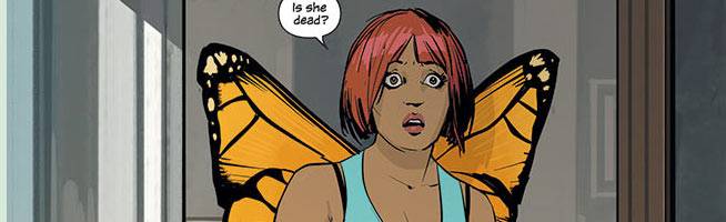
Fiona Staples had already been working in a comics for a few years when she made her name with two miniseries, "North 40" and "Mystery Society." When these titles hit stores, it became clear that she was an immensely talented designer and storyteller. Since then, she's drawn issues of "Jonah Hex" and "Northlanders," created covers for Archie Comics and "DV8," but the main reason most people know her name these days is because of "Saga."
When it was first announced, the book attracted attention because it marked writer Brian K. Vaughan's return to comics, but once the book was released and its popularity began to grow, it was obvious that much of the book's success was due to Staples, who draws and colors the book in addition to lettering Hazel's narration. The book won three Eisner Awards at this year's Comic-Con International, including Best Continuing Series and Best New Series, and was awarded six Harvey Awards including Best Artist and Best Color for Staples.
We spoke with the comic book superstar about her early days in comics, how she approached her art process, which is almost entirely digital, and whether or not the comiXology distribution issue affected her approach to the series.
CBR News: You're from Calgary, and Alberta was hit with some brutal flooding earlier this year. The region is still dealing with the damage -- I hope that you got through it all right.

Fiona Staples: I was okay, thanks! My area had a lengthy blackout that put my work behind schedule, but I'm doing my best to catch up now.
Now, the two big projects you did right before "Saga," which are the books where I think people started to take notice of you, were "North 40" and "Mystery Society." Besides both being great showcases for what you could do as an artist and a storyteller, you got to design characters and creatures from scratch. How important was that and did those opportunities come at the right time?
"North 40" and "Mystery Society" were both stories about wild, fantastical things happening in something resembling the real world. The setting of "North 40" was a small Missouri town, and I shot a lot of reference and tried to keep the locations pretty realistic to heighten the drama when the town got invaded by monsters and mutants. I think horror comics are more effective when the art is somewhat grounded.
For "Mystery Society," I don't think I really put as much into the environments as I should have. There were some fun locations -- like a giant "Indiana Jones"-style warehouse and futuristic mansion -- but I paid more attention to the characters and the action. There are things I'd do differently now on both series, but I learned a lot drawing them so I guess you could say they came along at the right time!
What was it that attracted you to "Saga?"
The chance to work with Brian [K. Vaughan] was obviously an immediate draw! I was a little bit concerned about the idea of doing an ongoing series, but when I heard the story concept and imagined the sci-fi fantasy world, I couldn't pass it up. I'd been wanting to move into more creator-owned work as well, so doing an adult book like this at Image, with total creative freedom, was a great opportunity.
When you were starting out, what did Brian give you as far as descriptions and details of Marko and Alana and how much freedom have you had to design things from scratch?
I was told that Marko should have ram horns, Alana should have small insect-like wings, and that they were young and attractive. Everything else was up to me. Sometimes I wonder what other artists would have come up with based on those descriptions!
How do you typically work on an issue? Walk us through your process.
I read the script and thumbnail it, then scan those thumbnails in and use them as pencils. I shoot quite a bit of photo ref, usually just of myself. Then I ink the figures and foreground elements in Manga Studio, and do the backgrounds and colors in Photoshop. I use an iMac and Cintiq 21UX.
Have you always worked that way? Why did you switch to working digitally?

I've been working digitally since 2007, which is when I got my first series at a major publisher -- "Secret History of the Authority: Jack Hawksmoor" at WildStorm. Up until then, I'd been doing colors in Photoshop, but pencilling and inking traditionally. However, I knew that wouldn't be fast enough for the demanding schedule "Hawksmoor" was on. I think I had four weeks to do each full-color issue. I was staying in England at the time, with Frazer Irving. He kindly lent me a spare Cintiq, and it changed my life immediately. I haven't drawn a pen-and-paper comic since then, much to the dismay of my art dealer.
Why do you thumbnail in pencil but ink and color and letter digitally? I'm sure going straight from thumbnails to inks is a faster process, but why do you need one stage working on paper?
Well, I don't need to thumbnail on paper, but it's my only chance to work outside of the house! I just enjoy thumbnailing in the coffee shop.
You also color your own work, and have for a while. Why is that important to you and what do you enjoy about the coloring process?
I've always worked in color, even before I started doing comics, so it seemed like a no-brainer. As a teenager, I scanned my terrible anime fanarts and colored them in Photoshop Elements. In art college, we did a bunch of color theory and painting classes, and all of our projects were full-color. So when I began drawing comics, it never occurred to me to get someone else to color my work.
I enjoy it because it gives me control over the final product. When I read Brian's script, I immediately picture it all in my head, and color and lighting and value is a huge component of that mental picture. I just like to be in charge of that stuff!
I've worked with a colorist exactly once -- Dave McCaig colored an issue of "Northlanders" that I drew. He did an amazing job and it was cool to see another artist bring their expertise to the book.
What did you learn from coloring other people's work like Frazer Irving or Riley Rossmo's, as you've done in the past?
It's interesting getting so close to another artist's work. Looking at it is one thing, but when you're coloring it you notice all the little details they draw and their stylistic quirks.
Besides coloring your own work, in "Saga" you also do some lettering.
I do Hazel's narration, but our letterer on "Saga" is the incredible Fonografiks, AKA Steven Finch. He does our lettering, designs and lays out the title pages and letter column, and even designed our logo.
Finally, "Saga" has had a few issues with comiXology as far as distribution, due to the series' sexual content. Are you able to ignore that and just focus on the story and its needs?
I was glued to Twitter the day that #13 was booted from comiXology, but the whole thing blew over very quickly, so the next day it was easy enough just to get back to work.


