THE EPIC GEN13 RE-READ: "SUPERMAN/GEN13"

In 2000, DC and Wildstorm (by then, they were one company) "teamed up" to publish a crossover miniseries, "Superman/Gen13." It's the story of what happens when the Gen13 kids travel to Metropolis and get mixed up with Superman. It turns out to be one of the most interesting and heartfelt stories starring the characters. It's greater than the sum of its parts, smarter than the most base humor of the Gen13 title, and informative of the character of Superman.
That's a lot to ask in three issues, but this miniseries delivers all of it.
Even more impressively, it's written by an artist with few writing credits to his name, and drawn by a relative newcomer who hadn't had a big credit yet.
Sometimes, magic happens in the craziest places.
The artist turned writer in this case is Adam Hughes, who had written and drawn a two-part miniseries, "Gen13: Ordinary Heroes," back in 1996. While best known for his art, Hughes displays a strong story sense with this three parter. Yes, it has a simple sit-com level plot device to get the story started, but that's played for laughs, particularly with the resolution of the story.
The story is that Caitlin Fairchild convinces the team to visit Metropolis on what's basically a field trip. Everyone else objects over Metropolis being a boring city and Superman being an old fuddy duddy, but Caitlin's crush on Superman fuels her insistence and a train is boarded.
While witnessing a superpowered fight between Superman and a giant gorilla powered by a brain in a jar, Fairchild gets hit in the head and suffers amnesia. Puzzled when she wakes up covered in Superman's cape, she believes herself to be Supergirl suffering from a Red Kryptonite attack that de-powered her. She tries to act the part, but does rather poorly, snarling up traffic in the city, burning down homes, and generally creating chaos. It's up to the Gen13 kids and Superman to figure out what's going on and stop her.

Hughes plays the story with a light touch, and rightfully so. Fairchild visits costume shops to repair her ripped up clothes after each blown opportunity. Superman is stuck helping the Gen13 kids who are openly negative towards him, just to save his city and get them to go away. There's also a cute bit in there about his secret identity and having Lois and Jimmy helping him out with that.
In the text page of the second issue, there's a quote taken from Hughes' script where he lays out what might be a tricky scene to get past DC, but also encapsulates beautifully what the miniseries is about. I'll interject along the way, but here it is:
I feel it's important to note that none of this is mean-spirited or spiteful. Modern teens will bust on someone just to hear themselves be clever, which is what the Gen13 kids are doing.
If anything, given the often crass and crude way the Gen13 kids talk, this scene is mild. Here's pages 2 and 3, which form the main thrust of the attitude Hughes is talking about, and that neatly express the conflict between the two title characters.
You can see how Kent alternates between crestfallen and angry over realizing that not everybody is thankful he's there, or thinks he's the greatest thing since sliced bread.


The conflict between the two is natural, in hindsight, but it takes someone like Hughes to write it so well that it feels this obvious.
The importance of this scene is to really startle Clark/Superman with the notion that people talk; that he has no real control over how people perceive him. For the duration of the story, he'll experience a bit of insecurity about what others think of him. This leads into Superman's introspection about the nature of heroism when Fairchild goes around trying to be what she mistakenly believes is "Super," and he begins to second-guess what has always come naturally to him. I realize that the nature of crossovers and miniseries precluded the possibility of character change and grown; that is the pervue [sic] of the writers and artists of the regular superman titles.
Hughes is realistic and respectful. The main title creators for any given character should be the people who determine the direction of a character. That just makes sense. And face it, when you read a one off special or crossover like this, you're not really expecting major changes, are you? The last time someone tried that that I can remember was when Warren Ellis used an Aliens crossover with "Stormwatch" to kill off a bunch of cast before launching "The Authority."
As I recall, rights issues kept that comic from being reprinted for years afterwards.
This situation doesn't really apply with a crossover like "Superman/Gen13," since the two publishers were one, but I'm not so sure they were when the production on this began...
However, if the only conflict Superman is allowed to experience in these miniseries is external, he will come across as flat and superficial. All I can hope for is the opportunity to let Superman experience some character dilemma for the run of the miniseries, and return him to DC in the same state he was given."
There are lots of movie fans who wish Zack Snyder shared that sentiment.
Isn't it nice to see someone proposing a crossover event book like this who isn't worried about pairing up The Biggest Villain from each book to go against each other?
This book gets so much right, and much of it is thanks to Adam Hughes having a heart when writing it, but also being so well versed in the mythology of comics to set an appropriate tone and sell it so well.

It's not entirely one-sided, either. Burnout -- Bobby -- gets the chance to work with Superman in the second issue, saving a family from a burning house, and realizes that the Big Blue Boy Scout isn't so bad. It takes another issue for everyone else to realize it, but he's clued in pretty quickly. The tricky part is, he doesn't want to be the outcast of the group, so he holds that opinion back. When it leaks out, he suffers more barbs from his friends.
Friends can be so cruel. But like Hughes said, they like to bust on one another.
The Lee Bermejo art in this series is clearly a larval stage version of the Bermejo we know today. He had only been in the industry for two years, picking up odds and ends at Wildstorm. It was after this series that he started to pick up more regular, higher profile work, and for good reason: his style stands out on the shelves and is unique at the level he's drawing at.
The thing with Bermejo is, his art draws all the details by laying down the shadows. It's obsessive with detail, but only in the ways that detail can be shown by depicting how it casts a shadow. The closest other artist I can think of in this category at the time might just be Tony Harris. There's a lot of techniques used in this series that reminded me of Harris' work on "Starman," in so far as the use of shadows goes.
There's always a strong light source in Bermejo's work. Deep shadows can be found under eyebrows and next to noses. Rim lighting gets added by the colorist, but the sense of broad and short lighting in Bermejo's work is epic. I'm sure that he'd look back on this art and see nothing but shortcuts and missed opportunities, but I like it just the way it is. There's often an energy that appears in these early works for artists that disappears when they get so much better that you expect perfection and forget about how those little cut corners and simplifications in the early days are what gave the art character.

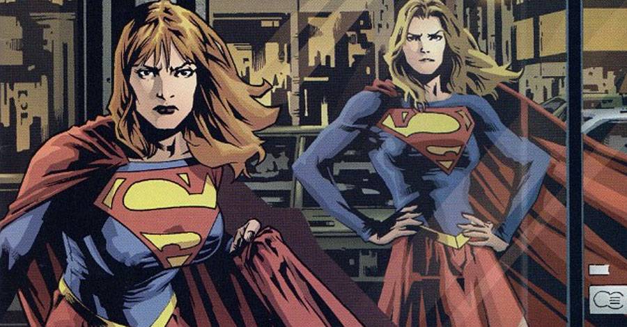
This is Fairchild's first appearance as Supergirl at the end of the first issue, and it's a great example of Bermejo's favorite lighting pattern. The major light source is to the right, in front of the subject. It leaves the noticeable triangular Rembrandt lighting pattern on the cheek away from the light. Then, a second light appears on the opposite side, slightly behind the subject leading to the rim light along her right arm and side. Less noticeably, it's also there on the edge of her hair above her right eye. I don't know how much of that was indicated in the original pencils, but Guy Major's coloring certainly helps the art here.
The shadows do more than just sculpt figures and make them look more dimensional. They provide textures to clothing, with special attention brought to the way the cloth folds, hangs, or strains against a person's body. There's a lot of information in every one of those large black blotches that, at first, might seem like random noise to the uninitiated.
Bermejo is inked by John Nyberg for this miniseries, who probably lost his shirt paying for all the bottles of India Ink. The final product, though, was definitely worth it. I don't know how detailed Bermejo's pencils got, but Nyberg certainly did a perfect job interpreting them and adding in his own flairs, because everything feel right that is there.
It's not perfect art all the time. You can see some issues with anatomy popping up here and there. The shadow usage can be inconsistent at times. Those things, though, help explain to the perceptive reader just what it is Bermejo is doing on every page. His work has only pushed further in the direction of realism and depicting every fold in every piece of clothing. He's only become more photorealistic in his style, but I still greatly enjoy this much younger version of his work. It's a little less sure of itself, but that's what gives it such great personality.
Most impressively, he achieves this very photorealistic style with his people without looking like he traced off a bunch of pictures. The characters don't have obvious poses in "Superman/Gen13." They all feel and look more natural than that. They benefit from being a little looser and more "cartoony" than a straight photo trace would give you.

There are some close-ups of buildings at street level that are clearly traced-over photocopies, but this was also a day before every artist used Photoshop or Manga Studio/Clip Studio Paint. The classic days of a photocopier and a lightbox were in their fading days, but they were still there. The overall effect is still much nicer than a photograph with a simple filter applied to try to apply a black outline to the edges of high contrast areas.
The larger cityscapes, I'm sure, also have some photo reference informing them, but still look carefully -- and meticulously -- constructed, from the air conditioning boxes hanging out the windows to the drawn curtains or blinds.
Bermejo tells the story well throughout. It's more than just using his style to his advantage in drawing detailed superhero battles and dramatic moments. His comedic touch is also strong. Caitlin Fairchild is believable as the amnesiac who convinces herself that she's Supergirl. Her pratfalls and overwhelming self-confidence in the light of bad decisions sell Hughes' story.

For example, as part of her reign of (t)error, Fairchild shakes a kitten out of a tree and walks away with a smile and a wave as the tree falls over onto a house, causing an explosion. It doesn't matter than it makes no sense. Hughes and Bermejo sell it with the comedic/cartoony tone. You'll want to believe it and enjoy it. It's good old-fashioned fun comics -- in a Gen13 book, no less!
Guy Major is the colorist for the series, and the palette he chose is an interesting one. The Gen13 cast is very colorful. Look at their regular series and see how bright and primary colored everything is. Superman, himself, is a bright red and blue. You'd expect a similar look to this series, wouldn't you?
Major goes in the opposite direction, choosing a more earthy color tone that makes Bermejo's artwork look more Normal Rockwell than Thomas Kincaid. The cityscape is very brown. Per Hughes' description early in the series, Metropolis is an art deco city that you visit after a ride on a coal-powered train. This isn't the super modern city of tomorrow that it's sometimes treated as. In this series, Metropolis is more old architecture with classic stylings.
Major's coloring is deceptively simple. He has lots of hard cuts to his colors, creating angular shadow shapes to fill in the appropriate areas on Bermejo's art. It works. He doesn't fight Bermejo's stark black and white line work. He doesn't try to overpower it by going with the heavy lighting styles and attempting to go photorealistic. His scheme is subdued, which is all the better to make things like the Superman costumes and Fairchild's hair stand out.
But he manages not to make the issues look like a mud pit. Major proves here that you can do a color scheme like this while still keeping layers separated and everything clean and clear. Most importantly, it never gets too dark. Even the night scenes, though overall darker, maintain a good contrast level to keep things clear.
"Superman/Gen13" excels on every layer, from the top down. If you're a classic Superman fan and aren't so sure of the Gen13 kids, this is the book to try. The trade paperback is unfortunately out of print, but not that difficult to find, or expensive to pick up on-line. And, like all but the first issue of the classic Gen13 series, it is not officially available digitally, either.
Fun Bonus Fact:For those of you who still aren't aware of how to pronounce Bermejo's last name, he answered that question on the cover of the second issue.

Twitter || E-mail || Pipeline Message Board || Instagram || Tumblr || VariousandSundry.com || AugieShoots.com || Original Art Collection || Google+