
I'll admit, I'm one of those people who seldom notices lettering unless it's bad, so when I was offered an interview with Deron Bennett, the letterer of Archaia's Cyborg 009, I jumped at the chance to expand my horizons a bit. Bennett, who was nominated for an Eisner Award last year, has lettered both manga and Western comics, and he worked on both the original translation of the Cyborg 009 manga and Archaia's Western-style retelling, so he has a unique perspective on this particular work. I also stole the opportunity to ask him some more general questions about being a letterer and what he looks for in other people's work.
Brigid Alverson: I saw on your blog that you worked on Tokyopop's translation of the original manga version of Cyborg 009 as well as a later Ishimori Productions edition. What sort of work did you do for them?
Deron Bennett: So here's the breakdown on that: I was a production artist for Tokyopop when they first brought Cyborg 009 to the U.S. A friend and co-worker of mine, James Lee, actually did the lettering for the manga. I was involved in post-lettering duties at the time, handling things like corrections and pre-press. That role came in handy, years later, when Itochu Corporation decided to revitalize the property through an agreement with Ishimori Productions. They wanted to digitally distribute the Cyborg 009 manga that Tokyopop had produced, but it needed some updating. I was contracted to add translations to the sound effects and fix some existing errors. That, in turn, got me lettering duties on two other Ishinomori classics, Skullman and Kikaider, which were also being prepped for digital distribution. You can currently find the versions of all three titles that I worked on on the comiXology app.
How did your previous work influence your lettering on the new version of Cyborg 009, and what did you do differently?
As a tip of the hat to the original, I wanted to incorporate elements from the manga into my own lettering. So I repurposed the fonts from the 009 manga into the new graphic novel. It uses the same dialogue font, and the font for the location captions is also borrowed from there. The modified telepathy balloons take their cue from the original as well. I even considered keeping the double balloon treatments that Ishinomori famously used but ultimately decided against it to fit Marcus To's art style. My goal was to take ideas from the original but still keep things fresh and give Cyborg 009 its own personality, lettering-wise.

In general, how does your approach to lettering manga differ from your approach to lettering Western comics, and which did you use for this edition of Cyborg 009?
In lettering manga, the style and layout are generally predetermined; balloons already exist, placement is already there. The challenge then, is to try as much as possible to keep things true to the Japanese version. That involves matching the lettering style of the original through font manipulation and retouching the art if necessary. It's an entirely different animal and usually involves another set of programs and skills. You primarily use a layout program, like InDesign, to letter manga, whereas a program like Illustrator is the standard workhorse for a letterer. Also, you are lettering in reverse because the Japanese reading order is right to left (which can sometimes trip you up if you are working on both types of books).
With traditional comics, I have to come up with my own plan of attack. The same was true for Cyborg 009. The font choices, balloon styles, and sound effects were entirely up to me. So I got to have some fun with it and come up with designs that I thought best fit the art of the book. What was interesting to see was how the roles reversed in the Japanese edition of our book. They had to take what I had done and match their lettering styles to mine. Small win for a long-time manga letterer.

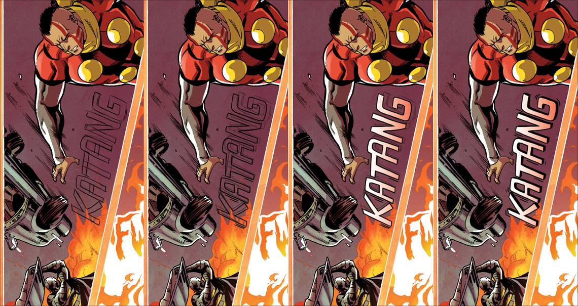
Mel Caylo of Archaia tells me you hand-drew the sound effects. Why did you want to do that?
Almost everything, with the exception of the dialogue font, was hand-drawn. Again, I wanted to take elements from manga lettering and work them into this book. Every sound effect in manga is hand-drawn. The balloons are all hand-drawn. They all become a part of the overall art because they are so well integrated into the page. The result is that it evokes a different feel than digital lettering. It doesn't seem as clinical or precise. There is an energy to the line work and I wanted that same feeling here.
What challenges did that present for you?
Suddenly, I found myself flexing my artistic muscles that I hadn't used in a while. I was drawing again where usually I would pick a font and be done with things. It added more time to my work, so what would usually take a few minutes could take five times as long. I also had to be aware of Marcus' line weights and Ian Herring's color palette. In order to achieve the effect that I wanted, it all had to look as seamless as possible so I had to take cues from what they had done.
What is your favorite sound effect in the book?
There are a few different “BOOMs” that I love. I like the explosion in the opening sequence on Page 5, the effect when the Zero Zero Tens collide on Page 44, and the gaseous explosion when the cyborgs are attacked at their base. They all have a different design that works within the environment. If I had to choose, I'd go with the collision — it was at that point that I finally felt I figured things out artistically.

Why do you like being a letterer? Was that something you always wanted to do, and if not, what turned you on to it?
I originally wanted to become a penciler and just sort of happened upon lettering. I was just trying to break into comics and started off lettering manga. It wasn't long before I recognized how similar the process was to graphic design. You have to use the same principles in order to make the page work. I'm constantly thinking in terms of things like rhythm, contrast, size, color, and space in my work. It really is an art unto itself. I just fell in love with it and the opportunities that I saw. I enjoy giving a voice to the characters and the environment that they exist in. It also turned my eye to other things like typography, logos, and font design. It's pretty cool being able to turn type into a work of art.
Give me an insider tip: What do you look for when you are looking at lettering, yours or anyone else’s? What defines quality lettering or, if it’s easier to put it this way, what are the most disturbing flaws?
It bugs me if the work looks lazy, even my own stuff. A page shouldn't look cookie-cutter. There should be variations or subtle changes in your balloons and effects. Standard ovals, re-used graphics, and overused fonts are dead giveaways to careless lettering. I love it when letterers step out of the box and try to innovate. These are the guys that spend forever picking the just the right font for the book they are on. They use new conventions and specialized balloons or graphics to illustrate whispering, yelling, or things like that. They are the ones who break rules in smart ways to effectively use space. I'm looking for well-designed pages. If it looks like a page was put together without thought, you lose me. But if you show that you really worked through some ideas, even if it's just the placement of balloons, color me impressed.