THE ART OF PIPELINKS
INJECTION
EPIC RE-READ: GEN13 #1
After six installments of this series, we've reached the first issue of "Gen13." Whew.
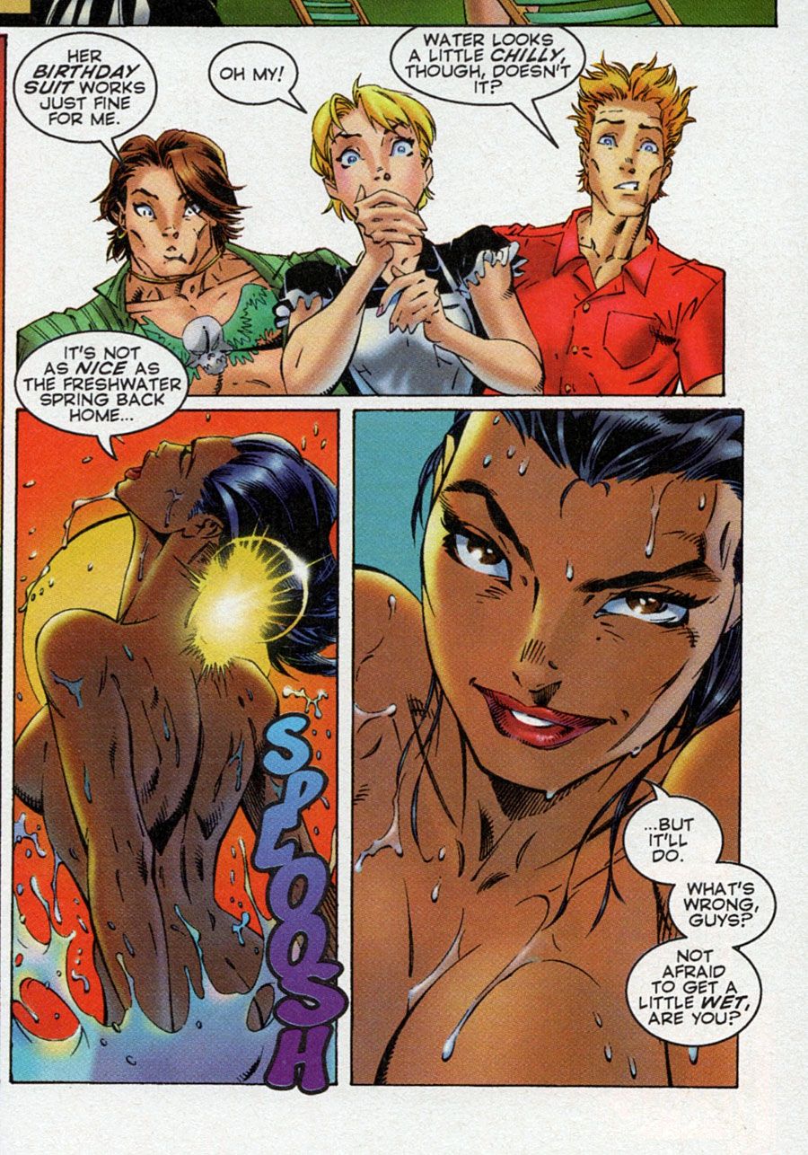
We jump forward in time a tad to where the team is living together at a safe house/beach house in La Jolla, California, along with their mentor John Lynch and housekeeper/maid, Anna. Being irresponsible young things, they goof off a lot with video games and guitars and naked jumps into the pool. Rainmaker, you see, is Native American and communes with nature au natural. She's confident in her body and enjoys going from the sauna to the cold pool, while the boys stare slack jawed and make with the double entendres.
Everyone is perfectly chaste, don't worry. It's all talk. And all the nudity happens off panel. See:
Campbell pushed those panel borders right up to the perfect spot to maintain the purity of the series' nipple-less vision.
There's no plot in the first half of the issue, and that's fine. The book is not really about fighting and defeating a series of big bad guys. It will shortly define itself more as a character book about teenagers who happen to have superpowers and use them while fooling around. It's something like what a live action sit-com Dan Schneider would create for Nickelodeon. (He does do "Henry Danger" currently, so superhero material is not beyond his grasp!)
Lynch is there to guide them through the issues that the bad guys will bring to their doorstep, because they'd be useless without him. But, being teenagers, they'll also feel the need to rebel against such a father figure at the same time. It's an interesting dynamic. I think John Arcudi explored it better, as I remember, but we're a couple dozen issues away from that happening.
The plot in this issue begins when Freefall (Roxy Spalding) goes to a dance club by herself in San Diego. There, she meets up with a dark and mysterious stranger, who is obviously not going to be any good for her. The part where he asks her to look deep into his eyes like a Vaudeville hypnotist is a dead giveaway. Doesn't matter, though. That story is dropped quickly and not picked back up. Because that's when a portal opens from another place and the dance club is besieged by oddly-shaped violent people from another dimension who appear to be hunting down Freefall.
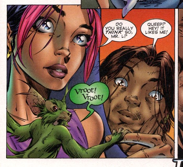
Don't worry; it's not her they're looking for. It's a little green mascot by the name of Qeelock, who is roughly analogous to Lockheed's position in "Excalibur." Except he's green and shaped more like a skinny squirrel. Lynch pulls the team together to go fight off the bad guys and bring Roxy home in one piece. They win, but the bad guys get away to fight another day.
If Art Adams were drawing a book written by Chris Claremont in the mid- to late-1980s, "Gen13" might just be the book you'd get. Claremont is very clearly a huge influence on Choi's writing, which makes sense. "X-Men" was the best-selling comic book of that era (before you kids decided you liked Avengers more), and team superhero books were dominated by that style. Choi's dialogue is clunkier than Claremont's, but you can see his attempts at that style throughout this issue. The attempts at catch phrases, the expository word balloons, and the story structure, itself, just screams of "Uncanny X-Men."
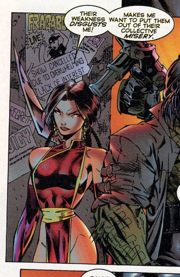
Campbell lets his Adams influence shine in this issue with the bad guys' designs. They look like a group of rejects from a "Longshot" Annual. You might even recognize bits and pieces from Adams characters being reconfigured to create these aliens.
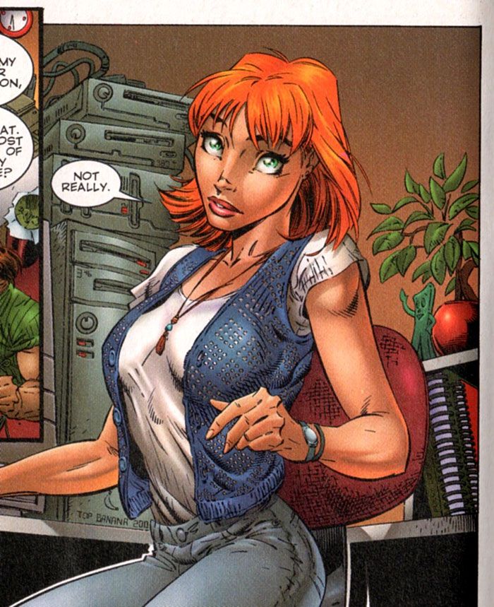
But Campbell's art is noticeably cleaner in this issue than it was in the miniseries. Wendy Fouts is back as colorist and Alex Garner is handling inks, so the creative team is intact. (Comicraft is now on board as series letterer, which also helps.) Maybe it's the better paper once again making a big difference on the art? The storytelling is still a little klunky at times, often with pages looking like they were laid out as the artist went along, rather than being designed in advance.
Garner's inks are also more restrained. There's less of an attempt to look like Scott Williams here, I think. When the kids get into the fight with the aliens, it gets a bit more cross-hatched, but when the kids are relaxing at home? It's much cleaner.
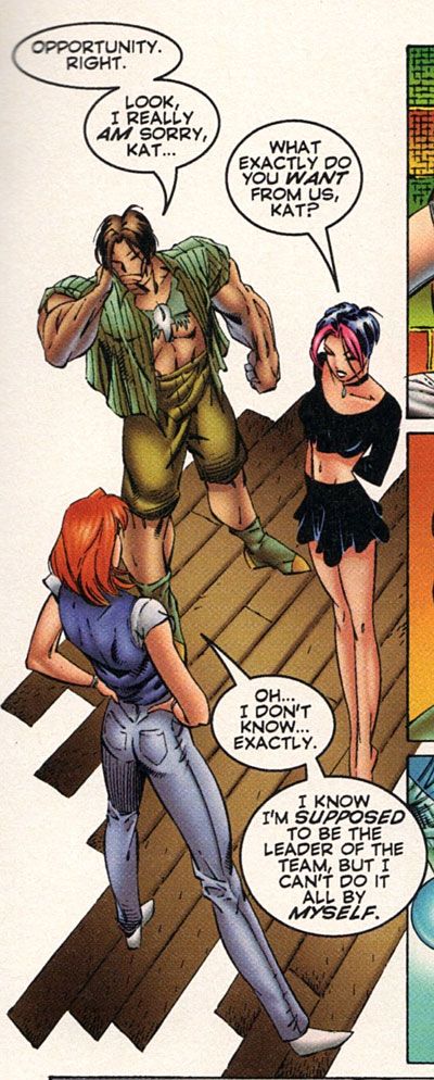
Campbell is also experimenting with his art, trying some new storytelling techniques and isolated angles and layouts that are interesting. I like this one angled from above, where the floor is not completely drawn in. It's a nice trick that helps to spotlight the characters by forming a circle around them.
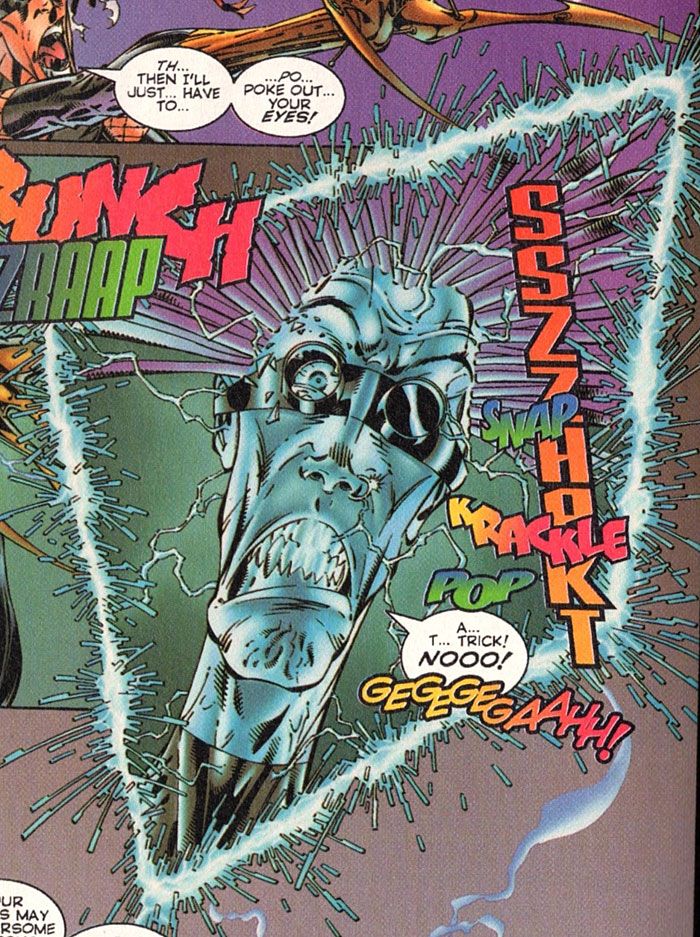
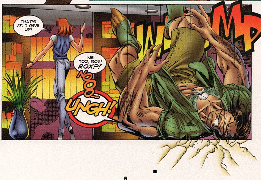
He goes a little meta here, as Grunge falls to the ground and cracks show up in the gutters.
And, of course, he takes playful swipes at studio mate Dan Fraga:
Fraga is currently prolific on Instagram and has some wonderful stuff posted here. Check it out.
That's the first issue of the new series. It is a story complete in one issue, even if the ending isn't completely satisfying. The characterization and relatable interests of the characters to their intended youthful audience is strong in the issue, though. It's a book that has a purpose with its design and is meeting it.
Next issue: You know what a promising new series needs with its second issue? YES! A company-wide crossover event! Remember "Wildstorm Rising"? No, it wasn't at all memorable and we've all forgotten it. Sorry to bring it back up again on you like this...
Twitter || E-mail || Pipeline Message Board || Instagram || Tumblr || VariousandSundry.com || AugieShoots.com || Original Art Collection || Google+

