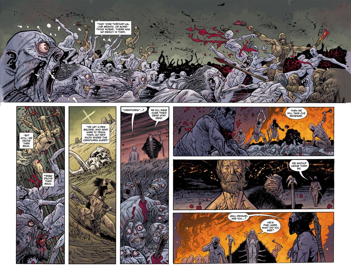
He's one of the most prolific creators in comics, but odds are only a small segment of his audience knows him by name. One of the foremost colorists in the industry, Dave Stewart is in demand as a collaborator for today's top artists, and one of the most versatile players on the comics scene. He's also dominated the Eisner Awards' coloring category, winning seven of the past nine years.
I reached out to Stewart because I'm an admirer of his work and, because frankly, we don't hear nearly enough from him. We talked about his place in comics, and his role as frequent collaborator with the likes of Mike Mignola and J.H. Williams III. I also asked about his early ambitions to become penciler, and the potential of trying that again some day.
Chris Arrant: Can you say what you’re working on today?
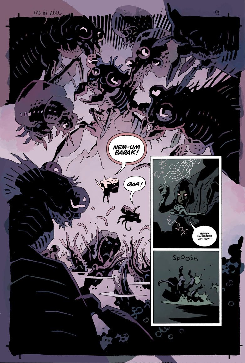
Dave Stewart: Hellboy in Hell #4.
What projects are you coloring this year that are announced?
B.P.R.D., Hellboy, Conan the Barbarian, Baltimore, Sandman.
I’ve read that your ideal workload is around five books, but you’ve sometimes pushed that to eight or more. How do you schedule what you’re doing, given how comics can sometimes run late?
It's impossible not to have projects pile on top of each other, so you just get fast. I used to just punish myself by staying up late and working all the time to get stuff done, but I'm finding I'm having to slow it down these days. This past year has been rough. I've had to back out of more projects than I like to. And it's harder to make up for scheduling shifts or mistakes. I'm learning new limits to the amount of work I can take on. 2013 should be pretty smooth, although it's always rough saying no to a project that has a creative team you've been working with for awhile.
Since coloring is often last in the production line of books, how do late books push up against your work?
It can be tough. Sometimes you aren't thinking about the most artistic choices when you have a couple days to finish a project. I'm trying to choose projects that give me that time. Dark Horse and Scott Allie in particular are really good at getting art to me early. While we are all trying to create interesting art, sometimes the deadline realty of a monthly publication overrides that. You just give it your best.
You say one of the draws is working with someone you’ve had a good relationship with in the past. On the flipside, are there artists or writers you haven’t worked with that you’d be particularly interested to?
Not really at this point. I'm just sort of happy to be working with who I'm working with right now.
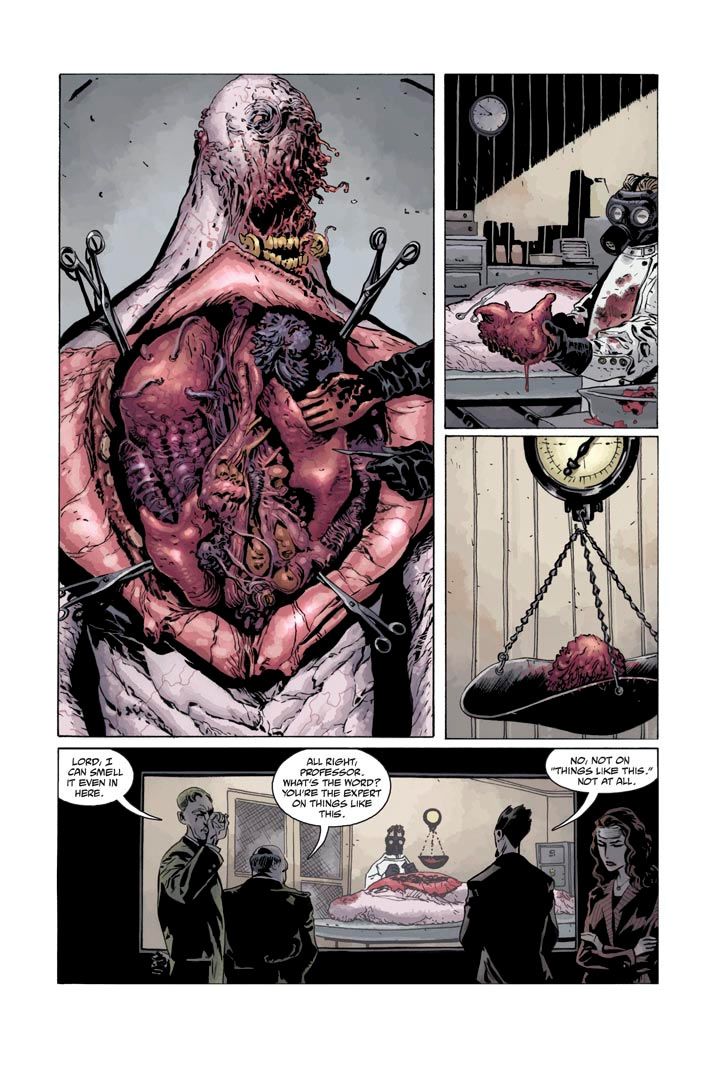
People know you best for your work on Mike Mignola’s assorted books at Dark Horse. How would you describe your working relationship with Mike and Dark Horse?
They've been great to me. Mike and I have been working together for a while now, and I think we're more in sync than ever. I feel like every time I color with Mike, I leave a better colorist. And Dark Horse is a great company to work for. They try to give me the things I need to do my best work. I work with a bunch of editors who really care about their projects.
Last year you also entered a long-term collaboration with Ed Brubaker and Sean Phillips on Fatale. In the past they primarily used another colorist, so what’s it like coming in new to a long-standing team like this for their new series?
Nerve-racking. I was stepping into some big shoes. I like working on the book, though! I've had to take a break for a few issues on Fatale, but hopefully we're back together later this year.
Another comic that pushes the limits to me is Batwoman, especially your coloring over J.H. Williams III. Could you put into words the coloring style and theme you go for with that series?
That's all established by the story and Jim. The color style meets what the art and story demand. Jim likes to play with variation in his approach to the art and it's my job to stay in pace with that. One word that I think might describe it is psychedelic.
How do you differentiate it from the other Bat-books while still making it fit within the larger Batman and DC umbrella?
That's something I've never considered. To be honest, I haven't seen the other Bat-books.
Flipping through your work, I noticed you’ve never really tried to make computer coloring look like it came from computer. No harsh gradients, or effects that are only possible with computers – you tend you make your coloring look more naturalistic, even in different styles between DC: The New Frontier and something more psychedelic like Zero Killer. You use Photoshop to color – so how do you draw the line for what you do and don’t do?
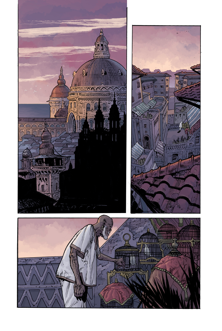
I like the warmth of laying in the brush strokes instead of letting the computer do the work of creating the blend. I just paint on the computer, and I think it is just what I'm drawn to in art. I don't necessarily like photo-realistic art. I like to see a more impressionistic brush stroke, so I try to do that in the computer. But for the most part I do what the project and art ask for. There may be a project yet that needs to look like it was colored by math equations.
From talking with other colorists, I find that most of them work with a flatter to help speed up work. Do you use flatters for your work, and if so, can you talk about what they do – and who they are?
Yeah! I use three great guys right now: Fred Paculba, Talon Kelly and Alex Petretch. They create the flat blocks of color that separate objects in the page. That creates selections I can drop color into and grab for rendering. Fred is located in the Philippines, and Talon and Alex are in the states. Couldn't do it with out them.
I read that when you were breaking in, you had ambitions to be a penciler. Have you ever thought more about doing that?
Maybe just painting on the computer, but it's hard to spend free time in front of the screen when I already spend so much time there. I have the desire so maybe with the new schedule I could start seriously thinking about it.
Generally, what are the conversations like with the writer or artist of a book when you’re coloring it?
A lot of the info I need from the writer is through the script. But the conversation can vary quite a bit with a creative team. The artist could have input about the way I render to story telling points that need emphasis. When I work with Mignola, we talk over the entire project, because Mike thinks about the color when he's drawing. Same with Batwoman; Jim has specific design ideas he needs emphasized with the color. In contrast, most projects I have an initial conversation with the artist about how he sees his art colored and rendered, and then I get my story telling notes from the script.
This past year I’ve become more keenly aware of how colorists are used to tie together series with different artists to create an overall more cohesive look. You do that a lot with the Mignola-verse titles, but also in other books like Conan the Barbarian. How do you create that arching style for a book and keep it straight between artists?
I use a similar palette on those types of projects. When Conan changes artists, I have to change rendering style to accommodate the look of the art, but I keep a similar palette through out. The tone of the work feels similar with that, while the artists can have there own distinct approach to the character. With B.P.R.D. it's nice to be working with Mike on a little more regular basis because I feel that gives me a touchstone for the book's mood.

