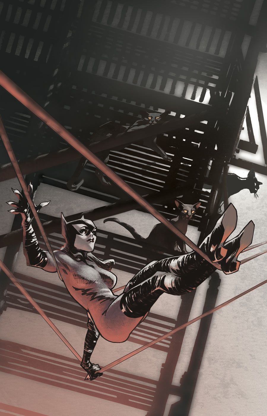
"Convergence: Catwoman" #1 is a comic book that feels like it was released from DC Comics in the 90s, from the story to the art. Writer Justin Gray delivers a Selina Kyle that is altruistic enough to be on the side of the angels -- a product of her inmate status and the fact that the objects of her desire are now inherently worthless -- while still maintaining her attitude and edge. While there is violence and death in the issue, the instances are delivered in a more all-ages fashion than current DC fans are used to, as penciller Ron Randall obfuscates the violence with smart panel choices or well-placed shadows. This storytelling development could be a product of a creative and editorial staff comprised of mostly old school storytellers: editor Marie Javins is a veteran of the industry who worked under Mark Gruenwald and Randall, the artist of "Justice League Europe" over 20 years ago.
The team faces a Herculean task in these 22 pages of story: reestablish the 90s version of Selina Kyle, create a motive for her presence in Metropolis, then RE-reestablish her role in the world as the protector of Suicide Slum while providing examples of the status quo of the domed pre-"Zero Hour" Metropolis, before taking her away from that for the real reason the book exists: to see who'd win in a fight between herself and a specific version of her sometimes-lover Batman. The team puts in a valiant effort; Gray paces the book with a five page opening sequence before jumping ahead one year and laying the groundwork for Intergang's dominance over the depressed sections of the city, prepping readers for a showdown between the two sides. That faceoff never happens, as Brainiac announces that champions of various cities must fight to the pain for his amusement, and Catwoman is confronted with an old version of an old friend. That's a lot to do with one issue and it creates a disjointed reading experience. Gray has to reset expectations more than once, which never gives readers a chance to settle into any situation offered and makes it difficult to connect or empathize with the situation.
Randall draws a beautiful Catwoman, believably athletic while not being comically disproportioned. His layouts have a curious disconnect between the fore- and backgrounds, the characters well positioned and rendered with backgrounds illustrated in a way that makes them look like flats behind an actor. The final splash page has an odd perspective on the Dark Knight, rendering him with a pronounced chin of almost "American Dad" levels. The main reason for the series actually doesn't even happen in the issue, as the fight is only set up by the end of the book. Readers will have to wait for next month to see who wins the showdown promised by the teaser page in the opening of the comic.
"Convergence" as a whole is a deep exercise in brand loyalty; with the limited page space, readers are expected to come in with background knowledge of each character, lest he or she be confused by the depicted era of that character. "Convergence: Catwoman" #1 puts its best paw forward but is a victim of having to do too many things at once.

