
Comic books aren’t the only publications who dabble in variant covers. Novels often find an entirely new audience by repackaging and reformatting the covers and sometimes even the content (e.g. the Harry Potter books are a good example of this, by creating fun covers with large type which appealed to children, and more elegant covers and smaller type for a more mature audience). A few weeks ago I stumbled on an instance of prose fiction dipping a proverbial toe into the world of sequential art and the results are pretty spectacular.

While a variant cover is often introduced simply as a marketing exercise, with very obvious results as noted above, when the aims are less direct then resulting variation can be quite unexpected . There are comic book companies who simply court scandal with variant covers by commissioning artists whose work is inappropriate for the content or the audience. If you’re interested in reading more about that, there are other place on this wonderful site to do so, I have little interest in discussing the poor choices of a single company, instead I’d like to focus on one company who did it right, because a variant cover chosen with care and thought can be a perfect way to attract positive attention and incite productive discussion.

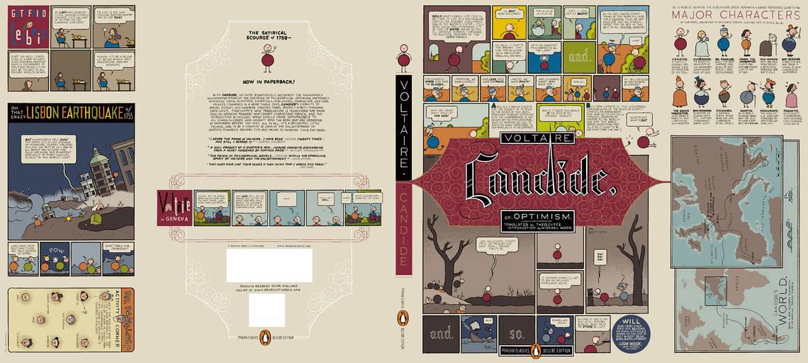
Browsing in City Lights a few weeks ago, (and this is the advantage of browsing books in a physical shop instead of online) I found that they had 3 or 4 different prints of each classic novel. As a graphic designer I often have to design new covers for books, so this was a fantastic opportunity to do some quick research. Two of the covers which immediately caught my eye were paperback copies of Lady Chatterley’s Lover (with a new cover by Chester Browne) and Candide (with a new cover by Chris Ware). Originally published in 1928, D.H. Lawrence’s work precedes Brown’s by decades, yet both of them share a willingness to explore and expose various, taboo aspects of sex and emotional connection. Similarly, Voltaire scathing little tale about the universal pain of living was published a couple of hundred years before Chris Ware was even thinking about creating book after book about his own sweet tortures of life, and so the two are an ideal match. Ignoring the perfect pairing of artists and authors, the books are also printed on lovely, toothy, heavy paper, and the covers are printed on a wonderfully dense, uncoated card, with folding back and front panels (as if it has a dust jacket) which allow the covers to tell a longer tale about the interior.

While the above are both well known now as simply a couple of well-known classics, in their time they were considered incendiary and weren’t exactly intended to end up as old classics. Pairing artist’s who’re famed for their work in independent comic book is a reminder that these books were once outrageous and is an excellent way to communicate the trashy, funny, relatable nature of the stories contained within. It’s so clever really that I can’t believe that this approach to variant covers is taken more often, Penguin aren't diluting or changing the message of their classics in any way, but are using the cover as a space to evoke a contemporary context for that in which they were originally published.

As clever as the idea is, it would be nothing if the right comic book artist weren’t paired with the right novel, that’s where the bit of genius comes in. Frank Miller uses negative space and a Jackson Pollack-esque mess to describe the chaos of Gravity’s Rainbow. Chris Ware grimly nihilistic world view provides a clear mirror for Voltaire’s Candide, and even the bloody-minded politics behind his novel. Chester Brown reprises the warm orange and brown color scheme of Paying For It for another book all about sex, Lady Chatterly’s Lover. Daniel Clowes turns his point of view (infamous for making the mundane freakish and the freakish mundane) to highlighting the horrors of Frankenstein. The list goes on, artists and authors from entirely different eras with entirely different reputations, wonderfully and beautifully paired to complement each other’s work and talents. It’s a very clever idea and I’m happy that I stumbled on a book shop with enough shelf space to stock 4 or 5 different versions of each classic novel to let me finally find these editions.

These two examples are just my favorite examples of a wonderful series of books which appear to have been shepherded primarily by Penguin graphic designer, Paul Buckley. Officially part of the Penguin Classics Deluxe Editions, the Penguin Classics Graphic Deluxe Editions are a great example of truly effective, lovingly produced, variant book cover designs. For each one a completely unexpected (and yet absolutely appropriate) contemporary artist has been chosen to re-package a classic novel in an entirely new way. One look at the collection and it is obvious that someone with a great understanding of both the books and the artists had an overview of the commissions, and of the implementation. They are in synch and each artist’s style is a perfect compliment to each specific book. Along with each cover crediting the artists involved, the design direction is also credited, and this is a key point which is often missing from comic books. While a good art director might not by the person physically producing something, it is essential that someone with a creative understanding of the process have an overview of the project, as well as a deep understanding of the original book, the audience, the cover artists, and of the ultimate aim of the work as a whole. In this way Buckley and his cohorts have provided a path for these great, independent comic book artists to create a series of treasures.