
While this might be obvious to everyone, I only just realized that Last Gasp don’t have a logo. Or rather they do... they have hundreds of logos, practically one for each book, letter, and business cards… This was such an insane concept in amongst our uniform, mass-produced world that I had to take a moment to look at a few of the logos by old and new authors, and find out the thinking behind such an adventurous approach to branding.
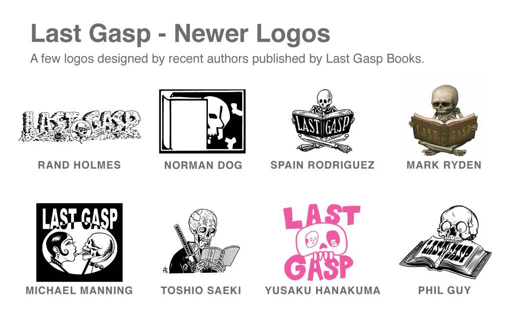
Last Gasp is the one of the largest and oldest underground publishers and the most well-established company not to have a consistent logo. Founded in 1970 by Ron Turner to publish underground comix, the job of adding a Last Gasp logo was given to each individual who published a book with them, from Robert Crumb, to Bill Griffith, to Frank Kozik (see below for examples, click to enlarge). Authors are asked only to make sure that they "incorporate a skull or a skeleton reading a book or with a book. Ideally the skull should have eyeballs and a tongue.”
Over more than 40 years, hundreds of authors have been creating their own interpretation of the logo and despite the changes in modern publishing, this practice has never changed. Today authors are encouraged to design their own Last Gasp logos and extra logos are even solicited from readers in the form of competitions. In the rare cases that an author doesn’t design their own logo, one of the recent designs by Mark Ryden, Spain Rodriguez, or Norman Dog are used (see below for examples, click to enlarge).

In addition to the many different varieties of logos to be found on books published by Last Gasp, the people who work at Last Gasp are allowed to choose any logo from the extensive archives. In the rare event that none of these logos appeal, employees can create their own version of the logo, adding to the ever-growing interpretation of Last Gasp.
When I’m hired to design a logo, companies are focused on creating a consistent brand and applying their logo to every aspect of their identity. The logo, color palette, and font usage are all strictly dictated by a style guide. Continuity and consistency is absolute and the logo must always look the same, and be used wherever possible to ensure easy recognizability.
It is refreshing to encounter a company who encourage the full-breadth of human expression to be illustrated in their logos. While for it might be important for other companies to have a single graphical voice, the broad collection of wild and crazy Last Gasp logos speaks volumes about their history and kind of publisher they are. Last Gasp’s unique logos act as a permanent, ever-changing reminder of the history and experience of Last Gasp publishing.

UPDATE (29th Sept, '14):
Last Gasp are doing a Kickstarter for their fall publishing season. Go help out here, and please spread the word!