
Comic book logo development is a lot of fun for me and I thought you might like to see how one gets made. Like a lot of self-employed people in this industry, I spent part of the holiday season working. Not because I had to, but because I wanted to. Being a graphic designer can be fun, but being a graphic designer for a comic book can be incredibly fun. So I worked on some ads for a new comic book and established some ground rules for the mood and feel that I want to evoke with the logo when it is done. This project is so far in the future that I cannot share the work, but it got me thinking that you might be interested in seeing how a new comic book logo takes shape for me. A logo that I worked on a couple of months ago is now in use on a comic book that will be available to buy in the Spring.

Working with Kurtis Wiebe (the author of atmospheric, creator-owned books like Green Wake and the Intrepids), I began by talking to him extensively about his next project. After he sent me his script and the first 6 pages of art by Aluisio Santos, (see left for a very sneaky peek at page 1 of issue # 1) he told me about the mood and the tone of the story. I asked as many questions as I could about his inspiration and what excited him about this story, seeking to gain insight into the kind of mood he would like a prospective reader to feel when glancing at the book on a shelf. After all, the cover of a book is often the first hint we have about what the book is about and I wanted to be sure I was conveying Wiebe's intent.
Kurtis is based in Canada and I am in California, so after a very brief initial conversation at the New York Comic Book Convention, the rest of our conversations about the project were via email and phone call, which was surprisingly effective (but then again, he is a writer so his communication skills ought to be pretty good.) My first step in the process was to try and use Wiebe's words to inspire me, I told him that I wanted to give the logo a sort of macabre "Breakfast at Tiffany's" feel, with an edge of "Vertigo" meets "The Seven Year Itch" and "Seven" (i.e. encapsulating both the madcap humor, the disturbing tension, romance, and the gory deaths that the story contains.) Using the language of film made much more sense to me than looking at other comic book logos for a number of reasons. This isn't your classic, big two, comic book story (which you'll find out more about when it is available for purchase in the Spring), as a short-run, creator-owned book, the comic book owes more to moody, mid-century short stories of crime and noir fiction. While it definitely has a filmic / tv air about it, I felt that the art on the cover and title would already convey that to the audience, leaving the look of the logo to do the rest. Referencing film and music graphics allowed me to set it apart from other comic books and gave me a familiar visual language to use when discussing it with Wiebe.

For my own inspiration, I put together a big board of imagery (see above, click on the image to see a larger version) which echoed this conversation. This imagery collection served to inspire and remind me of the mood I wanted to evoke while I was designing, so that I wouldn't lose sight of our agreed aims. While the comic book clearly has a lot of death and violence (as you would expect by simply reading the title), there is also a lot of humor and an almost slapstick quality to the outrageous situations that our hero will find himself in. Wiebe's description reminded me so much of my favorite movies of the '50's and '60's that I wanted to evoke that with the title treatment.

WIth my inspiration all in place, my next step was to simply see how the title looked when written out in a slew of different ways. Like the inspiration research, this wasn't for Wiebe's eyes, but for mine, so I wrote it out in every font I could imagine might fit and from those, I filtered it down to 18 typefaces (pictured above, click on the image to see a larger version), which I then further narrowed down to my four or five strongest and began developing them by placing them on to the cover art and into a lock up with a tagline. At this point, Wiebe hadn't yet written a tagline, but since I was giving this a filmic feel, I wanted to have one. To my eyes, the logo looked more real when it had a short line of text under it, and I also wanted to have something right up front which talked about the messed up love story that our grimly leaping hero must also contend with. Besides, a hard-edged logo always looks better when it has something written in a sexy script under it, like someone standing over their discarded underwear in a dark bedroom, so I found a nasty, scrawly looking script and wrote "A love story to die for."
Since Wiebe didn't have any specific visual direction, I wanted to be sure to give him four very different designs to choose from. Each logo had to be not only in a different style, but also speak of a different era. After all, while we'd both agreed to a retro feel, that doesn't always translate as a retro look. It was also important to get the mood right, so there had to be a good span of serious, earnest looking designs to more fun, madcap designs. After a few tries, I sent Wiebe the following four designs to choose from. With each, I set the logo up in two different ways to show options of use, as a monochrome design on a solid red background (the easiest way to preview it in a clean way), as well as on the cover art of issue #1.
This is the first thing I showed him, though I did offer to show him the fonts and inspirational imagery afterwards if he was interested, I didn't want to influence his first impression (since anyone buying the comic would also be going on their first impressions.) In addition, I didn't give him any kind of introduction or explanation for the designs, since again, I wanted to hear his first impressions. As soon as he'd had a chance to look at them, we spoke and I gave him the background on each design.
With each design, I was going for something bold and easy to spot from far away (since I operate on the assumption that most comic books tend to get lost in the shuffle, I tried to create something visually aggressive.) The monochrome design means that the layout works over any cover art.

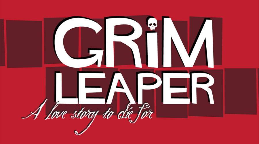
Design 1 (above, click on the image to see a larger version) was my favorite (although I like all of them, and wouldn't have shown them otherwise), with the obvious Hitchcock references in both the font and the haphazard square motifs, which work to echo the way the hero jumps from one body to another in the comic book.

Design 2 (above, click on the image to see a larger version) was a cleaner, more contemporary design. Using a rounded font with crisp lines called "Gotham", cropped slightly to create the feeling of being trapped and boxed in (as the hero is, metaphorically, by his strange circumstances.)

Design 3 (above, click on the image to see a larger version) echoed the quirky, inelegance of design 1, but this time with a more rigid arrangement, using the off-kilter background black box to show the way the hero and his body aren't always in sync with each other.

Design 4 (above, click on the image to see a larger version) was my most aggressively '50's direction, owing as much to screwball romantic comedies as it does to a Roadrunner cartoon. With more humor and fun than the other designs.

After some discussion and deliberation, Wiebe chose design 1 and asked me to refine it for the cover. He liked both the black drop shadow AND the black squares, and so I set about looking at how to incorporate them both into the design. He also liked my tagline enough to include it on the cover and had the idea of adding a little skull as the dot on the "i" in "Grim", to give the design even more of a unique character. At this point I had all the pieces, I just needed to work on how the design would work for the cover of #1 and also for future issues.

Our final design for the logo (pictured above and right, click on the images to see larger versions) incorporates the drop shadows, the squares, the tagline, and the skull. By making the squares translucent and using them only behind the logo (and not the credits), the focus is clear and the eye is drawn to the title.
Right now I'm still working on the designs for other parts of the book, but I did enjoy giving you a sneak peek at this key stage of the design. You'll be able to judge the finished product in Spring 2012 when Grim Leaper will be in stores.