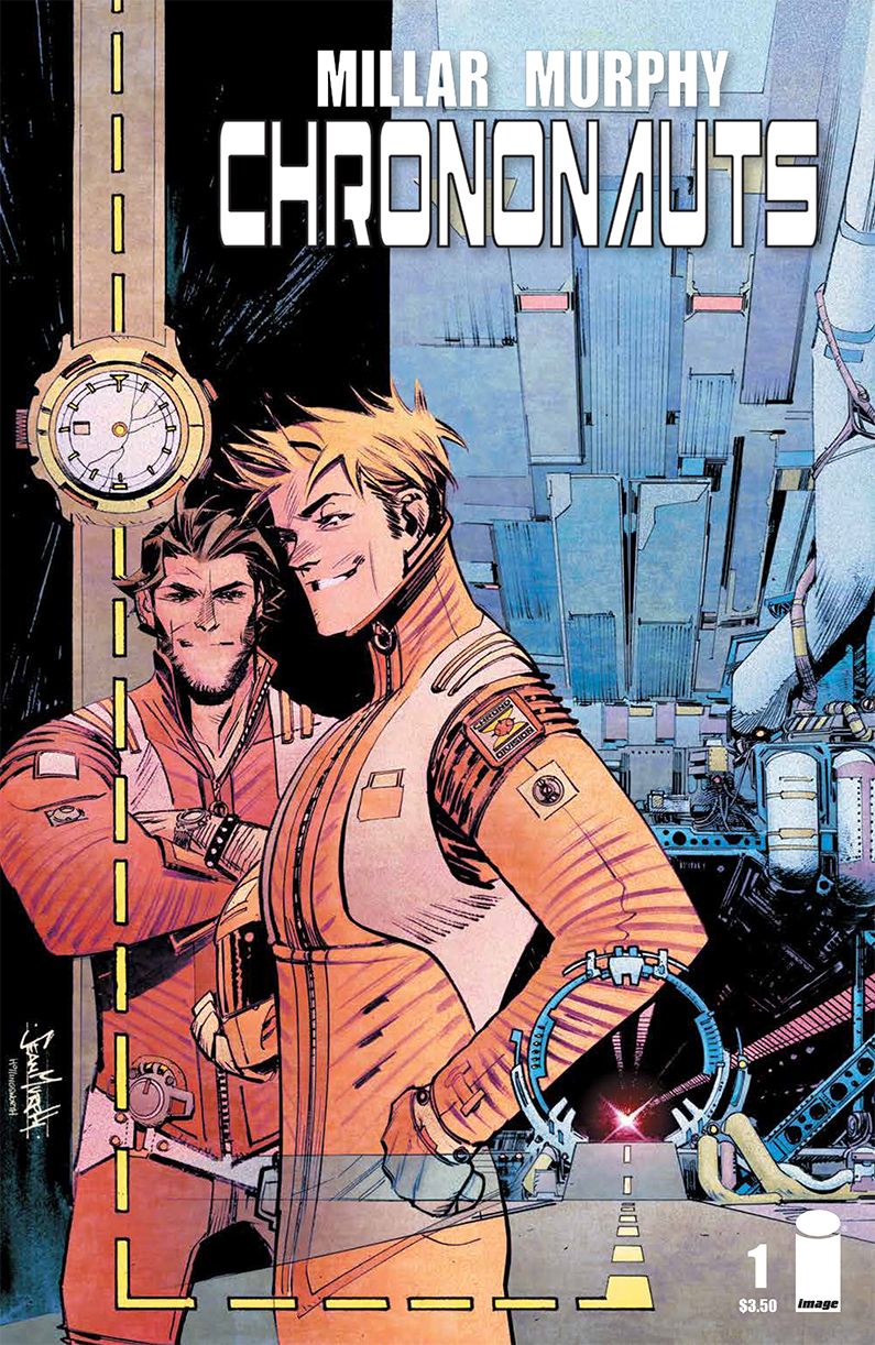
Writer Mark Millar avoids the urge to send both the characters and the reader back to the time of dinosaurs in "Chrononauts" #1, playing more to artist Sean Murphy's strengths instead. Likewise, Murphy brings plenty of gritty details, solid storytelling and bold, dynamic opportunities for his colorist, Matt Hollingsworth. With each playing to the strengths of the next, "Chrononauts" #1 showcases the talents of each contributor but also becomes a magnificent display of the possibilities inherent in successful collaboration.
The series opens at an archeological site for a temple that predates Stonehenge by six thousand years. This is where Millar introduces readers to Corbin Quinn by letting them in on the fact that the discovered object within is certainly not six thousand years old. The mystery of how the object got there and its connection to other anomalies Quinn has happened upon is established fairly early in "Chrononauts"# 1, right around the time that Millar introduces readers to Quinn's brother-in-arms, Danny Reilly.
Millar doesn't waste time (no pun intended) with formulaic origin tales or text-heavy background stories, choosing instead to push the issue forward and watch it go. He puts the protagonists at the front of the story and spins the camera around a bit, feeding the thoughts and declarations of others to readers before returning to the action as Quinn and Reilly prep for a manned time exploration mission. Along the way, readers are given teases about the history and personalities of the Chrononauts, enough of which add up to an extended invitation to return.
The cliffhanger ending compounds and accelerates that invitation, as does the lavish artwork from Murphy. Readers familiar with Murphy's style will enjoy everything the artist pours into the pages of "Chrononauts" #1, from the logos on Quinn and Reilly's t-shirts to the attention to detail in the wide array of clothing and fabric as they wrinkle and bend on the characters' bodies. Murphy brings plenty of shadow, even more substance, dynamic range, strong, animated characters and a surprising amount of visual humor to the tale.
In some cases, Murphy dials the detail back, letting Hollingsworth visually describe the scene for readers through color and effect. The colorist uses everything from smoggy, sun-soaked haze to roiling, crackling energy as the Chrono Division encounters some technical difficulties in their trip. More than a few times, Hollingsworth's colors complete the images that Murphy starts on the pages. Murphy provides enough strong storytelling clues in every panel that he empowers his colorist to push the boundaries, which just opens up the creative floodgates, giving "Chrononauts" #1 a unique set of visual effects that surpass other time travel standards.
Millar, Murphy and Hollingsworth collaborate nicely on "Chrononauts" #1, blurring the edges of their jobs and making this comic a gorgeous-looking, fast-paced and fun team effort. Admittedly, "Chrononauts" #1 didn't have me circling the calendar waiting for its release but, after reading this issue, I'll be back for the continuing adventures of Quinn and Reilly.

