Yes, I can't do something simply when I can make it complicated!
So last night, FotB Dan Felty asked:
Is it possible for you to post a page out of the Sandman collection? I’m curious how it’s formatted. How do the annotations affect the reading experience? Whether it’s endnotes, margin notes, facing pages, etc. can really influence how much I take to notes, and I’d like to make sure this edition works as a good reading copy since I don’t already own the comic. Thanks!
I told him I would insert it into the post, but then I thought, "Why do that when I can complicate matters by doing an entire post about The Annotated Sandman and what it looks like?" It's because I love you guys, dear readers, that I do this. Well, that and if I were sitting around this morning my wife might put me to work. NO ONE WANTS THAT!!!!!
So here's some comparisons as well as what the annotated version looks like. I currently own Sandman in three different versions, sort of: I own almost every single issue, the first trade of "The Doll's House" (before DC started standardizing the trade dress; and how weird is it to consider that DC put out "The Doll's House" first because they weren't sure they would put the whole series out in trade? man, comics have changed), the first two Absolute Editions, and now the first volume of The Annotated Sandman. Eventually I'm going to get the rest of the Absolute Editions and all of these annotated versions, and maybe someday I'll track down the single issues of #8-16. So I decided to look at pages from the single issues, from the Absolute Editions, and from The Annotated Sandman, just to see the differences. You'll have to forgive me for the annotated pages - the book does not fit on my scanned, so I took pictures of the relevant pages. But then I scanned the annotations so you can get a better idea of what's what.
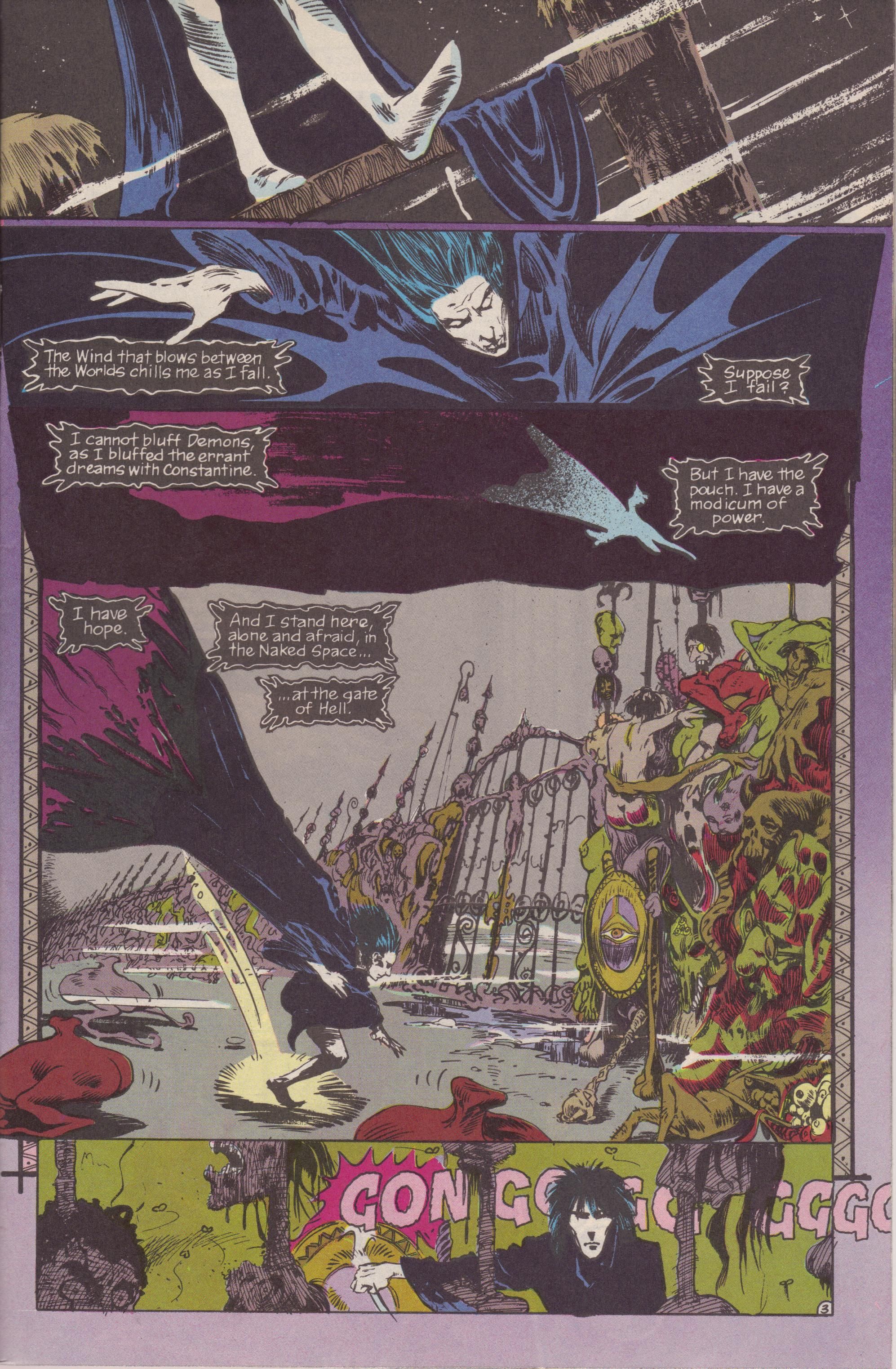
Here's Page Three of Sandman #4, "A Hope in Hell," in the original:
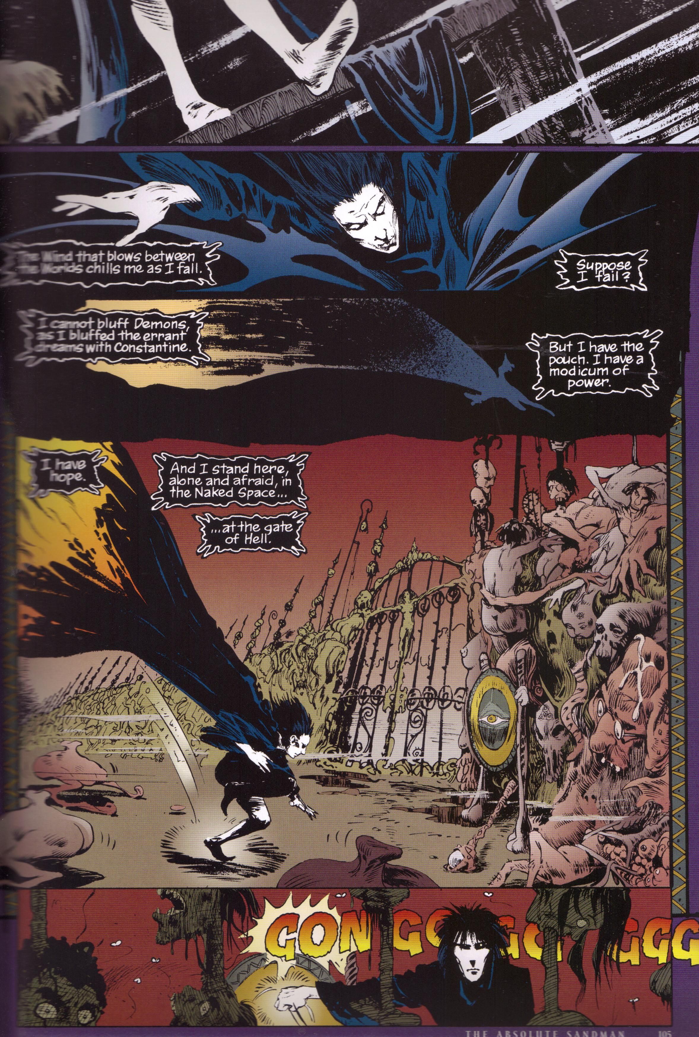
Here's the same page in The Absolute Sandman, volume 1:
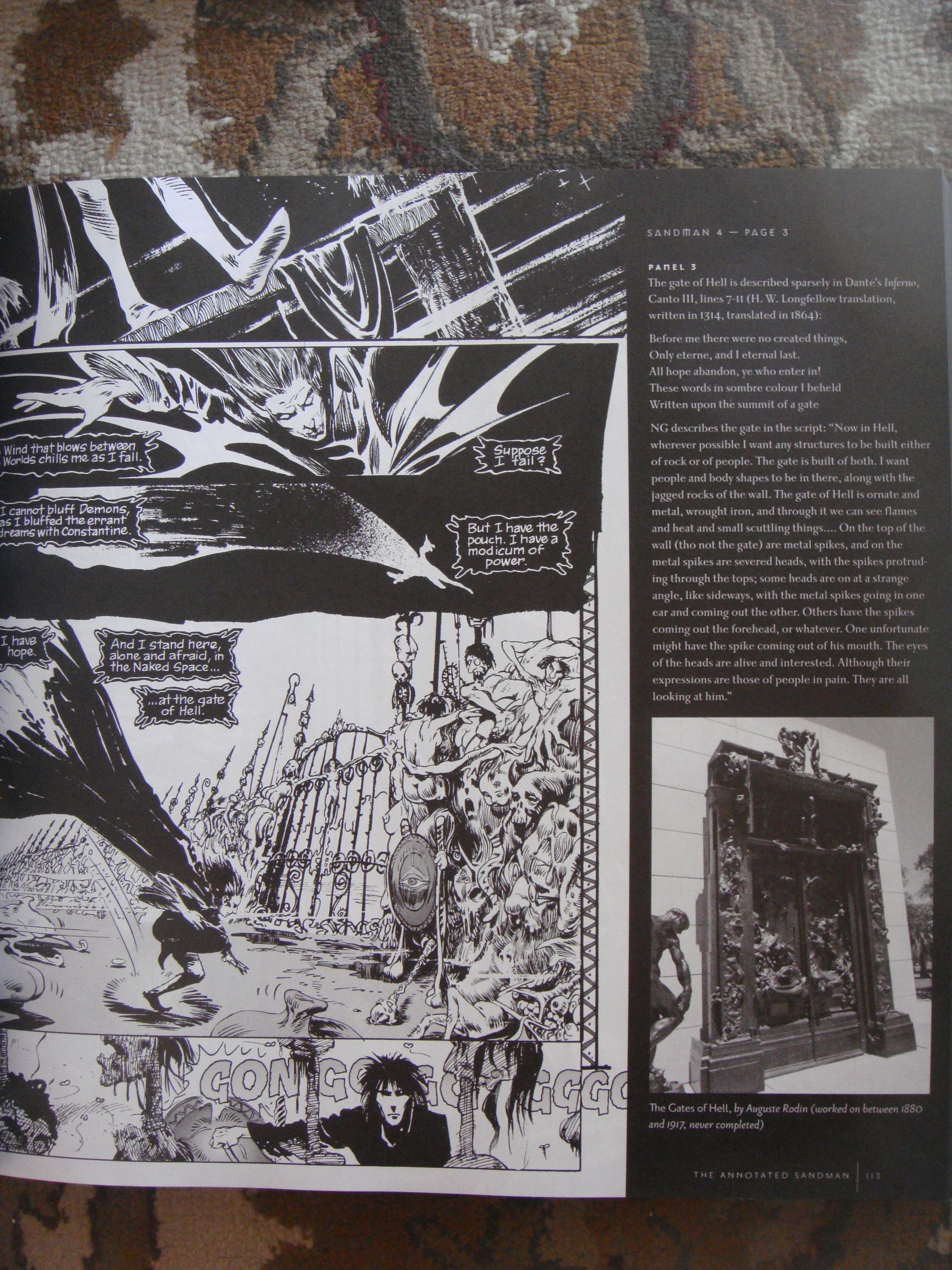
Here's the annotated page:
The biggest difference is, of course, the coloring. Robbie Busch colored the first 18 issues of the ongoing, and Daniel Vozzo re-colored the pages for The Absolute Sandman. You'll notice that Busch's coloring is much more lurid than Vozzo's, and the gates of Hell are nauseating in the original version while in Vozzo's version, they're simply bizarre. Vozzo changes the purple at the edge of Morpheus's cape to flame, which is apparently the way Gaiman wanted it. It doesn't look quite as spooky, though. I can see why Vozzo recolored the page - I imagine Gaiman wanted it done this way, and it does look more professional - but Busch's coloring really makes Hell look more polluted and ugly and queasy. Note also that Kieth's art looks less cartoony as the coloring changes. Busch's colors make it look the tiniest bit goofy, while the black and white in the annotated version is stark and horrifying. Kieth's art in Sandman was a weird mixture of these two extremes, and it's interesting to see how the color or lack of it brings out one aspect or the other.
Here's the annotations for this page, up close:
This is pretty standard, although we don't get photographs very often in the book.
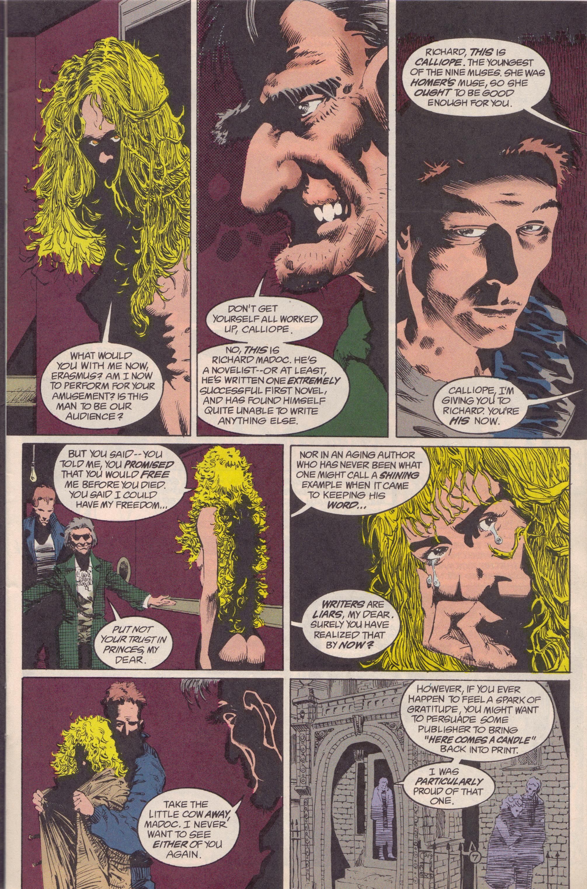
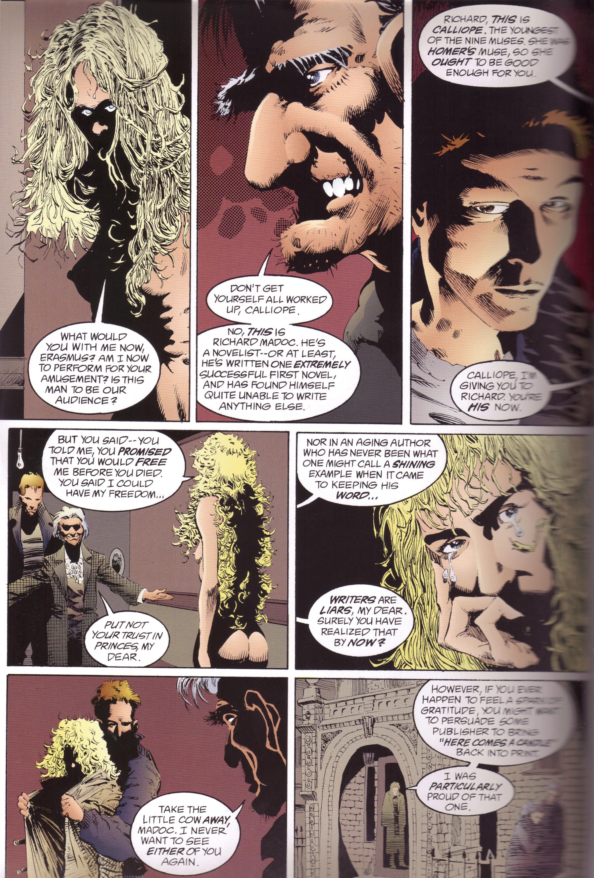
Moving on, here's Page Seven of Sandman #17, "Calliope," in the original:
Vozzo softens it up for The Absolute Sandman (sorry that the edge is a bit blurred!):
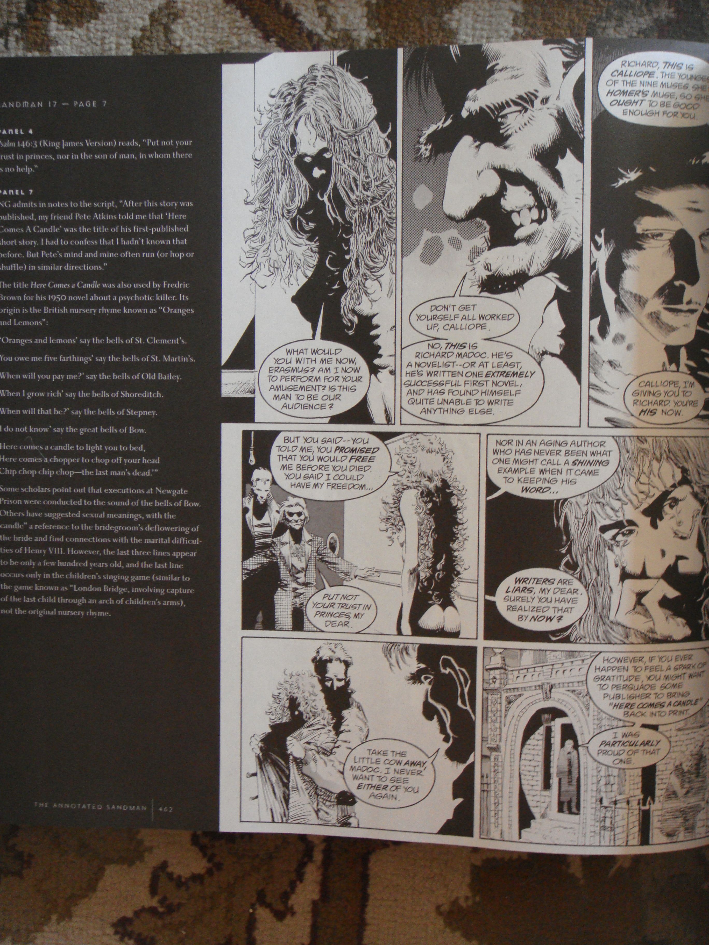
Here's the annotated page:
Once again, the biggest difference is that Vozzo's coloring is slightly less garish. This is due mainly to the advances in coloring over the years, although some people will say this isn't a good thing. Calliope's hair is not as bright, Erasmus Fry and Richard Madoc wear gray jackets instead of green and blue, respectively, and everyone's skin is a bit more washed out. Vozzo does make the figures in the last panel more distinctive, which is either a good thing or a bad thing, depending on your point of view. Jones's art in the black and white looks nice because of the heavy use of blacks.
Here's the annotations from this page:
Leslie Klinger, the annotator, doesn't mention the excellent use of this nursery rhyme in Ellen Raskin's The Tattooed Potato and Other Clues, which is a brilliant novel (for both kids and adults). Oh well - he can't cover everything!
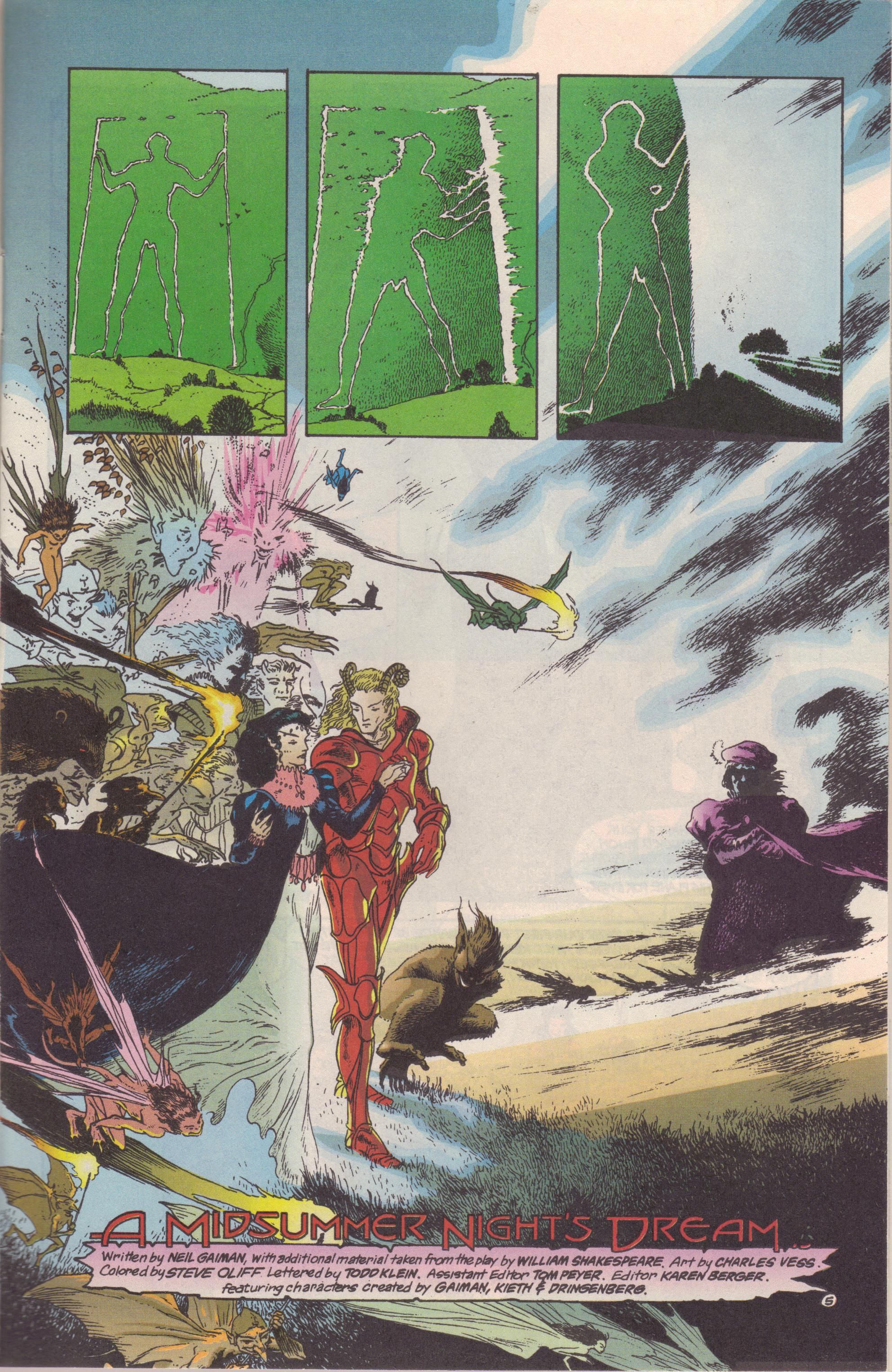
Finally, here's Page Five of Sandman #19, "A Midsummer Night's Dream," in the original:
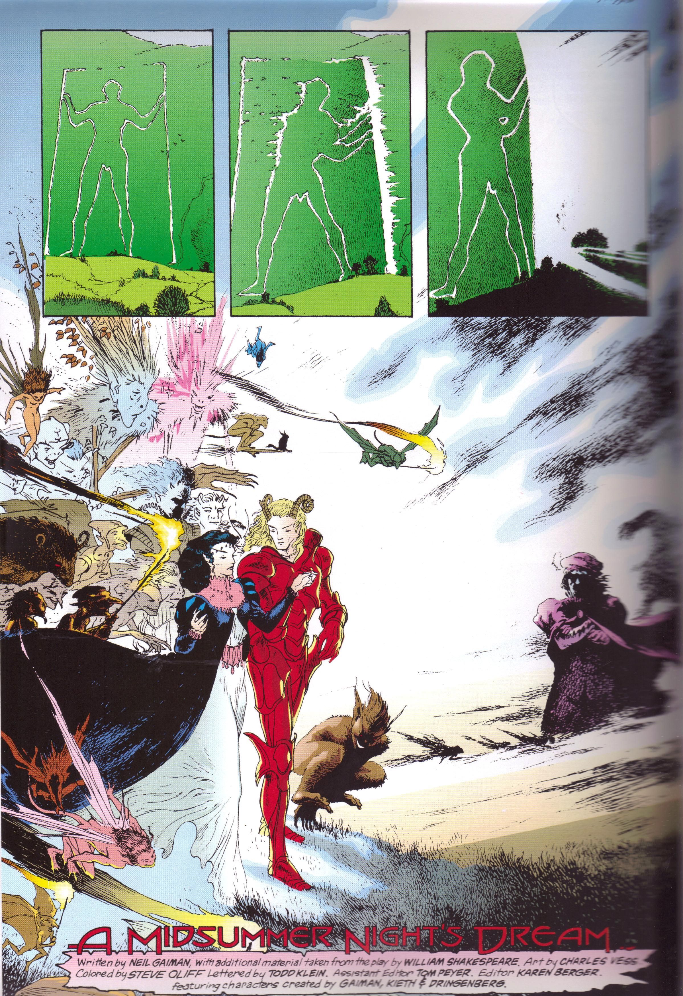
This is from The Absolute Sandman:
Here's the page in The Annotated Sandman:
This issue was not recolored for The Absolute Sandman, and you can tell: the only real difference is the glossy paper, which makes it a bit brighter in the Absolute version. The annotated version suffers a bit because Vess's art is really beautiful when colored and it does lose a bit when uncolored. Here's the annotations for this page:
This is a case of the annotations continuing from the previous page, which doesn't happen that often. As the previous few pages have a lot of stuff about the Shakespearean stage, the annotations ran long. We do get a nice picture of the Long Man of Wilmington, though.
For the most part, I enjoyed the annotations (yes, I've already read the entire book, which is easy to do when you don't actually read the issues; I've read the first 20 issues of Sandman so often I know them pretty well). The annotated version is reprinted from the Absolute Edition, so any changes made there are reflected here (there's an example of some panels being flipped and a few script changes and even script mistakes - Jed says "spooky birds" instead of "skooky birds" in the Absolute version) and noted. There's a lot about the DC history Gaiman includes, which is nice. I certainly don't mind that Gaiman slowly (but never completely) divorced the series from the DCU, but seeing how he works stuff in is very keen. Much like Klinger's annotations of the Sherlock Holmes oeuvre, I liked what was there and was a tiny bit disappointed that there wasn't more. I don't even know if there could be more, but I WANTED IT!!!!! And, of course, some pages have no annotations, because they don't need them.
So that's a peek at The Annotated Sandman, which is 50 dollars for 20 issues of uncolored comics you've probably already read (unless you're Dan Felty, of course). I certainly loved it, but I'm not sure if it's the best place to start reading the series. I hope this helps Mr. Felty and anyone else who was curious, though. We're all about customer service here at the blog!

