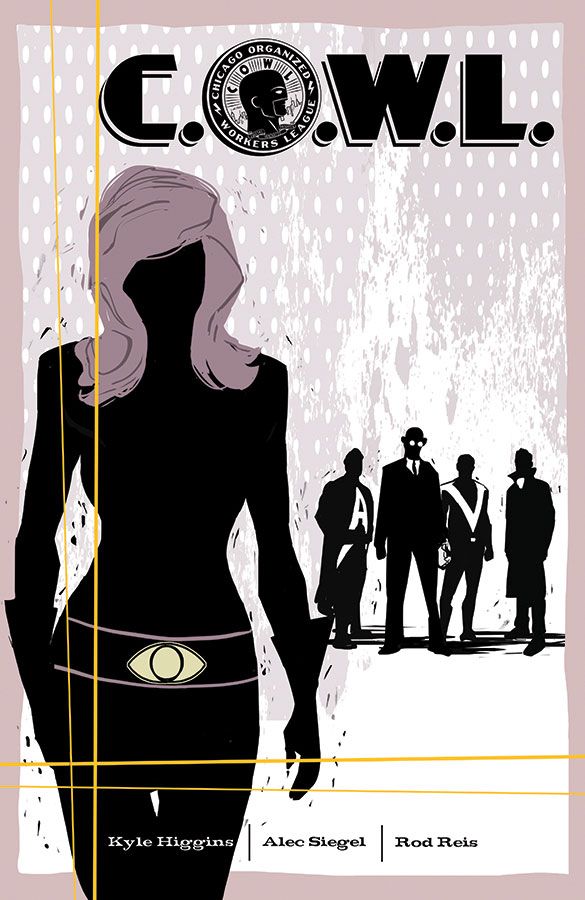
In "C.O.W.L." #3, writers Kyle Higgins and Alec Siegel continue to build their world with artist Rod Reis and letterer Troy Peteri. The creative crew dials the focus in tightly around Radia and Geoffrey Warner's negotiations with the city council.
Set in 1962, "Principles of Power" is filled with lots of talking and a little action, as the story begins to congeal, giving readers a chance to see that "C.O.W.L." is a comic book equivalent of a television drama. This series won't be filled with grandiose threats to the universe. Instead, it focuses on the humanity of super-powered beings in a time when the nation was on the brink of significant change. "C.O.W.L." #3 is a period piece that's part "Mad Men" due to timing and atmosphere, if not setting, and part "Squadron Supreme" in that the super-powered beings are essentially familiar, but not iconic per se. Higgins and Siegel don't hesitate to make the men of "C.O.W.L." #3 chauvinistic and egotistical, but on the other side of that coin, Radia has had about as much as she can stand.
Peteri's borderless word balloons give "C.O.W.L." #3 the feeling of a prestige format book held over from the 1990s. It's sharp and clean, and the simple omission of overbearing black outlines on the balloons gives the story a more liberated, free feeling, especially as the balloons settle more comfortably into Rod Reis' gorgeous artwork. Reis brings everything he has and pours it into every single panel. At some points, his work reminds me of Phil Noto. At others, it defies comparison. Throughout "C.O.W.L." #3, the work is simply amazing. The splash page of Radia posing for the "Bombshell" photo shoot is nothing short of stunning. Not overly sexualized, nor gratuitous, but word-free and breathtaking, Reis knocks this out of the park and shows readers he has no problem with a fancy splash page, but he doesn't even think about overusing splashes. Splash pages and split pages, nine-panel grids and characters popping out of panels, Reis creates a visual spectacle worth every penny in the price of admission. Topping it all off, following the text piece and letters, Jen Aprahamian contributes an amazing image at the back of the comic to close out "C.O.W.L." #3. The image looks like a mosaic, composed of subtle tones and type overlays. The more attention paid to its components, the more amazing it becomes.
I binge read this run, capping off with "C.O.W.L." #3. Higgins, Siegel, Reis and Peteri give Image yet another solid book worth checking out. Image has built up a nice little streak over the past few years and as long as books of this quality, with this level of talent continue to appear, I'll be a happy reader.

