THE McSPIDEY CHRONICLES BEGINS

"The Amazing Spider-Man by David Michelinie and Todd McFarlane Omnibus" has been calling out to me from the bookshelf for a long time, now. I love having that run of comics in one handy place. I love so many of those issues, even if it's not always for perhaps the purest of high comics art reasons. They are, in a way, the start of my comics life.
The first comic I bought that started me on the weekly comics reading grind was "The Amazing Spider-Man" #318. As close as I can tell, Marvel released that issue in June of 1989. The cover date on it is August 1989 and I know these comics always showed a date a couple of months in advance. I picked up my copy of the issue at a newsstand, which means it likely came out a week or two after the Direct Market had it. And Marvel usually went bi-weekly with their major titles in June, July, and August. "Amazing Spider-Man" started that run with the following issue. It seems to me that the latest this issue might have arrived on newsstands, then, is early June.
By the time I get to that issue in this series, perhaps I'll have found an answer. Marvel's Wiki, the Grand Comic Database, and ComicBookDB all list the issue only by its cover date, not the release date. If you have any information on the actual release date, please drop me a line.
What this all means is that I'm coming up on my 25th comics anniversary. I will have been a comics reader continuously since the day I picked up that comic. Wanting to do something special to celebrate, I struck upon the concept of "The McSpidey Chronicles," inspired no doubt by the kind of work Tim Callahan has done in recent years with, for one example, the output of Alan Moore, or maybe Not Blog X's thorough chronicling of 90s X-Men or Spider-Man comics. (Wait, he also did 75 issues of "Spawn"!) I'm not quite that ambitious, so I think sticking to these couple dozen issues or so will be enough.
Let us begin. Set your time machines for the beginning of 1988...
"THE AMAZING SPIDER-MAN" #298: "CHANCE ENCOUNTER!"

The gambling mercenary Chance gets involved in a weapon heist that gives Peter Parker a crisis of conscience. Also, Peter has issues with bringing in less money than his new wife, super-model Mary Jane.
The concept of this Chance character is one of those goofy little twists on the old standard mercenary character, but series scribe David Michelinie plays it well. Chase likes the thrill of the gamble, so he doesn't take a straight payday for the jobs he does. Instead, he bets with his employers on whether he can get the job done or not. It's a little motivation that keeps him from being just another green-and-darker-green costume wearing fool with flying boots.
He is far from being the most ludicrous antagonist in this series; just wait for issue #302 for that. . .
The gambling angle could work on a character today, but would likely be weighed down with extra layers to make it seem more serious and relevant. I like it just fine as a novelty. I don't need to hear about -- let's hypothesize a modern take on the character here -- his gambling problem, the money he owes the mob, his childhood neglect from an abusive father, or his days being a card shark to his fellow students, winning him no friends and sending him spiraling down into a supervillain lifestyle to fill the hole in his heart left by blah blah blah.
He's a mercenary dude with a twist. Throw him at Spider-Man, and let the aerial hijinks fly!

It takes only to page three before the classic McFarlane moments start happening in this issue.
- First, Chance flies out of a giant explosion behind him. McFarlane draws awesome explosions. I love the life and the volume they have. This one is tame by his standards, but it's the beginning of a trademark to his style that few mention. The clouds flying out of Chance's boots that allow him to fly also have great life in them, swirling around a central core of power, not unlike the spaghetti webbing McFarlane borrowed from Michael Golden and popularized to the point of normalcy. If McFarlane didn't make it as a comic book artist, he might have had a career ahead of him as a special effects animator.
- The other classic bit is in the last panel on the page, with "fashion model Mary Jane Watson-Parker" posing awkwardly for a photographer. In an attempt to give her a dynamic pose, McFarlane overdoes it a bit, contorting her legs and hips to the point where they don't look connected. Heck, that back leg looks like it's coming from another person all together.
It's one of the recurring things you'll see in this series as we go along. Michelinie gives McFarlane lots of opportunities to deliver crowd-pleasing beautiful model shots, and lots of "frisky newlywed" scenes that inevitably end with doors closing or the camera panning away.

In this issue, for example, Peter welcomes Mary Jane into their bedroom with the promise of a "venus butterfly." Please, for the sake of all that is pure and good in this world, resist your temptation to look that up in the Urban Dictionary. I'm not even giving you a link. Just -- don't. [EDITOR: Augie's too squeamish - CBR's Brian Cronin explains it all right here!]
The big character moment of the issue comes when Peter, as Spider-Man, lets Chance carry on with his assault on a weapons delivery haul for the sake of taking better, more valuable pictures for The Daily Bugle. That leads to Chance injuring one of the soldiers, something for which Peter has a hard time forgiving himself. Michelinie always did a good job in keeping these character moments in every issue, even as the series was the main action/supervillain-of-the-month title of the Spider-Man family at the time. He could have gotten away with just action-packed bombast, but never did.
Todd McFarlane was drawing both "The Amazing Spider-Man" and "The Incredible Hulk" for a few months. The overlap ran through "Hulk" #341-346 and "Amazing Spider-Man" #298-303. (That wasn't all the double-dipping McFarlane did in 1988, but we'll get to that in later weeks.)

To keep this schedule up, McFarlane had an inker. He started the year inking "Hulk" himself, before giving that up to Bob Wiacek and Jim Sanders III. (Yes, that's the Jim Sanders III who ran into some financial difficulties last year.) In fact, his last two "Hulk" issues were done as "breakdowns" and "layouts" (the latter for Erik Larsen to pencil), so you can see where the schedule started to strain things.
Helping him out for his first two "Amazing Spider-Man" issues was the great inker, Bob McLeod. Heck, he's a great artist whose skills are most often put to work with inks. His inking style isn't right for McFarlane at all, but who knew that back then? With McLeod's inks, McFarlane's style feels more Romita-ish, with clean faces, black-filled hairstyles. It also blends better with the previous artist on the series, Alex Saviuk. (Saviuk would move to "Web of Spider-Man," where you'd start to see McFarlane's influence creeping into Saviuk's style.)
Sure to give some nightmares, consider what these issues might have looked like if the inker of the previous story had stuck around for McFarlane. That would have been Vince Colletta. We'd all be looking for the pencils to see what got erased.
The Omnibus edition of this material, it should be noted, leaves off McLeod's credits on the table of contents page. It skips straight over his two issues. Weird. McLeod's credits are still present on the comic pages (which is where most people will look), so it's not a total oversight.

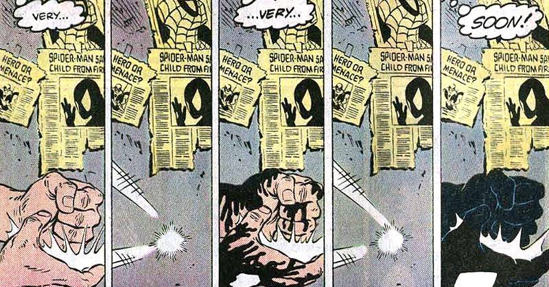
In the end, though, nobody remembers Chance from this issue. They remember the final page, which introduces us to the shadowy world of Eddie Brock and Venom...
Oh, and if I may steal a beat from Not Blog X:
That's So '80s! Peter Parker's apartment has a framed Patrick Nagel print.
Chance returns for the next issue to finish off this storyline before the 300th issue extravaganza and the return of the blue-and-red costume. Come back next week for more of that!
To Be Continued...
DELILAH DIRK AND THE TURKISH LIEUTENANT

The most amazing thing about the web is that its very nature you means you might find links from one thing to another unexpected thing that turns out to be a welcome surprise. Links are not just the currency of the web, but also the most important structure and function.
I say that because I discovered the webcomic, "Delilah Dirk" this past week thanks to a link from a French Twitter account I follow to keep up with the BD comics market. "Delilah Dirk" is not French, though you can quickly see how it might appeal to an audience used to globetrotting adventures, densely packed pages, and strong art design.
I'll let the website sum up the first story and printed collection of the series, "Delilah Dirk and the Turkish Lieutenant":
First, Delilah Dirk causes his execution. Then, she saves his life. Honour-bound to return the favour, Selim, the titular Turkish lieutenant, plunges into a world of danger and excitement. What will he sacrifice to repay his debt?
There's a nice sense of humor in the comic, that of the realistic and adventurous Delilah crossed with the more proper Lieutenant and his bloodthirsty military leader. It's a strong clash of personalities all around which leads to the exciting action scenes and quippy dialogue.
Tony Cliff's art is done in a slightly animated style. The character designs are thin-lined and lacking solid black areas, but it's the body language and the facial expressions that sell the book. The sense of humor is sold beautifully with careful attention being paid to the expressive eyebrows and mouths, arm movements selling the action to "the back row," and Delilah's casual violence -- most of which is never seen, since we always seem to cut to her after she's committed a serious act.


Cliff adds lots of background art in, giving the book a specific feel, like the story is taking place in a real and well-explored place. There's enough architectural detail to sell it to the casual reader as something Turkish, and not just a generic eastern European or perhaps North African bazaar.
The first chapter is noticeably golden-orange in tone, while the second chapter set in the high seas sticks with bold blues. It's not a flashy coloring style, carrying some light texture work in the occasional backgrounds and some cuts across faces to give shadows and form to some figures. It's light enough and bright enough to highlight the artwork the majority of the times, with one or two instances of gradients or vignettes threatening the art just a little bit.
The lettering is a key component in the storytelling, too, with the bits of exaggerated font size to mimic the over-the-top declarations and demands. This isn't a book done by an artist who sees lettering as the final production job necessary to get the work out. It's the work of someone who "gets" lettering and what it can add to a story being told.
The first two chapters are available on-line, and the complete 170 page graphic novel is available in print form today. It looks very nice on the screen. If they could get that color quality and saturation to translate to the page, the book would be a very nice treat.
There's also a Tumblr site for the book, including this helpful How To showing how Cliff scans in his pencil art and gets it to look right on the screen. And then check out Cliff's studio tour on MacTeenBooks.
Also, as she is wont to do, Brigid found this comic first over on Robot6 back in 2011.
Twitter || E-mail || Pipeline Message Board || VariousandSundry.com || AugieShoots.com || Original Art Collection || Google+