It's no secret which versions of Marvel Comics' characters Alex Ross loves best.
The painter has been a student of the original "Marvel Age" of comics since his first major project for the publisher in the series "Marvels" 20 years ago. Since then, Ross has returned to the '60s again and again while sprinkling in contributions to the modern Marvel canon. So it came as no surprise when the artist and the company teamed up once again to help celebrate Marvel's 75th anniversary with a series of special variant covers spotlighting the publisher's biggest franchises.
RELATED: Alex Ross Revives "Batman '66 Meets Green Hornet" & "Astro City"
But just because Ross' new covers look to the past iterations of their characters, it doesn't mean his take on them has remained set in stone for two decades. CBR News spoke with the painter about the series that went from "Fantastic Four" through to Marvel's most recent acquisition of "Miracleman," and Ross opened up about his influences and ideas including why he looked to the second iteration of the X-Men's first class, his personal war over John Romita and Steve Ditko's Spider-Man, who he believes the Red Hulk should have been and why some of his art would look perfect under a black light.

CBR News: How did the 75th Anniversary cover gig come about? Were you looking to get back into the Marvel sandbox?
Alex Ross: I have done a little bit with their licensors for limited edition prints. With Choice Collectibles, I've done a few new prints over the last couple of years. So I never completely stopped doing work with them, just like I still do collectible prints with DC. This was mainly [my art dealer] Sal Abinatti's baby. He was trying to get some more Marvel stuff out of me, and we're both interested in Marvel stuff as fans. So he decided to make some overtures there, and it was sort of a fresh relationship. It's always good to keep me as far removed from dealing directly with people as possible because I ruin things. [Laughs] So Sal's taken point every step of the way as my conversational mouthpiece with Marvel.
The running theme with this group of covers is, obviously, the classic Marvel Age versions of the characters, but they also each have a bit of their own style. Did you start with Fantastic Four and do these chronologically?
Fantastic Four was the second one released, but it was the first one I did. Both that and the Avengers cover were asked for at the same time, and I'd had that composition for the FF kicking around in my sketchbook for years. I wanted to show them as an homage to the profile portraits Norman Rockwell did of astronauts from the Mercury space program in the '60s. I wanted to do a take on that blending into a rocket shot and then of course into a big shot of the Fantastic Four to finish off the piece. That was something I wanted to get out of my head before I moved on to whatever I was going to say with all the rest of the characters -- particularly the challenge of the Avengers.
With the Avengers, I have them effectively doing a not-so-well hidden human pyramid. It's a little less ridiculous because it's not that they are technically standing on one another's shoulders. It's just cropped in such a way that it looks like they make an "A."

What stood out to me was that the FF piece had darker earth tones to it, but the Avengers piece was more like your recent "Kirby Genesis" work in that it's almost psychedelic in its colors.
[Laughs] Well, if you see the print that we've made, it feels a little different. Depending on whether it's the cover or the poster Marvel made to now a limited edition print we'll be selling at San Diego, the vibrancy varies depending on the printing process. All my pieces are made with an eye towards trying to trap a certain monochromatic feel. Obviously, you see a lot of color in a piece like the Avengers one, but take note of the fact that the main Avengers figures that make up the "A" are all basically a magenta tone. And that's not because magenta is a kind of outrageous color. It's for the idea that they all can blend with that, where there's not any primary colors differentiating their costumes. It's all just tones of that magenta. Then there's spot color used throughout the other figures in the piece -- their villains and some select moments throughout their history -- but for the most part, they are largely monochromatic, too.
It's more obvious when you look at the Fantastic Four piece, because there's a much stronger reddish/brownish overtone affecting all of it. It washes out all the blue of their costumes and makes it much more harmonious between the Thing and the Human Torch's color blending. I think when I do that in the art, it has a grounding of reality that separates you a little bit from just pure paint-by-numbers of the costumes that balance everything 100%. I'm trying to use brilliant color to say, "Yes, these are bright, brilliant characters," but I'm also trying to mask how garish they might seem if you took them all at face value as individual colors blazing equally.
Aside from the colors, in the Avenger piece in particular you draw from a wide range of stories and characters to represent the team's signature runs. Was there a lot of discussion with Marvel about what would best be included there? I'm finding it hard that they were telling you, "We have to have Klaw in there."
Well, because the genesis of this was Sal largely saying to them, "Don't ask the guy to draw the Red Hulk, please!" [Laughs] Which was largely symbolic of the idea that I'd be good as an artistic tool for the historical versions of the characters or the most classic and long-lived -- we asked if there was a scheme of covers they could commission from me to be more-or-less recognizable versions. They came back with this idea that we acknowledge the history of the characters in each of my covers. You can either do that by showing their origins, which I do in the Daredevil cover, or Spider-Man, or you can do what I did with the Avengers, which is a retrospective of the many villains they've had surrounding them. But as you can tell looking at the images I showed, I picked what topped out to me as important in their history -- which is basically the first ten years of their storytelling. It's very subjective to what I'd infer to it. There have been no real demands from Marvel, but I guess the only thing that was asked of me came from the most modern version of all these covers that was the Guardians of the Galaxy piece.

That Guardians cover goes back to a couple of months ago, and the trick with that was that not only is this the most modern iteration of the group, but it was also the most recent versions of those characters. Like, I designed the entire piece trying to get away with the thing I didn't think they'd let me get away with -- showing the classic Guardians from the future in the background. That wasn't the problem in the end, though. The problem was that the main figure in my composition,Starlord, had a new costume update that Steve McNiven gave him. That design was trying to give him a stronger connection back to the original John Byrne version from the '70s, which I loved. I even got the chance to redesign that myself in the series "Paradise X."
I liked what Steve had done, but I feared as soon as I turned in my composition that they were going to ask me to do the gas mask thing from the movie. And yes, that was the one change of any sizable nature they asked for. I knew it was going to have to happen, but at least I got the one thing I wanted, which was to draw Vance Astro and all those characters I cared about, because that's my youth reflected there. Technically, characters like Drax and Gamora all go back 40 years. They've been around in comics as long as I've been alive, but the contemporary costuming is much different. That's why my covers may not be for certain modern collectors because they've been introduced to these heroes with mostly revamped costuming. Most comic characters have a continuation of form that unites them over the years. Spider-Man essentially looks the same from 1962 to today.

It's interesting you mention that, because with your X-Men cover, you present the redesigns of that "First Class" group of characters. Was that because you identify the Marvel Girl costume with the mask or Cyclops' swashbuckler boots as their most iconic versions?
The thing is, I'd already gotten multiple chances to do the earliest versions of them, which is mostly fun because you get to draw the snowy version of Iceman. [Laughs] I recognized with this opportunity that I could do that original group as they were costumed when Neal Adams drew them. It was more fun than I'd ever expected, and it allowed me to scratch an itch I never did before. For all the times I've drawn them, I'd never explored that period. I was either doing their earlier costumes or the All-New, All-Different X-Men.
So I loved doing this, especially what seems to be a very dated outfit for Jean Grey, with the pointed mask and everything. That's one of those adorable, charming costumes in comics, like Mary Marvel or Princess from "Battle of the Planets." Girls with a skirt -- you just don't get a lot of that today.

You mentioned the origin covers, and I think it's Daredevil, Spider-Man and Hulk that all fit that mold. You've done pieces akin to this before, so how did you approach these to differentiate the way you'd paint them this time?
You try and hook into what makes the most visual sense. Spider-Man has such a key, pointed group of scenes and supporting characters that demand you don't go straight into painting their villains. I might do that with a different character, but in the case of Spider-Man, it's so distinctive that you've got to show his aunt and uncle, his girlfriends, his boss, the guy who killed his uncle. Those are all extremely classic elements that can easily fill up a composition, and everyone has an affinity for all that material.

Then, with Daredevil, you've got even less than that. The visual elements that are his father being a boxer and the accident that made him blind are the two key things. But then you don't want to necessarily pad it out with either the Owl or the Gladiator or even someone like Elektra. It feels like you're trying to cram in all these broad things that don't have as specific a connection to the simplicity of what makes this character.
If there was any one great inspiration for what I was doing in a piece like the Daredevil one was trying to connect to that first impression of him from when he had his costume redesigned by Wally Wood. That red costume was made of such a mystifying material. This constant of comic books is to draw dark, shadow-aread costumes that have a bright color highlight whether it's Daredevil's red or back in the '40s Hourman's "yellow" shirt. Is it yellow or is it black? It's supposed to be yellow, but it's almost entirely black. So it's this game of what material that could possibly be. The fun thing for me, as a painter, is that I can try and find something that has that flexibility as a material. I found a costume that was actually made for a toy that was the exact thing. It had a highlight of red but mostly went into darkness. I rendered that as well I could, and I guess there were some people online saying, "Now we know for sure that he wears velvet!" [Laughs] So it's not going to work for everybody, but it's kind of fun to try and bring to life the reality of it. They're going to make certain choices when they adapt these things into cinema that could go one way, but that's not the only way to do it.

The other element these origin covers share is that their compositions are driven by the characters' powers. What led you to that way of thinking -- a desire to tie the look of the piece with the character thematically?
Yeah. But there are times when I really regret that. Like with the X-Men piece, I wish I had just simply had Cyclops standing next to his girlfriend rather than having his eyeblast go off. Because as I know, graphically, if you get that much red, bright light filling the scene, it's going to have to touch everything. And if you've got that much bright red light going into a scene that's already well lit, it means that you've now got this conflicting light source that makes everything look weird and kind of psychedelic. That makes a painting for me where, like you said, the colors begin to look arty and intentionally psychedelic, and I'm not really hoping to achieve that. I'm just arriving there in spite of myself.
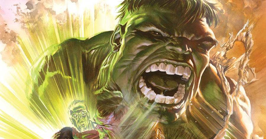
One thing I'll say in these ones since I've got the platform, and it's kind of goofy -- in terms of paying homages to certain things, in the case of the Hulk, as much as all the elements in it are reflecting the original Kirby story from '63, there's also a hidden thing in there I'm trying to portray. I'm a regular Marvel reader, and I follow a lot of those comics as they come out. During the Red Hulk saga that stretched out over two years, making us question who it was going to be, I always had my answer ready at hand. To me, it was obvious that the guy who would have become the Red Hulk -- who wanted to become a Hulk -- was this other scientist who pressed the button that made the explosion that trapped Bruce Banner in the first place. That's Igor Drenkov. And if you take a look at the piece I did, he's the guy right behind Ross. That's my way of pointing a finger at him to say, "That guy was important." And if you look between him and the half-changing Hulk above him, there's the impression of an arrow going between the two. The reason there's all that red light in the piece is my way of saying, "This is the guy who should have turned out to be the Red Hulk." [Laughs] He had the hair. He was working with the Russians, so he would have been a Red. It made much more sense than General Ross turning out to be the Red Hulk. But then again, I'm not the kind of person who thinks the Hulk should have a son kicking around or that every character he ever met eventually gets turned into a Hulk. So there's a whole disparity on creative outlook there.


You're also doing a series of covers for "Amazing Spider-Man," now
There is one particular sin I've committed with the Spider-Man covers, and that's that I won't allow myself to do anything but the John Romita version that I always do with his costume. They did make the request of saying, "This is going to be set in the Ditko era, so everything that you can do to make it fit with that is good." And I did do a test shot where the pencil version was drawn with the very curved web shapes and a slightly different shape to the eyes that Ditko had done back then. He obviously drew more webs on the mask at first, and the spider on his chest was much more hand-drawn. But the reason I couldn't let myself do it in the end, because I have this feeling where every time I draw Spider-Man, I want it to be -- it's almost a political movement where I'm trying to make this gesture out loud to people where I'm saying, "The Romita version is the best version of all! Bow down before it!" [Laughs] I'm trying to bully everybody into the same point of view that I have. And as much as I adore the Ditko version, I still feel like the Romita version never gets its due since the post-MacFarlane era, which was sort of a Ditko retread. I keep feeling like, "Don't you realize that one of the best drawings in the history of comics is the way Romita drew Spider-Man?!?"
Though I feel like there's an awful lot of Ditko in your Peter Parker here.
I certainly tried to compensate for it, yeah. You'll see that the fifth cover of the series will have a pastiche of face shots of all the villains from his first year. There's the Terrible Tinkerer and Sandman and Doc Ock, and I hope you'll get the impression of the Ditko art style brought forward. It's his version of drawing those faces. I even did a couple covers that Aunt May is on -- I think I've drawn her three times -- and it's always a weird game of what version of her face I'm trying to draw. Is it skinny enough? Is it old but not too old? There's a fine line, and of course now in the contemporary comics, she's gotten younger looking. But I want to pay tribute to the version that is the icon.

Outside the Marvel 75th anniversary cover versions, you've also recently done a "Miracleman" cover.
Talk about psychedelic! [Laughter]
I'm assuming that you must have been a big fan of that series when you were younger. What were you going for on this cover? Was it Alan Davis or any of the other artists that you looked to base your version off of?
I have a particular affinity for all the versions those guys did on the series, but artistically, I'm much closer to Garry Leach because he's more of a photorealist in his art style, and the way he drew the book attracted me. But then again, you've got to look back at the original comics done in the late '50s and early '60s, by Mick Anglo and his contemporaries. They were just drawing a blonde version of Captain Marvel, so in some ways, you've got to have a little bit of that CC Beck flavor in there. A lot of that got washed out when Leach and Davis did what they did. So in some ways, that got into my head as I was working on this.
But the two things that really got into my head here was, first, that I was trying to pay tribute to the very specific storyline told about the revelation of Miracleman's origins -- the revelation that this alien has landed on earth and was fused between two changing bodies. If you know the story and read this thing, you know that's how Alan Moore explained the genesis of the Billy Batson/Captain Marvel tradeoffs. I wanted to show that I'm as invested in that book as if I'd worked on it, because it had such a huge impact on me as a teenager. But secondly, the pose of Miracleman himself is actually the painting from Michelangelo of Adam from the Sistine Chapel. He's in the pose where Adam is reaching out to touch fingers with God, so he is the created man. When you marry that idea with the version of superhuman life that gave birth to his super humanity -- as seen within the native parts of his body -- that's the conceptual part of the image. It's a religious motif.
With the colors and the bright magenta, I was trying to achieve something that felt as surreal and unnerving as Alan Davis was going for in the original sequence, when Dr. Gargunza finds the alien ship crash landed. They walk inside, and there's all these crazy colors. He was trying to change his art style to a stipple effect that was very different than you were used to, so that the environment they were walking into was completely unnatural.
The only other thing that would have really gotten that effect is if you could translate my painting into a full-on black light poster. Then it would possibly be the illustration I was hoping it might be. [Laughs]