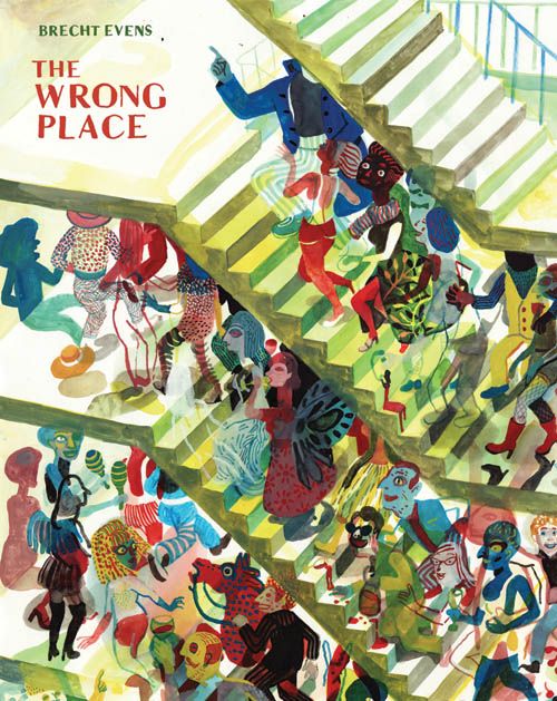
Brecht Evens took a lot of people by surprise this past autumn. Seemingly emerging from nowhere, the Flemish cartoonist’s English-language graphic-novel debut, The Wrong Place, was released by Drawn & Quarterly and quickly made a major splash among critics and cartoonists in a year already crowded by high-quality releases. For that you can thank Evens’ eye-popping painted colors, which do far more than just tell you what color hair or clothes his characters have.
His story of a small group of twenty-somethings -- revolving around an odd couple of mismatched friends and their divergent night lives during a party, a one-night stand, and a night out at a club -- uses color almost as a code. It differentiates the characters, conveys their personalities, and helps us understand their environments and relationships. You’ll see parts of yourself you like and dislike in all three of its main characters: gray-colored wallflower Gary, his legend-in-his-own-time bright-blue best friend Robbie, and Olivia, who decides to live it up one night in fiery red.
So color us excited (sorry, couldn’t resist!) to be able to interview Evens as part of Robot 6’s second anniversary spectacular...
Sean T. Collins: The thing that most surprised me about The Wrong Place was that it didn't "teach me a lesson." I expected to be hit with a moral about how Robbie's vida loca was actually empty and meaningless, or how wrong it is for Gary not to loosen up and live a little, but neither thing happened. Olivia shows a tinge of regret about her wild night with Robbie, but it's just a tinge, not an indication that she Did The Wrong Thing or something like that. All of this despite the fact that the title itself implies that one or all of these characters is not where they really belong. I was hoping you could talk a bit about why you took this approach to your main characters and their decisions, which I found refreshingly non-judgmental.
Brecht Evens: I was 20 when I came up with the first draft, the setup for the book, and it was very noir, very contrived and judgmental, and full of nifty “ideas.” Most of this got thrown out along the way, where the ideas come to seem stale and instead the need becomes greater to be able to believe in and identify with the characters, and to testify about things observed in real life. Or, because I automatically began to identify with the characters, and love them, I was more compelled to nuance.
To give you an idea, in the original script someone is crushed by one of those mirrored disco-balls. That didn't really go anywhere, so it had to go. Even though, once, I almost got crushed by a falling disco-ball. It missed me by a few feet.
So anyway, what I ended up with is a book in which people coldly step on each other's soul all the time, except when they don't.
Ha! The "crushed to death by a disco ball" element is really hilarious. Not the part of it involving it almost happening to you, of course! What's interesting to me here is that you're really not all that much older than twenty even now, but obviously you've grown quite a bit in terms of your approach to this material. I can't help but wonder if you've had more experiences with people like Gary or Robbie that have tempered your initial, harsher treatment of them, in addition to simply coming to like your own characters better as you said.
Yeah, that's part of it - let's file that under “testimony.” For one thing, I only began having one-night-stands myself a short while after writing that first draft. And oh — almost getting crushed by a disco ball was genuinely funny in real life, too.
Glad to hear that, I guess! [Laughs] It occurs to me that you let color do a lot of the work normally reserved for linework, character design and so forth -- it emerges as a sort of shorthand for not just what the characters look like, but the type of people they are. What do you feel you gain in painting the comic in this way as opposed to a more traditional fashion? Is there anything you lose?
I think the whole spectrum is there, or at least that was the idea when I started drawing this way: to have big crude forms and surfaces combined with fine detail, also linework. So nothing should be lost. It's only when I get lazy that I stop using the whole spectrum. Characters had to be recognizable by color, even when just drawn as a splotch. This way, when I do detail a face, for example, it draws a lot of attention.
I certainly didn't mean to imply that you were being lazy! I suppose what I'm saying has to do with one of the things you told Frank Santoro in your interview at Comics Comics -- when you're drawing a woman wearing fancy boots and a hat, you emphasize the boots and the hat and allow suggestion to do more of the work with the rest of her. Is that a fairer way to characterize it?
The first way was perfectly fair already -- I don't think you called me lazy. As you say, there's a lot of shorthand in the book, which allows other details and newer information to come to the fore.
One passage of the book that really did draw a lot of attention because of how differently it was drawn was the sex scene. You obviously use a lot of techniques there, but I was struck by how your line thinned out and became less dependent on dense, overlapping fields of color. It was a very different way of depicting the intensity and physicality of the act than what you do elsewhere for dancing or fencing, for example. How did you come to feel that this was the right way to go about it?
While dancing and fencing look pretty convincing just by showing the frozen poses in between quick movements, lines seemed more apt to depict continuous and repetitive movement like sex. And I had to work up to the orgasm, which had to be linear to have the drawings vibrate and disintegrate the way they do.
I have a feeling that readers of The Wrong Place will come away preferring one of the book's three sections -- Gary's party, Olivia's night on the town, and Gary's rendez-vous with Robbie -- to the others. They're all different not just in terms of the outcome of the evening for the participants, but also in terms of the way the most impactful dialogue and layouts are delivered -- they really FEEL like very different sections, even though they're obviously in the same world with the same characters. Did you have a favorite among the three, or at least did you feel that one worked better than the others?
I think the first section works best, as a tightly controlled whole. It was first conceived as a short story. But I prefer the third and last section. There's a lot of warmth in it, but also all the chilling notes from the earlier parts. It combines operatic spectacle and tiny intimate moments, or alternates between them, as if it's a fight between operatic spectacle and tiny intimate moments, both of them wanting to define the finale.
I definitely like the final act in that, as I mentioned earlier, I'm not left with the feeling that I'm being told who the "good guy" and "bad guy" are. Like the conflict between spectacle and intimacy, you leave the victor of that particular duel up to the reader. But do you yourself have a preference for either character? I guess I'm so struck by how even-handed you are in their depiction that I'm even more interested than usual in where your own sympathies lie.
No, I love all the characters in their moments of difference, Robbie when he invites Gary to sit on his lap, Gary when he's struggling for words…Anytime they seem alive it gives me a nice warm Pygmalion feeling.
The art in The Wrong Place is so striking and unique that it's going to get a lot of attention, and justifiably so. But I wanted to talk to you a bit about the dialogue, which struck me as very accurate to the lives of young urbanites. Gary's party in particular was dead-on in depicting the ebb and flow of conversation at a get-together, and how that ebb and flow can gradually push things in uncomfortable directions. Do you have any particular techniques you use for writing believable dialogue? Also, since The Wrong Place was translated into English, how involved were you in that process? Do you feel like the English-language version captures the feel of the original?
Most of my dialogues consist of small talk with a hidden agenda, an undercurrent. My favorite moments are when this undercurrent bubbles up enough to mangle the characters' phrasing, with one word tripping up a sentence. A lot of the small talk comes from life, where it often didn't have a desperate and obvious hidden agenda.
[Drawn & Quarterly editor] Tom Devlin and me were heavily involved in the translation, and bothered the three translators about many things, so I think the English mangled phrases come close to the Dutch mangled phrases, but, necessarily, some very Dutch stuff is lost.
What influenced you when you were working on The Wrong Place? I'm especially interested in what kinds of comics you were looking at as you prepared to draw the book, but feel free to mention anything else that influenced its creation.
I wasn't really looking at comics, except for maybe Blexbolex. I got started on the right track by looking at a book of early 20th-century Georg Grosz drawings, Ecce Homo. There's a lot of cityscapes with skewed perspectives. In one of them there's a prostitute sitting on a chair, viewed from behind. She's all dressed, but through the back of the chair you see her naked. A lot of what I now do in my drawings comes from that, the transparency, see-through walls, people, things...
Finally, you have a new book coming out in 2011 from Top Shelf called Night Animals. How did you hook up with Top Shelf after first publishing with D&Q? What can we expect from the new book? Is this a return to the nightlife setting of so much of The Wrong Place?
This is not a new book but an older one I made while studying abroad in 2007. The contact with Top Shelf dates from before The Wrong Place. Night Animals has more of a 'Where the Wild Things Are'-setting than any other I can think of.
[gallery columns="5"]


